CSS navigation bar
Next we will customize our own navigation bar.
Vertical navigation bar:
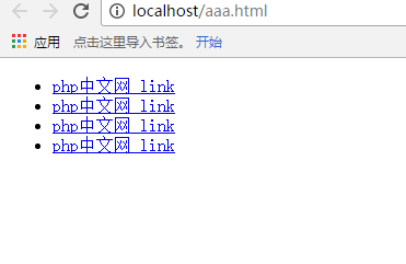
First we use the list as the most basic carrier, and then we add local or external The link is like the following:
<ul>
    <li><a href="http://www.php.cn">php中文网 link</a></li>
    <li><a href="http://www.php.cn">php中文网 link</a></li>
    <li><a href="http://www.php.cn">php中文网 link</a></li>
    <li><a href="http://www.php.cn">php中文网 link</a></li>
</ul>
Then we will get this effect:

The navigation bar we usually see is not underlined, and There is a dot in front, and when our mouse moves over the link, the color of the link will change accordingly. This is the effect we want to achieve with CSS now.
First, we need to remove the dot in front
ul{    list-style: none;
}
Next we remove the underline (regardless of whether it is an unclicked state or a clicked state), then add a background color, and then display it as a block:
a:link,a:visited{   text-decoration: none;   background-color: lightgray;    display: block;
}
Finally, we will add a mouse to the navigation bar to change the background color:
a:active,a:hover{    background-color: cadetblue;
}
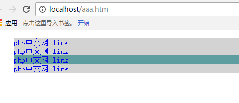
The following is the rendering

Vertical effect After the picture is finished, let's talk about the horizontal navigation bar. We only need to modify the CSS file.
First we need to delete the previous display effect, which is this sentence:
display: block;
Of course we only need to change the display mode in the li tag:
li{    display: inline;
}
In this way, we can realize the horizontal navigation bar

We can according to our own Preferences, setting margins, fonts, colors, etc. We won’t describe them one by one here.
