css3 radial-gradient() radial gradient
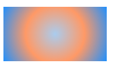
Radial gradient: perform a circular gradient from the starting point to the end point color from the inside to the outside. (Pull from the center outwards).
Detailed explanation of radial-gradient() radial gradient of css3:
Gradient includes radial gradient and linear gradient. For linear gradient, please refer to the chapter "Detailed explanation of linear-gradient linear gradient of css3".
Also in the past, some browsers had relatively old syntax, which will not be introduced here. What I introduce is the latest syntax for radial gradients.
We can get some clues about this gradient from the name of the gradient, which is the gradient effect from the center of the circle along the radius.
Grammar structure:
radial-gradient(   [ circle || <length> ] [ at <position> ]? ,
                 | [ ellipse || [<length> | <percentage> ]{2}] [ at <position> ]? ,
                 | [ [ circle | ellipse ] || <extent-keyword> ] [ at <position> ]? ,
                 | at <position> ,
                 <color-stop> [ , <color-stop> ]+ )
Parameter analysis:
(1).circle: Specifies that the radial gradient becomes a circle.
(2).ellipse: Specifies that the radial gradient becomes an ellipse.
(3).at <position>: Specifies the coordinate position of the center of the circle.
(4).<extent-keyword>: Keywords that specify the mirror gradient radius size (of course you can also use pixels or percentages, but circular radial gradients cannot use percentages): closest-side, closest-corner , farthest-side, farthest-corner, contain and cover will not be introduced here for now, but will be introduced in detail later.
(5).<color-stop>: Specifies the starting and ending colors.
Code example:
<!DOCTYPE html>
<html>
<head>
<meta charset="gb2312">
<meta name="author" content="http://ask.php.cn/" />
<title>php中文网</title>
<style type="text/css">
div{
  width:150px;
  height:80px;
  margin:20px;
}
.antzone{
  background:radial-gradient(#ace, #f96, #1E90FF);
}
</style>
</head>
<body>
<div class="antzone"></div>
</body>
</html>
If the position of the center of the circle is not specified, the value is center.
In addition to using percentages and pixels, there are several keywords for the position of the center of the circle, namely left, top, bottom and right.
The code example is as follows:
<meta charset="gb2312">
<meta name="author" content="http://ask.php.cn/" />
<title>php中文网</title>
<style type="text/css">
div{
  width:150px;
  height:80px;
  margin:20px;
}
.antzone{
  background:radial-gradient(at left bottom,#ace, #f96, #1E90FF);
}
</style>
</head>
<body>
<div class="antzone"></div>
</body>
</html>
The above code specifies the center coordinate left bottom of the radial gradient, that is, the center of the circle is at the lower left corner of the rectangle.
We can also display the specified shape of the radial gradient. The code example is as follows:
<!DOCTYPE html>
<html>
<head>
<meta charset="gb2312">
<meta name="author" content="http://ask.php.cn/" />
<title>php中文网</title>
<style type="text/css">
div{
  width:150px;
  height:80px;
  margin:20px;
}
.antzone{
  background:radial-gradient(circle ,#ace, #f96, #1E90FF);
}
</style>
</head>
<body>
<div class="antzone"></div>
</body>
</html>
The above code can specify the shape of the radial gradient as a circle. shape.
We can also specify the size of the radial gradient radius. The code example is as follows:
<!DOCTYPE html>
<html>
<head>
<meta charset="gb2312">
<meta name="author" content="http://ask.php.cn/" />
<title>php中文网</title>
<style type="text/css">
div{
  width:150px;
  height:80px;
  margin:20px;
}
.closest-side{
  background:radial-gradient(closest-side,#ace, #f96, #1E90FF);
}
.closest-corner{
  background:radial-gradient(closest-corner,#ace, #f96, #1E90FF);
}
.farthest-side{
  background:radial-gradient(farthest-side,#ace, #f96, #1E90FF);
}
.farthest-corner{
  background:radial-gradient(farthest-corner,#ace, #f96, #1E90FF);
}
.contain{
  background:-webkit-radial-gradient(contain,#ace, #f96, #1E90FF);
}
.cover{
  background:-webkit-radial-gradient(cover,#ace, #f96, #1E90FF);
}
</style>
</head>
<body>
<div class="closest-side"></div>
<div class="closest-corner"></div>
<div class="farthest-side"></div>
<div class="farthest-corner"></div>
<div class="contain"></div>
<div class="cover"></div>
</body>
</html>
Special note: contain and cover currently need to add the prefix of their respective browsers. This is only compatible with Google Chrome.
The following introduces the meaning of the keywords:
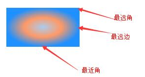
(1).closest-side: Specify the radius length of the radial gradient from the center of the circle to the side closest to the center of the circle.
(2).closest-corner: Specify the radius length of the radial gradient from the center of the circle to the corner closest to the center of the circle.
(3).farthest-side: Specify the radius length of the radial gradient from the center of the circle to the side farthest from the center of the circle.
(4).farthest-corner: Specify the radius length of the radial gradient from the center of the circle to the farthest corner from the center of the circle.
(5).contain: Contains, specifying the radius length of the radial gradient from the center of the circle to the point closest to the center of the circle. Similar to closest-side.
(6).cover: Cover, specify the radius length of the radial gradient from the center of the circle to the point farthest from the center of the circle. Similar to farthest-corner.
The picture is as follows:
 I believe it goes without saying, it is easy to understand through this picture.
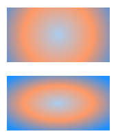
Of course, we can also use a customized radius length of the radial gradient. The code example is as follows:
<!DOCTYPE html>
<html>
<head>
<meta charset="gb2312">
<meta name="author" content="http://ask.php.cn/" />
<title>php中文网</title>
<style type="text/css">
div{
  width:150px;
  height:80px;
  margin:20px;
}
.circle{
  background:radial-gradient(circle 100px,#ace, #f96, #1E90FF);
}
.ellipse{
  background:radial-gradient(ellipse 100px 50px,#ace, #f96, #1E90FF);
}
</style>
</head>
<body>
<div class="circle"></div>
<div class="ellipse"></div>
</body>
</html>
The above code considers setting the radius size of the radial gradient. , note that the circle only needs one parameter, and the ellipse needs two. This is obvious.
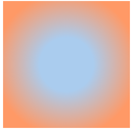
The same as linear gradient, we can also specify the gradient area, the principle is the same, the code example is as follows:
<!DOCTYPE html>
<html>
<head>
<meta charset="gb2312">
<meta name="author" content="http://ask.php.cn/" />
<title>php中文网</title>
<style type="text/css">
div{
  width:250px;
  height:250px;
}
.circle{
  background:radial-gradient(circle,#ace 30%, #f96 80%);
}
</style>
</head>
<body>
<div class="circle"></div>
</body>
</html>
The above code stipulates The gradient area is between 30% and 80% of the gradient line, and the rest is solid color.
