CSS3 flexible layout
Introduction to the basic syntax of Flex elastic layout in css3:
This chapter introduces the basic syntax of Flex elastic layout. Due to its layout flexibility, it will be widely used in the future.
We are not obsessed with the browser compatibility issue here, but focus on its basic syntax, because the compatibility issue can not only be basically solved at present, but also will be naturally solved in the future as the browser version improves. question. Now let’s get to the point.
Special note: All the pictures below come from the following two articles:
(1).A Complete Guide to Flexbox.
(2).A Visual Guide to CSS3 Flexbox Properties.
1. What is Flex elastic layout:
Flex is the abbreviation of Flexible Box, which means flexible layout.
We can specify any container as a flexible layout, that is, Flex layout.
Let’s look at a code example first:
<!DOCTYPE html>
<html>
<head>
<meta charset=" utf-8">
<meta name="author" content="http://www.php.cn/" />
<title>php中文网</title>
<style type="text/css">
#box {
  display:flex;
  width:300px;
  height:100px;
  justify-content:space-between;
  align-items:center;
  background:#ccc;
}
#box span {
  border-radius:50px;
  background:green;
  width:50px;
  height:50px;
}
</style>
</head>
<body>
<div id="box">
  <span></span>
  <span></span>
</div>
</body>
</html>
The above code is a simple flexible layout usage code example.
To set a container as a flexible layout, you can use the following code:
#box{
  display: flex;
}
内联元素也可以设置为弹性布局,代码如下:
#box{
  display: inline-flex;
}
2. The concept of flexible layout:
Elements that use Flex layout are called Flex containers (flex containers), referred to as "containers" .
All child elements of the container automatically become members of the container, called Flex items (flex items), referred to as "items".
The diagram is as follows:
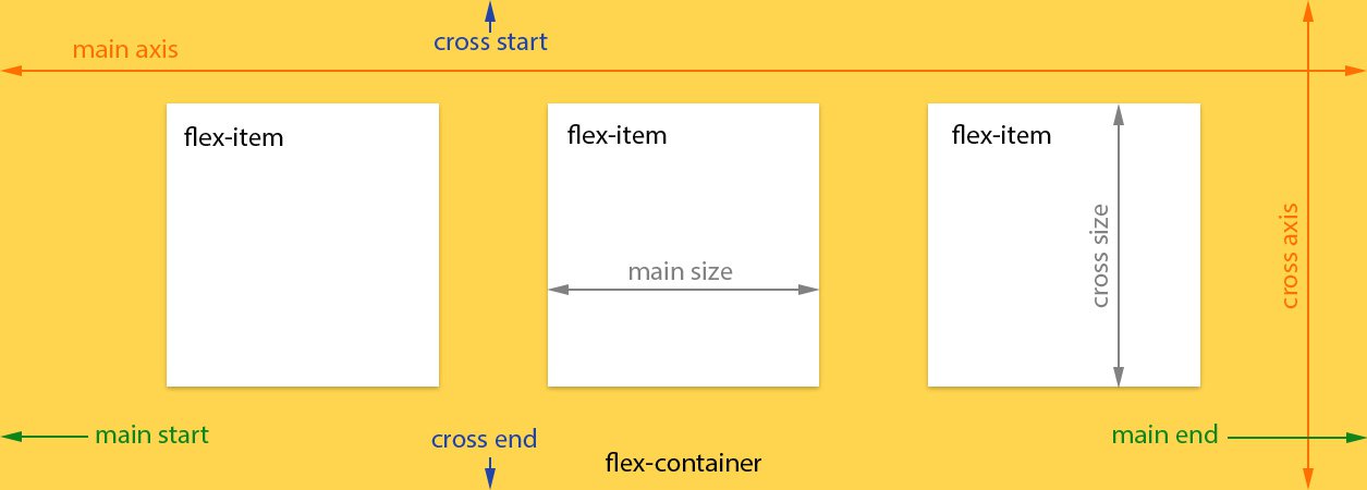 The following is a brief introduction to the diagram:
(1). Main axis: the main axis of the scalable container. The scalable project is mainly carried out along this axis. Arrange layout.
Special note: It is not necessarily horizontal, it mainly depends on the "justify-content" attribute.
(2). Main axis starting point (main-start) and main axis end point (main-end): The telescopic project is placed in the telescopic container from the main axis starting point (main-start) to the main axis end point (main-start).
(3). Main axis size (main size): The main axis space occupied by a single item is called the main axis size.
(4). Cross axis: Perpendicular to the main axis is called the cross axis. Its direction mainly depends on the main axis direction.
(5). Cross-start and cross-end: The configuration of the telescopic row starts from the cross-axis starting edge of the container and ends at the cross-axis end point.
(6). Cross size: The cross-axis space occupied by a single item is called cross-axis size.
3.1.flex-direction attribute:
This attribute determines the direction of the main axis, which is the arrangement direction of the items.
Grammar structure:
#box {
  flex-direction: row | row-reverse | column | column-reverse;
}
The diagram is as follows:
 Attribute value analysis:
(1).row (default value): The main axis is horizontal, and the starting point is at the left end.
(2).row-reverse: The main axis is horizontal and the starting point is at the right end.
(3).column: The main axis is vertical, and the starting point is on the upper edge.
(4).column-reverse: The main axis is vertical, and the starting point is at the lower edge.
3.2 flex-wrap attribute:
By default, items are arranged on a line ("axis").
The flex-wrap attribute defines how to wrap the line if one axis line cannot fit.
Grammar structure:
#box{
  flex-wrap: nowrap | wrap | wrap-reverse;
}
The diagram is as follows:
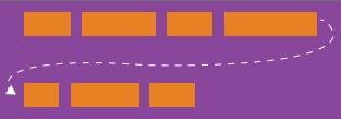
Attribute value analysis:
(1) nowrap (default): no line wrapping.

# (2) wrap: wrap, with the first line at the top.

(3) wrap-reverse: Line wrap, the first line is below.

3.3 flex-flow attribute:
This attribute is the abbreviation of flex-direction attribute and flex-wrap attribute. The default value is row nowrap.
Syntax structure:
#box {
  flex-flow: <flex-direction> || <flex-wrap>;
}
3.4 justify-content attribute:
The justify-content attribute defines the alignment of the item on the main axis.
Syntax structure:
#box {
  justify-content: flex-start | flex-end | center | space-between | space-around;
}
The diagram is as follows:
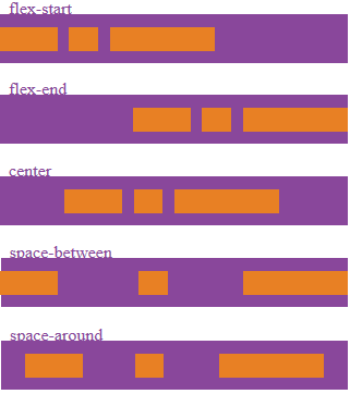 Parameter analysis:
It may take 5 values, and the specific alignment is related to the direction of the axis. The following assumes that the main axis is from left to right.
(1).flex-start (default value): left-aligned
(2).flex-end: right-aligned
(3).center: centered
(4).space-between : Align both ends, with equal spacing between items.
(5).space-around: The space on both sides of each item is equal. Therefore, the space between items is twice as large as the space between items and the border.
3.5 align-items attribute:
This attribute defines how items are aligned on the cross axis.
Grammatical structures:
#box {
  align-items: flex-start | flex-end | center | baseline | stretch;
}
The diagram is as follows:
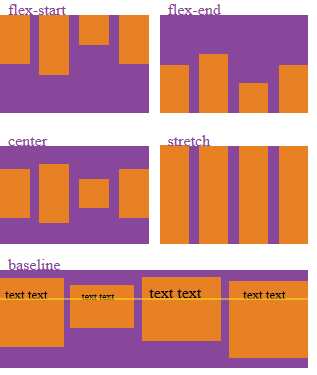 Attribute value analysis:
It can take 5 values. The specific alignment is related to the direction of the cross axis. It is assumed below that the cross axis is from top to bottom.
(1).flex-start: Align the starting point of the cross axis.
(2).flex-end: Align the end point of the cross axis.
(3).center: Align the midpoint of the cross axis.
(4).baseline: Baseline alignment of the first line of text of the item.
(5) stretch (default value): If the item does not set a height or is set to auto, it will occupy the entire height of the container.
3.6 align-content attribute:
This attribute defines the alignment of multiple axes. This property has no effect if the project has only one axis.
Grammar structure:
#box {
  align-content: flex-start | flex-end | center | space-between | space-around | stretch;
}
The diagram is as follows:
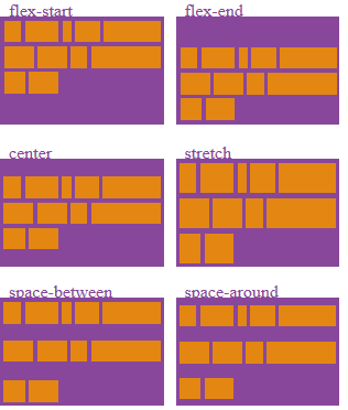 Attribute value analysis:
(1).flex-start: Align with the starting point of the cross axis.
(2).flex-end: Align with the end point of the cross axis.
(3).center: Aligned with the midpoint of the cross axis.
(4).space-between: Align with both ends of the cross axis, and the intervals between the axes are evenly distributed.
(5).space-around: The intervals on both sides of each axis are equal. Therefore, the distance between the axes is twice as large as the distance between the axes and the frame.
(6).stretch (default value): The axis occupies the entire cross axis.
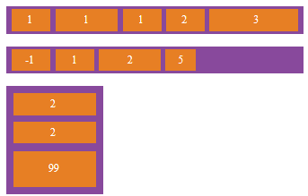
4.1 order attribute:
This attribute defines the order of items. The smaller the value, the higher the ranking. The default is 0.
Syntax structure:
.item {
  order: <integer>;
}
The diagram is as follows:
 4.2.flex-grow attribute:
This attribute defines the magnification ratio of the project, and the default is 0.
But if there is no remaining space, it will not be enlarged.
Syntax structure:
.item {
  flex-grow: <number>; /* default 0 */
}
The illustration is as follows:
 If the flex-grow property of all items is 1, they will equally divide the remaining space (if any).
4.3.flex-shrink attribute:
This attribute defines the shrinkage ratio of the item, the default is 1, that is, if there is insufficient space, the item will shrink.
Grammatical structures:
.item {
  flex-shrink: <number>; /* default 1 */
}
The diagram is as follows:
 If the flex-shrink property of all items is 1, when there is insufficient space, they will all be reduced proportionally.
If the flex-shrink attribute of one item is 0 and the other items are 1, the former will not shrink when there is insufficient space.
4.4 flex-basis attribute:
This attribute defines the main axis space (main size) occupied by the item before allocating excess space.
Based on this attribute, the browser calculates whether there is extra space on the main axis. Its default value is auto, which is the original size of the project.
Syntax structure:
.item {
  flex-basis: <length> | auto; /* default auto */
}
4.5.flex attribute:
This attribute is the abbreviation of flex-grow, flex-shrink and flex-basis. The default value is 0 1 auto. The last two properties are optional.
Syntax structure:
.item {
  flex: none | [ <'flex-grow'> <'flex-shrink'>? || <'flex-basis'> ]
}
This attribute has two shortcut values: auto (1 1 auto) and none (0 0 auto).
4.6 align-self attribute:
This attribute allows a single item to have a different alignment than other items and can override the align-items attribute.
The default value is auto, which means inheriting the align-items attribute of the parent element. If there is no parent element, it is equivalent to stretch.
Grammar structure:
.item {
  align-self: auto | flex-start | flex-end | center | baseline | stretch;
}
The diagram is as follows:
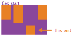
This attribute may take 6 values. Except for auto, the others are exactly the same as the align-items attribute.
Next Section