css3 linear-gradient linear gradient
Linear gradient: changes the color along an axis (horizontally or vertically), and performs a sequential gradient from the starting point to the end color (pulling from one side to the other).
Detailed explanation of linear-gradient linear gradient of css3:
gradient includes linear-gradient linear gradient and radial-gradient radial gradient.
This chapter only introduces linear gradients. For radial gradients, please refer to the radial-gradient chapter of CSS3.
The currently popular browser kernels mainly include the following:
(1). Mozilla (Firefox, Flock, etc.).
(2).WebKit (Safari, Chrome, etc.).
(3) Opera (Opera browser).
(4) Trident (IE browser), IE9 and above browsers support this attribute.
The latest syntax of linear gradient is basically the same (Google Chrome also has a relatively old-fashioned syntax structure, which will be introduced below).
Grammar structure:
linear-gradient( [<point> || <angle>,]? <stop>, <stop> [, <stop>]* )
Parameter analysis:
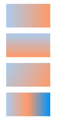
(1). [<point> || <angle>,]: Optional, if used to specify linear gradient direction. The point value can be left, top, right or bottom, or an appropriate combination of them. left means from left to right, top means from top to bottom, left top means from the upper left corner to the lower right corner, and so on. Angle specifies an angle, which will be introduced below.
(2).<stop>: Required, the second and third parameters are the starting point color and the end point color respectively. Of course, more parameters can be inserted between them to represent multiple color gradients.
The diagram is as follows:

The old version of Google Chrome also has a grammatical structure as follows:
-webkit-gradient(<type>, <point> [, <radius>]?, <point> [, <radius>]? [, <stop>]*)
Everything must keep pace with the times, this article This grammatical structure has been abandoned, and interested friends can check it out by themselves.
Code example:
<!DOCTYPE html>
<html>
<head>
<meta charset=" utf-8">
<meta name="author" content="http://ask.php.cn/" />
<title>php中文网</title>
<style type="text/css">
div{
  width:150px;
  height:80px;
  margin:20px;
}
.left{
  background:-webkit-linear-gradient(left, #ace,#f96 );
  background:-moz-linear-gradient(left, #ace,#f96 );
  background:-o-linear-gradient(left,#ace,#f96);
}
.top{
  background:-webkit-linear-gradient(top, #ace,#f96 );
  background:-moz-linear-gradient(top, #ace,#f96 );
  background:-o-linear-gradient(top,#ace,#f96);
}
.lefTop{
  background:-webkit-linear-gradient(left top, #ace,#f96 );
  background:-moz-linear-gradient(left top, #ace,#f96 );
  background:-o-linear-gradient(left top,#ace,#f96);
}
.more{
  background:-webkit-linear-gradient(left, #ace, #f96, #0094ff );
  background:-moz-linear-gradient(left, #ace, #f96, #0094ff );
  background:-o-linear-gradient(left, #ace, #f96, #0094ff);
}
</style>
</head>
<body>
<div class="left"></div>
<div class="top"></div>
<div class="lefTop"></div>
<div class="more"></div>
</body>
</html>
The above code demonstrates the basic usage of linear gradient. It is very simple. Let’s continue to introduce it in depth.
In the previous demonstrations, the position of the color was not specified, so the gradient was evenly distributed. In fact, we can control the gradient area.
The code example is as follows:
<!DOCTYPE html>
<html>
<head>
<meta charset=" utf-8">
<meta name="author" content="http://ask.php.cn/" />
<title>php中文网</title>
<style type="text/css">
div{
  width:150px;
  height:80px;
  margin:20px;
}
.antzone{
  background:-webkit-linear-gradient(left, #ace 80%, #f96);
  background:-moz-linear-gradient(left, #ace 80%, #f96);
  background:-o-linear-gradient(left,#ace 80%, #f96);
}
</style>
</head>
<body>
<div class="antzone"></div>
</body>
</html>
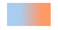
The above code stipulates the range of the gradient. The gradient action starts from 80%. Since the second There is no specified color, so the end position of the gradient is 100%. That is to say, the position before 80% is solid color without gradient effect, and the area between 80%-100% is gradient. Let’s look at a code example:
<!DOCTYPE html>
<html>
<head>
<meta charset=" utf-8">
<meta name="author" content="http://ask.php.cn/" />
<title>php中文网</title>
<style type="text/css">
div{
  width:150px;
  height:80px;
  margin:20px;
}
.antzone{
  background:-webkit-linear-gradient(left, #ace 30%, #f96 80% );
  background:-moz-linear-gradient(left, #ace 30%, #f96 80%);
  background:-o-linear-gradient(left,#ace 30%, #f96 80%);
}
</style>
</head>
<body>
<div class="antzone"></div>
</body>
</html>
The above code stipulates that the area between 30% and 80% is the gradient area, and the other areas are solid colors.
About the use of angle:
In the grammatical structure introduced at the beginning of the article, the first parameter can also be an angle, as follows:
linear-gradient( [<point> || <angle>,]? <stop>, <stop> [, <stop>]* )
It is an angle composed of a horizontal line and The angle generated by the gradient line is counterclockwise. If you do not specify an angle, it will automatically define an angle based on the starting position.
The code example is as follows:
<!DOCTYPE html>
<html>
<head>
<meta charset=" utf-8">
<meta name="author" content="http://ask.php.cn/" />
<title>php中文网</title>
<style type="text/css">
div{
  width:150px;
  height:80px;
  margin:20px;
}
.antzone{
  background:-webkit-linear-gradient(30deg,#ace,#f96);
  background:-moz-linear-gradient(30deg,#ace,#f96);
  background:-o-linear-gradient(30deg,#ace,#f96);
}
</style>
</head>
<body>
<div class="antzone"></div>
</body>
</html>
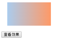
A gradient angle is set above. It may be static and is not conducive to observation and understanding. Here is another one. Continuous setting effect.
The code example is as follows:
<!DOCTYPE html>
<html>
<head>
<meta charset=" utf-8">
<meta name="author" content="http://ask.php.cn/" />
<title>php中文网</title>
<style type="text/css">
div{
  width:150px;
  height:80px;
  margin:20px;
}
.antzone{
  background:-webkit-linear-gradient(0deg,#ace,#f96);
  background:-moz-linear-gradient(0deg,#ace,#f96);
  background:-o-linear-gradient(0deg,#ace,#f96);
}
</style>
<script>
window.onload = function () {
  var odiv = document.getElementsByTagName("div")[0];
  var obt = document.getElementById("bt");
  obt.onclick = function () {
    var timer = null;
    var count = 0;
    timer = setInterval(function () {
      if (count == 360) {
        clearInterval(timer);
      }
      count = count + 1;
      odiv.style.background = "-webkit-linear-gradient(" + count + "deg,#ace,#f96)";
      odiv.style.background = "-moz-linear-gradient(" + count + "deg,#ace,#f96)";
      odiv.style.background = "-o-linear-gradient(" + count + "deg,#ace,#f96)";
    }, 100)
  }
}
</script>
</head>
<body>
<div class="antzone"></div>
<input type="button" id="bt" value="查看效果"/>
</body>
</html>
Click the button to see the effect of dynamically setting the angle, which can be helpful for understanding.
Application of transparency:
Linear gradient can also be applied to transparency. The code example is as follows:
<!DOCTYPE html>
<html>
<head>
    <meta charset="gb2312">
    <meta name="author" content="http://ask.php.cn/" />
    <title>php中文网</title>
    <style type="text/css">
        div{
            width:1000px;
            height:667px;
            margin:20px;
        }
        .antzone{
            background:-webkit-linear-gradient(left,rgba(255,255,255,0),rgba(255,255,255,1)),url(http://img01.taopic.com/141002/240423-14100210124112.jpg);
            background:-moz-linear-gradient(left,rgba(255,255,255,0),rgba(255,255,255,1)),url(http://img01.taopic.com/141002/240423-14100210124112.jpg);
            background:-o-linear-gradient(left,rgba(255,255,255,0),rgba(255,255,255,1)),url(http://img01.taopic.com/141002/240423-14100210124112.jpg);
        }
    </style>
</head>
<body>
<div class="antzone"></div>
</body>
</html>
