Apply an image border-image to the border
Detailed explanation of the usage of the border-image attribute of CSS3:
Before CSS3, setting the style of the border was very monotonous, that is, setting the type and color of the border Or thickness, even if it is carefully crafted, there is always limited room for improvement. However, the emergence of the border-image attribute can make the border style of the element more colorful.
1. Basic concept:
border- The image attribute can use pictures as border styles.
Use the border-style attribute to set the border type. We can think of border-image as a type of border.
When border-image is none or the image is not visible, the border effect defined by border-style will be displayed, otherwise the image border effect defined by border-image will be displayed.
This attribute can be considered as the abbreviation of the following attributes:
border-image-source
border-image-slice
border-image-width
border-image-outset
border-image-repeat
Grammar structure:
border-image: source slice / width / outset repeat
The above is the abbreviation of the compound attribute, and each attribute will be explained in detail later. .
2. Parameter analysis:
1.border-image-source:
This attribute is used to specify whether to use a picture to define the border style or image source path.
Syntax structure:
border-image-source : none | <url>
The default value of this attribute is none, which means that the picture is not used to define the border.
If you use an image to define the border, it is similar to background-image. The url() method is also used to specify the path of the image. It can be a relative or absolute path.
2.border-image-slice:
This attribute is used to specify the cutting position of the image.
Syntax structure:
border-image-slice: [ <number> | <percentage>]{1,4}&& fill?The default value of this attribute is 100%.
If it is number mode, it is a pure numerical value and cannot have a unit, but it refers specifically to pixels (px).
If it is percentage mode, it is relative to the size of the image.
Both number and percentage can have 1-4 values. The value method is similar to border-width, and also follows the top, right, bottom, and left method.
The value method of the border-image-slice attribute is introduced above. Here is an introduction to how it specifically cuts the picture. Let’s look at a picture first: 
The picture above is what we want to use as the picture border. In the picture, the size of each small square is 27px, then the length and width of this picture are (27*3) pixels.
slice is to cut and divide the picture. The cutting method is to cut inward. If there is the following code:
border-image-slice:27px 27px 27px 27px
The first 27px is cut 27px inward from the upper edge of the picture.
The second 27px is cut 27px inward from the right edge of the image.
The third 27px is cut 27px inward from the bottom edge of the picture.
The fourth 27px is cut 27px inward from the left edge of the image.
The cutting demonstration picture is as follows:

The above describes how to cut the picture, and the following describes how to use the cut picture.
After the image is cut, it will be divided into nine areas. These nine areas will correspond to the nine areas of the element. Here is an introduction to the nine areas of the element:
The css code is as follows:
div{
  margin:0px auto;
  height:100px;
  width:100px;
  border-style:solid;
  border-width:20px;
  border-color:blue red;
}
The above code can form a div element with a border. In fact, this element also has nine potential areas. The diagram is as follows:
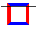
Then the nine areas of the border image There is a one-to-one correspondence with the nine areas of the element, that is, the corresponding part of the border image is applied to the corresponding position of the element.
If the fill keyword exists, the middle part of the border-image will be retained (the default is to discard the middle part and leave it blank).
3.border-image-width:
This attribute is used to specify the width of the border image.
Syntax structure:
border-image-width : [ <length> | <percentage> | <number> | auto ]{1,4}The border image is drawn in a specified area. This area is called the border image area. The border-image-width attribute is used to specify the "thickness" of this area.
This attribute can be omitted. At this time, the border image area is consistent with the border of the element.
This attribute can have values 1-4. The value method is similar to border-width, and also follows the top, right, bottom, and left method.
4.border-image-outset:
This attribute is used to specify the size of the border image area beyond the element border.
Syntax structure:
border-image-outset : [ <length> | <number> ]{1,4}This attribute can have values 1-4. The value method is similar to border-width, and also follows the top-right, bottom-left method.
5.border-image-repeat:
This attribute is used to specify how the middle part of the cut border image (the yellow part in the demo image) exists in the corresponding part of the element.
Grammar structure:
border-image-repeat: [ stretch | repeat | round ]{1,2}First explain the meaning of the three methods:
stretch: The picture fills the area in an extended manner.
repeat: The image is tiled repeatedly to fill the area.
round: The image is tiled repeatedly to fill the area. If the area is not filled in a multiple of an integer, the image is scaled to fit the tiled multiple of the integer.
This attribute can have 1-2 attribute values:
If there is one, it is used for the four directions of up, down, left and right.
If there are two, the first one is used for up and down directions, and the second one is used for left and right directions.
If this attribute is omitted, stretch is used by default.
3. Code examples:
Special note: The following code examples use the following picture as the border picture, and the size is (27*3) px.

Example 1:
<!DOCTYPE html>
<html>
<head>
<meta charset=" utf-8">
<meta name="author" content="http://ask.php.cn/" />
<title>PHP中文网</title>
<style type="text/css">
div{
  height:100px;
  width:200px;
  border:27px solid red;
  border-image:url("mytest/demo/bimg.jpg") 27;
}
</style>
</head>
<body>
<div id="thediv"></div>
</body>
</html> 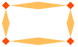
In the above code, border-image-slice is set to 27, Since the border-image-width is not specified, the size of the border will be used as the standard. And since the border-image-repeat attribute is not specified, the stretch method is used by default, which is to stretch the cut middle area (that is, the demonstration image yellow area in ).
Example 2:
<!DOCTYPE html>
<html>
<head>
<meta charset=" utf-8">
<meta name="author" content="http://ask.php.cn/" />
<title>PHP中文网</title>
<style type="text/css">
div{
  height:100px;
  width:200px;
  border:54px solid red;
  border-image:url("mytest/demo/bimg.jpg") 27;
}
</style>
</head>
<body>
<div id="thediv"></div>
</body>
</html>
The only difference between this example and Example 1 is the width of the border. The border image will adapt to the width of the border.
Example 3:
<!DOCTYPE html>
<html>
<head>
<meta charset=" utf-8">
<meta name="author" content="http://http://ask.php.cn/"/>
<title>PHP中文网</title>
<style type="text/css">
div{
  height:100px;
  width:200px;
  border:27px solid red;
  border-image:url("mytest/demo/bimg.jpg") 27 stretch repeat;
}
</style>
</head>
<body>
<div id="thediv"></div>
</body>
</html>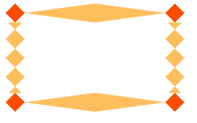
In the above code, stretch is used in the horizontal direction, and repeat is used in the vertical direction. The repeat method will not adjust the size of the middle part of the border picture after cutting (the yellow part of the demonstration picture) to achieve a repeated tiling effect, so there will be incompleteness.
Example 4:
<!DOCTYPE html>
<html>
<head>
<meta charset=" utf-8">
<meta name="author" content="http://http://ask.php.cn/" />
<title>PHP中文网</title>
<style type="text/css">
div{
  height:100px;
  width:100px;
  border:27px solid red;
  border-image:url("mytest/demo/bimg.jpg") 27 repeat round;
}
</style>
</head>
<body>
<div id="thediv"></div>
</body>
</html>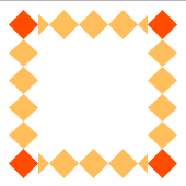
The round method can automatically adjust the size of the middle part of the border picture after cutting (the yellow part of the demonstration picture) to achieve repeated flatness. paving effect, so there will be no incompleteness.
Example 5:
<!DOCTYPE html>
<html>
<head>
<meta charset=" utf-8">
<meta name="author" content="http://http://ask.php.cn/" />
<title>PHP中文网</title>
<style type="text/css">
div{
  height:100px;
  width:100px;
  border-style:solid;
  border-color:red;
  border-width:27px 54px;
  border-image:url("mytest/demo/bimg.jpg") 27;
}
</style>
</head>
<body>
<div id="thediv"></div>
</body>
</html>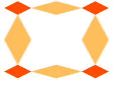
The above code modifies the size of the border. It can be seen that the border image will adapt according to the border size.
Example 6:
<!DOCTYPE html>
<html>
<head>
<meta charset=" utf-8">
<meta name="author" content="http://http://ask.php.cn/" />
<title>PHP中文网</title>
<style type="text/css">
div{
  height:100px;
  width:100px;
  border-style:solid;
  border-color:red;
  border-width:27px 54px;
  border-image:url("bimg.jpg") 27/27px;
}
</style>
</head>
<body>
<div id="thediv"></div>
</body>
</html>
When the border-image-width attribute is specified, the border image will no longer adapt to the border width.
Next Section