
一、实现原理和代码
1、双飞翼布局:用浮动定位结合margin实现三列布局。
在dom布局的主体中,与气体两种实现方式不同的是用一个外部div包住中部div区块,其原因就是为了方便通过中部的main类div的margin或padding的设置把被left和right盖住的内容显示出来。这样不影响wrap类、left类和right类之间的浮动关系。实现代码如下:
<!DOCTYPE html>
<html>
<head>
<meta charset="UTF-8">
<title>2.经典三列双飞翼布局</title>
<style type="text/css">
.header, .footer {
width: 100%;
height: 60px;
background-color: lightgray;
}
.content {
width: 1000px;
min-height: 100%;
background-color:gray;
margin:auto;
text-align: center;
line-height: 60px;
}
/*为保证底部正确位置,一般要在此清除浮动*/
.footer {
clear: both;
}
.container {
width: 1000px;
margin: auto;
background-color: yellow;
overflow: hidden;
}
.wrap {
width: 100%;
float: left;
background-color: cyan;
}
.wrap .main {
min-height: 600px;
margin: 0px 200px;
/*用margin或padding均可:*/
/*padding-left: 200px;
padding-right: 200px;*/
background-color: wheat;
}
.left {
width:200px;
min-height: 600px;
float:left;
/*margin-left: -1000px;*/
margin-left: -100%;
background-color: lightskyblue;
}
.right {
width:200px;
min-height: 600px;
float:left;
margin-left: -200px;
background-color: lightgreen;
}
</style>
</head>
<body>
<!-- DOM布局 -->
<!-- 头部 -->
<div>
<div>网站头部</div>
</div>
<!-- 主体 -->
<div>
<!-- 下面要用一个div包住中部的原因:就是为了方便通过中部的main类div的margin或padding的设置把被left和right盖住的内容显示出来。这样不影响wrap类、left类和right类之间的浮动关系。 -->
<div>
<div>中部</div>
</div>
<div>左侧</div>
<div>右侧</div>
</div>
<!--底部 -->
<div>
<div>网站底部</div>
</div>
</body>
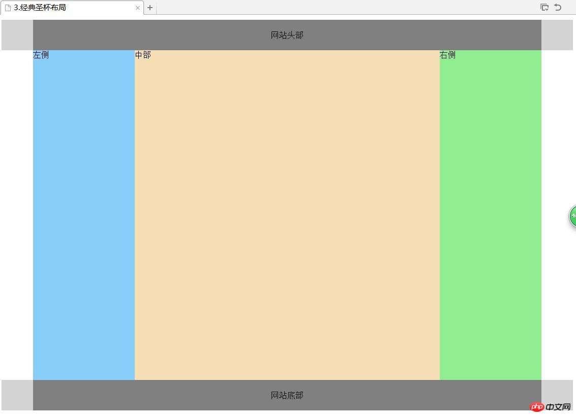
</html>2、经典圣杯布局:结合了浮动与相对定位来实现
核心:先浮动,再采用相对定位(相对浮动后的新位置的原点的再定位(移动到新新位置))。实现代码如下:
<!DOCTYPE html>
<html>
<head>
<meta charset="UTF-8">
<title>3.经典圣杯布局</title>
<style type="text/css">
/*头部和底部设置样式*/
.header, .footer {
width: 100%;
height: 60px;
background-color: lightgray;
}
.content {
width: 1000px;
/*height: 100%;*/
min-height: 100%;
background-color: gray;
margin: auto;
text-align: center;
line-height: 60px;
}
.footer{
clear:both;
}

.container {
width: 600px;
margin: auto;
padding: 0px 200px;
overflow: hidden;
background-color: yellow;
}
.container .main {
width: 100%;
min-height: 650px;
float: left;
}

.container .left {
width: 200px;
min-height: 650px;
float: left;
margin-left: -100%;
position: relative;
left: -200px;
background-color:lightskyblue;
}
.container .main {
width: 100%;
min-height: 650px;
float: left;
background-color: wheat;

}
.container .right {
width: 200px;
min-height: 650px;
float: left;
margin-left: -200px;
position: relative;
left: 200px;
background-color:lightgreen;

}

</style>

</head>
<body>
<!-- DOM布局 -->
<!-- 头部 -->
<div>
<div>网站头部</div>
</div>
<!-- 主体 -->
<div>
<div>中部</div>
<div>左侧</div>
<div>右侧</div>
</div>
<!-- 底部 -->
<div>
<div>网站底部</div>
</div>
</body>
</html>
二、布局效果如下:
三、体会
要理解实现包括双飞翼与圣杯布局,以及采用绝对定位实现以上经典三列布局,关键在于要理解几种定位方式的定义。三种定位:绝对定位(absolute)、相对定位(relative)和静态定位(static)特别是前两种定位方式的具体概念,以及浮动(float)的物理意义。