
1227日作业——Flex实现手机端的布局
1、本次手机端用flex实现,我觉得是对之前知识的综合运用考验,其中包括了:
flex容器的6属性运用和flex项目的6属性运用
2、在做本次作业的时候,多看多记多练是关键,之前自己没看作业视频的时候,经常容易卡壳,有时候一个小小的细节,就要耽搁半个小时以上,可能都还做不出来
3、本次的页面依然有很多不足之处,继续努力
感谢老师的辛勤付出!
以下是实现图片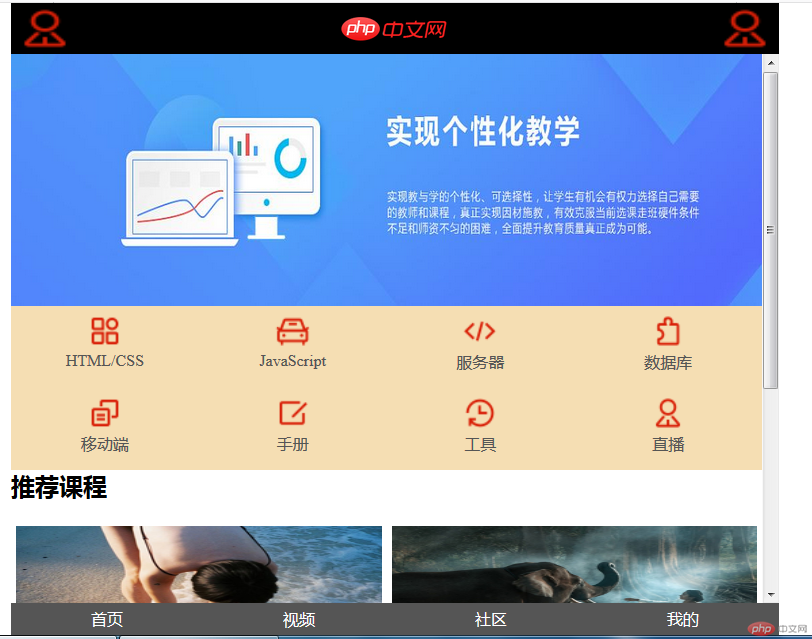
以下是代码(包含)CSS
<!DOCTYPE html><html lang="en"><head><meta charset="UTF-8"><title>flex移动端布局</title><style>* {padding: 0;margin-top: 0;/*outline: 1px dashed red;*/}a {text-decoration: none;color: #555555;}ul , li {list-style: none;}img {width: 100%;height: 100%;}body {min-width: 320px;max-width: 768px;width: 100vw;height: 100vh;display: flex;flex-direction: column;overflow-x: hidden ;margin: auto;}body header , body footer {height: 8vh;}body > header {display: flex;justify-content: space-between;background-color: black;}body > header > img {height: inherit;width: 5vw;}body > header > a >img {height: 100%;width: 8vw;}body > main {flex-grow: 1;overflow: auto;}/*轮播图*/body > main > div {height: 40vh;width: 100%;}body > main > .banner > img {height: inherit;width: 100%;}body > main > nav {display: flex;flex-flow: column nowrap;background-color: wheat;}body > main > nav > ul {display: flex;}body > main > nav > ul > li {flex-grow: 1;width: 25%;}body > main > nav > ul > li > a {display: flex;flex-flow: column wrap;align-items: center;margin-top: 5px;}body > main > nav > ul > li > a > img {height: 40px;width: 40px;}/*推荐课程*/body > main > section {display: flex;flex-direction: column;}body > main > section > .picture {display: flex;flex-direction: row;flex-wrap: nowrap;}body > main > section > .picture img {height: 20vh;width: 50%;margin: 5px;}body > main > section > .comment > section {display: flex;flex-flow: row nowrap;height: 20vh;}body > main > section > .comment > section img {width: 250px;padding: 5px;box-sizing: border-box;}body > main > section > .comment > section > div {display: flex;flex-direction: column;flex-grow: 1;justify-content:space-around ;margin-left: 5px;}body > main > section > .comment > section > div> div {display: flex;/*flex-grow: 1;*/}body > main > section > .comment > section > div> div span:first-of-type{background-color: black;color: white;border-radius: 5px;}footer {display: flex;justify-content: space-between;background-color: #555555;flex-grow: 1;}footer > span {color: white;margin: auto;}</style></head><body><!-- 头部--><header><img src="icon_fh1ahalyzh/bussiness-man.png" alt=""><a href=""><img src="1225/static/images/logo.png" alt=""></a><img src="icon_fh1ahalyzh/bussiness-man.png" alt=""></header><!-- 主体--><main><!-- 轮播图--><div class="banner"><img src="1225/static/images/5.jpg" alt=""></div><!-- 导航--><nav><ul><li><a href=""><img src="icon_fh1ahalyzh/all.png" alt=""><span>HTML/CSS</span></a></li><li><a href=""><img src="icon_fh1ahalyzh/auto.png" alt=""><span>JavaScript</span></a></li><li><a href=""><img src="icon_fh1ahalyzh/code.png" alt=""><span>服务器</span></a></li><li><a href=""><img src="icon_fh1ahalyzh/component.png" alt=""><span>数据库</span></a></li></ul><ul><li><a href=""><img src="icon_fh1ahalyzh/copy.png" alt=""><span>移动端</span></a></li><li><a href=""><img src="icon_fh1ahalyzh/editor.png" alt=""><span>手册</span></a></li><li><a href=""><img src="icon_fh1ahalyzh/history.png" alt=""><span>工具</span></a></li><li><a href=""><img src="icon_fh1ahalyzh/bussiness-man.png" alt=""><span>直播</span></a></li></ul></nav><!-- 推荐课程--><section><h2>推荐课程</h2><div class="picture"><img src="1225/static/images/img3.jpg" alt=""><img src="1225/static/images/img4.jpg" alt=""></div><div class="comment"><section><img src="1225/static/images/img1.jpg" alt=""><div><span>CI框架30分钟极速入门</span><div><span>中级</span><span>2187次播放</span></div></div></section><section><img src="1225/static/images/img1.jpg" alt=""><div><span>CI框架30分钟极速入门</span><div><span>中级</span><span>2187次播放</span></div></div></section></div></section></main><footer><span>首页</span><span>视频</span><span>社区</span><span>我的</span></footer></body></html>