
一下是整段HTML代码,修改过很多次,看上去还是有点乱,需要在实践过程中去逐渐优化代码,与言简意赅的类名。
<!DOCTYPE html><html lang="en"><head><meta charset="UTF-8"><link rel="stylesheet" href="font/iconfont.css"><link rel="stylesheet" href="m.php.cn.css"><title>仿m.php.cn练习</title></head><body><header><a href=""><i class="iconfont icon-huiyuan3"></i></a><div><img src="images/logo.png" alt=""></div><div><img src="images/cebian.png" alt=""></div></header><main><nav><img src="images/6.png" alt=""><div class="quick-entry"><a href=""><img src="images/html.png" alt=""><p>HTML/CSS</p></a><a href=""><img src="images/JavaScript.png" alt=""><p>JavaScript</p></a><a href=""><img src="images/code.png" alt=""><p>服务端</p></a><a href=""><img src="images/sql.png" alt=""><p>数据库</p></a><a href=""><img src="images/app.png" alt=""><p>移动端</p></a><a href=""><img src="images/manual.png" alt=""><p>手册</p></a><a href=""><img src="images/tool2.png" alt=""><p>工具</p></a><a href=""><img src="images/live.png" alt=""><p>直播</p></a></div></nav><aside><h3>推荐课程</h3><section class="recommend"><a href=""><img src="images/img1.jpg" alt=""></a><a href=""><img src="images/img2.jpg" alt=""></a></section><section class="course"><img src="images/img3.jpg" alt=""><div class="course-brief"><a href="">CI框架30分钟极速入门</a><div><span class="level">初级</span><span>55643次播放</span></div></div></section><section class="course"><img src="images/img4.jpg" alt=""><div class="course-brief"><a href="">CI框架30分钟极速入门</a><div><span class="level">初级</span><span>55643次播放</span></div></div></section></aside><article><h3>最新更新</h3><section class="renew"><img src="images/img5.jpg" alt=""><div class="renew-box1"><a href="">2019python自学视频</a><span>本课程适合想从零开始学习 Python 编程语言的开发人员。由浅入深的带</span><div class="renew-text"><span>初级</span><span>257125次播放</span></div></div></section><section class="renew"><img src="images/img6.png" alt=""><div class="renew-box1"><a href="">PHP开发免费公益直播课</a><span>主讲:php中文网-朱老师( Peter Zhu) 时间:2019.10.17 晚 20:00-22:00 主题</span><div class="renew-text"><span>初级</span><span>257125次播放</span></div></div></section><section class="renew"><img src="images/img7.png" alt=""><div class="renew-box1"><a href="">从零开始到WEB响应式布局</a><span>重点介绍了HTML、CSS、web布局前端核心技术,通过视频讲解,了解可以利</span><div class="renew-text"><span>初级</span><span>257125次播放</span></div></div></section><section class="renew"><img src="images/img8.jpg" alt=""><div class="renew-box1"><a href="">PHP文件基础操作</a><span>好多同学在PHP基础的时候对PHP文件的操作了解的不够多,本节课就带着大家</span><div class="renew-text"><span>初级</span><span>257125次播放</span></div></div></section><section class="renew"><img src="images/img9.png" alt=""><div class="renew-box1"><a href="">memcache基础课程</a><span>本课程带你从零认识memcache,让你在一小时左右轻松掌握memcache在windows和</span><div class="renew-text"><span>初级</span><span>257125次播放</span></div></div></section><section class="renew"><img src="images/img10.jpg" alt=""><div class="renew-box1"><a href="">微信小程序--企业微网站</a><span>1,介绍小程序、开发者工具 2,介绍小程序文档 3,微官网项目 4,首页、产品</span><div class="renew-text"><span>初级</span><span>257125次播放</span></div></div></section></article><section class="new-essay"><h3>最新文章</h3><div class="new-essay-box1"><div class="new-essay-box2"><a href=""><b>13个加速开发效率的现代CSS框架</b></a><a href="">发布时间:2019-12-27</a></div><img src="images/img12.jpg" alt=""></div><div class="new-essay-box1"><div class="new-essay-box2"><a href=""><b>13个加速开发效率的现代CSS框架</b></a><a href="">发布时间:2019-12-27</a></div><img src="images/img12.jpg" alt=""></div><div class="new-essay-box1"><div class="new-essay-box2"><a href=""><b>13个加速开发效率的现代CSS框架</b></a><a href="">发布时间:2019-12-27</a></div><img src="images/img12.jpg" alt=""></div><a href="">更多内容</a></section></main><footer><a href=""><i class="iconfont icon-daohangshouye"></i><span>首页</span></a><a href=""><i class="iconfont icon-yunhang"></i><span>视频</span></a><a href=""><i class="iconfont icon-guangbo"></i><span >社区</span></a><a href=""><i class="iconfont icon-huiyuan2"></i><span >我的</span></a></footer></body></html>
以下是CSS代码,相对以前的代码来说,比较工整有一定进步,还需要努力
*{margin: 0;padding: 0;font-size: 13px;/*outline: 1px dashed red ;*/}a{text-decoration: none;color: black;}body{max-width: 760px;min-width: 360px;overflow: auto;display: flex;flex-direction: column;margin: 0 auto;height: 100vh;background-color: #edeff0;}body>header{background-color: #2c2e2f;display: flex;flex-direction: row;justify-content: space-between;align-items: center;}body>header>a{margin-left: 5px;box-sizing: border-box;}body>header>div:first-of-type>img{height: 5vh;}.icon-huiyuan3{font-size: 20px;color: white;}body>main{flex: 1;display: flex;flex-direction: column;overflow: auto;}body>main>nav{display: flex;flex-direction: column;}body>main>nav>img{height: 24vh;}body>main>nav>.quick-entry{display: flex;background-color: white;flex-flow: row wrap;justify-content: space-between;}body>main>nav>.quick-entry>a{width: 180px;text-align: center;padding: 1vh 0;box-sizing: border-box;}body>main>nav>.quick-entry>a>img{/*width: 45px;*/height: 6vh;}body>main>aside{margin: 1vh;/*padding: 1vh;*/box-sizing: border-box;display: flex;flex-direction: column;}h3{font-size: 16px;padding: 1vh;}body>main>aside>.recommend{margin: 1vh 0;display: flex;justify-content:space-between;}body>main>aside>.recommend>a>img{box-sizing: border-box;display: block;height: 15vh;width: 21vw;}body>main>aside>.course{margin: 1vh 0;display: flex;background-color: #fff;}body>main>aside>.course>img{height: 11vh;width: 20vw;padding: 1vh;box-sizing: border-box;}body>main>aside>.course>.course-brief{flex: 1;display: flex;flex-direction: column;}body>main>aside>.course>.course-brief>a{padding-top: 1vh;font-size: 16px;color: #777;margin-bottom: 1vh;}body>main>aside>.course>.course-brief>div>.level{font-size: 11px;color: white;border-radius: 8px;background-color: #595757;padding: 2px;}body>main>aside>.course>.course-brief>div>.level + span{font-size: 12px;color: #777;}body>main>article{margin: 1vh;box-sizing: border-box;display: flex;flex-direction: column;}body>main>article>.renew{margin: 1vh 0;display: flex;background-color: #fff;/*align-items: center;*/}body>main>article>.renew>img{height: 11vh;width: 20vw;padding: 1vh;box-sizing: border-box;}body>main>article>.renew>.renew-box1{margin-right: 2vw;flex: 1;display: flex;flex-direction: column;justify-content: space-around;}body>main>article>.renew>.renew-box1>a{font-size: 16px;color: #777;}body>main>article>.renew>.renew-box1>span{font-size: 11px;color: #777;}body>main>article>.renew>.renew-box1>.renew-text{display: flex;justify-content: space-between;}body>main>article>.renew>.renew-box1>.renew-text>span:first-child{font-size: 11px;color: white;border-radius: 8px;background-color: #595757;padding: 2px;}body>main>article>.renew>.renew-box1>.renew-text>span:nth-last-child(1){font-size: 11px;color: #777;}body>main>.new-essay{margin: 1vh;box-sizing: border-box;display: flex;flex-direction: column;}body>main>.new-essay>.new-essay-box1{box-shadow: 0 0 10px lightgray;margin: 1vh 0;display: flex;background-color: white;}body>main>.new-essay>.new-essay-box1>.new-essay-box2{flex:1;display: flex;flex-direction: column;}body>main>.new-essay>.new-essay-box1>img{height: 9vh;width: 14vw;padding: 1vh;box-sizing: border-box;}body>main>.new-essay>.new-essay-box1>.new-essay-box2>a{padding: 1vh ;font-size: 13px;color: #777;}body>main>.new-essay>a{background-color: white;flex: 1;text-align: center;}body>footer{display: flex;height: 5vh;border-top: 2px solid lightgray;box-sizing: border-box;/*background-color: lightblue;*/}body>footer>a:first-of-type{display: flex;flex-direction: column;flex: 1;text-align: center;padding: 1vh 0;}body>footer>a:nth-of-type(2){display: flex;flex-direction: column;flex: 1;text-align: center;padding: 1vh 0;}body>footer>a:nth-of-type(3){display: flex;flex-direction: column;flex: 1;text-align: center;padding: 1vh 0;}body>footer>a:last-of-type{display: flex;flex-direction: column;flex: 1;text-align: center;padding: 1vh 0;}
实际效果图上部分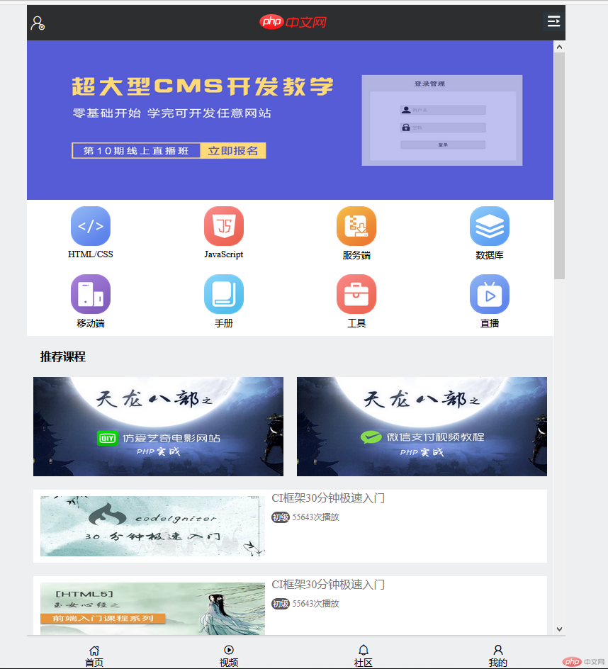
实际效果图下部分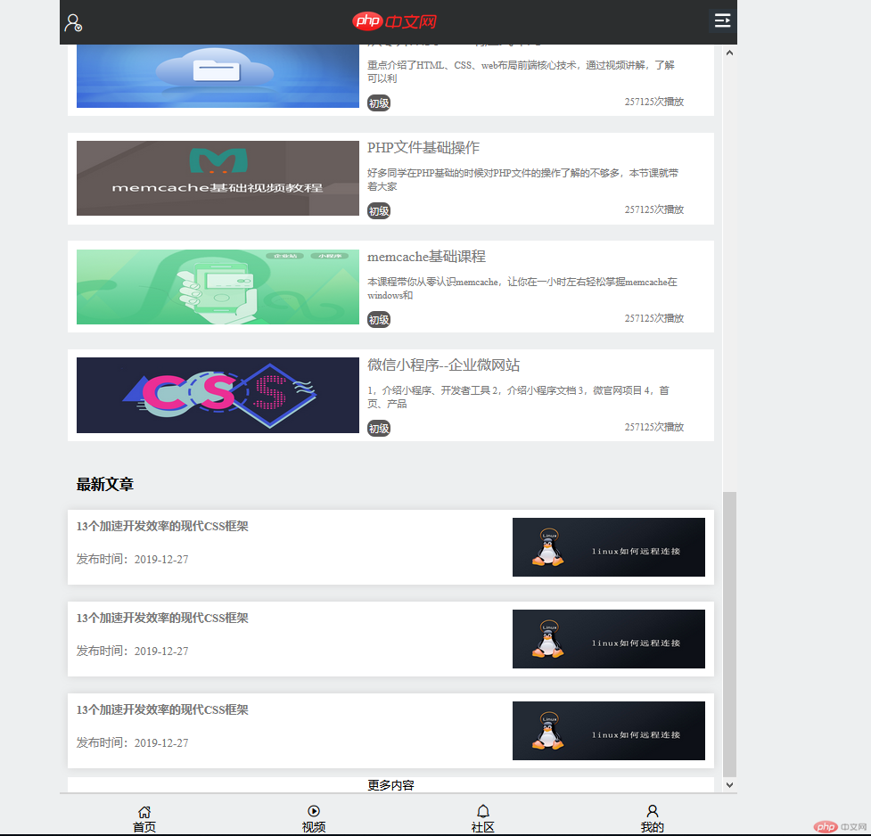
进过一周的学习对于前端布局思路比才开始的时候清晰多了,大概思路就是,拿到整张设计图,想构思布局,把整个网页分成几个部分,每个部分有拆卸成几块(几个盒子),越拆越细的时候整体思路就会越来越清晰,想把HTML大概框架写出来,然后再去分析CSS的布局与写法。(前期分析得越详细,后期写起来越轻松)
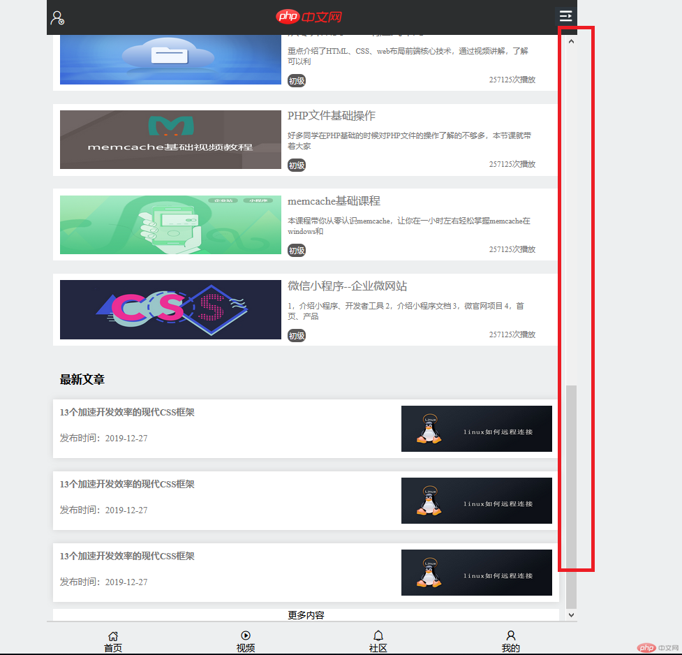
另外有个问题想请教下老师,我写的页面滚动条就在内容旁边
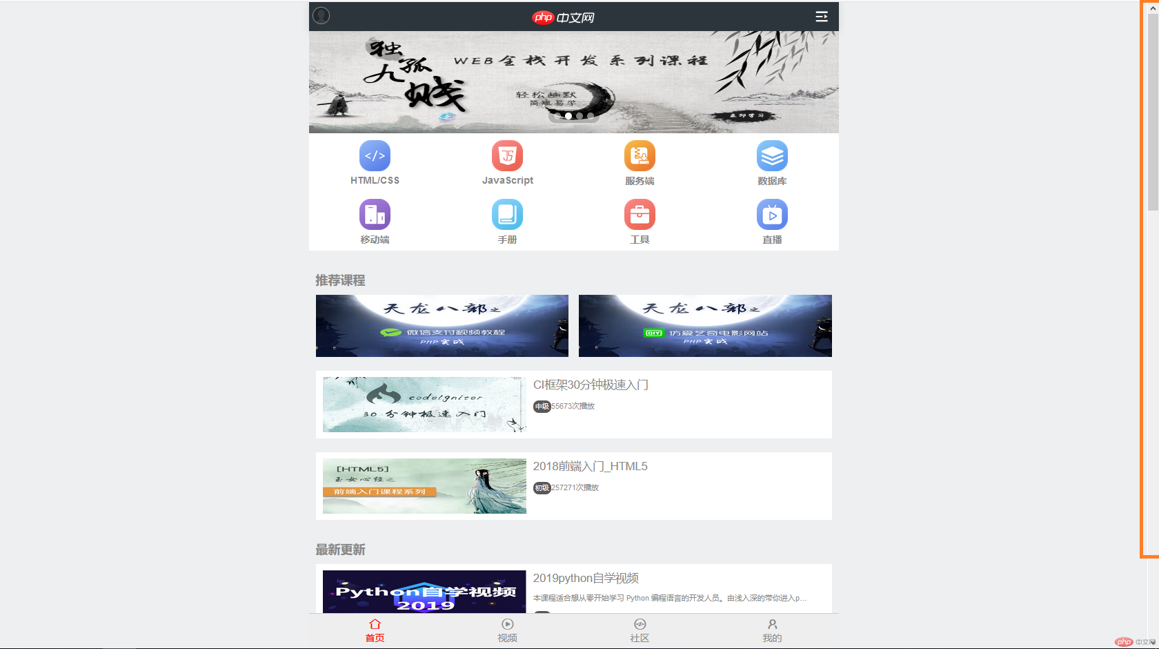
而中文网移动端的滚动条却在浏览器的旁边,而不是内容的旁边
我在BODY上设置了overflow:auto滚动条显示也是在内容的旁边,不会移到浏览器边上
然后我padding后面的属性也是用1vh这样写的 不知道这样对不起。