
Home >Software Tutorial >Office Software >How to adjust the position of minor tick marks in excel graph
How to adjust the position of minor tick marks in excel graph

- 王林forward
- 2024-01-17 11:48:061419browse
How to change the position of the minor tick marks in the curve chart of excel chart making
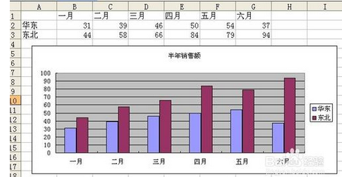
1, use excel to open a data table with charts
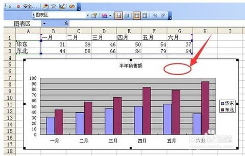
2, click the chart area to activate the chart
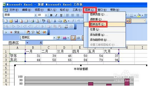
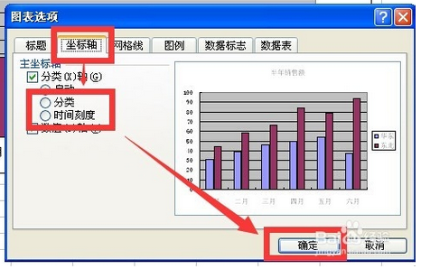
3, click the menu bar chart chart option
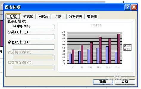
4, after clicking this command, the chart options dialog box will pop up
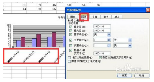
5, click the Axis tab and then switch between classification and time scale and click OK. If you select the data point of the time scale data series (a row or column of data in the data source) (one graph corresponds to one cell value) ) Blank data points will be formed in discontinuous charts in time. If you want to clear these data points, you can change the time axis to a category axis
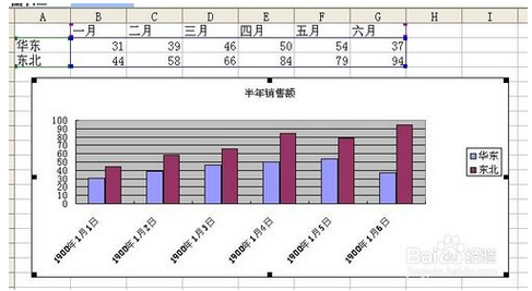
6, this is the display effect of the timeline
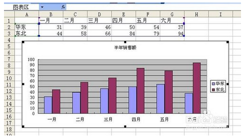
7, this is the display effect of the classification axis
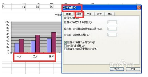
8, this is the scale option of the classification axis. It is relatively simple, only the maximum value, the minimum value, the basic unit, the primary unit, the secondary unit and the data in reverse order
9, this is the scale option of the time axis, including minimum value, maximum value, basic unit, major unit, minor unit, the value y-axis crosses the data in reverse order, the value y-axis crosses the date period, the value y-axis crosses the maximum value
How to display coordinate axis lines in excel
Select the table in the box, click Insert → Chart in the menu, as shown in the figure, select a chart form, insert a chart in the middle of the sheet, left-click and drag the chart to the specified position.
1.Set the vertical coordinate scale unit
Select the vertical coordinate, click, and a border will be displayed on the vertical coordinate, indicating that it is selected. Right-click to bring up the menu command, select Format Axies at the bottom, and the coordinate axis setting window will pop up. The current main scale of the ordinate is 100. Now we will change the main scale to 50 and display the minor scale.
In the Axies Option page card, change the major scale value to 50. Generally speaking, the minor scale divides the major scale into five equal parts by default, so if the minor scale is automatic, its value is automatically changed to 10.
Select cross in the scale form, then close and exit. The result is as shown in the figure.
2. Display the vertical coordinate value unit and set its value display format
Next we add the display format and unit of the ordinate value. Right-click the ordinate, select Format Axies at the bottom, and in the second page card Number, select the financial item Accounting. The default number of decimal places is 2. Then position the mouse cursor in the input box below, and the category will automatically jump to the custom item, change the corresponding symbol, as shown in the picture, click the Add button behind the box, close and exit, and the effect will be as shown in the picture.
3. Display tick marks
The chart displays major tick marks by default. We can display minor tick marks and set their line style. Right-click the ordinate and select Add Minor Grindlines to add minor ticks.
4. Set the tick line style
Right-click the ordinate, select Format Minor Grindlines, and change the minor ticks to double-dots and dashes, as shown in the figure. Of course, if you don't want to display small tick marks, you can select the No Line option.
Similarly, you can set the main tick mark.
After the setting is completed, we find that the scale lines are too dense. We can repeat the steps of setting the scale unit and change the main scale unit to 100. The effect is as shown in the figure.
How to set the coordinate scale and unit of excel chart
How to set the X-axis scale value irregularly in excel chart
How to set the x-axis as the timeline or category axis in excel chart
1, use excel to open a data table with charts
2, click the chart area to activate the chart
3, click the menu bar chart chart option
4, after clicking this command, the chart options dialog box will pop up
5, click the Axis tab and then switch between classification and time scale and click OK. If you select the data point of the time scale data series (a row or column of data in the data source) (one graph corresponds to one cell value) ) Blank data points will be formed in discontinuous charts in time. If you want to clear these data points, you can change the time axis to a category axis
6, this is the display effect of the timeline
7, this is the display effect of the classification axis
8, this is the scale option of the classification axis. It is relatively simple, only the maximum value, the minimum value, the basic unit, the primary unit, the secondary unit and the data in reverse order
9, this is the scale option of the time axis, including minimum value, maximum value, basic unit, major unit, minor unit, the value y-axis crosses the data in reverse order, the value y-axis crosses the date period, the value y-axis crosses the maximum value
The above is the detailed content of How to adjust the position of minor tick marks in excel graph. For more information, please follow other related articles on the PHP Chinese website!