
flex布局术语
| 序号 | 简称 | 描述 |
|---|---|---|
| 1 | 二根轴 | 主轴和交叉轴 |
| 2 | 二条线 | 起始线和终止线 |
| 3 | 二个主体 | 容器和项目 |
| 4 | 一个空间 | 剩余空间 |
图示: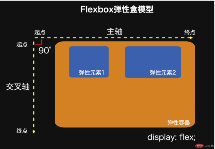
- 特点
任何一个可视元素,添加display:flex后都可转为flex弹性容器
flex弹性容器内的直接子元素称之为flex项目,它是真正的布局目标对象
- 常用属性
1.flex-flow: 描述主轴方向和是否换行
例如flex-flow: row nowrap;默认值
2.justify-content:描述项目在主轴上的对齐方式
例如justify-content: flex-start;默认值
3.align-items:描述项目在交叉轴对齐的方式
例如align-items: flex-start;
4.flex: 放大因子 收缩因子 计算大小
flex默认: 禁止放大, 允许收缩, 宽度自动
flex默认可以写作flex: 0 1 auto;
或者flex: initial;
5.align-self: 单独设置某个项目在交叉轴上的对齐
例如 align-self: flex-start;
flex布局实例
代码显示
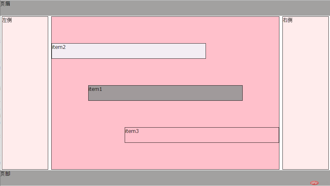
代码
html
<!DOCTYPE html><html lang="en"><head><meta charset="UTF-8"><meta http-equiv="X-UA-Compatible" content="IE=edge"><meta name="viewport" content="width=device-width, initial-scale=1.0"><title>flex容器</title><link rel="stylesheet" href="flex.css"></head><body><header>页眉</header><div class="container"><aside>左侧</aside><main class="main"><div class="item">item1</div><div class="item two">item2</div><div class="item three">item3</div></main><aside>右侧</aside></div><footer>页脚</footer></body></html>
css
* {margin:0;padding:0;box-sizing: border-box;}:root {font-size:10px;}body {font-size:1.6rem;}header,footer {height: 5rem;background-color: rgba(151, 150, 149, 0.897);}.container {display: flex;flex: 1,1,auto;justify-content: space-between;min-height: 50rem;}.container > aside {border: 1px solid;background-color:rgba(255, 192, 192, 0.294);width: 15rem;margin: 2px 5px;}.container > .main {display: flex;flex-flow: column nowrap;border: 1px solid;background-color:pink;flex: 1;margin: 2px 5px;justify-content:space-evenly;align-items: center;}.main > .item {border: 1px solid;background-color:rgb(160, 154, 155);height: 5rem;width: 50rem;}.main .item.two {background-color: rgb(243, 237, 243);align-self: flex-start;order: -1;}.main .item.three {background-color: rgba(53, 51, 53, 0);align-self: flex-end;}