
浮动
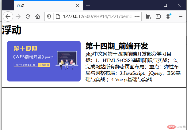
<!DOCTYPE html><html lang="en"><head><meta charset="UTF-8"><meta name="viewport" content="width=device-width, initial-scale=1.0"><title>浮动</title><style>/* 页面初始化 */*{margin: 0;padding: 0;box-sizing: border-box;}.box{padding: 1em;border: 1px solid #000;}.box img{width: 15em;/* 图片圆角 */border-radius: 0.5em;/* 图片向左浮动 */float: left;/* 添加右边的外边距 */margin-right: 1em;}/* 通过清除浮动来处理图片脱离box的范围,父元素塌陷的问题 *//* 附加元素 *//* .clear{clear: left;} *//* 伪元素 */.box::after{content: '';display: block;/* 清除左右浮动 */clear: both;}/* 创建BFC */.box .desc{overflow: hidden;}</style></head><body><h1>浮动</h1><div class="box"><img src="https://img.php.cn/upload/course/000/000/001/5fae4f08a043a576.png" alt=""><div class="desc"><h2>第十四期_前端开发</h2><p>php中文网第十四期前端开发部分学习目标:1、HTML5+CSS3基础知识与实战; 2、完成网站所有静态页面布局;重点:弹性布局与网格布局;3.JavaScript、jQuery、ES6基础与实战 ;4.Vue.js基础与实战</p></div><!-- <div class="clear"></div> --></div></body></html>
创建BFC的方式: 任何一个元素添加上以下任何一个属性后就是是一个BFC容器
1. float: left / right, 不能是 none2. overflow: hidden / auto / scroll , 不能是 visible3. display: inline-block / table-cell4. display: flex / inline-flex5. display: grid / inline-grid6. position: absolute / fiexed
总结
- 浮动仅限于水平方向
- 浮动只会影响后面的元素不会影响上级元素
- 浮动的元素是脱离文档流的,后面的元素会上移填充它原来的空间
- 设置浮动后的任何元素都会具有块级元素效果
- 通过清除浮动可以处理父元素塌陷的问题
- BFC的方式也可以解决父元素塌陷的问题
定位
position属性
- 静态定位
static,文档流默认定位 - 相对定位
relative,相对于该元素在文档流中的原始位置进行偏移 - 绝对定位
absolute,相对于他的父级元素中离它最近的定位元素的位置发生便宜 - 固定定位
fixed,是绝对定位的一个特例,始终相对于html定位
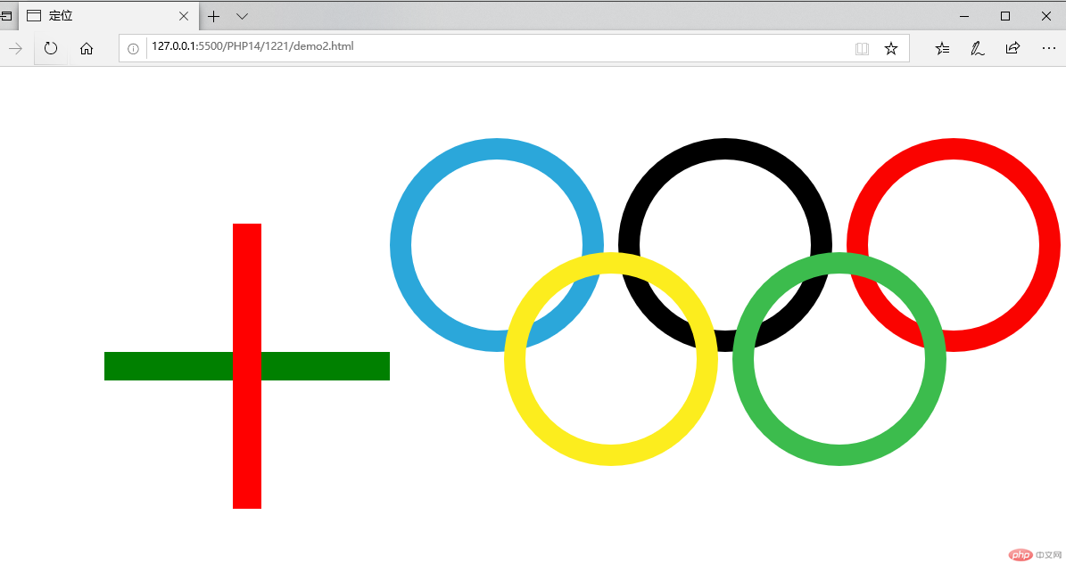
<!DOCTYPE html><html lang="en"><head><meta charset="UTF-8"><meta name="viewport" content="width=device-width, initial-scale=1.0"><title>定位</title><style>/* 页面初始化 */*{margin: 0;padding: 0;box-sizing: border-box;}.box{position: relative;}.box1{position: absolute;height: 2em;width: 20em;background-color: green;top: 20em;left: 10em;}.box2{position: absolute;height: 20em;width: 2em;background-color: red;top: 11em;left: 19em;}.ring{position: relative;top: 5em;left: 30em;}.ring :nth-of-type(1){width: 15em;height: 15em;border:1.5em solid #2ba7da;border-radius: 50%;position: absolute;}.ring :nth-of-type(2){position: absolute;width: 15em;height: 15em;border:1.5em solid #000000;border-radius: 50%;left: 16em;}.ring :nth-of-type(3){position: absolute;width: 15em;height: 15em;border:1.5em solid #fa0300;border-radius: 50%;left: 32em;}.ring :nth-of-type(4){position: absolute;width: 15em;height: 15em;border:1.5em solid #fced1e;border-radius: 50%;left: 8em;top: 8em;}.ring :nth-of-type(5){position: absolute;width: 15em;height: 15em;border:1.5em solid #3cbc4d;border-radius: 50%;left: 24em;top: 8em;}</style></head><body><div class="box"><div class="box1"></div><div class="box2"></div></div><div class="ring"><div></div><div></div><div></div><div></div><div></div></div></body></html>
模态框使用
<!DOCTYPE html><html lang="en"><head><meta charset="UTF-8"><meta name="viewport" content="width=device-width, initial-scale=1.0"><title>模态框</title><style>/* 页面初始化 */*{margin: 0;padding: 0;box-sizing: border-box;}/* 页眉 */header{background-color: #ccc;padding: .5em 1em;/* BFC 清除浮动 */overflow: hidden;}header h2{/* 左浮动 */float: left;}header button {/* 右浮动 */float: right;width: 5em;height: 2.5em;}header button:hover{cursor: pointer;}/* 遮罩层 */.modal .modal-backdrop {background-color: rgb(0,0,0,0.5);position: fixed;top:0;left:0;right:0;bottom: 0;}.modal .modal-body {background-color: #fff;padding: 1em;overflow: hidden;max-width: 20em;max-height: 20em;/* 固定定位 */position: fixed;/* 水平垂直自动居中 */top: 0;left: 0;right: 0;bottom: 0;margin: auto;}.modal form table {width: 100%;}.modal form table caption {font-size: 14px;font-weight: bold;margin-bottom:1.6em;margin-right:1em;}.modal form table td {padding: 0.5em 0;}.modal form table td:first-of-type {width: 4em;}.modal form table input {width: 12em;height: 2em;}.modal form table button {width:8em;height: 2em;}/* 定位父级 */.modal-body {position: relative;}.modal .close {position: absolute;width: 3em;height: 1.5em;top: 1.1em;left: 1em;}.modal .close:hover {cursor: pointer;background-color: red;color: white;}/* 模态框初始化隐藏 */.modal {display: none;}</style></head><body><!-- 页眉 --><header><h2>百万弟弟的博客</h2><button>登录</button></header><!-- 模态框 --><div class="modal"><!-- 蒙版盖住后面的内容,使他半透明 --><div class="modal-backdrop"></div><!-- 主体 --><div class="modal-body"><button class="close">关闭</button><form action="" method="POST"><table><caption>用户登录</caption><tr><td><label for="username">用户名:</label></td><td><input type="username" name="username" id="username" /></td></tr><tr><td><label for="password">密 码:</label></td><td><input type="password" name="password" id="password" /></td></tr><tr><td></td><td><button>登录</button></td></tr></table></form></div></div></body></html><script>const btn = document.querySelector('header button');const modal = document.querySelector('.modal');const close = document.querySelector('.close');btn.addEventListener('click', setModal, false);close.addEventListener('click', setModal, false);function setModal(ev) {ev.preventDefault();let status = window.getComputedStyle(modal, null).getPropertyValue('display');modal.style.display = status === 'none' ? 'block' : 'none';}</script>