

一、浮动元素高度塌陷产生的原因与常用解决方案
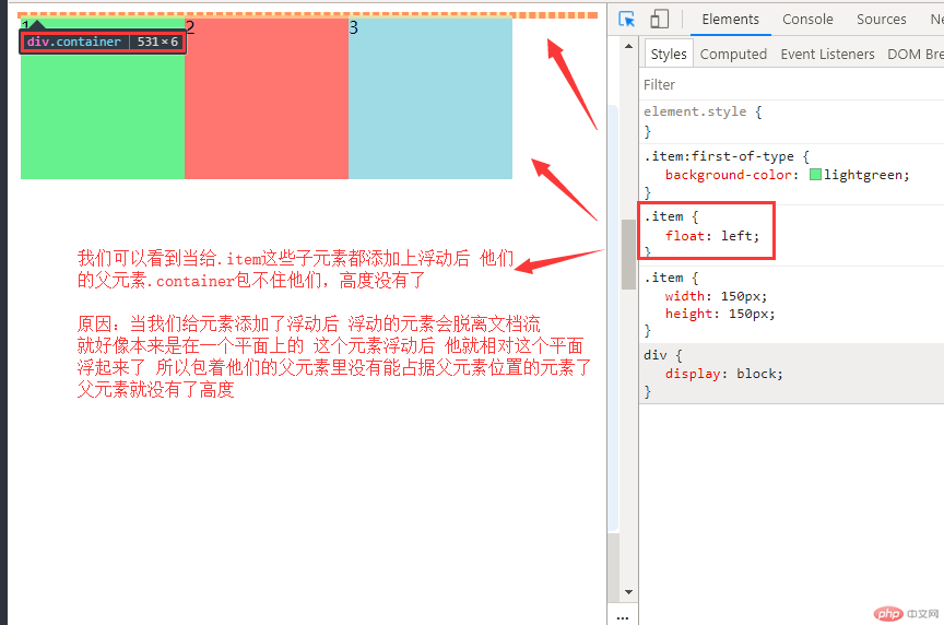
1.浮动元素高度塌陷产生的原因
我们先来看一组代码和效果图:
<!DOCTYPE html><html lang="en"><head><meta charset="UTF-8" /><meta name="viewport" content="width=device-width, initial-scale=1.0" /><title>浮动元素的高度塌陷原因</title><style>.container {border: 3px dashed red;}.item {width: 150px;height: 150px;}.item:first-of-type {background-color: lightgreen;}.item:nth-last-of-type(2) {background-color: lightcoral;}.item:last-of-type {background-color: lightblue;}/* 将三个子元素全部浮动 */.item {float: left;}</style></head><body><div class="container"><div class="item">1</div><div class="item">2</div><div class="item">3</div></div></body></html>
2.两种常用解决方案
好,我们知道了为什么会高度塌陷后,解决方案有四五种,接下来我们讲两种最常用且主流的解决方案:
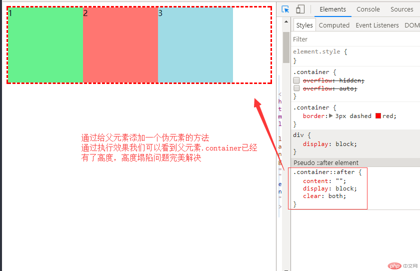
(1)通过添加一个伪元素来解决
写法例:
.container::after {content: "";display: block;clear: both;}
我们可以通过给父元素添加一个伪元素来解决高度塌陷的问题
<!DOCTYPE html><html lang="en"><head><meta charset="UTF-8" /><meta name="viewport" content="width=device-width, initial-scale=1.0" /><title>解决方案1</title><style>.container {border: 3px dashed red;}.item {width: 150px;height: 150px;}.item:first-of-type {background-color: lightgreen;}.item:nth-last-of-type(2) {background-color: lightcoral;}.item:last-of-type {background-color: lightblue;}/* 将三个子元素全部浮动 */.item {float: left;}/* 解决方案1: 通过添加一个伪元素来解决 */.container::after {content: "";display: block;clear: both;}</style></head><body><div class="container"><div class="item">1</div><div class="item">2</div><div class="item">3</div></div></body></html>
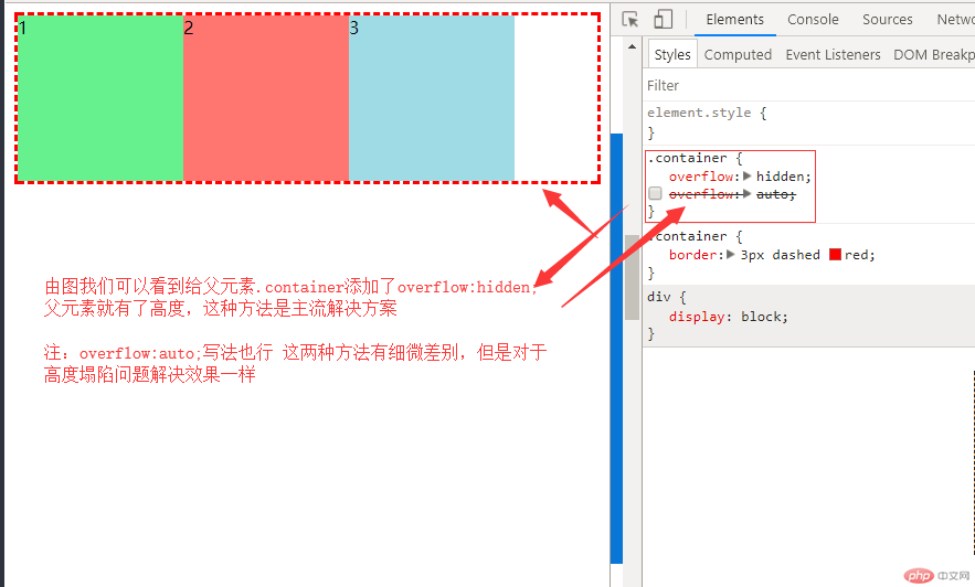
(2)最简单的解决方案,用到BFC(块级格式化上下文) 通俗点用一个溢出隐藏的css方法
写法例:
.container {overflow: hidden;}
我们可以通过给父元素添加一个overflow: hidden;溢出隐藏来解决高度塌陷的问题
<!DOCTYPE html><html lang="en"><head><meta charset="UTF-8" /><meta name="viewport" content="width=device-width, initial-scale=1.0" /><title>解决方案2</title><style>.container {border: 3px dashed red;}.item {width: 150px;height: 150px;}.item:first-of-type {background-color: lightgreen;}.item:nth-last-of-type(2) {background-color: lightcoral;}.item:last-of-type {background-color: lightblue;}/* 将三个子元素全部浮动 */.item {float: left;}/* 解决方案2: 最简单的解决方案,用到BFC(块级格式化上下文) 溢出隐藏 */.container {overflow: hidden;}</style></head><body><div class="container"><div class="item">1</div><div class="item">2</div><div class="item">3</div></div></body></html>
讲完了浮动高度塌陷的问题接下来我们实战定位和浮动做web经典的三列布局
二、运用定位和浮动知识实战三列布局
1.使用定位方法来完成一个三列布局
代码:
<!DOCTYPE html><html lang="en"><head><meta charset="UTF-8" /><meta name="viewport" content="width=device-width, initial-scale=1.0" /><title>使用绝对定位来完成一个通用三列布局</title><style>/* 初始化 */* {margin: 0;padding: 0;box-sizing: border-box;}li {list-style: none;}a {text-decoration: none;color: #666;}/* 页眉与页脚 */.header,.footer {height: 40px;background-color: black;}/* 页眉与页脚的内容区 */.content {width: 960px;margin: auto;}.content ul li {float: left;line-height: 40px;padding: 0 15px;}.content ul li a {display: block;width: 100%;height: 100%;color: white;box-sizing: content-box;}.content ul li:hover {background-color: white;color: black;}.content ul li a:hover {color: black;}/* 页脚样式 */.content p {text-align: center;line-height: 40px;color: white;}/* 主体用定位 */.container {width: 960px;margin: 10px auto;min-height: 600px;/* 转为定位元素,做为定位父级 */position: relative;}.container > .left {width: 200px;background-image: url("111.jpg");background-size: 100%;min-height: 600px;position: absolute;top: 0;left: 0;}.container > .right {width: 200px;background-image: url("222.jpg");background-size: 100%;min-height: 600px;position: absolute;top: 0;right: 0;}.container > .main {background-color: lightgreen;min-height: 600px;width: 540px;position: absolute;top: 0;left: 210px;}</style></head><body><!-- 页眉 --><div class="header"><!-- 内容区: 水平居中 --><div class="content"><ul><li><a href="">首页</a></li><li><a href="">电脑办公</a></li><li><a href="">家装</a></li><li><a href="">食品</a></li><li><a href="">生鲜</a></li><li><a href="">手机</a></li><li><a href="">数码</a></li></ul></div></div><!-- 主体 --><div class="container"><div class="left">左侧</div><div class="main">内容区</div><div class="right">右侧</div></div><!-- 页脚 --><div class="footer"><div class="content"><p>北京XXXX科技发展有限公司© | 备案号: 京ICP *********</p></div></div></body></html>
效果图: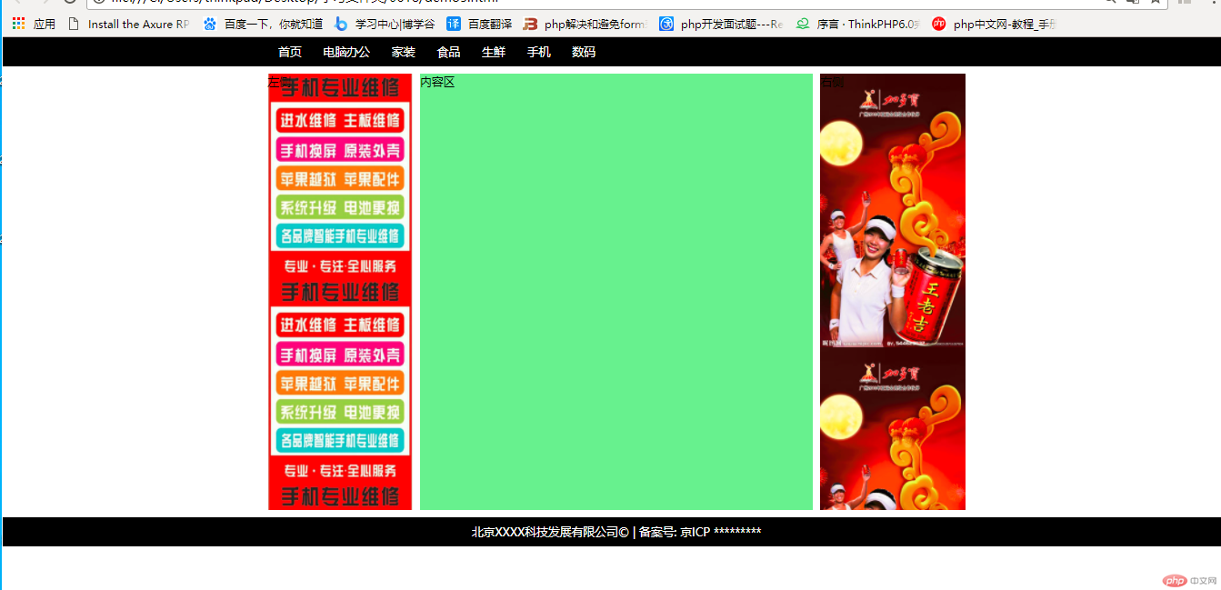
左右侧图片随便找的 将就着看☺
2.使用浮动方法来完成一个三列布局
代码:
<!DOCTYPE html><html lang="en"><head><meta charset="UTF-8" /><meta name="viewport" content="width=device-width, initial-scale=1.0" /><title>使用浮动来完成一个通用三列布局</title><style>/* 初始化 */* {margin: 0;padding: 0;box-sizing: border-box;}li {list-style: none;}a {text-decoration: none;color: #666;}/* 页眉与页脚 */.header,.footer {height: 40px;background-color: lightblue;}/* 页眉与页脚的内容区 */.content {width: 960px;margin: auto;}.content ul li {float: left;line-height: 40px;padding: 0 15px;}.content ul li:hover {background-color: coral;}/* 页脚样式 */.content p {text-align: center;line-height: 40px;}/* 主体用定位 */.container {width: 960px;margin: 10px auto;min-height: 600px;/* 防止浮动元素的高度塌陷 */overflow: hidden;}.container > .left {width: 200px;background-image: url("111.jpg");background-size: 100%;min-height: 600px;float: left;}.container > .right {width: 200px;background-image: url("222.jpg");background-size: 100%;min-height: 600px;float: right;}.container > .main {background-color: lightgreen;min-height: 600px;width: 540px;float: left;margin-left: 10px;}</style></head><body><!-- 页眉 --><div class="header"><!-- 内容区: 水平居中 --><div class="content"><ul><li><a href="">首页</a></li><li><a href="">电脑办公</a></li><li><a href="">家装</a></li><li><a href="">食品</a></li><li><a href="">生鲜</a></li><li><a href="">手机</a></li><li><a href="">数码</a></li></ul></div></div><!-- 主体 --><div class="container"><div class="left">左侧</div><div class="main">内容区</div><div class="right">右侧</div></div><!-- 页脚 --><div class="footer"><div class="content"><p>北京XXXX科技发展有限公司© | 备案号: 京ICP *********</p></div></div></body></html>
效果图: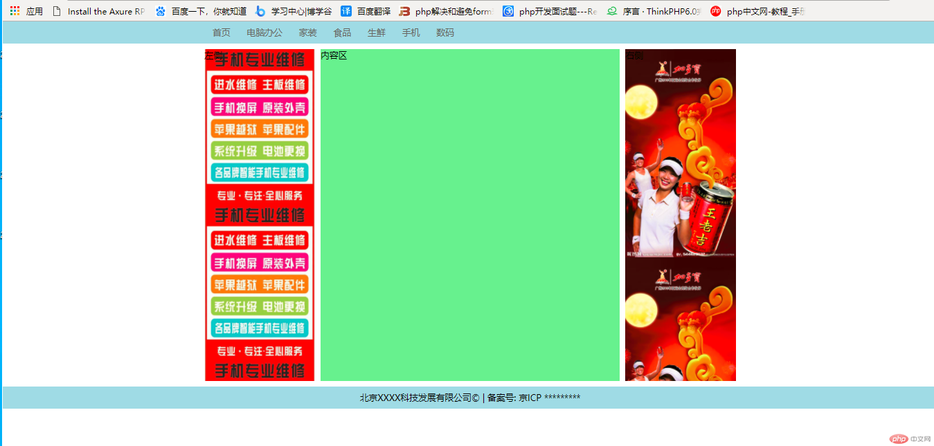
两种布局方法主要是css浮动和定位元素的变化,认真看css代码
小结
1.web页面布局技术常用到浮动和定位,一定要深刻理解浮动和定位知识
2.理解浮动的原理 会解决浮动后高度塌陷的问题
3.动手实践利用定位和浮动技术实现通用的三列布局方法