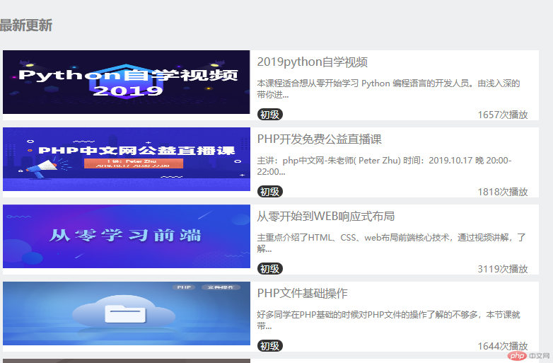
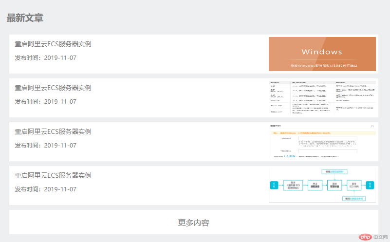
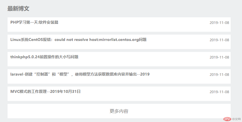
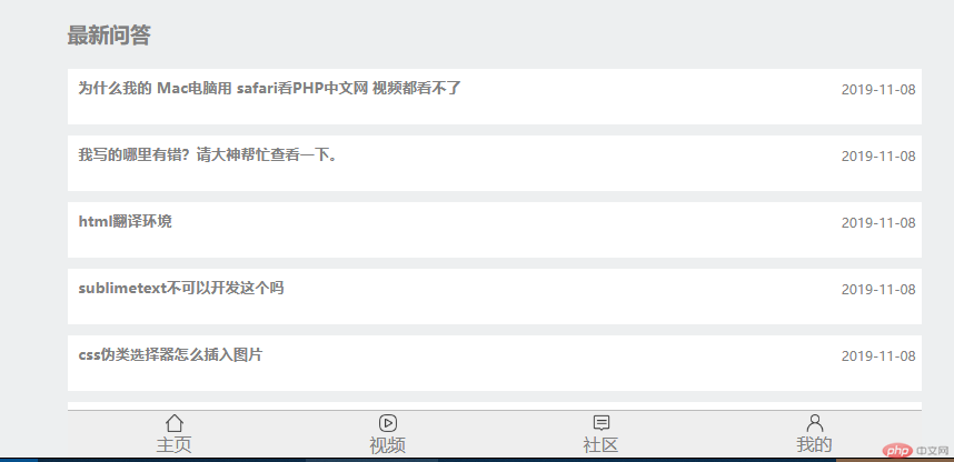
<!DOCTYPE html><html lang="en"><head> <meta charset="UTF-8"> <title>php中文网手机版首页</title> <link rel="stylesheet" href="static/css/init.css"> <link rel="stylesheet" href="static/css/style.css"></head><body><!--布局原则: 宽度自适应,高度固定--><!--顶部固定定位--><header> <img src="static/images/user-pic.jpeg" alt=""> <img src="static/images/logo.png" alt=""> <img src="static/images/user-nav.jpg" alt=""></header><!--banner轮播图,这里用图片暂时代替--><div class="banner"> <img src="static/images/banner.jpg" alt=""></div><!--导航区--><nav> <ul> <li> <a href=""> <img src="static/images/html.png" alt=""> <span>HTML/CSS</span> </a> </li> <li> <a href=""> <img src="static/images/JavaScript.png" alt=""> <span>JavaScript</span> </a> </li> <li> <a href=""> <img src="static/images/code.png" alt=""> <span>服务端</span> </a> </li> <li> <a href=""> <img src="static/images/sql.png" alt=""> <span>数据库</span> </a> </li> </ul> <ul> <li> <a href=""><img src="static/images/app.png" alt=""> <span>移动端</span> </a> </li> <li> <a href=""> <img src="static/images/manual.png" alt=""> <span>手册</span> </a> </li> <li> <a href=""><img src="static/images/tool2.png" alt=""> <span>工具</span> </a> </li> <li> <a href=""> <img src="static/images/live.png" alt=""> <span>直播</span> </a> </li> </ul></nav><!-- 课程区--><main> <!-- 推荐课程--> <article class="recommend"> <h3>推荐课程</h3> <section> <a href=""><img src="static/images/tjkc1.jpg" alt=""></a> <a href=""><img src="static/images/tjkc2.jpg" alt=""></a> </section> <section> <div> <a href=""><img src="static/images/tjkc3.jpg" alt=""></a> <span> <a href="">CI框架30分钟极速入门</a> <span><i>中级</i>49738次播放</span> </span> </div> <div> <a href=""><img src="static/images/tjkc4.jpg" alt=""></a> <span> <a href="">2018前端入门基础</a> <span><i>初级</i>209952次播放</span> </span> </div> </section> </article> <!--最新更新--> <article class="recommend-1"> <h3>最新更新</h3> <section> <div> <a href=""><img src="static/images/zx1.jpg" alt=""></a> <span> <a href="">2019python自学视频</a> <p>本课程适合想从零开始学习 Python 编程语言的开发人员。由浅入深的带你进...</p> <span><i>初级</i>1657次播放</span> </span> </div> <div> <a href=""><img src="static/images/zx2.png" alt=""></a> <span> <a href="">PHP开发免费公益直播课</a> <p>主讲:php中文网-朱老师( Peter Zhu) 时间:2019.10.17 晚 20:00-22:00...</p> <span><i>初级</i>1818次播放</span> </span> </div> <div> <a href=""><img src="static/images/zx3.jpg" alt=""></a> <span> <a href="">从零开始到WEB响应式布局</a> <p>主重点介绍了HTML、CSS、web布局前端核心技术,通过视频讲解,了解...</p> <span><i>初级</i>3119次播放</span> </span> </div> <div> <a href=""><img src="static/images/zx4.png" alt=""></a> <span> <a href="">PHP文件基础操作</a> <p>好多同学在PHP基础的时候对PHP文件的操作了解的不够多,本节课就带...</p> <span><i>初级</i>1644次播放</span> </span> </div> <div> <a href=""><img src="static/images/zx5.jpg" alt=""></a> <span> <a href="">memcache基础课程</a> <p>本课程带你从零认识memcache,让你在一小时左右轻松掌握memcache...</p> <span><i>初级</i>782次播放</span> </span> </div> <div> <a href=""><img src="static/images/zx6.png" alt=""></a> <span> <a href="">微信小程序--企业微网站</a> <p>1,介绍小程序、开发者工具 2,介绍小程序文档 3,微官网项目 4,首页...</p> <span><i>初级</i>3508次播放</span> </span> </div> </section> </article> <!--最新文章--> <article class="recommend-2"> <h3>最新文章</h3> <section> <a href=""> <img src="static/images/wz1.jpg" alt=""> <span> <span>重启阿里云ECS服务器实例</span> <p>发布时间:2019-11-07</p> </span> </a> <a href=""> <img src="static/images/wz2.jpg" alt=""> <span> <span>重启阿里云ECS服务器实例</span> <p>发布时间:2019-11-07</p> </span> </a> <a href=""> <img src="static/images/wz3.jpg" alt=""> <span> <span>重启阿里云ECS服务器实例</span> <p>发布时间:2019-11-07</p> </span> </a> <a href=""> <img src="static/images/wz4.jpg" alt=""> <span> <span>重启阿里云ECS服务器实例</span> <p>发布时间:2019-11-07</p> </span> </a> <a href="""><div><span>更多内容</span></div></a> </section> </article> <!-- 最新博文 --> <article class="recommend-3"> <h3>最新博文</h3> <section> <a href=""> <div> <h5>PHP学习第一天:软件安装篇</h5> <span>2019-11-08</span> </div> </a> <a href=""> <div> <h5>Linux系统CentOS报错:could not resolve host:mirrorlist.centos.org问题</h5> <span>2019-11-08</span> </div> </a> <a href=""> <div> <h5>thinkphp5.0.24前置操作的大小写问题</h5> <span>2019-11-08</span> </div> </a> <a href=""> <div> <h5>laravel-创建“控制器”和“模型”,使用模型方法获取数据库内容并输出--2019</h5> <span>2019-11-08</span> </div> </a> <a href=""> <div> <h5>MVC模式的工作原理--2019年10月31日</h5> <span>2019-11-08</span> </div> </a> <a href=""> <div> <div> <span>更多内容</span> </div> </div> </a> </section> </article><!-- 最新问答 --><article class="recommend-3"> <h3>最新问答</h3> <section> <a href=""> <div> <h5>为什么我的 Mac电脑用 safari看PHP中文网 视频都看不了</h5> <span>2019-11-08</span> </div> </a> <a href=""> <div> <h5>我写的哪里有错?请大神帮忙查看一下。</h5> <span>2019-11-08</span> </div> </a> <a href=""> <div> <h5>html翻译环境</h5> <span>2019-11-08</span> </div> </a> <a href=""> <div> <h5>sublimetext不可以开发这个吗</h5> <span>2019-11-08</span> </div> </a> <a href=""> <div> <h5>css伪类选择器怎么插入图片</h5> <span>2019-11-08</span> </div> </a> <a href=""> <div> <div> <span>更多内容</span> </div> </div> </a> </section> </article></main><!--底部--><footer> <a href=""><img src="static/font-icon/zhuye.png" alt=""> <span>主页</span></a> <a href=""> <img src="static/font-icon/video.png" alt=""> <span>视频</span> </a> <a href=""> <img src="static/font-icon/luntan.png" alt=""> <span>社区</span> </a> <a href=""> <img src="static/font-icon/geren.png" alt=""> <span>我的</span> </a></footer></body></html>
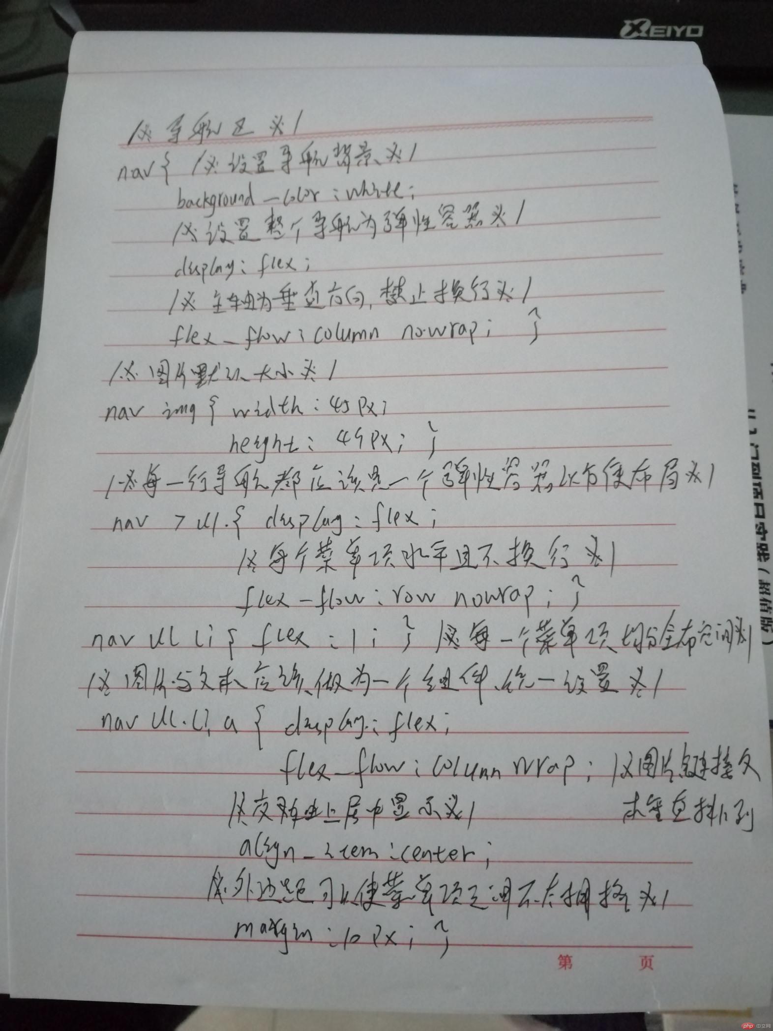
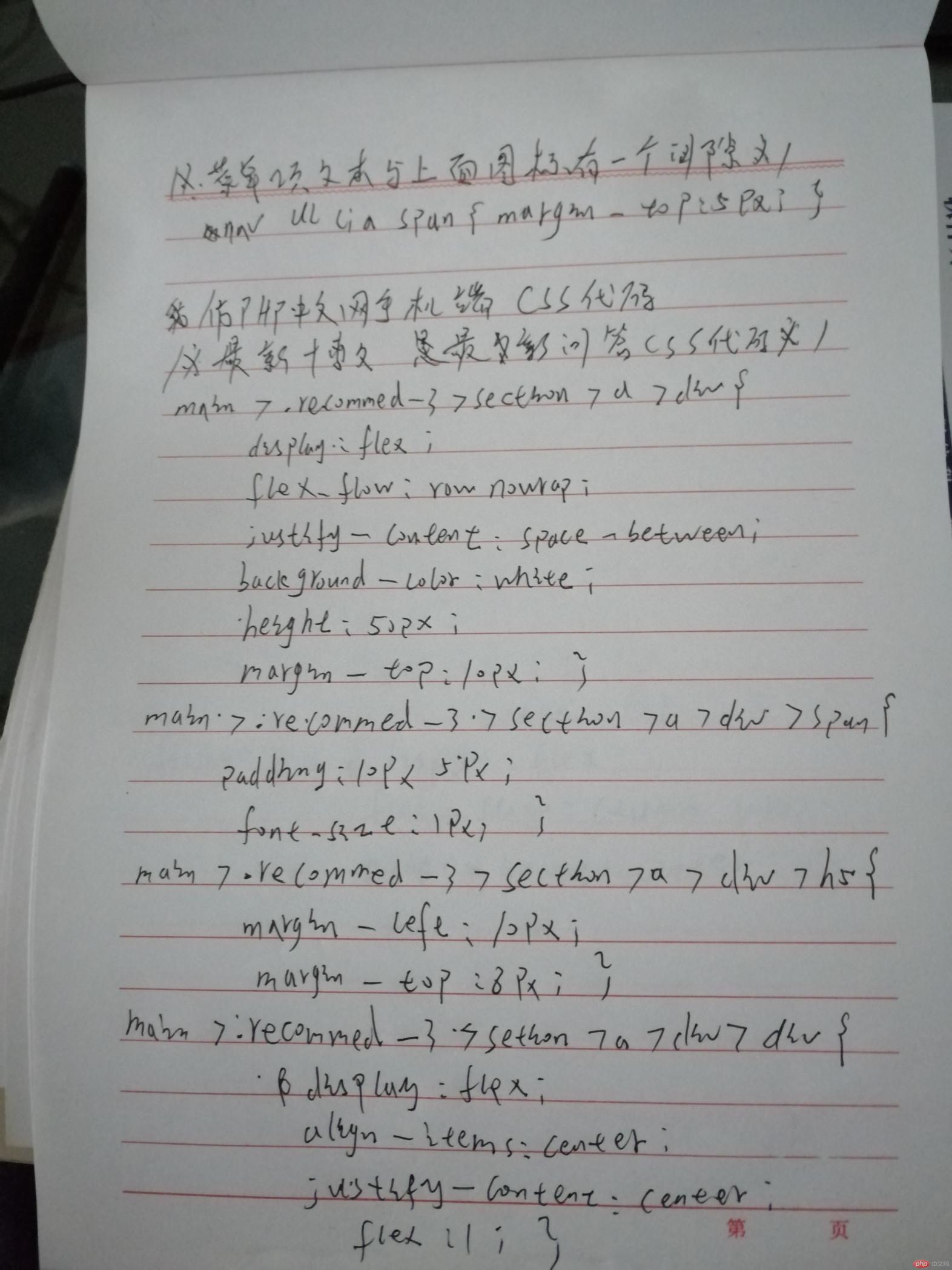
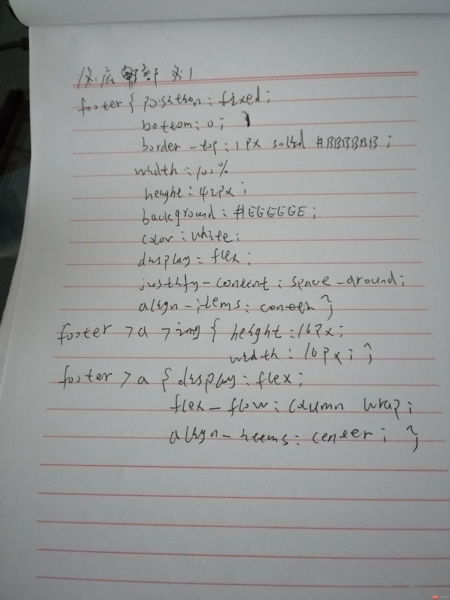
/*************** 头部样式 ***************/header { /*固定定位*/ position: fixed; top: 0; /*固定定位元素必须设置宽度与高度*/ width: 100%; height: 42px; background: #444444; color: white; /*设置最小尺寸*/ min-width: 320px; max-width: 768px; /*转为Flex容器,设置元素排列*/ display: flex; /*元素主轴分散,两端对齐*/ justify-content: space-between; /*元素交叉轴居中对齐*/ align-items: center;}/*第一张,最后一设置通用样式*/header > img:first-of-type,header > img:last-of-type { width: 26px; height: 26px; margin: 5px;}/*第一张用户头像应该是正圆*/header > img:first-of-type { border-radius: 50%; /* 13px */}/*设置中间LOGO样式*/header > img { width: 94px;}/*************** 轮播图设置 ***************/.banner { display: flex; height: 200px;}/*************** 导航区 ***************/nav { background-color: white; display: flex; /*主轴为垂直方向, 禁止换行*/ flex-flow: column nowrap;}/*图片默认大小*/nav img { width: 45px; height: 49px;}/*每一行导航都应该是一个弹性容器以方便布局*/nav > ul { display: flex; /*每个菜单项水平且不换行*/ flex-flow: row nowrap;}/*每一菜单项均分全部空间*/nav ul li { flex: 1;}/*图片与文本应该做为一个组件,统一设置*/nav ul li a { display: flex; /*图片, 链接文本垂直排列*/ flex-flow: column wrap; /*交叉轴上居中显示*/ align-items: center; /*外边距可以使菜单项之间不太拥挤*/ margin: 10px;}/*菜单项文本与上面图标有一个间隙*/nav ul li a span { margin-top: 5px;}/*************** 主体内容区 ***************//******** 推荐课程区 *******/main { display: flex; flex-flow: column nowrap;}/*设置水平排列的推荐课程*/main > .recommend > section:first-of-type { display: flex; flex-flow: row nowrap;}/*每个课程图片平分全部空间*/main > .recommend > section:first-of-type > a { margin: 5px; flex: 1;}/*设置图片高度*/main > .recommend > section:first-of-type > a > img { height: 90px;}/*设置垂直排列的推荐课程*/main > .recommend > section:last-of-type { display: flex; flex-flow: column nowrap;}main > .recommend > section:last-of-type > div { background-color: #fff; margin: 5px; /*也转为弹性容器*/ display: flex; flex-flow: row nowrap;}main > .recommend > section:last-of-type > div img { width: 350px; height: 90px;}main > .recommend > section:last-of-type > div > span { display: flex; /*文本垂直排列*/ flex-flow: column nowrap; margin-top: 5px; padding-left: 10px;}main > .recommend > section:last-of-type > div > span i { font-style: normal; background-color: #333333; color: white; border-radius: 4px; padding: 0 5px; font-size: smaller;}/*最新更新*/main > .recommend-1 > section { display: flex; flex-flow: column nowrap;}main > .recommend-1 > section > div { background-color: #fff; margin: 5px; /*也转为弹性容器*/ display: flex; flex-flow: row nowrap;}main > .recommend-1 > section > div img { width: 350px; height: 90px;}main > .recommend-1 > section > div > span { display: flex; /*文本垂直排列*/ flex-flow: column nowrap; margin-top: 5px; padding-left: 10px; padding-right: 15px;}main > .recommend-1 > section > div > span > p { font-size: 1px;}main > .recommend-1 > section > div > span > span { display: flex; justify-content: space-between; font-size: smaller;}main > .recommend-1 > section > div > span i { font-style: normal; background-color: #333333; color: white; border-radius: 8px; padding: 0 5px;}/*最新文章*/main > .recommend-2 > section { display: flex; flex-flow: column nowrap;}main > .recommend-2 > section > a{ background-color: #fff; margin: 5px; display: flex; flex-flow: row-reverse nowrap;}main > .recommend-2 > section > a >img { width: 220px; height: 70px; margin-top: 5px; margin-bottom: 5px; margin-right: 5px;}main > .recommend-2 > section > a > span { display: flex; /*文本垂直排列*/ flex-flow: column nowrap; position: relative; left: -48%; margin-top: 10px;}main > .recommend-2 > section > a > span > p { font-size: 1px;}main > .recommend-2 > section > a > span > span { font-size: smaller;}main > .recommend-2 > section > a:last-of-type > div { display: flex; align-items: center; justify-content: center; flex: 1; height: 50px;}/*最新博文*/main >.recommend-3 > section > a > div { display: flex; flex-flow: row nowrap; justify-content: space-between; background-color: white; height: 50px; margin-top: 10px;}main >.recommend-3 > section > a > div > span { padding: 10px 5px; font-size: 1px;}main >.recommend-3 > section > a > div > h5 { margin-left: 10px; margin-top: 8px;}main >.recommend-3 > section > a > div > div { display: flex; align-items: center; justify-content: center; flex: 1;}/*底部*/footer { /*固定定位*/ position: fixed; bottom: 0; border-top: 1px solid #BBBBBB; /*固定定位元素必须设置宽度与高度*/ width: 100%; height: 42px; background: #EEEEEE; color: white; /*转为Flex容器,设置元素排列*/ display: flex; /*元素主轴分散,两端平均对齐*/ justify-content: space-around; /*元素交叉轴居中对齐*/ align-items: center;}footer > a > img { height: 16px; width: 16px;}footer > a { display: flex; flex-flow: column wrap; align-items: center;}
总结:
通过对flex布局实战的练习,发现了很多问题,第一点:脑子中有思路,就是做的时候不知道怎么写,这应该是基础知识不太牢固,第二点:关于布局时候,最好先画给草图,了解先后顺序,这样在做容器嵌套不至于乱,第三点:关于容器的直接子元素问题,一定要是其直接子元素,否则无效,被坑过多次!关于老师讲的很多知识点在实际开发中,有些用不到,但要知道,说不准什么时间就要用到了!总之还是要多写 多练 多踩坑,不要走冤路!通过对flex布局实战的练习,发现了很多问题,第一点:脑子中有思路,就是做的时候不知道怎么写,这应该是基础知识不太牢固,第二点:关于布局时候,最好先画给草图,了解先后顺序,这样在做容器嵌套不至于乱,第三点:关于容器的直接子元素问题,一定要是其直接子元素,否则无效,被坑过多次!关于老师讲的很多知识点在实际开发中,有些用不到,但要知道,说不准什么时间就要用到了!总之还是要多写 多练 多踩坑,不要走冤路!

