

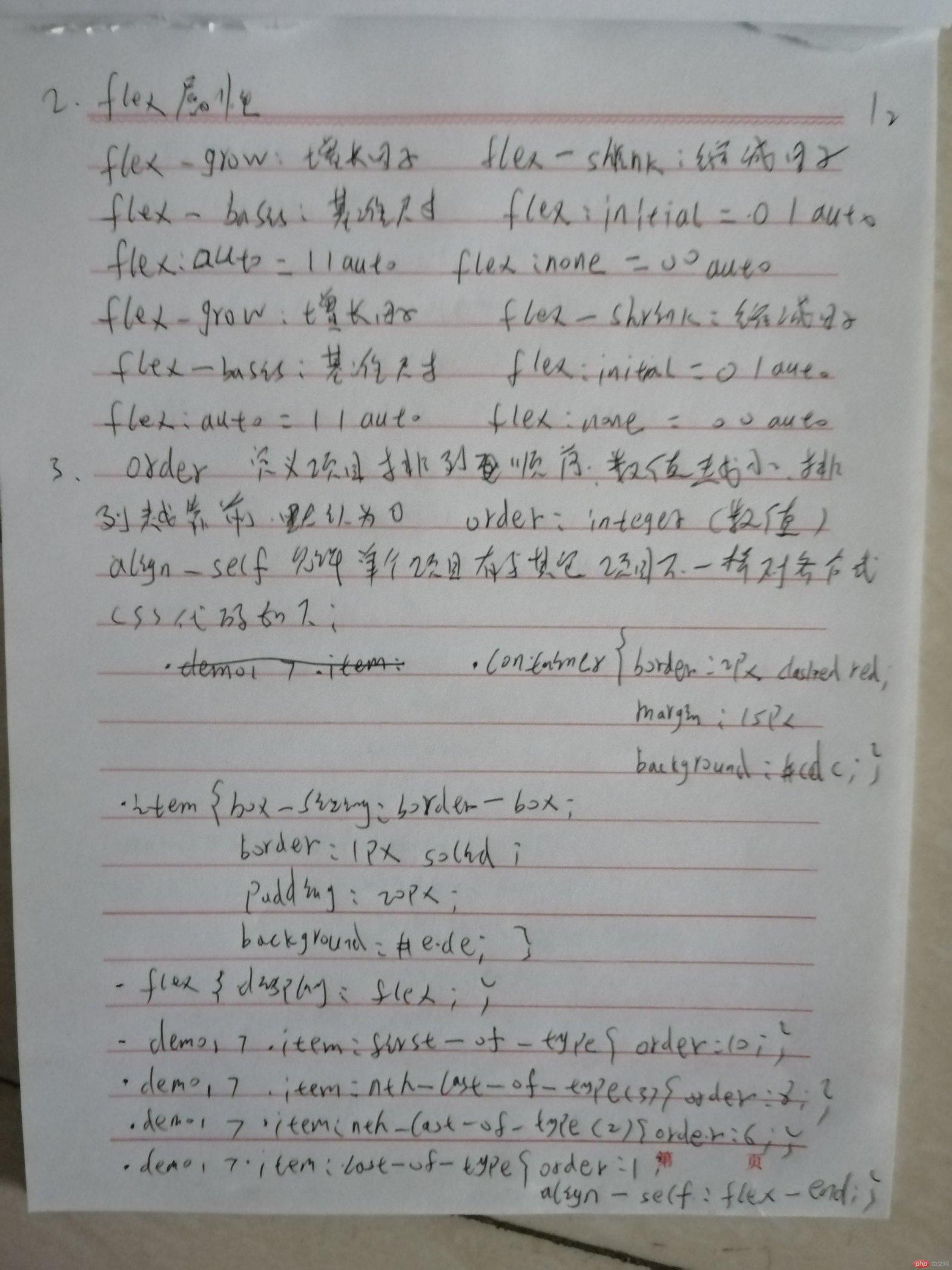
自学:align-self, order的用法
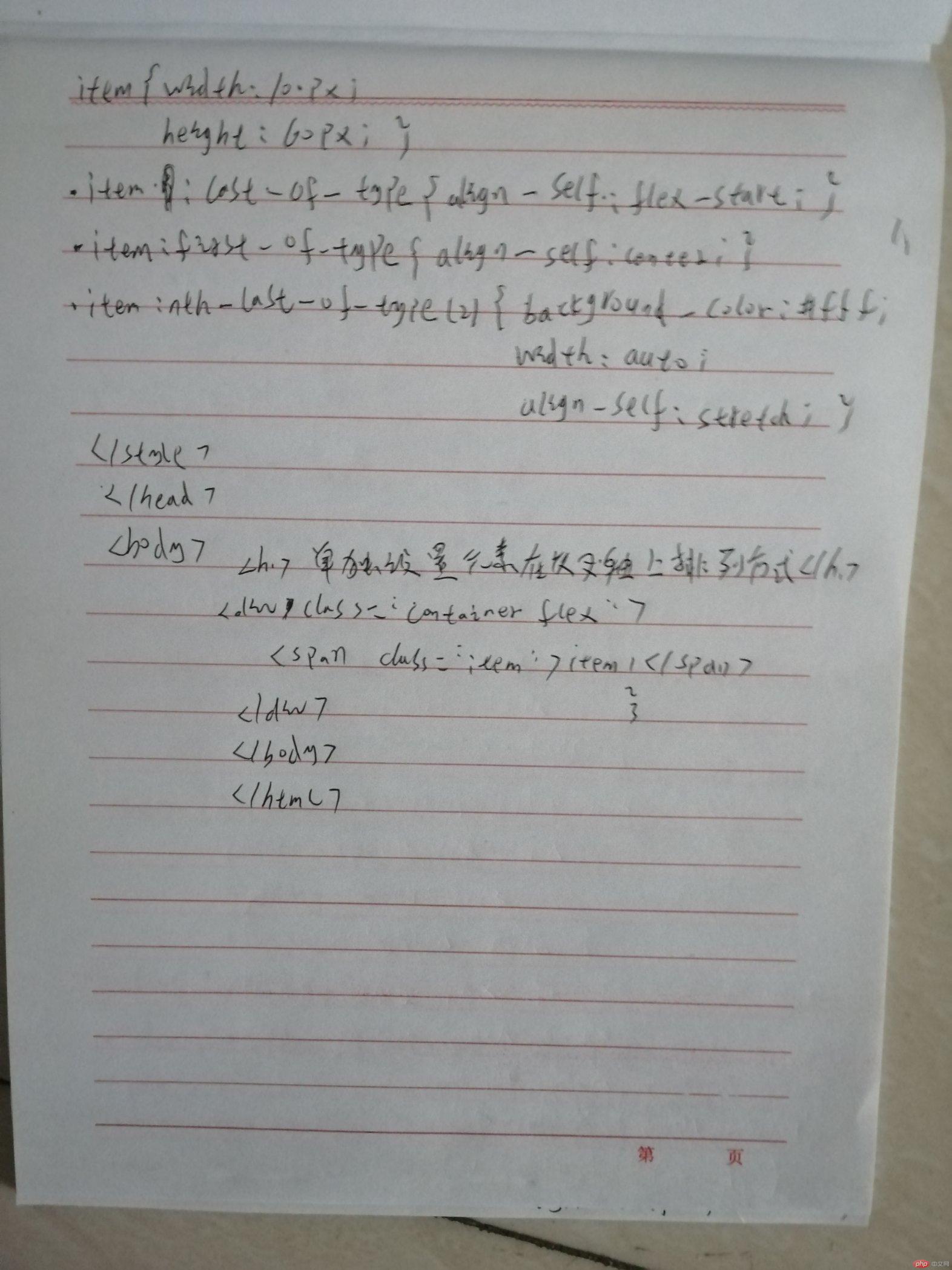
order:定义项目的排列顺序。数值越小,排列越靠前,默认为0
align-self该属性允许单个项目有与其它项目不一样的对齐方式, 可覆盖掉容器的flex-items属性 默认值: auto,表示继承父元素的align-items,如果没有父元素,则等价于stretch
.demo1 > .item:first-of-type {order: 10;}.demo1 > .item:nth-last-of-type(3) {order: 8;}.demo1 > .item:nth-last-of-type(2) {order: 6;}.demo1 > .item:last-of-type {order: 1;align-self: flex-end;}
演示效果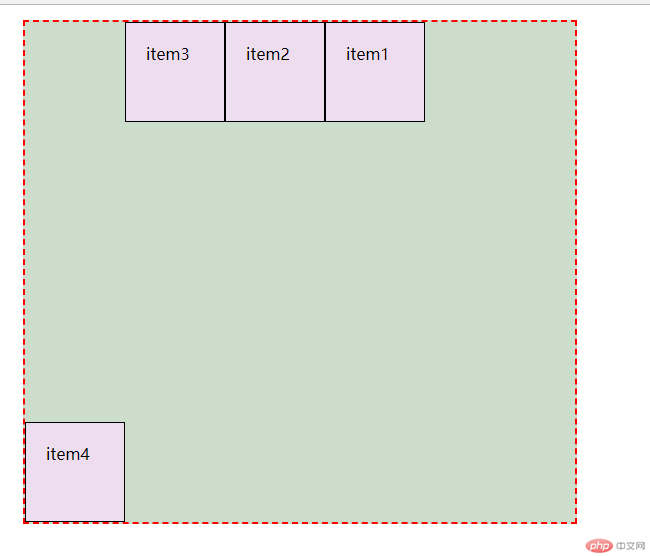
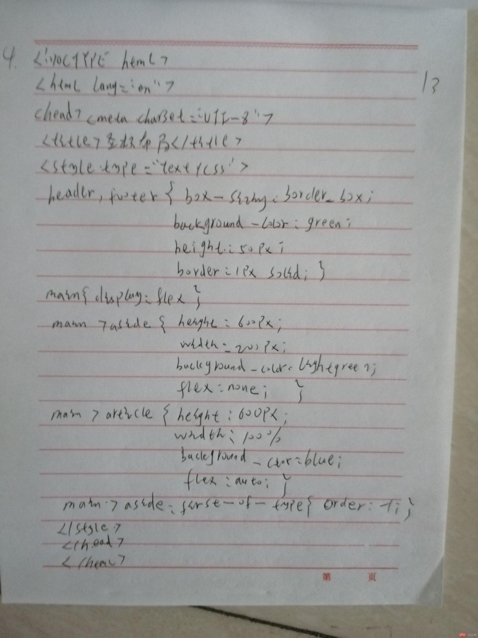
用flex布局改圣杯布局
<!DOCTYPE html><html lang="en"><head><meta charset="UTF-8"><title>圣杯布局</title><style type="text/css">header,footer {box-sizing: border-box;background-color: green;height: 50px;border: 1px solid;}main {display: flex;}main > aside {height: 600px;width: 200px;background-color: lightgreen;flex: none;}main > article{height: 600px;width: 100%;background-color: blue;flex: auto;}main > aside:first-of-type {order: -1;}</style></head><body ><header>头部</header><main><article>主体内容区</article><aside >左侧</aside><aside >右侧</aside></main><footer>底部</footer></body></html>
效果图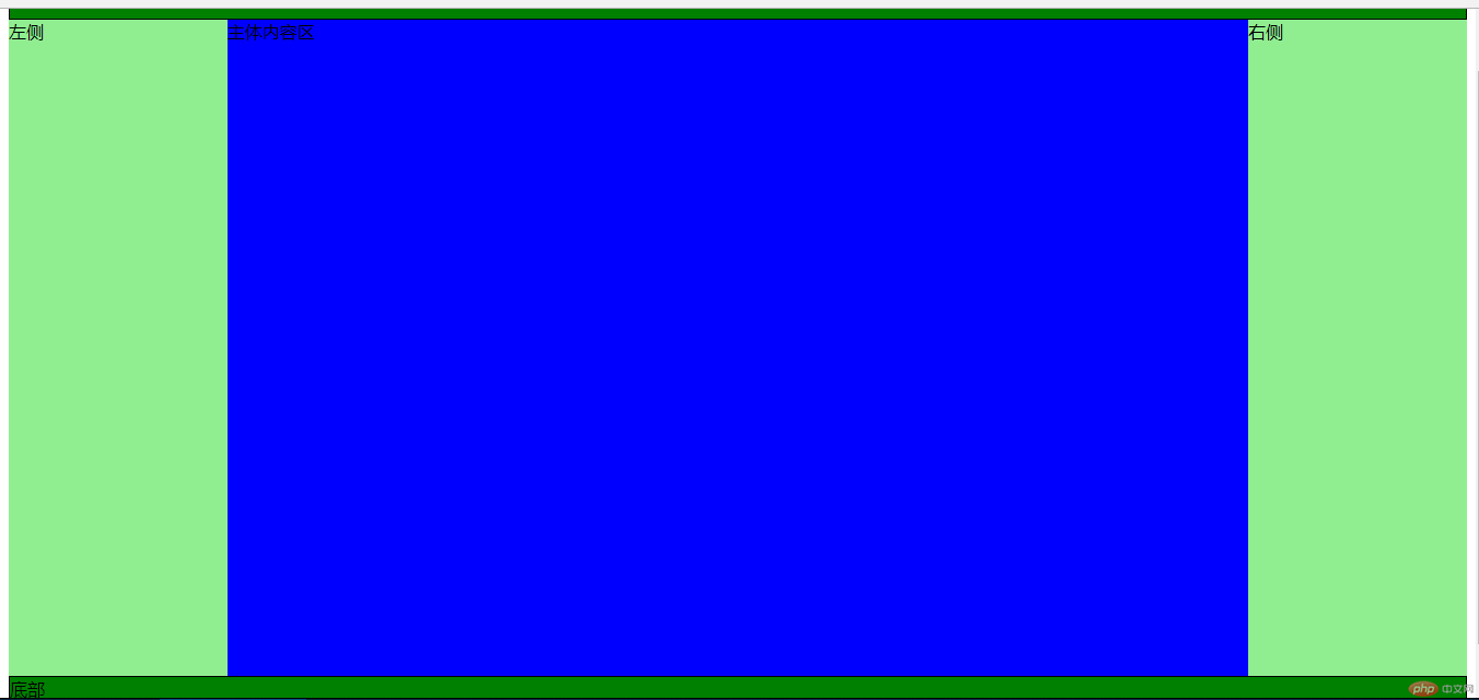
总结:需要多写多练,关于flex要灵活运用。
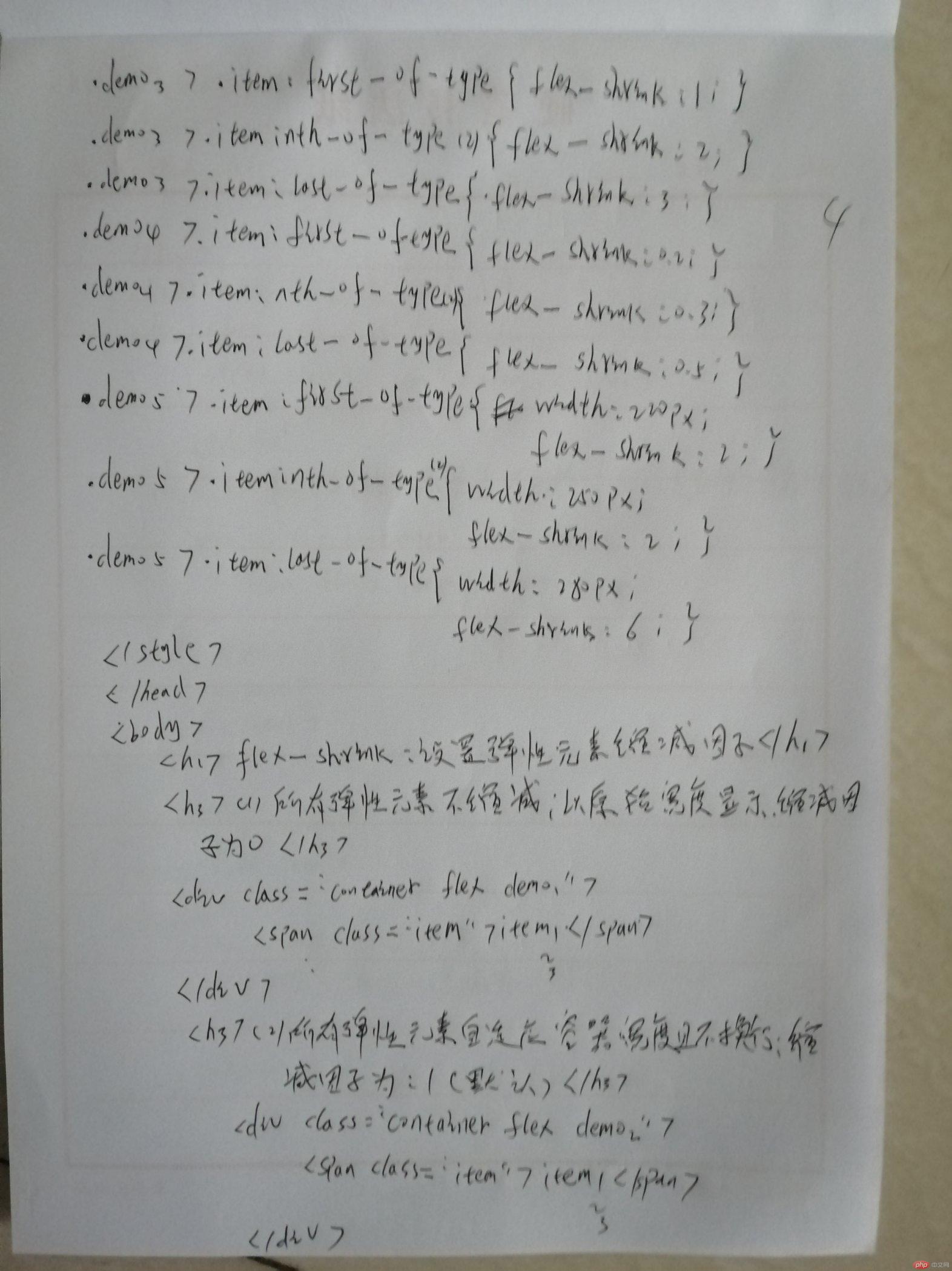
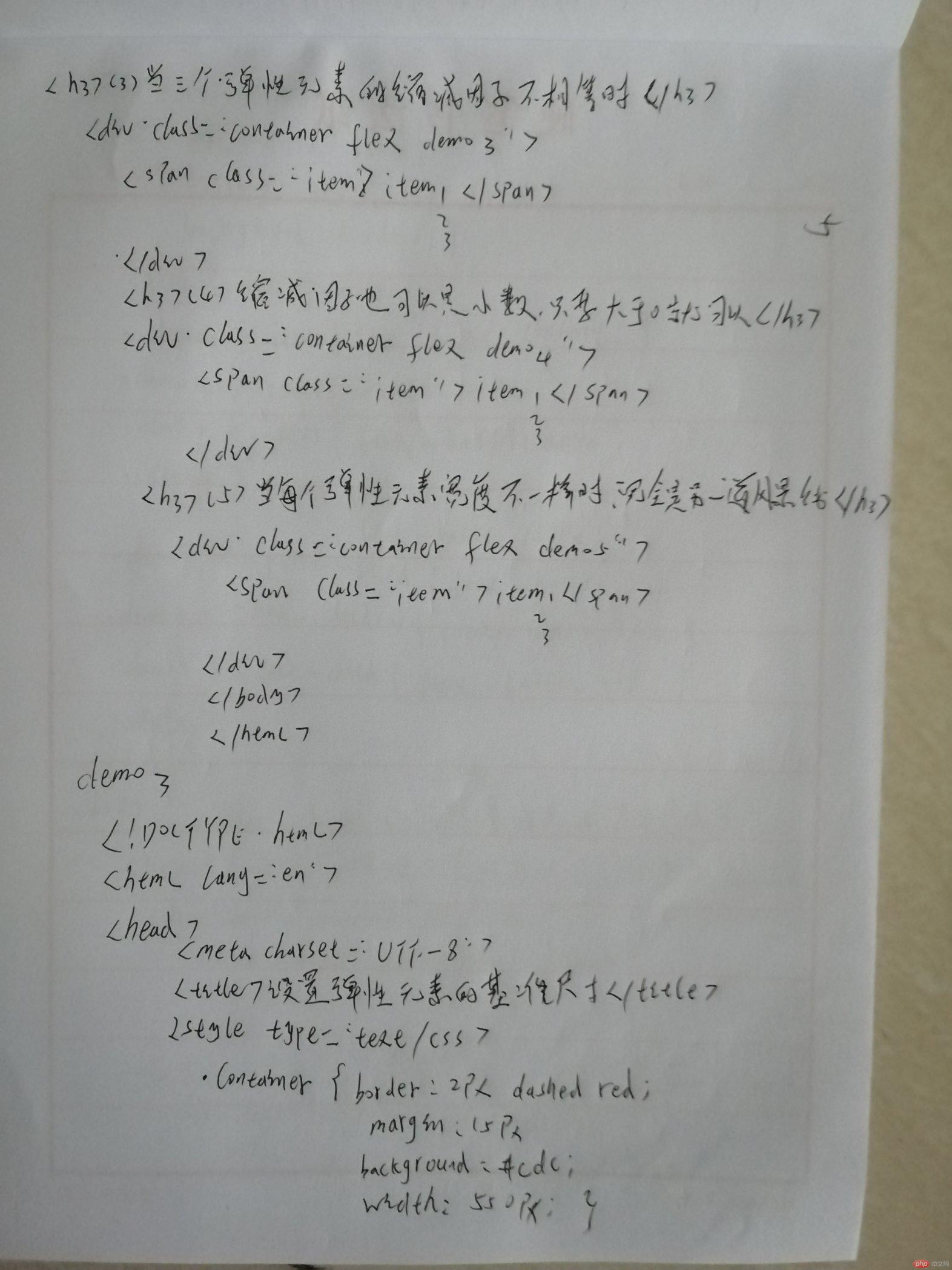
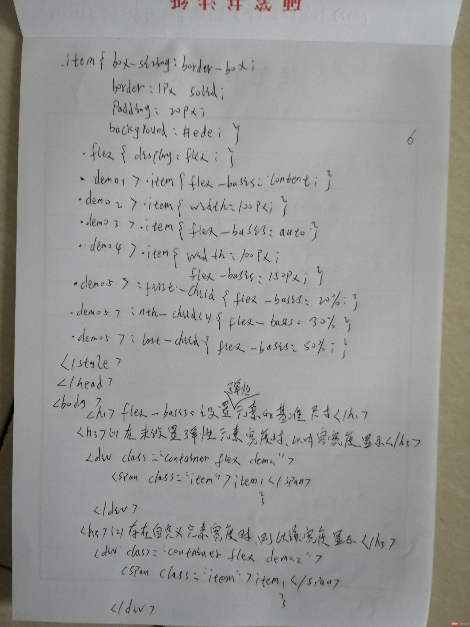
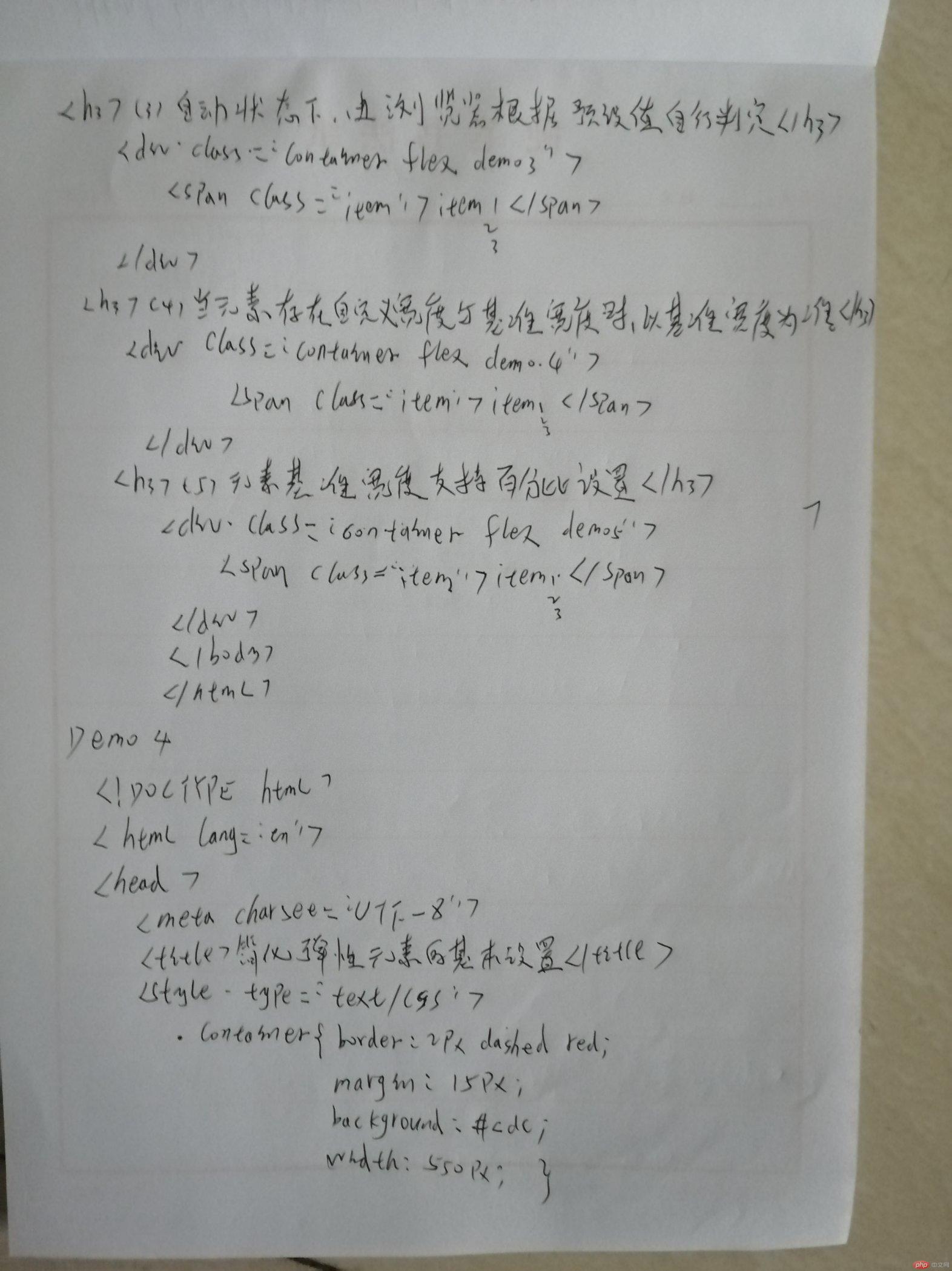
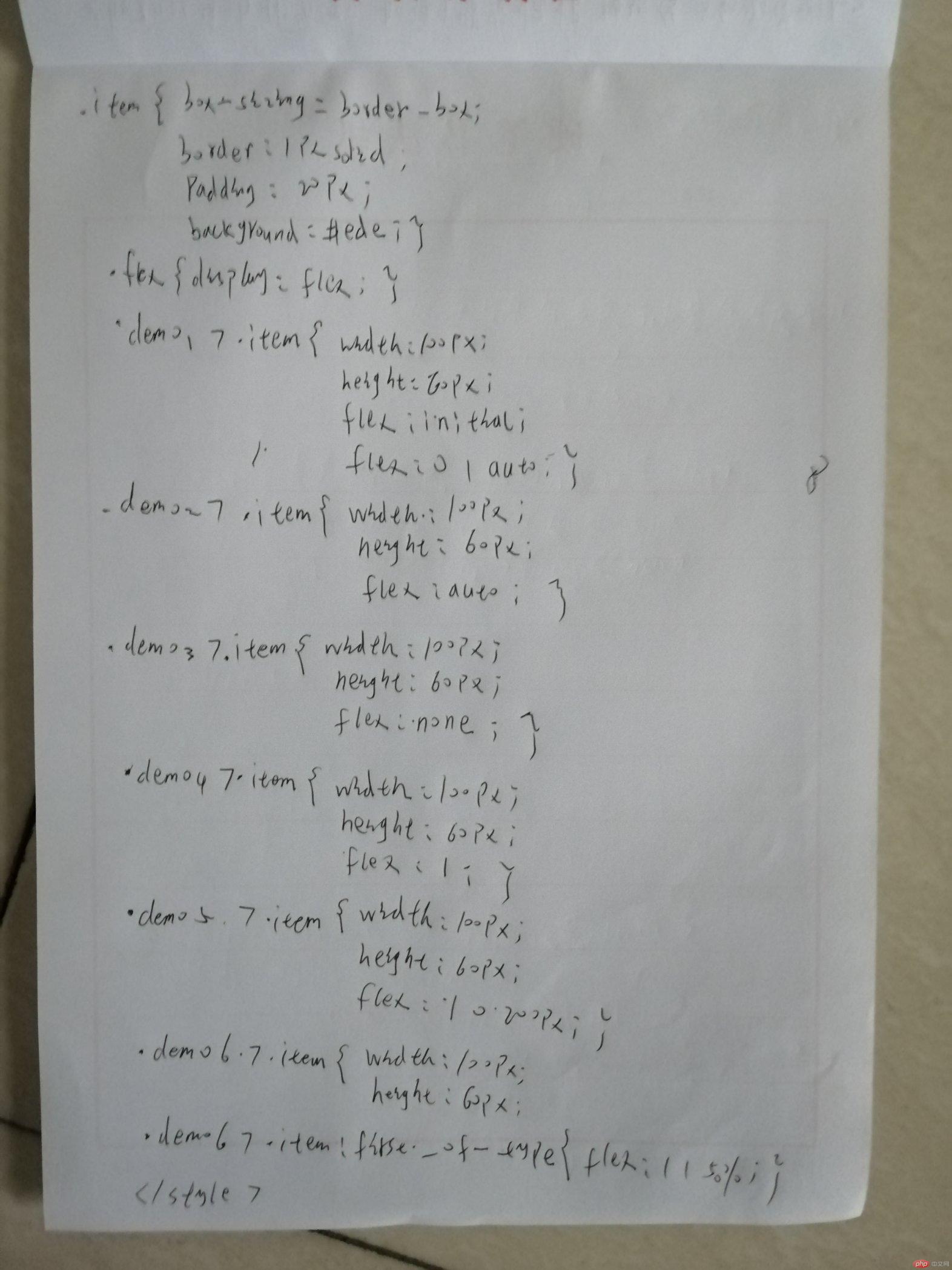
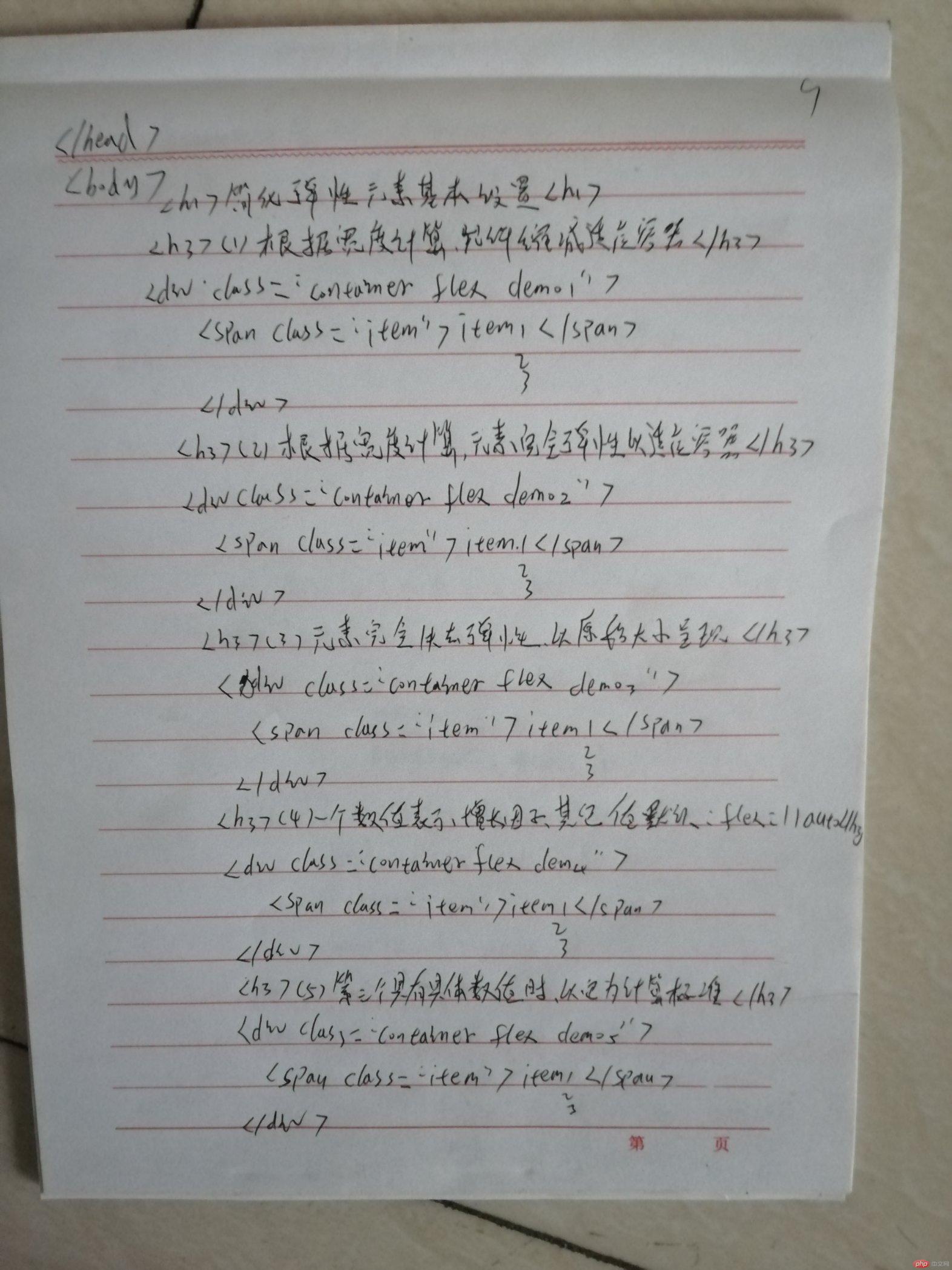
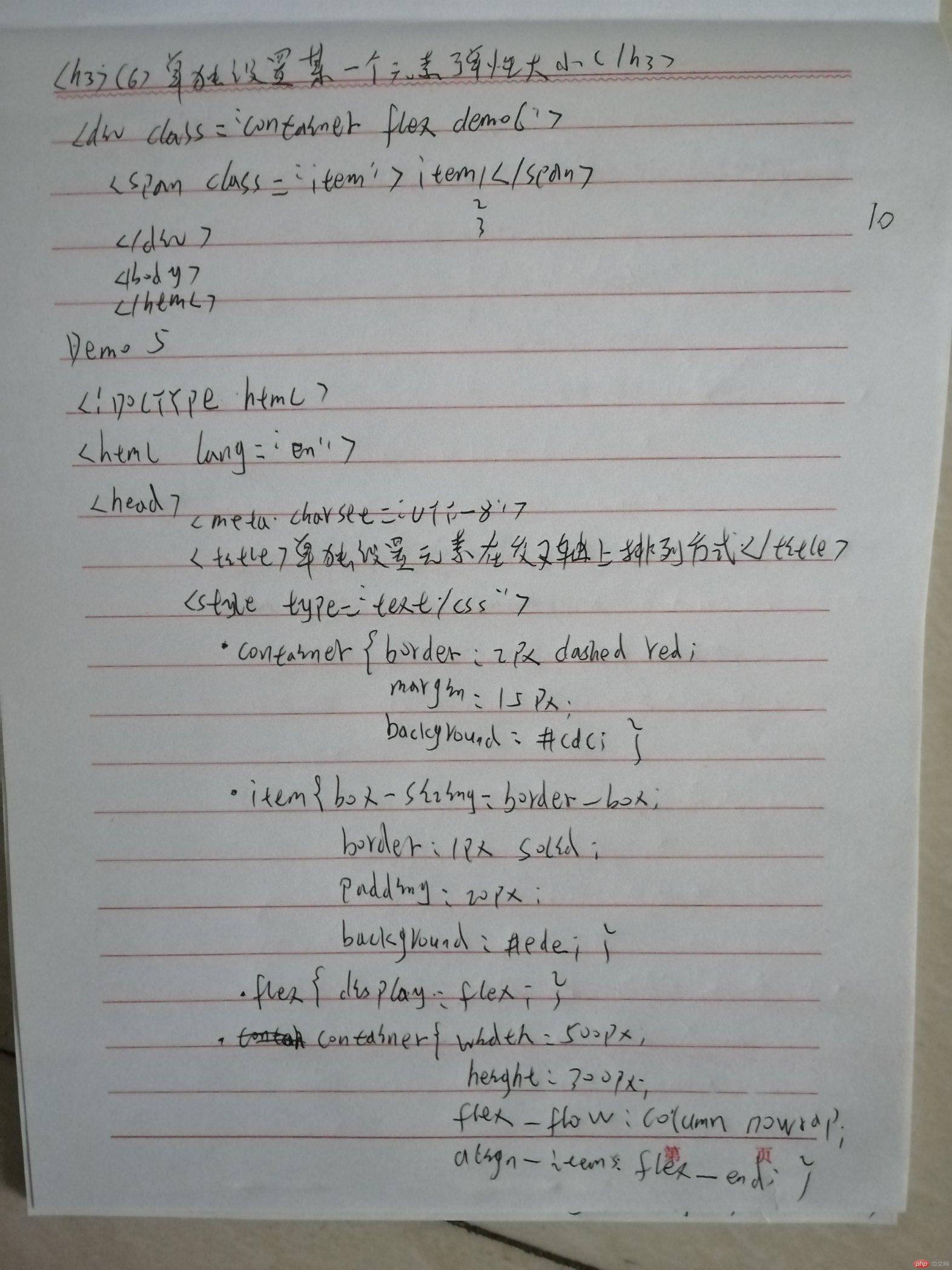
手抄代码如下:
