
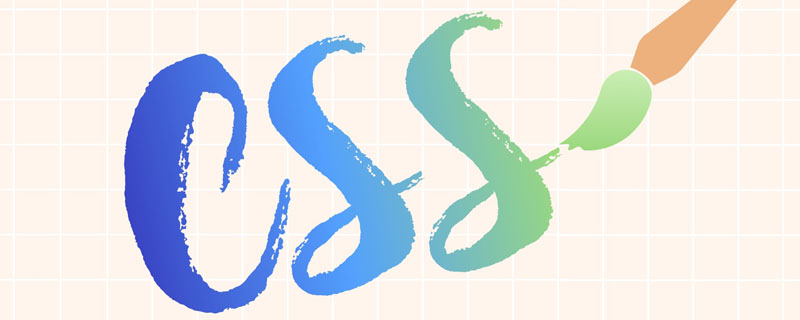
CSS에서 텍스트 색상 그라데이션을 얻는 몇 가지 방법

- 青灯夜游앞으로
- 2020-12-18 09:31:302054검색
(추천 튜토리얼: CSS 비디오 튜토리얼)
웹 프론트엔드 개발 과정에서 UI 디자이너들은 종종 그라데이션 텍스트로 일부 디자인 도면을 디자인합니다. 과거에는 텍스트를 대체하기 위해 png 그림만 사용할 수 있었습니다. 오늘날에는 순수한 CSS를 사용하여 그라데이션 텍스트를 구현하는 것이 가능합니다. 참고할 수 있는 3가지 구현 방법은 다음과 같습니다!
기본 스타일:
.gradient-text {
	text-align: left;
	text-indent: 30px;
	line-height: 50px;
	font-size: 40px;
	font-weight: bolder;
	position: relative;
}
첫 번째 방법은 background-cli, text-fill-color 사용: background-cli、 text-fill-color:
.gradient-text-one{
    background-image:-webkit-linear-gradient(bottom,red,#fd8403,yellow);
    -webkit-background-clip:text;
    -webkit-text-fill-color:transparent;
}
说明 :
background: -webkit-linear-gradient(...)为文本元素提供渐变背景。webkit-text-fill-color: transparent使用透明颜色填充文本。webkit-background-clip: text用文本剪辑背景,用渐变背景作为颜色填充文本。
第二种方法,使用 mask-image:
.gradient-text-two {
	color: red;
}

.gradient-text-two[data-content]::after {
	content: attr(data-content);
	display: block;
	position: absolute;
	color: yellow;
	left: 0;
	top: 0;
	z-index: 2;
	-webkit-mask-image: -webkit-gradient(linear, 0 0, 0 bottom,
	                       from(yellow), to(rgba(0, 0, 255, 0)));
}
说明:
mask-image 和 background-image 一样,不仅可以取值是 图片路径,也可以是渐变色。
第三种方法,使用 linearGradient、fill
.gradient-text-three{
    fill:url(#SVGID_1_);
    font-size:40px;
    font-weight:bolder;
}
지침:
배경: -webkit-linear-gradient(...) 텍스트 요소에 그라데이션 배경을 제공합니다. -
webkit-text-fill-color: transparent텍스트를 투명한 색상으로 채웁니다. -
webkit-Background-clip: text배경을 텍스트로 자르고 텍스트를 그라데이션 배경으로 색상으로 채웁니다.
두 번째 방법은 mask-image를 사용하세요.
<svg viewBoxs="0 0 500 300" class="svgBox">
    <defs>
        <linearGradient id="SVGID_1_" gradientUnits="userSpaceOnUse" x1="0" y1="10" x2="0" y2="50">
            <stop  offset="0" style="stop-color:yellow"/>
            <stop  offset="0.5" style="stop-color:#fd8403"/>
            <stop  offset="1" style="stop-color:red"/>
        </linearGradient>
    </defs>
    <text text-anchor="middle" class="gradient-text-three" x="110px" y="30%">花信年华</text>
</svg>
지침: 
mask-image 및 background- Like image의 경우 값은 이미지 경로뿐만 아니라 그라데이션 색상도 될 수 있습니다.
linearGradient, fill 사용: 🎜🎜🎜<!DOCTYPE html>
<html>
<head>
<meta charset="utf-8">
<meta name="viewport" content="width=device-width, user-scalable=no,
initial-scale=1.0, maximum-scale=1.0, minimum-scale=1.0">
<title>CSS3渐变字体</title>
<link rel="stylesheet" href="https://cdn.bootcss.com/bootstrap/3.3.7/css/bootstrap.min.css">
<script src="https://cdn.bootcss.com/jquery/2.1.1/jquery.min.js"></script>
<script src="https://cdn.bootcss.com/bootstrap/3.3.7/js/bootstrap.min.js"></script>
<style type="text/css">
*{margin:0;padding:0;}
body,html{width:100%;height:100%;}
.wrapper{width:80%;margin:0 auto;margin-top:30px;}
.gradient-text{text-align: left;text-indent:30px;line-height: 50px;font-size:40px;
font-weight:bolder; position: relative; }
.gradient-text-one{
background-image:-webkit-linear-gradient(bottom,red,#fd8403,yellow);
-webkit-background-clip:text;
-webkit-text-fill-color:transparent;
}
.gradient-text-two{
color:red;
}
.gradient-text-two[data-content]::after{
content:attr(data-content);
display: block;
position:absolute;
color:yellow;
left:0;
top:0;
z-index:2;
-webkit-mask-image:-webkit-gradient(linear, 0 0, 0 bottom, from(yellow),
to(rgba(0, 0, 255, 0)));
}
.gradient-text-three{
fill:url(#SVGID_1_);
font-size:40px;
font-weight:bolder;
}
</style>
</head>
<body>
<section class="wrapper">
<div class="panel panel-info">
<div class="panel-heading">
<h3 class="panel-title">方法1. background-clip + text-fill-color</h3>
</div>
<div class="panel-body">
<h3 class="gradient-text gradient-text-one">花样年华</h3>
</div>
</div>
<div class="panel panel-warning">
<div class="panel-heading">
<h3 class="panel-title">方法2. mask-image</h3>
</div>
<div class="panel-body">
<h3 class="gradient-text gradient-text-two" data-content="豆蔻年华">豆蔻年华</h3>
</div>
</div>
<div class="panel panel-danger">
<div class="panel-heading">
<h3 class="panel-title">方法3. svg linearGradient</h3>
</div>
<div class="panel-body">
<svg viewBoxs="0 0 500 300" class="svgBox">
<defs>
<linearGradient id="SVGID_1_" gradientUnits="userSpaceOnUse"
x1="0" y1="10" x2="0" y2="50">
<stop offset="0" style="stop-color:yellow"/>
<stop offset="0.5" style="stop-color:#fd8403"/>
<stop offset="1" style="stop-color:red"/>
</linearGradient>
</defs>
<text text-anchor="middle" class="gradient-text-three" x="110px"
y="30%">花信年华</text>
</svg>
</div>
</div>
</section>
</body>
</html>rrreee🎜🎜설명: 🎜🎜🎜SVG에는 두 가지 주요 유형의 그라디언트가 있습니다. 🎜 🎜🎜🎜선형 그라데이션(linearGradient) 🎜🎜🎜🎜방사형 그라데이션(radialGradient) 🎜🎜🎜🎜SVG의 그라데이션은 그래픽 요소뿐만 아니라 텍스트 요소도 채우는 데 사용할 수 있습니다. 🎜🎜🎜dom 예: 효과: 🎜🎜🎜🎜🎜더 많은 프로그래밍 관련 지식을 보려면 🎜프로그래밍 소개🎜를 방문하세요! ! 🎜위 내용은 CSS에서 텍스트 색상 그라데이션을 얻는 몇 가지 방법의 상세 내용입니다. 자세한 내용은 PHP 중국어 웹사이트의 기타 관련 기사를 참조하세요!
성명:
이 기사는 segmentfault.com에서 복제됩니다. 침해가 있는 경우 admin@php.cn으로 문의하시기 바랍니다. 삭제
이전 기사:CSS에서 이미지의 둥근 모서리를 얻는 방법다음 기사:CSS에서 이미지의 둥근 모서리를 얻는 방법