
Maison >interface Web >js tutoriel >Explication détaillée de Bootstrap, le meilleur framework front-end en 2018
Explication détaillée de Bootstrap, le meilleur framework front-end en 2018

- PHPzoriginal
- 2018-02-01 10:34:334541parcourir
Bootstrap est basé sur HTML, CSS et JAVASCRIPT et est utilisé pour développer des projets WEB de mise en page réactive et axés sur les appareils mobiles. Bootstrap a apporté des améliorations plus personnalisées basées sur JQuery pour créer son propre style de site Web unique et est compatible avec la plupart des plug-ins jQuery. Rendre le développement front-end plus rapide et plus simple.
Structure de base : Bootstrap fournit une structure de base avec un système de grille, des styles de liens et des arrière-plans.
CSS : Bootstrap est livré avec les fonctionnalités suivantes : paramètres CSS globaux, définition des styles d'éléments HTML de base, classes extensibles et système de grille avancé.
Composants : Bootstrap contient plus d'une douzaine de composants réutilisables pour la création d'images, de menus déroulants, de navigation, de boîtes d'alerte, de boîtes contextuelles, etc.
Plug-ins JavaScript : Bootstrap comprend plus d'une douzaine de plug-ins jQuery personnalisés. Vous pouvez inclure tous les plug-ins directement ou les inclure un par un.
Personnalisation : vous pouvez personnaliser les composants Bootstrap, les variables LESS et les plug-ins jQuery pour obtenir votre propre version.
[Recommandations vidéo associées : Tutoriel Bootstrap]
1. Modèle de base Bootstrap
<!DOCTYPE html> <html lang="zh-CN"> <head> <meta charset="utf-8"> <!--让浏览器使用最新的IE内核进行渲染页面--> <meta http-equiv="X-UA-Compatible" content="IE=edge"> <!--设置视口宽度等于当前设备宽度,默认缩放比为1--> <meta name="viewport" content="width=device-width, initial-scale=1"> <!-- 上述3个meta标签*必须*放在最前面,任何其他内容都*必须*跟随其后! --> <title>Bootstrap 101 Template</title> <!-- 导入Bootstrap核心CSS文件 --> <link href="css/bootstrap.css" rel="external nofollow" rel="stylesheet"> <!-- HTML5 shim and Respond.js for IE8 support of HTML5 elements and media queries --> <!-- WARNING: Respond.js doesn't work if you view the page via file:// --> <!-- ①<!--[if lt IE 9]>…… <![endif]- ->这一对标签用于检测当前浏览器的版本,lt表示小于,gt表示大写。所以这句话作用是,当浏览器版本低于IE9执行。 ②html5shiv:解决ie9以下浏览器对html5新增标签的不识别,并导致CSS不起作用的问题。 ③respond.min:让不支持css3 Media Query的浏览器包括IE6-IE8等其他浏览器支持查询。 --> <!--[if lt IE 9]> <script src="https://cdn.bootcss.com/html5shiv/3.7.3/html5shiv.min.js"></script> <script src="https://cdn.bootcss.com/respond.js/1.4.2/respond.min.js"></script> <![endif]--> </head> <body> <h1>你好!</h1> <script src="js/jquery-3.1.1.js"></script> <!-- 导入BootStrap的JS插件 ①如果不使用BootStrap提供的JS插件,则这个JS文件无需导入; ②BootStrap的JS插件功能依赖JQuery,因此这个JS必须在JQuery之后导入; --> <script src="js/bootstrap.min.js"></script> </body> </html>
Copiez et collez le modèle de base. au-dessus du code HTML, il s'agit de la page Bootstrap la plus simple. Il est important de noter que tous les plugins JavaScript pour Bootstrap dépendent de jQuery, jQuery doit donc être introduit avant Bootstrap.
2. Composants
Bootstrap contient une multitude de composants Web Sur la base de ces composants, vous pouvez rapidement créer un site Web magnifique et entièrement fonctionnel. Il comprend les composants suivants :
Menu déroulant, groupe de boutons, menu déroulant de boutons, navigation, barre de navigation, chemin de navigation, pagination, mise en page, vignettes, boîte de dialogue d'avertissement, barre de progression, objets multimédias, etc. .
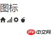
2.1 Icônes de police
bootstrap fournit plus de 200 icônes par défaut. Nous pouvons utiliser ces icônes via des balises span :
<h3>图标</h3>
 <span class="glyphicon glyphicon-home"></span>
 <span class="glyphicon glyphicon-signal"></span>
 <span class="glyphicon glyphicon-cog"></span>
 <span class="glyphicon glyphicon-apple"></span>
Jetons un coup d'œil à l'effet :
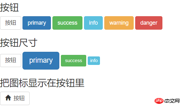
2.2 Boutons
< La balise ;button> est utilisée pour créer des boutons, et bootstrap fournit des styles de boutons riches. En plus de la taille par défaut du bouton, bootstrap fournit également trois paramètres pour ajuster la taille du bouton, à savoir : btn-lg, btn-sm et btn-xs.
<h3>按钮</h3>
 <button type="button" class="btn btn-default">按钮</button>
 <button type="button" class="btn btn-primary">primary</button>
 <button type="button" class="btn btn-success">success</button>
 <button type="button" class="btn btn-info">info</button>
 <button type="button" class="btn btn-warning">warning</button>
 <button type="button" class="btn btn-danger">danger</button>
 <h3>按钮尺寸</h3>
 <button type="button" class="btn btn-default">按钮</button>
 <button type="button" class="btn btn-primary btn-lg">primary</button>
 <button type="button" class="btn btn-success btn-sm">success</button>
 <button type="button" class="btn btn-info btn-xs">info</button>
 <h3>把图标显示在按钮里</h3>
 <button type="button" class="btn btn-default"><span class="glyphicon glyphicon-home"></span>  按钮</button>
Effet :
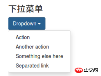
2.3 Menu déroulant
Le menu déroulant est l'une des interactions les plus courantes, bootstrap nous offre un style niçois.
 <h3>下拉菜单</h3>
 <p class="dropdown">
 <button class="btn btn-primary dropdown-toggle" type="button" id="dropdownMenu1" data-toggle="dropdown" aria-expanded="true">
 Dropdown
 <span class="caret"></span>
 </button>
 <ul class="dropdown-menu" role="menu" aria-labelledby="dropdownMenu1">
 <li role="presentation"><a role="menuitem" tabindex="-1" href="#" rel="external nofollow" rel="external nofollow" rel="external nofollow" rel="external nofollow" rel="external nofollow" rel="external nofollow" rel="external nofollow" rel="external nofollow" rel="external nofollow" rel="external nofollow" rel="external nofollow" rel="external nofollow" rel="external nofollow" >Action</a></li>
 <li role="presentation"><a role="menuitem" tabindex="-1" href="#" rel="external nofollow" rel="external nofollow" rel="external nofollow" rel="external nofollow" rel="external nofollow" rel="external nofollow" rel="external nofollow" rel="external nofollow" rel="external nofollow" rel="external nofollow" rel="external nofollow" rel="external nofollow" rel="external nofollow" >Another action</a></li>
 <li role="presentation"><a role="menuitem" tabindex="-1" href="#" rel="external nofollow" rel="external nofollow" rel="external nofollow" rel="external nofollow" rel="external nofollow" rel="external nofollow" rel="external nofollow" rel="external nofollow" rel="external nofollow" rel="external nofollow" rel="external nofollow" rel="external nofollow" rel="external nofollow" >Something else here</a></li>
 <li role="presentation"><a role="menuitem" tabindex="-1" href="#" rel="external nofollow" rel="external nofollow" rel="external nofollow" rel="external nofollow" rel="external nofollow" rel="external nofollow" rel="external nofollow" rel="external nofollow" rel="external nofollow" rel="external nofollow" rel="external nofollow" rel="external nofollow" rel="external nofollow" >Separated link</a></li>
 </ul>
 </p>
Regardez l'effet :
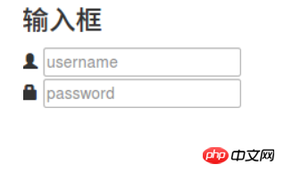
2.4 Zone de saisie
Créez-le via
 <h3>输入框</h3>
 <p class="input-group">
 <span class="glyphicon glyphicon-user"></span>
 <input type="text" placeholder="username">
 </p>
 <p class="input-group">
 <span class="glyphicon glyphicon-lock"></span>
 <input type="password" placeholder="password">
 </p>
Rendu :
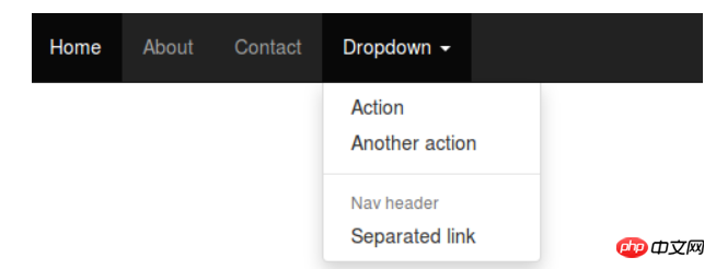
2.5 Barre de navigation
La barre de navigation est essentielle en tant que guide pour l'ensemble du site Web.
 <h3>导航栏</h3>
 <nav class="navbar navbar-inverse navbar-fixed-top">
 <p id="navbar" class="navbar-collapse collapse">
 <ul class="nav navbar-nav">
 <li class="active"><a href="#" rel="external nofollow" rel="external nofollow" rel="external nofollow" rel="external nofollow" rel="external nofollow" rel="external nofollow" rel="external nofollow" rel="external nofollow" rel="external nofollow" rel="external nofollow" rel="external nofollow" rel="external nofollow" rel="external nofollow" >Home</a></li>
 <li><a href="#about" rel="external nofollow" >About</a></li>
 <li><a href="#contact" rel="external nofollow" >Contact</a></li>
 <li class="dropdown">
 <a href="#" rel="external nofollow" rel="external nofollow" rel="external nofollow" rel="external nofollow" rel="external nofollow" rel="external nofollow" rel="external nofollow" rel="external nofollow" rel="external nofollow" rel="external nofollow" rel="external nofollow" rel="external nofollow" rel="external nofollow" class="dropdown-toggle" data-toggle="dropdown" role="button" aria-expanded="false">Dropdown <span class="caret"></span></a>
 <ul class="dropdown-menu" role="menu">
 <li><a href="#" rel="external nofollow" rel="external nofollow" rel="external nofollow" rel="external nofollow" rel="external nofollow" rel="external nofollow" rel="external nofollow" rel="external nofollow" rel="external nofollow" rel="external nofollow" rel="external nofollow" rel="external nofollow" rel="external nofollow" >Action</a></li>
 <li><a href="#" rel="external nofollow" rel="external nofollow" rel="external nofollow" rel="external nofollow" rel="external nofollow" rel="external nofollow" rel="external nofollow" rel="external nofollow" rel="external nofollow" rel="external nofollow" rel="external nofollow" rel="external nofollow" rel="external nofollow" >Another action</a></li>
 <li class="pider"></li>
 <li class="dropdown-header">Nav header</li>
 <li><a href="#" rel="external nofollow" rel="external nofollow" rel="external nofollow" rel="external nofollow" rel="external nofollow" rel="external nofollow" rel="external nofollow" rel="external nofollow" rel="external nofollow" rel="external nofollow" rel="external nofollow" rel="external nofollow" rel="external nofollow" >Separated link</a></li>
 </ul>
 </li>
 </ul>
 </p><!--/.nav-collapse -->
 </p>
 </nav>
Quel est l'effet↓
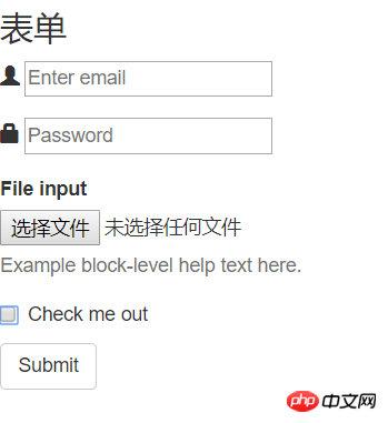
2.6 Formulaires
Le transfert de données entre des personnes et des systèmes nécessite des formulaires pour complet. Par exemple, soumission des informations d'inscription/de connexion, soumission des conditions de requête, etc. Utilisez la balise
pour créer un formulaire.<h3>表单</h3> <form> <p class="form-group"> <span class="glyphicon glyphicon-user"></span> <input type="email" id="exampleInputEmail1" placeholder="Enter email"> </p> <p class="form-group"> <span class="glyphicon glyphicon-lock"></span> <input type="password" id="exampleInputPassword1" placeholder="Password"> </p> <p class="form-group"> <label for="exampleInputFile">File input</label> <input type="file" id="exampleInputFile"> <p class="help-block">Example block-level help text here.</p> </p> <p class="checkbox"> <label> <input type="checkbox"> Check me out </label> </p> <button type="submit" class="btn btn-default">Submit</button> </form>
L'effet est le suivant :
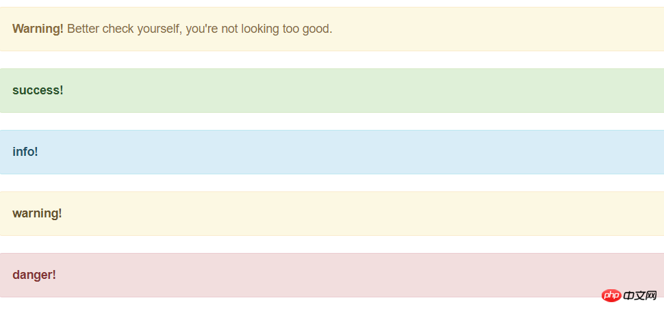
2.7 Boîte d'avertissement
La boîte d'avertissement est un moyen important pour le système de transmettre des informations et guider les utilisateurs. Il n'y a pas de balise pour la boîte d'avertissement. Vous pouvez créer instantanément une belle boîte d'avertissement grâce aux styles fournis par bootstrap.
 <h3>警告框</h3>
 <p class="alert alert-warning alert-dismissible" role="alert">
 <button type="button" class="close" data-dismiss="alert" aria-label="Close"><span aria-hidden="true">×</span></button>
 <strong>Warning!</strong> Better check yourself, you're not looking too good.
 </p>
 <p class="alert alert-success" role="alert">
 <a href="#" rel="external nofollow" rel="external nofollow" rel="external nofollow" rel="external nofollow" rel="external nofollow" rel="external nofollow" rel="external nofollow" rel="external nofollow" rel="external nofollow" rel="external nofollow" rel="external nofollow" rel="external nofollow" rel="external nofollow" class="alert-link">success!</a>
 </p>
 <p class="alert alert-info" role="alert">
 <a href="#" rel="external nofollow" rel="external nofollow" rel="external nofollow" rel="external nofollow" rel="external nofollow" rel="external nofollow" rel="external nofollow" rel="external nofollow" rel="external nofollow" rel="external nofollow" rel="external nofollow" rel="external nofollow" rel="external nofollow" class="alert-link">info!</a>
 </p>
 <p class="alert alert-warning" role="alert">
 <a href="#" rel="external nofollow" rel="external nofollow" rel="external nofollow" rel="external nofollow" rel="external nofollow" rel="external nofollow" rel="external nofollow" rel="external nofollow" rel="external nofollow" rel="external nofollow" rel="external nofollow" rel="external nofollow" rel="external nofollow" class="alert-link">warning!</a>
 </p>
 <p class="alert alert-danger" role="alert">
 <a href="#" rel="external nofollow" rel="external nofollow" rel="external nofollow" rel="external nofollow" rel="external nofollow" rel="external nofollow" rel="external nofollow" rel="external nofollow" rel="external nofollow" rel="external nofollow" rel="external nofollow" rel="external nofollow" rel="external nofollow" class="alert-link">danger!</a>
 </p>
Rendu :
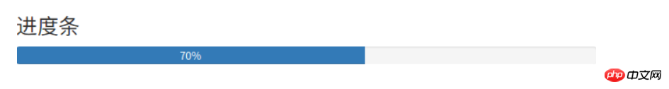
2.8 Barre de progression
Le traitement du système nécessite souvent que les utilisateurs attendent, et la barre de progression permet aux utilisateurs Percevoir le traitement du système, augmentant ainsi la tolérance.
 <h3>进度条</h3>
 <p class="progress">
 <p class="progress-bar" role="progressbar" aria-valuenow="70" aria-valuemin="0" aria-valuemax="100" style="width: 60%;">
 70%
 </p>
 </p>
3. Système de grille Bootstrap
Tout d'abord, il faut d'abord comprendre ce qu'est un système de grille ! Regardez vers le bas↓
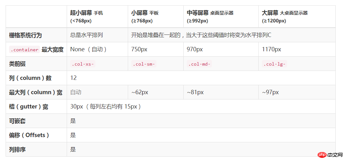
Bootstrap fournit un système de grille fluide réactif et axé sur les mobiles À mesure que la taille de l'écran ou de la fenêtre d'affichage augmente, le système le divisera automatiquement en 12 colonnes maximum. Il contient des classes prédéfinies faciles à utiliser et des mixins puissants pour générer des présentations plus sémantiques.
Le système de grille est utilisé pour créer des mises en page à travers une série de lignes et de colonnes, et notre contenu peut être placé dans ces mises en page créées. Voici une introduction au fonctionnement du système de grille Bootstrap :
"Row" doit être contenu dans .container (largeur fixe) ou .container-fluid (100% de largeur) afin de lui donner l'alignement et le remplissage appropriés. .
Créez un ensemble de "colonnes" dans le sens horizontal à travers des "lignes".
你的内容应当放置于“列(column)”内,并且,只有“列(column)”可以作为行(row)”的直接子元素。
类似 .row 和 .col-xs-4 这种预定义的类,可以用来快速创建栅格布局。Bootstrap 源码中定义的 mixin 也可以用来创建语义化的布局。
通过为“列(column)”设置 padding 属性,从而创建列与列之间的间隔(gutter)。通过为 .row 元素设置负值 margin 从而抵消掉为 .container 元素设置的 padding,也就间接为“行(row)”所包含的“列(column)”抵消掉了padding。
栅格系统中的列是通过指定1到12的值来表示其跨越的范围。例如,三个等宽的列可以使用三个 .col-xs-4 来创建。
如果一“行(row)”中包含了的“列(column)”大于 12,多余的“列(column)”所在的元素将被作为一个整体另起一行排列。
栅格类适用于与屏幕宽度大于或等于分界点大小的设备 , 并且针对小屏幕设备覆盖栅格类。 因此,在元素上应用任何 .col-md-*栅格类适用于与屏幕宽度大于或等于分界点大小的设备 , 并且针对小屏幕设备覆盖栅格类。 因此,在元素上应用任何 .col-lg-*不存在, 也影响大屏幕设备。
3.1媒体查询
在栅格系统中,我们在 Less 文件中使用以下媒体查询(media query)来创建关键的分界点阈值。
/* 超小屏幕(手机,小于 768px) */
/* 没有任何媒体查询相关的代码,因为这在 Bootstrap 中是默认的( Bootstrap 是移动设备优先) */
/* 小屏幕(平板,大于等于 768px) */
@media (min-width: @screen-sm-min) { ... }
/* 中等屏幕(桌面显示器,大于等于 992px) */
@media (min-width: @screen-md-min) { ... }
/* 大屏幕(大桌面显示器,大于等于 1200px) */
@media (min-width: @screen-lg-min) { ... }
3.2栅格参数
<p class="row">
 <p class="col-md-1">.col-md-1</p>
 <p class="col-md-1">.col-md-1</p>
 <p class="col-md-1">.col-md-1</p>
 <p class="col-md-1">.col-md-1</p>
 <p class="col-md-1">.col-md-1</p>
 <p class="col-md-1">.col-md-1</p>
 <p class="col-md-1">.col-md-1</p>
 <p class="col-md-1">.col-md-1</p>
 <p class="col-md-1">.col-md-1</p>
 <p class="col-md-1">.col-md-1</p>
 <p class="col-md-1">.col-md-1</p>
 <p class="col-md-1">.col-md-1</p>
</p>
<p class="row">
 <p class="col-md-8">.col-md-8</p>
 <p class="col-md-4">.col-md-4</p>
</p>
<p class="row">
 <p class="col-md-4">.col-md-4</p>
 <p class="col-md-4">.col-md-4</p>
 <p class="col-md-4">.col-md-4</p>
</p>
<p class="row">
 <p class="col-md-6">.col-md-6</p>
 <p class="col-md-6">.col-md-6</p>
</p>
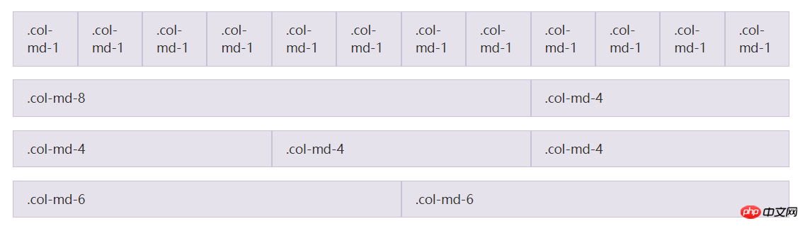
输入上面的代码就可以实现上图的样式,是不是已经对栅格系统有所了解了,我们继续往下看↓
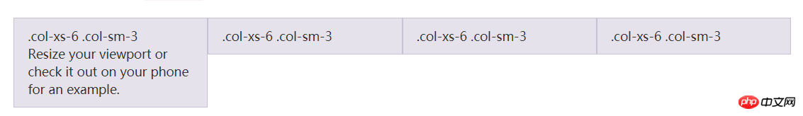
3.3响应式列重置
即便有给出的栅格class,你也不免会碰到一些问题,例如,在某些阈值时,某些列可能会出现比别的列高的情况。为了克服这一问题,建议联合使用 .clearfix 和响应式工具类。
<p class="row">
 <p class="col-xs-6 col-sm-3">.col-xs-6 .col-sm-3</p>
 <p class="col-xs-6 col-sm-3">.col-xs-6 .col-sm-3</p>
 <p class="clearfix visible-xs-block"></p>
 <p class="col-xs-6 col-sm-3">.col-xs-6 .col-sm-3</p>
 <p class="col-xs-6 col-sm-3">.col-xs-6 .col-sm-3</p>
</p>
除了列在分界点清除响应, 您可能需要 重置偏移, 后推或前拉某个列。
<p class="row"> <p class="col-sm-5 col-md-6">.col-sm-5 .col-md-6</p> <p class="col-sm-5 col-sm-offset-2 col-md-6 col-md-offset-0">.col-sm-5 .col-sm-offset-2 .col-md-6 .col-md-offset-0</p> </p> <p class="row"> <p class="col-sm-6 col-md-5 col-lg-6">.col-sm-6 .col-md-5 .col-lg-6</p> <p class="col-sm-6 col-md-5 col-md-offset-2 col-lg-6 col-lg-offset-0">.col-sm-6 .col-md-5 .col-md-offset-2 .col-lg-6 .col-lg-offset-0</p> </p> <h2 style="margin: 8px 0px 0px; padding: 0px; font-weight: bold; font-size: 16px; line-height: 28px; max-width: 100%; color: #59c3f9; min-height: 32px; border-bottom-width: 1.5px; border-bottom-style: solid; border-color: #59c3f9; text-align: justify;"><span style="font-family: 'Microsoft YaHei'; font-size: 14px;"><span class="autonum" style="background-color: #59c3f9; color: #ffffff; display: block; float: left; line-height: 20px; margin: 0px 8px 0px 0px; max-width: 100%; padding: 4px 10px; word-wrap: break-word !important;" title="" src-title="">3.2.1</span><span style="font-size: 16px;"><strong class="135brush" style="border-color: #59c3f9; color: inherit;" data-brushtype="text">内部类作为事件监听器</strong></span></span></h2>
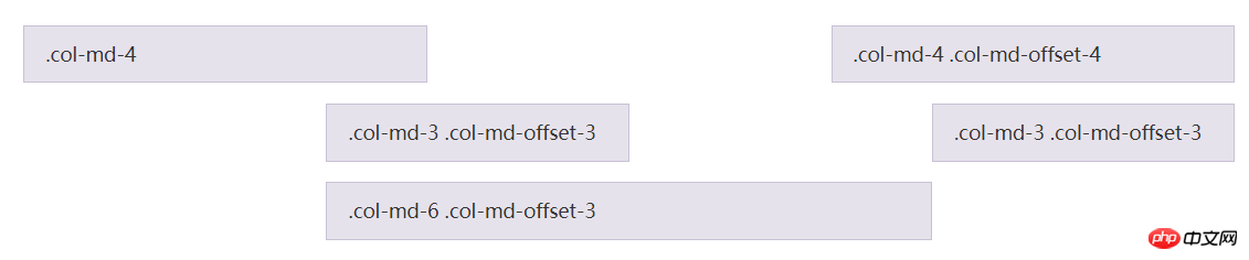
3.4列偏移
使用 .col-md-offset-* 类可以将列向右侧偏移。这些类实际是通过使用 * 选择器为当前元素增加了左侧的边距(margin)。例如,.col-md-offset-4 类将 .col-md-4 元素向右侧偏移了4个列(column)的宽度。
<p class="row">
 <p class="col-md-4">.col-md-4</p>
 <p class="col-md-4 col-md-offset-4">.col-md-4 .col-md-offset-4</p>
</p>
<p class="row">
 <p class="col-md-3 col-md-offset-3">.col-md-3 .col-md-offset-3</p>
 <p class="col-md-3 col-md-offset-3">.col-md-3 .col-md-offset-3</p>
</p>
<p class="row">
 <p class="col-md-6 col-md-offset-3">.col-md-6 .col-md-offset-3</p>
</p>
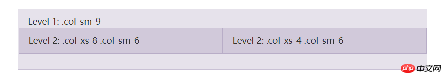
3.5嵌套列
为了使用内置的栅格系统将内容再次嵌套,可以通过添加一个新的 .row 元素和一系列 .col-sm-* 元素到已经存在的 .col-sm-* 元素内。被嵌套的行(row)所包含的列(column)的个数不能超过12(其实,没有要求你必须占满12列)。
<p class="row">
 <p class="col-sm-9">
 Level 1: .col-sm-9
 <p class="row">
 <p class="col-xs-8 col-sm-6">
 Level 2: .col-xs-8 .col-sm-6
 </p>
 <p class="col-xs-4 col-sm-6">
 Level 2: .col-xs-4 .col-sm-6
 </p>
 </p>
 </p>
</p>
3.6列排序
通过使用 .col-md-push-* 和 .col-md-pull-* 类就可以很容易的改变列(column)的顺序。
<p class="row">
 <p class="col-md-9 col-md-push-3">.col-md-9 .col-md-push-3</p>
 <p class="col-md-3 col-md-pull-9">.col-md-3 .col-md-pull-9</p>
</p>

相关推荐:
Ce qui précède est le contenu détaillé de. pour plus d'informations, suivez d'autres articles connexes sur le site Web de PHP en chinois!