
Maison >interface Web >js tutoriel >Exemples pour expliquer le système de grille Bootstrap du framework réactif
Exemples pour expliquer le système de grille Bootstrap du framework réactif

- PHPzoriginal
- 2017-12-20 09:05:002119parcourir
Système de grille Le système de grille est appelé « systèmes de grille » en anglais, et certaines personnes le traduisent par « système de grille ». Il utilise une grille fixe pour concevoir la mise en page. Son style est soigné et concis. Il est devenu très populaire après World. War II et est devenu une publication populaire dans l'industrie de l'édition actuelle. L'un des styles dominants de conception d'objets. Cet article partage principalement avec vous un exemple du système de grille Bootstrap du framework réactif. Il a une bonne valeur de référence et j'espère qu'il sera utile à tout le monde. Suivons l'éditeur et jetons un œil. J'espère que cela pourra aider tout le monde.
[Recommandations vidéo associées : Tutoriel Bootstrap]
L'exemple est le suivant :
<!DOCTYPE html>
<html>
<head lang="en">
<meta charset="UTF-8">
<title></title>
<meta name="viewport" content="width=device-width, initial-scale=1">
<link rel="stylesheet" href="css/bootstrap.min.css" rel="external nofollow" />
<script language="JavaScript" src="js/jquery-3.js"></script>
<style type="text/css">
*{
top: 0px;
padding: 0px;
text-decoration: none;
list-style-type: none;
}
.top-styl{
height: 50px;
border: 1px solid red;
background-color: #000000;
}
.img-styl{
width: 174px;
height: 50px;
background: url("imges/logo.png")no-repeat 0px 3px;
background-size: contain;
float: left;
}
.sousuo-styl{
width: 187px;
float: left;
}
.top-search-input{
width: 150px;
padding: 0 5px;
height: 30px;
border: 0;
background: #363636;
float: left;
color: #ccc;
}
.top-search-submit{
width: 30px;
height: 30px;
border: 0;
background: green url("imges/zoom.gif")center center no-repeat;
float: left;
cursor: pointer; //光标指针
}
.dao-styll{
float: left;
font-size: 16px;
width: 329px;
margin-left: 33px;
margin-top: 11px;
}
.dao-styll li{
float: left;
position: relative; //相对定位
text-align: center;
padding: 0 7px;
}
.dao-styll >li:hover{
background-color: #999;
}
.dao-styll >li >a{
color: #FFF;
width: 100%;
height: 34px;
text-decoration: none; //取消下划线
}
.dz-styl{
float: right;
margin: -19px -9px 6px 21px;
}
.imgs-styl{
padding: 11px 0px 0px 114px;
float: right;
margin: 0px -98px -3px 8px;
}
.green-styl{
color: green;
}
.zc-styl{
color: white;
}
a{
text-decoration: none;
}
</style>
</head>
<body>
<p class="container-fluid"> //fluid表示用 百分比
<p class="row"> //row 行
<p class="top-styl col-md-12"> //col-md-12 每行桌面占12列
<p class="row">
<p class=" col-md-offset-1 col-md-9"> //col-md-offset-1 列偏移1列
<p class="row">
<p class="col-md-3 col-xs-4">
<p class="img-styl"></p>
</p>
<p class="col-md-3 ">
<p class="sousuo-styl" style="padding-left: 7px; margin: 8px auto;">
<input class="top-search-input" value="" type="text"><input
class="top-search-submit" type="submit" value="" />
</p>
</p>
<p class="col-md-4 hidden-xs" style="padding: 0px">
<ul class="dao-styll">
<li class=""><a href="#" rel="external nofollow" rel="external nofollow" rel="external nofollow" rel="external nofollow" rel="external nofollow" rel="external nofollow" >风格</a>
</li>
<li class=""><a href="#" rel="external nofollow" rel="external nofollow" rel="external nofollow" rel="external nofollow" rel="external nofollow" rel="external nofollow" >造型师</a></li>
<li class=""><a href="#" rel="external nofollow" rel="external nofollow" rel="external nofollow" rel="external nofollow" rel="external nofollow" rel="external nofollow" >众分享</a>
</li>
<li class=""><a href="#" rel="external nofollow" rel="external nofollow" rel="external nofollow" rel="external nofollow" rel="external nofollow" rel="external nofollow" >我的美丽衣橱</a></li>
</ul>
</p>
<p class="col-md-2">
<p class="imgs-styl">
<img src="imges/sina.gif">
</p>
<p class="dz-styl">
<span><a href="#" rel="external nofollow" rel="external nofollow" rel="external nofollow" rel="external nofollow" rel="external nofollow" rel="external nofollow" class="green-styl">登录</a> | </span><span>
<a href="#" rel="external nofollow" rel="external nofollow" rel="external nofollow" rel="external nofollow" rel="external nofollow" rel="external nofollow" class="zc-styl">注册</a></span>
</p>
</p>
</p>
</p>
</p>
</p>
</p>
<p class="row">
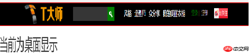
<p class="visible-md"><h1>当前为桌面显示</h1></p> //visible默认占满整行
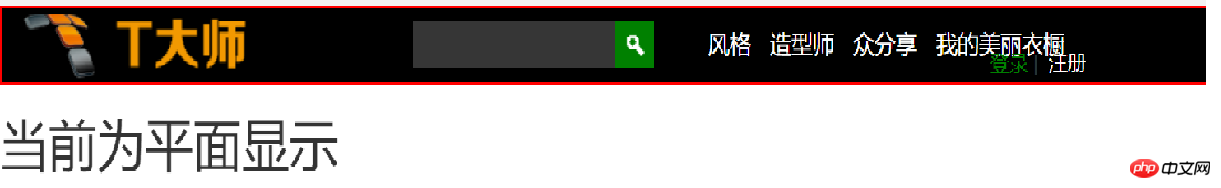
<p class="visible-sm"><h1>当前为平面显示</h1></p>
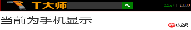
<p class="visible-xs"><h1>当前为手机显示</h1></p>
</p>
</p>
</body>
</html>
Affichage de l'effet :
Recommandations associées :
Notes d'étude du système de grille Bootstrap
Apprenez à utiliser la grille bootstrap3 compétences system_javascript
Ce qui précède est le contenu détaillé de. pour plus d'informations, suivez d'autres articles connexes sur le site Web de PHP en chinois!