Home >Software Tutorial >Office Software >How to make a mountain column chart in PPT_This operation will make your chart look taller
How to make a mountain column chart in PPT_This operation will make your chart look taller
- WBOYWBOYWBOYWBOYWBOYWBOYWBOYWBOYWBOYWBOYWBOYWBOYWBforward
- 2024-04-26 11:30:11847browse
Want to create impressive charts? The mountain column chart in PPT can perfectly meet your needs! PHP editor Yuzai will show you a simple and easy-to-understand method to help you easily create a mountain histogram to make your presentation more eye-catching. Read on for detailed steps below to learn how to make your charts stand out and become a feast for the eyes.
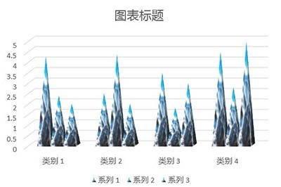
First we insert a 3D column chart.
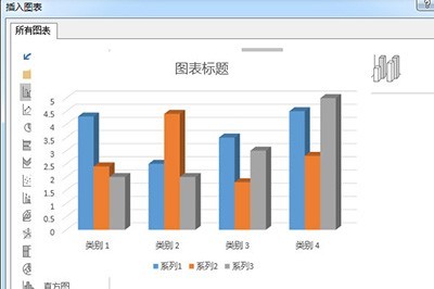
#Right-click to set the data series format, select [Series Options], and select [Complete Concave Cone] for the cylinder shape.
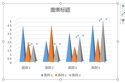
#Then we insert a picture material of a mountain peak and insert a triangle on the picture.
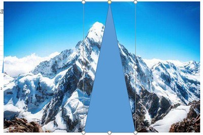
After that, we first select the picture, then select the triangle, and select [Merge Shapes]-[Intersect] in [Drawing Tool Format], so that the triangle will have the effect of a mountain peak. .
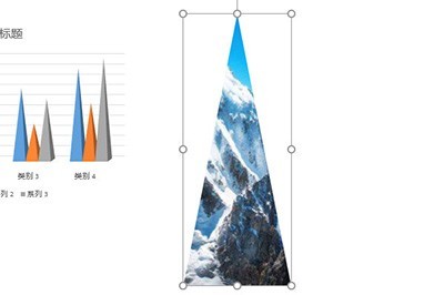
Finally cut this triangle, select the column chart, right-click to set the format, fill the selected picture or texture fill, and fill the inserted picture from the selected clipboard. In this way, a column chart with a mountainous effect is created. Isn’t it very beautiful?
The above is the detailed content of How to make a mountain column chart in PPT_This operation will make your chart look taller. For more information, please follow other related articles on the PHP Chinese website!

