Home >Software Tutorial >Office Software >How to set XY axis in Excel table_Excel table setting XY axis operation tutorial
How to set XY axis in Excel table_Excel table setting XY axis operation tutorial
- WBOYWBOYWBOYWBOYWBOYWBOYWBOYWBOYWBOYWBOYWBOYWBOYWBforward
- 2024-04-25 10:01:381035browse
When working with Excel charts, setting up the XY axis is crucial to presenting the data clearly. PHP editor Xigua will introduce you in detail the steps to set the XY axis in the Excel table to help you master this practical skill and create more professional and easy-to-understand charts. Read on below for step-by-step guidance and practical tips.
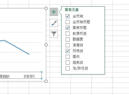
First we insert a chart, then click the icon, and in the button that appears on the right, select the first add chart element, and we check [Coordinate Axis], so that the XY coordinate axis will appear.

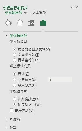
Then we double-click the coordinate axis, and [Set Axis Format] will appear on the right. You can adjust the style of the coordinate axis.

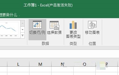
If necessary, you can also add axis titles. If you want to replace the coordinate system, you can click [Switch Rows/Columns] above to quickly switch the display of the XY axis.

The above is the detailed content of How to set XY axis in Excel table_Excel table setting XY axis operation tutorial. For more information, please follow other related articles on the PHP Chinese website!

