Home >Web Front-end >CSS Tutorial >It's time to celebrate the New Year, use CSS to achieve a festive lantern animation effect!
It's time to celebrate the New Year, use CSS to achieve a festive lantern animation effect!
- 青灯夜游forward
- 2022-01-10 19:33:492928browse
It’s time to celebrate the New Year. The following article will show you how to draw a lantern with CSS and add animation effects to achieve the effect of the lantern swinging left and right. I hope it will be helpful to everyone!

It’s the New Year~ It’s the New Year~ It’s the New Year~
Say goodbye to the old and welcome the New Year, it’s the Spring Festival with lanterns and colorful decorations~
The golden rooster dances to send Blessings are coming in the new year~
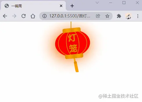
The first few lyrics of the article suddenly seem festive. No, our lanterns look like this.

animation attribute
Drawing a lantern We definitely cannot draw a static lantern. Let’s first review the animation attribute in CSS. , which is a shorthand attribute consisting of animation-name, animation-duration, animation-timing-function, animation-delay , animation-iteration-count, animation-direction, animation-fill-mode and animation-play-state attributes. We won’t explain it here. You can learn more about it in MDN.
Let’s first take a look at the following example:
animation: swing 3s infinite ease-in-out;
In the above example, an animation sequence named swing is used. The animation sequence passes @ keyframes is created, the execution time is 3s, the animation is executed in a loop, and the last ease-in-out indicates the rhythm of animation execution.
Implementation Idea
Add
border-radiusto a rectangle to form the shape of a lantern.Add
::beforeand::afterto the rectangle to form the top and head of the lanternDraw a lantern line.
Add two thinner rectangles inside the rectangle, and form the lines of the lantern by adding border-radius.
Set the animation effect of the lantern
Add the style of the lamp spike
Next we will Implemented in steps.
Drawing the shape of the lantern
First we define the HTML structure, the code is as follows:
<!-- 灯笼容器 -->
<div class="lantern-con">
  <!-- 提着灯笼的线 -->
  <div class="lantern-line"></div>
  <!-- 灯笼主要区域 -->
  <div class="lantern-light">
  </div>
</div>
Then we draw an ellipse, and then pass ::before and ::after, draw the upper and lower lantern covers, the CSS is as follows:
/* 灯笼容器 */
.lantern-con {
  position: fixed;
  left: 160px;
}

/* 灯笼中间红色区域 */
.lantern-light {
  position: relative;
  width: 120px;
  height: 90px;
  background-color: red;
  margin: 30px;
  border-radius: 50%;
  box-shadow: -5px 5px 50px 4px #fa6c00;
  /* 设置旋转点 */
  transform-origin: top center;
  animation: swing 3s infinite ease-in-out;
}

/* 灯笼顶部和底部的样式 */
.lantern-light::before,
.lantern-light::after {
  content: '';
  position: absolute;
  border: 1px solid #dc8f03;
  width: 60px;
  height: 12px;
  /* 背景渐变 */
  background: linear-gradient(
    to right,
    #dc8f03,
    #ffa500,
    #dc8f03,
    #ffa500,
    #dc8f03
  );
  left: 30px;
}

/* 顶部位置 */
.lantern-light::before {
  top: -7px;
  border-top-left-radius: 5px;
  border-top-right-radius: 5px;
}

/* 底部位置 */
.lantern-light::after {
  bottom: -7px;
  border-bottom-left-radius: 5px;
  border-bottom-right-radius: 5px;
}

/* 提着灯笼的线的样式 */
.lantern-line {
  width: 2px;
  height: 50px;
  background-color: #dc8f03;
  position: absolute;
  left: 88px;
}
/* 灯笼的动画效果 */
@keyframes swing {
  0% {
    transform: rotate(-6deg);
  }

  50% {
    transform: rotate(6deg);
  }

  100% {
    transform: rotate(-6deg);
  }
}
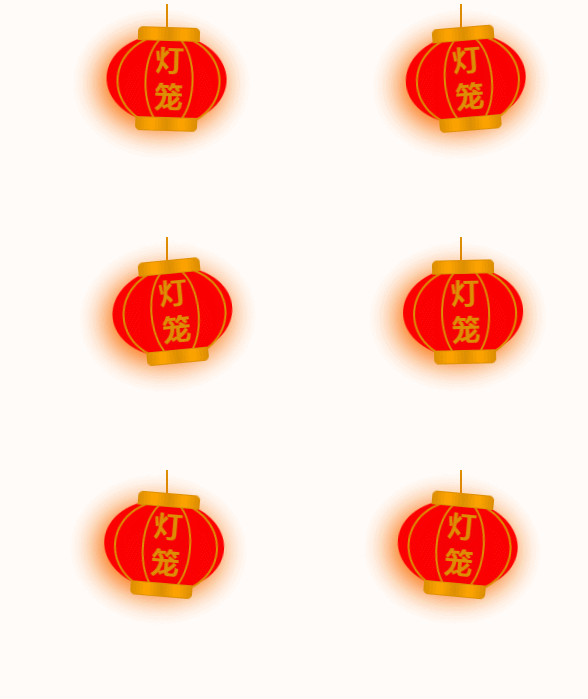
Now a relatively basic lantern shape has been implemented, the effect is as follows:

Internal lines of the lantern
The internal lines of the lantern are realized through two rectangles. Set it to an ellipse through the border-radius property, and then draw the edges to present the lantern lines. .
<div class="lantern-light">
  <!-- 灯笼中间的线条 -->
  <div class="lantern-circle">
    <div class="lantern-rect">
      <!-- 灯笼中间的文字内容 -->
      <div class="lantern-text">灯笼</div>
    </div>
  </div>
</div>
The corresponding CSS is as follows:
/* 灯笼中间的线条 */
.lantern-circle,
.lantern-rect {
  height: 90px;
  border-radius: 50%;
  border: 2px solid #dc8f03;
  background-color: rgba(216, 0, 15, 0.1);
}

/* 外层 */
.lantern-circle {
  width: 100px;
  margin: 12px 8px 8px 10px;
}

/* 内层 */
.lantern-rect {
  margin: -2px 8px 8px 26px;
  width: 45px;
}

/* 文字样式 */
.lantern-text {
  font-size: 28px;
  font-weight: bold;
  text-align: center;
  color: #dc8f03;
  margin-top: 4px;
}
The effect is as follows:

Lantern Spike
Now let’s draw it Lantern spike, this thing is relatively simple. The most important thing is to add an animation effect. Its HTML structure is as follows:
<!-- 灯笼主要区域 -->
<div class="lantern-light">
  <!-- more code -->
  <!-- 灯笼穗 -->
  <div class="lantern-tassel-top">
    <div class="lantern-tassel-middle"></div>
    <div class="lantern-tassel-bottom"></div>
  </div>
</div>
CSS is as follows:
/* 灯穗 */
.lantern-tassel-top {
  width: 5px;
  height: 20px;
  background-color: #ffa500;
  border-radius: 0 0 5px 5px;
  position: relative;
  margin: -5px 0 0 59px;
  /* 让灯穗也有一个动画效果 */
  animation: swing 3s infinite ease-in-out;
}

.lantern-tassel-middle,
.lantern-tassel-bottom {
  position: absolute;
  width: 10px;
  left: -2px;
}

.lantern-tassel-middle {
  border-radius: 50%;
  top: 14px;
  height: 10px;
  background-color: #dc8f03;
  z-index: 2;
}

.lantern-tassel-bottom {
  background-color: #ffa500;
  border-bottom-left-radius: 5px;
  height: 35px;
  top: 18px;
  z-index: 1;
}
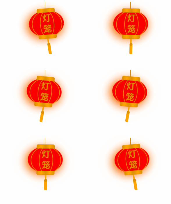
At this point we have finished drawing this lantern.

(Learning video sharing: css video tutorial)
The above is the detailed content of It's time to celebrate the New Year, use CSS to achieve a festive lantern animation effect!. For more information, please follow other related articles on the PHP Chinese website!
Related articles
See more- What does repeat mean in css
- How CSS implements absolute positioning and centering technology for horizontal and vertical centering
- 13 commonly used CSS font style attributes, which ones do you know?
- Use CSS to implement a Pac-Man Loading effect
- How to understand CSS preprocessors, postprocessors and selectors

