Home >Web Front-end >CSS Tutorial >Use pure CSS to achieve the animation effect of rotating React icons
Use pure CSS to achieve the animation effect of rotating React icons
- 青灯夜游forward
- 2022-01-06 10:32:412768browse
This article will take you step by step to use pure CSS to achieve the animation effect of rotating React icons. I hope it will be helpful to everyone!

剑气 loading effect in codepen. He was greatly surprised and was ## again. #CSS Impressed. I originally wanted to work with everyone to realize 剑气 loading. After searching, Xiaobao found that Mr. Xiao Lu had achieved it, so he stopped trying to do it. Is Xiao Bao a person who can be convinced? of course!
Xiao Bao racked his brains and came up with a very interesting pattern, which is simply the Jianqi
plus version.
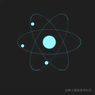
react Icon, so amazing, isn’t this Sword Qiplus? react Let the small package move*!

reacthttps://zcxiaobao.github .io/zc-demos/display/reactMoveLoading/index.html
react icon drawing
Everyone should be familiar with the icon, which consists of three identical icons. It consists of an ellipse and a central circle. Ellipses and circles are implemented using border-radius.
- html
-
<div class="react">
    <div class="electron"></div>
    <div class="electron-alpha"></div>
    <div class="electron-omega"></div>
</div>
.react > [class^="electron"] {
    border: #5ed3f3 solid 2px;
    border-radius: 100%;
    width: 100%;
    /* CSS变量 --electron-orbit-size值为72px */
    height: var(--electron-orbit-size);
}
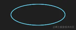
- 60deg
- and
-60deg## respectively#<pre class="brush:js;toolbar:false;">.electron-alpha { transform: rotate(60deg); } .electron-omega { transform: rotate(-60deg); }</pre>Use
- pseudo-element to draw the center circle, and use absolute positioning to position the center circle to the center.
- react
The icon drawing is completed.<pre class="brush:css;toolbar:false;">.react:before { position: absolute; top: 50%; left: 50%; width: var(--nucleus-size); height: var(--nucleus-size); margin-top: calc(var(--nucleus-size) / -2); margin-left: calc(var(--nucleus-size) / -2); background: var(--electron-color-hex); } .react > [class^="electron"] { position: absolute; top: 50%; margin-top: calc(var(--electron-orbit-size) / -2); }</pre>
react icon animation design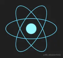
The number of days is fifty, Dao Yan is forty-nine, there is still a glimmer of hope, and it may be missing. It will form a special beauty.
Assume that the starting state isSo let’s try to remove part of the ellipse to see if it will create a cool dynamic effect?
border-left
is missing, and then it is missing in the order ofleft,bottom,right,top. Let’s take a look at the animation effect. Set animation
- Switch missing edges in order
<pre class="brush:css;toolbar:false;">@keyframes electron-orbit {
  0% {
    border-top: rgba(94, 211, 243, 1) solid 2px;
    border-right: rgba(94, 211, 243, 1) solid 2px;
    border-bottom: rgba(94, 211, 243, 1) solid 2px;
    border-left: rgba(94, 211, 243, 0) solid 2px;
  }
  25% {
    border-top: rgba(94, 211, 243, 1) solid 2px;
    border-right: rgba(94, 211, 243, 1) solid 2px;
    border-bottom: rgba(94, 211, 243, 0) solid 2px;
    border-left: rgba(94, 211, 243, 1) solid 2px;
  }
  50% {
    border-top: rgba(94, 211, 243, 1) solid 1px;
    border-right: rgba(94, 211, 243, 0) solid 2px;
    border-bottom: rgba(94, 211, 243, 1) solid 4px;
    border-left: rgba(94, 211, 243, 1) solid 2px;
  }
  75% {
    border-top: rgba(94, 211, 243, 0) solid 2px;
    border-right: rgba(94, 211, 243, 1) solid 2px;
    border-bottom: rgba(94, 211, 243, 1) solid 2px;
    border-left: rgba(94, 211, 243, 1) solid 2px;
  }
  100% {
    border-top: rgba(94, 211, 243, 1) solid 2px;
    border-right: rgba(94, 211, 243, 1) solid 2px;
    border-bottom: rgba(94, 211, 243, 1) solid 2px;
    border-left: rgba(94, 211, 243, 0) solid 2px;
  }
}</pre>
The overall effect of animation is still OK , but because the missing part is from 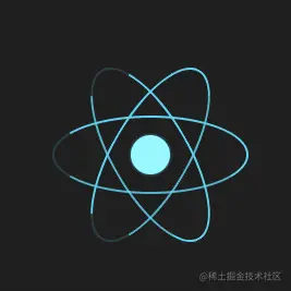 0 -> 1
Reduce the transparency of the display side, respectively
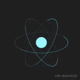
4px 2px 1px 0px
1.2s 1s 0.8s
 Only the line animation is still a bit monotonous. Continue to optimize and add small balls to the missing parts. The small balls move with the missing parts, and the small balls are also accompanied by a zooming-in effect.
@keyframes electron {
  0% {
    left: calc(var(--electron-size) / -1);
    transform: scale(1);
  }
  12.5% {
    top: 100%;
    transform: scale(1.5);
  }
  25% {
    left: 100%;
    transform: scale(1);
  }
  37.5% {
    top: 0%;
    transform: scale(0.25);
  }
  50% {
    left: calc(var(--electron-size) / -1);
    transform: scale(1);
  }
  62.5% {
    top: 100%;
    transform: scale(1.5);
  }
  75% {
    left: 100%;
    transform: scale(1);
  }
  87.5% {
    top: 0%;
    transform: scale(0.25);
  }
  100% {
    left: calc(var(--electron-size) / -1);
    transform: scale(1);
  }
}
How about it, does it look like something is done? Don’t worry, there is one last step, let’s make the icon move.  The icon moves
Add rotation, shrinking and zooming animations to the entire icon to complete the final
react loadingeffect
@keyframes react {
  0% {
    transform: rotate(0deg) scale(1);
  }
  12.5% {
    transform: rotate(-45deg) scale(0.9);
  }
  25% {
    transform: rotate(-90deg) scale(1);
  }
  37.5% {
    transform: rotate(-135deg) scale(0.9);
  }
  50% {
    transform: rotate(-180deg) scale(1);
  }
  62.5% {
    transform: rotate(-225deg) scale(0.9);
  }
  75% {
    transform: rotate(-270deg) scale(1);
  }
  87.5% {
    transform: rotate(-315deg) scale(0.9);
  }
  100% {
    transform: rotate(-360deg) scale(1);
  }
}https://zcxiaobao.github.io/zc-demos/display/reactMoveLoading/index.htmlProject address: react
Don’t forget to order a small bag if you find it helpful.(Learning video sharing: css video tutorial)
The above is the detailed content of Use pure CSS to achieve the animation effect of rotating React icons. For more information, please follow other related articles on the PHP Chinese website!
Related articles
See more- Take a look at how to achieve the dynamic effect of the revolving door of pictures using CSS?
- How CSS implements absolute positioning and centering technology for horizontal and vertical centering
- The fuzzy and grainy smoke effect can also be achieved with pure CSS!
- 13 commonly used CSS font style attributes, which ones do you know?
- Use CSS to implement a Pac-Man Loading effect
- How to understand CSS preprocessors, postprocessors and selectors

