Home >Web Front-end >CSS Tutorial >Use CSS to implement a Pac-Man Loading effect
Use CSS to implement a Pac-Man Loading effect
- 青灯夜游forward
- 2022-01-05 10:18:182723browse
This article will introduce to you how to use pure CSS to achieve the loading effect of Pac-Man. I hope it will be helpful to everyone!

CSS is indeed incredibly charming. Maybe those who have followed my articles recently will know that I have published a lot of articles related to CSS, and some of them have been seen on the Internet. This kind of effect can be reproduced by oneself. Some of them use a knowledge point that they have just seen and use it to make some fun things. In short, CSS is really fun!
The performance I bring to you today, the creativity originated from the friend link page of my blog. If I can't request resources for other people's avatars, then I will add a Pac-Man 's Loading goes up, and this Pac-Man is the performance I brought today~

realizes Pac-Man's Big Mouth
Let’s first realize the big mouth on the left. I used two things of this shape. After that, I gave the one below margin-top:-50px, The two are overlapping, and then the animation effect is used to rotate the top clockwise and the bottom in the opposite direction. By rotating 90°, the mouth can open and close.

    width: 0px;
    height: 0px;
    border-right: 25px solid transparent;
    border-top: 25px solid #279fcf;
    border-left: 25px solid #279fcf;
    border-bottom: 25px solid #279fcf;
    border-radius: 25px;
The rotation animations are:
@keyframes rotate_pacman_up {
  0% {
    -webkit-transform: rotate(270deg);
            transform: rotate(270deg); }

  50% {
    -webkit-transform: rotate(360deg);
            transform: rotate(360deg); }

  100% {
    -webkit-transform: rotate(270deg);
            transform: rotate(270deg); }
}
@keyframes rotate_pacman_down {
0% {
-webkit-transform: rotate(90deg);
transform: rotate(90deg);
}
50% {
-webkit-transform: rotate(0deg);
transform: rotate(0deg);
}
100% {
-webkit-transform: rotate(90deg);
transform: rotate(90deg);
}
}Then add the animation to the css of the two elements we just generated (use this attribute Just: animation), because I used div with div, so I used pseudo elements to select: respectively first-of -type and nth-child(2), selected the first and second div as Pac-Man's mouth.
It should be noted that the animation time of the two mouths must be synchronized, otherwise the mouth will move up and down:
animation: rotate_pacman_up 0.75s 0s infinite
The current effect is like this:

Implementing Pac-Man’s beans
Similarly, we built three more divs at the same level as the two div , I really like div~
Everything can be div! ! !
The bean is very simple compared to the mouth. First of all, it is round, and secondly, its animation moves to the left. If these two conditions are met, it will be fine. We directly use pseudo elements to select three div, 3, 4, and 5, and add this css.
    background-color: #279fcf;
    width: 15px;
    height: 15px;
    border-radius: 100%;
    margin: 2px;
    width: 10px;
    height: 10px;
    position: absolute;
    transform: translate(0, -6.25px);
    top: 25px;
    left: 100px;
Will anyone ask: Why do you know that the positioning is
-6.25px?, the last explanation is the last explanation.
Next, add the animation of moving to the left:
@keyframes pacman-balls {
  75% {
    opacity: 0.7; }

  100% {
    -webkit-transform: translate(-100px, -6.25px);
            transform: translate(-100px, -6.25px); }
}
It seems that it would be better if it becomes more transparent for a while? This needs to be considered~
Finally, just use the selector to hang the animation on the 3rd, 4th, and 5th div. At the same time, be careful not to set the starting time of the animation to the same , otherwise they would be synchronized! ! ! The settings I set here are 0.33/0.66/0.99 seconds respectively~
Like this:
animation: pacman-balls 1s 0.33/0.66/0.99s infinite linear
Let’s take a look at the final effect~

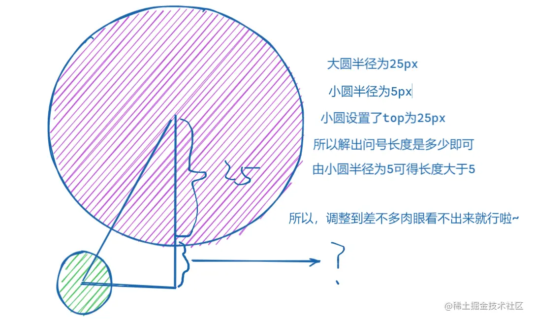
About that-6.25px
Actually...I After studying for a long time, I gave the picture to everyone. If you can calculate it, please help me calculate it. I finally got it through experiments. 6 to 7 are almost the same, but 6.25 is more pleasing to the eye. But when the experiment reached 7px, Xiao Yuan The center of the circle is obviously a little higher, so emm is 6.25 (almost~, and I want to write 6.5, but I always think 6.25 sounds better emm).

(Learning video sharing: css video tutorial)
The above is the detailed content of Use CSS to implement a Pac-Man Loading effect. For more information, please follow other related articles on the PHP Chinese website!
Related articles
See more- The global CSS report at the end of 2021 is freshly released. Let's take a look at the latest developments in CSS!
- You must understand the 20,000-word CSS technology that the backend must also know
- Take a look at how to achieve the dynamic effect of the revolving door of pictures using CSS?
- How CSS implements absolute positioning and centering technology for horizontal and vertical centering
- The fuzzy and grainy smoke effect can also be achieved with pure CSS!
- 13 commonly used CSS font style attributes, which ones do you know?

