Home >Web Front-end >CSS Tutorial >Explanation of steps for flex layout in css (with code)
Explanation of steps for flex layout in css (with code)
- 不言forward
- 2018-10-18 15:44:402507browse
The content of this article is about the steps of flex elastic layout in CSS (with code). It has certain reference value. Friends in need can refer to it. I hope it will be helpful to you.
html:
nbsp;html>


        <meta>
        <meta>
        <title></title>
        <style>
            *{
                margin: 0;
                padding: 0;
                box-sizing: border-box;
            }
            .wrap{
                width: 300px;
                height: 300px;
                display: flex;
                flex-direction: row; /*默认主轴方向水平向右*/
                flex-direction: row-reverse;  /*可选主轴方向水平向左*/
                /* flex-direction: column; */  /*可选主轴方向垂直向下*/
                /* flex-direction: column-reverse; */ /*可选主轴方向垂直向上*/

                flex-wrap: wrap;  /*默认侧轴方向与主轴垂直方向向下或者右*/
                /* flex-wrap: wrap-reverse; */ /*可选侧轴方向与主轴垂直方向向上或者左*/
            }
            .wrap div{
                background: skyblue;
                text-align: center;
                line-height: 100px;
                width: 100px;
                height: 100px;
                border: bisque 1px solid;
            }
        </style>


        <div>
            <div>0</div>
            <div>1</div>
            <div>2</div>
            <div>3</div>
            <div>4</div>
            <div>5</div>
            <div>6</div>
            <div>7</div>
            <div>8</div>
        </div>
Step 1: First set display: flex; for the parent container, which means using flex elastic layout
Step 2: Set the main axis direction
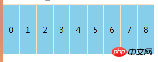
①flex -direction: row; (default parameter) the main axis direction is horizontally to the right, the result is as shown:

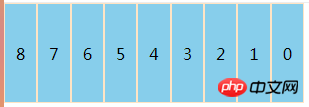
##②flex-direction: row-reverse; (optional parameter) the main axis direction is horizontally to the left, the result is as shown in the figure:

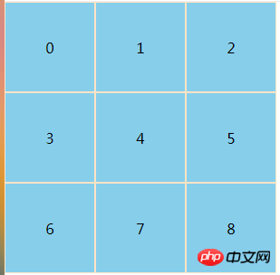
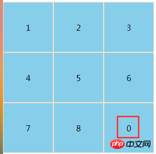
 ##②flex- wrap: wrap-reverse; The optional direction of the side axis is upward or left perpendicular to the main axis. The result is brainstorming
Note: The direction of the side axis changes with the main axis, and the main axis is always relative to the side axis. Vertical, the direction of the two axes defaults to the right and down
Other property settings:
flex-flow:
order:number scalable item, for example, add an order: 1 to a sub-container. The default order of all sub-containers is 0. When we set the order of the first container to 1, something similar to Sorting effect
 ##justify-content:flex-start(default)||flex-end||center||space-between||space -around scalable container
The above is the detailed content of Explanation of steps for flex layout in css (with code). For more information, please follow other related articles on the PHP Chinese website!
Related articles
See more- Detailed introduction to flexible layout (Flex layout)
- Detailed explanation of content alignment method when using CSS3 for flexible layout
- About the flexible layout of css flex
- What is Flexible Layout? Basic application of flexible layout flex (with code)
- Recommended flex layout video tutorials: 5 latest flex elastic layout video tutorials in 2021

