 Web Front-end
 H5 Tutorial
 Detailed explanation of content alignment method when using CSS3 for flexible layout
Detailed explanation of content alignment method when using CSS3 for flexible layout
This article mainly introduces the detailed use of CSS3 elastic layout content alignment (justify-content) attribute, which has certain reference value. If you are interested, you can learn about the
content alignment (justify-content) attribute application. On the flex container, align the flex items along the main axis of the flex container.
This operation occurs after the elastic length and automatic margins are determined. It is used to allocate remaining space when it exists, and also affects the alignment of items when content overflows.
Note: There are two basic terms main axis and cross axis in elastic layout. Generally speaking, we can regard them as the row direction and column direction on the screen (but Strictly speaking, this is related to the write mode and the elastic flow direction).
Then main-start and main-end can be regarded as the left and right sides of the elastic container respectively.
justify-content syntax is as follows:
justify-content: flex-start | flex-end | center | space-between | space-around
The parameter description is as follows:
flex-start
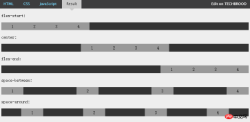
Flex items are filled next to each other toward the beginning of the line. This is the default value. The main-start margin edge of the first flex item is placed on the main-start edge of the row, and subsequent flex items are placed flush in sequence.
flex-end
Flex items are filled next to the end of the line. The main-end margin edge of the first flex item is placed on the main-end edge of the row, and subsequent flex items are placed flush in sequence.
center
The flex item is centered next to the padding. (If the remaining free space is negative, the flex items will overflow in both directions).
space-between
Flex items are evenly distributed across the row. If the remaining space is negative or there is only one flex item, this value is equivalent to flex-start. Otherwise, the margins of the first flex item are aligned with the main-start edge of the row, and the margins of the last flex item are aligned with the main-end edge of the row, and then the remaining flex items are distributed on the row, adjacent to each other. Items are equally spaced.
space-around
Flex items are evenly distributed on the row, leaving half the space on either side. If the remaining space is negative or there is only one flex item, this value is equivalent to center. Otherwise, the flex items are distributed along the row with equal intervals between each other (for example, 20px), while leaving half the space between the first and last sides and the flex container (1/2*20px=10px).
Justify-content attribute value effect example

The above figure intuitively demonstrates the effects and differences of the above five values.
The above is the detailed content of Detailed explanation of content alignment method when using CSS3 for flexible layout. For more information, please follow other related articles on the PHP Chinese website!
 H5 and HTML5: Commonly Used Terms in Web DevelopmentApr 13, 2025 am 12:01 AM
H5 and HTML5 refer to the same thing, namely HTML5. HTML5 is the fifth version of HTML, bringing new features such as semantic tags, multimedia support, canvas and graphics, offline storage and local storage, improving the expressiveness and interactivity of web pages.
 What Does H5 Refer To? Exploring the ContextApr 12, 2025 am 12:03 AM
H5referstoHTML5,apivotaltechnologyinwebdevelopment.1)HTML5introducesnewelementsandAPIsforrich,dynamicwebapplications.2)Itsupportsmultimediawithoutplugins,enhancinguserexperienceacrossdevices.3)SemanticelementsimprovecontentstructureandSEO.4)H5'srespo
 H5: Tools, Frameworks, and Best PracticesApr 11, 2025 am 12:11 AM
The tools and frameworks that need to be mastered in H5 development include Vue.js, React and Webpack. 1.Vue.js is suitable for building user interfaces and supports component development. 2.React optimizes page rendering through virtual DOM, suitable for complex applications. 3.Webpack is used for module packaging and optimize resource loading.
 The Legacy of HTML5: Understanding H5 in the PresentApr 10, 2025 am 09:28 AM
HTML5hassignificantlytransformedwebdevelopmentbyintroducingsemanticelements,enhancingmultimediasupport,andimprovingperformance.1)ItmadewebsitesmoreaccessibleandSEO-friendlywithsemanticelementslike,,and.2)HTML5introducednativeandtags,eliminatingthenee
 H5 Code: Accessibility and Semantic HTMLApr 09, 2025 am 12:05 AM
H5 improves web page accessibility and SEO effects through semantic elements and ARIA attributes. 1. Use, etc. to organize the content structure and improve SEO. 2. ARIA attributes such as aria-label enhance accessibility, and assistive technology users can use web pages smoothly.
 Is h5 same as HTML5?Apr 08, 2025 am 12:16 AM
"h5" and "HTML5" are the same in most cases, but they may have different meanings in certain specific scenarios. 1. "HTML5" is a W3C-defined standard that contains new tags and APIs. 2. "h5" is usually the abbreviation of HTML5, but in mobile development, it may refer to a framework based on HTML5. Understanding these differences helps to use these terms accurately in your project.
 What is the function of H5?Apr 07, 2025 am 12:10 AM
H5, or HTML5, is the fifth version of HTML. It provides developers with a stronger tool set, making it easier to create complex web applications. The core functions of H5 include: 1) elements that allow drawing graphics and animations on web pages; 2) semantic tags such as, etc. to make the web page structure clear and conducive to SEO optimization; 3) new APIs such as GeolocationAPI support location-based services; 4) Cross-browser compatibility needs to be ensured through compatibility testing and Polyfill library.
 How to do h5 linkApr 06, 2025 pm 12:39 PM
How to create an H5 link? Determine the link target: Get the URL of the H5 page or application. Create HTML anchors: Use the <a> tag to create an anchor and specify the link target URL. Set link properties (optional): Set target, title, and onclick properties as needed. Add to webpage: Add HTML anchor code to the webpage where you want the link to appear.


Hot AI Tools

Undresser.AI Undress
AI-powered app for creating realistic nude photos

AI Clothes Remover
Online AI tool for removing clothes from photos.

Undress AI Tool
Undress images for free

Clothoff.io
AI clothes remover

AI Hentai Generator
Generate AI Hentai for free.

Hot Article

Hot Tools

DVWA
Damn Vulnerable Web App (DVWA) is a PHP/MySQL web application that is very vulnerable. Its main goals are to be an aid for security professionals to test their skills and tools in a legal environment, to help web developers better understand the process of securing web applications, and to help teachers/students teach/learn in a classroom environment Web application security. The goal of DVWA is to practice some of the most common web vulnerabilities through a simple and straightforward interface, with varying degrees of difficulty. Please note that this software

VSCode Windows 64-bit Download
A free and powerful IDE editor launched by Microsoft

MinGW - Minimalist GNU for Windows
This project is in the process of being migrated to osdn.net/projects/mingw, you can continue to follow us there. MinGW: A native Windows port of the GNU Compiler Collection (GCC), freely distributable import libraries and header files for building native Windows applications; includes extensions to the MSVC runtime to support C99 functionality. All MinGW software can run on 64-bit Windows platforms.

ZendStudio 13.5.1 Mac
Powerful PHP integrated development environment

WebStorm Mac version
Useful JavaScript development tools


