Home >Web Front-end >HTML Tutorial >What is Flexible Layout? Basic application of flexible layout flex (with code)
What is Flexible Layout? Basic application of flexible layout flex (with code)
- 不言Original
- 2018-08-01 14:55:104531browse
What is elastic layout? Flexible layout (flex), as the name suggests, is a layout method. Nowadays, basically all browsers support flexible layout. So, what this article will share with you next is the basic application of flexible layout flex.
How to apply elastic layout, the code is as follows:
<!DOCTYPE html>
<html>
<head>
    <meta charset="UTF-8">
    <meta name="viewport" content="width=device-width, initial-scale=1.0">
    <meta http-equiv="X-UA-Compatible" content="ie=edge">
    <title>Document</title>
    <style>
        *{
            margin: 0;
            padding: 0;
        }
        div{
            border: 1px solid #ccc;
            box-sizing: border-box;
        }
        .box{
            height:20vh;
            display: flex;
        }
        .box div{
            flex: 1;
        }
        .box div:last-child{
            flex: 2;
        }
    </style>
</head>
<body>
    <div>
        <div>Document1</div>
        <div>Document2</div>
        <div>Document3</div>
        <div>Document4</div>
        <div>Document5</div>
    </div>
</body>
</html>
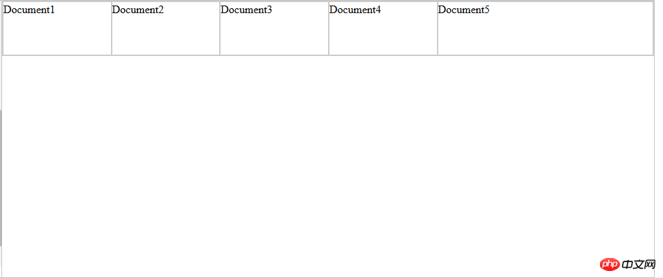
The running results are as follows:

Container settings
flex has 6 properties that can be set:
flex-direction:row (main axis from left to right, default) / row-reverse ( Main axis from right to left) / column (main axis from top to bottom) / column-reverse (main axis from bottom to top) Determine the direction of the main axis
flex-wrap:nowrap (default, no line wrap) / wrap (line wrap) ) / wrap-reverse (line wrap, first line below) determines the wrapping method when the items cannot be arranged on one axis
flex-flow: It is the abbreviation mode of the above two properties. The default value: flex-flow :row nowrap.
justify-content: flex-start (default, left-aligned) / flex-end (right-aligned) / center (center) / space-between (justified at both ends, equal spacing between items) /
space-around (the space between each item is equal, so the space between items is twice as large as the price between the item and the border); determines the alignment of the items on the main axis. space-between/around is useful when adaptively adjusting spacing
align-items: flex-start (alignment of the starting point of the cross axis) / flex-end (alignment of the end point of the cross axis) / center (alignment of the end point of the cross axis) Midpoint alignment)/baseline (baseline alignment of the first line of text of the item)/stretch (default value, if the item does not set a height or is set to auto, the item will fill the height of the entire container). Define the alignment of items on the cross axis
align-content: flex-start (aligned with the starting point of the cross axis) / flex-end (aligned with the end point of the cross axis) / center (aligned with the center of the cross axis) Point alignment) /
space-between (aligned with both ends of the cross axis, the intervals between the axes are evenly distributed) /space-around (the intervals on both sides of the axis are equal, so the spacing between the axes is ratio The distance between the axis and the border is doubled)
/ stretch (default value, the axis occupies the entire cross axis). Define the alignment of multiple axes. If the project has its own axis, this property will not work.
Project property settings
order: Define the order of items, The smaller the number, the higher it is arranged. The default is 0.
flex-grow: Defines the magnification ratio of the item. The default is 0. By default, the item will not be enlarged even if there is remaining space. The direction of scaling is the direction of flex-direction.
flex-shrink: Define the shrinkage ratio of the item. The default is 1. When there is insufficient space, the item will shrink. A value of 0 means no scaling. The direction of scaling is the direction of flex-direction.
flex-basis: Defines the main axis space (main size) occupied by the project before allocating excess space. The browser does not calculate whether there is excess space on the main axis based on this attribute. The default value is auto, which is the original size of the project. size. flex-basis: 80px; the width (direction is row) is set to 80px;
flex: is the abbreviation of the above three properties, the default value is 0 1 auto. There are two shortcut values: auto (1 1 auto ) and none (0 0 auto)
align-self: This attribute allows the alignment of delayed items to be different from other items, and overrides the attribute value of align-items. The default value is auto, which means inheriting the align-items attribute of the parent element, or stretch if there is no parent element.
align-self: auto/flex-start/flex-end/center/baseline/stretch flex-basis: The difference between the value 0 and auto (default): the former does not calculate the entire item, and then The other is calculated ignoring the content, so if the layout requires the percentage configuration of each item, flex-basis should be set to 0.
Related recommendations:
Introduction to flexible layout (Flex) in HTML (with code)
The above is the detailed content of What is Flexible Layout? Basic application of flexible layout flex (with code). For more information, please follow other related articles on the PHP Chinese website!

