Home >Web Front-end >CSS Tutorial >How to use pure CSS to implement a wandering jelly monster (source code attached)
How to use pure CSS to implement a wandering jelly monster (source code attached)
- 不言Original
- 2018-09-03 17:56:342025browse
The content of this article is about how to use pure CSS to realize the wandering jelly monster. It has certain reference value. Friends in need can refer to it. I hope it will be helpful to you.
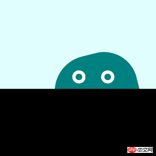
Effect preview

Source code download
https://github.com/comehope/front-end-daily-challenges
Code Interpretation
Define dom, the container contains 2 elements, representing the monster's body and eyes respectively:
<p>
    <span></span>
    <span></span>
</p>
Set the background color:
body {
    margin: 0;
    height: 100vh;
    background-color: black;
}
Settings Foreground color:
.monster {
    width: 100vw;
    height: 50vh;
    background-color: lightcyan;
}
Draw the monster’s body:
.monster {
    position: relative;
}

.body {
    position: absolute;
    width: 32vmin;
    height: 32vmin;
    background-color: teal;
    border-radius: 43% 40% 43% 40%;
    bottom: calc(-1 * 32vmin / 2 - 4vmin);
}
Define the container where the monster’s eyes are:
.eyes {
    width: 24vmin;
    height: 5vmin;
    position: absolute;
    bottom: 2vmin;
    left: calc(32vmin - 24vmin - 2vmin);
}
Draw the monster’s eyes using pseudo elements:
.eyes::before,
.eyes::after {
    content: '';
    position: absolute;
    width: 5vmin;
    height: 5vmin;
    border: 1.25vmin solid white;
    box-sizing: border-box;
    border-radius: 50%;
}

.eyes::before {
    left: 4vmin;
}

.eyes::after {
    right: 4vmin;
}
Define a gentle jumping animation for the monster, and combine it with the following animation effects to make it have the elasticity of jelly:
.body {
    animation:
        bounce 1s infinite alternate;
}

@keyframes bounce {
    to {
        bottom: calc(-1 * 32vmin / 2 - 2vmin);
    }
}
Let the monster's body rotate:
@keyframes wave {
    to {
        transform: rotate(360deg);
    }
}
Let the monster wander Walking:
.monster {
    overflow: hidden;
}

.body {
    left: -2vmin;
    animation:
        wander 5s linear infinite alternate,
        wave 3s linear infinite,
        bounce 1s infinite alternate;
}

.eyes {
    animation: wander 5s linear infinite alternate;
}

@keyframes wander {
    to {
        left: calc(100% - 32vmin + 2vmin);
    }
}
Finally, let the monster’s eyes blink:
.eyes::before,
.eyes::after {
    animation: blink 3s infinite linear;
}

@keyframes blink {
    4%, 10%, 34%, 40% {
        transform: scaleY(1);
    }

    7%, 37% {
        transform: scaleY(0);
    }
}
Done!
Related recommendations:
How to use pure CSS to achieve the animation effect of a person walking alone (source code attached)
How to use pure CSS Implement a paper crane (with source code)
The above is the detailed content of How to use pure CSS to implement a wandering jelly monster (source code attached). For more information, please follow other related articles on the PHP Chinese website!
Related articles
See more- How to use pure CSS to achieve the effect of a coffee machine
- How to use pure CSS to achieve the effect of a Saturn
- How to use pure CSS to achieve the effect of a green pig
- How to use pure CSS to realize a smiling and meditating little monk
- How to use pure CSS to achieve a moving white rabbit animation effect

