


The content of this article is about how to use pure CSS to realize a smiling and meditating little monk. It has certain reference value. Friends in need can refer to it. I hope it will be helpful to you.
Effect preview:

## Code interpretation:
Definition of dom , the several elements contained in the container represent the head, eyes, mouth, body and legs respectively:<p> </p><p></p> <p></p> <span></span> <span></span> <span></span> <span></span>Centered display:
body {
    margin: 0;
    height: 100vh;
    display: flex;
    align-items: center;
    justify-content: center;
    background: linear-gradient(white, bisque);
}
Define the size of the container and set the horizontal center alignment of child elements:
.buddha {
    width: 13em;
    height: 19em;
    font-size: 20px;
    border: 1px dashed black;
    display: flex;
    align-items: center;
    flex-direction: column;
    position: relative;
}
Draw the outline of the head:
.head {
    width: 12.5em;
    height: 12.5em;
    color: peachpuff;
    background: currentColor;
    border-radius: 50%;
    filter: brightness(0.9);
}
Draw the eyes with pseudo elements:
.eyes::before,
.eyes::after {
    content: '';
    position: absolute;
    width: 1em;
    height: 0.5em;
    border: 0.6em solid #333;
    border-radius: 1em 1em 0 0;
    border-bottom: none;
    top: 6em;
}

.eyes::before {
    left: 2.5em;
}

.eyes::after {
    right: 2.5em;
}
Draw the mouth:
.mouth {
    position: absolute;
    width: 1.5em;
    height: 0.5em;
    border: 0.5em solid tomato;
    border-radius: 0 0 1.5em 1.5em;
    border-top: none;
    top: 9em;
}
Draw the body:
.body {
    position: absolute;
    width: 10em;
    height: 8em;
    background-color: coral;
    border-radius: 4em;
    bottom: 1em;
    z-index: -1;
}
Draw the legs:
.legs {
    position: absolute;
    width: inherit;
    height: 5em;
    background-color: coral;
    border-radius: 2.5em;
    bottom: 0;
    z-index: -1;
}
Use shadows to draw the ears and hands:
.head {
    box-shadow:
        5.8em 2em 0 -4.8em, /* ear right*/
        -5.8em 2em 0 -4.8em, /* ear left*/
        0 8.6em 0 -4.5em; /* hand */
}
Use radial gradient to draw the eyebrows:
.head {
    background:
        radial-gradient(
            circle at 50% 40%,
            tomato 0.6em,
            transparent 0.6em
        ), /* circle between eyebrows */
        currentColor;
}
Draw the body Shadow:
.shadow {
    position: absolute;
    width: inherit;
    height: 5em;
    background-color: rgba(0, 0, 0, 0.2);
    border-radius: 50%;
    bottom: -4em;
    transform: rotateX(100deg);
}
Let the little monk float up and down:
.buddha {
    animation: animate 3s ease-in-out infinite;
}

@keyframes animate {
    50% {
        transform: translateY(-2em);
    }
}
Keep the shadow in a fixed position and not float with people:
.shadow {
    animation: shadow-animate 3s ease-in-out infinite;
}

@keyframes shadow-animate {
    50% {
        transform: rotateX(100deg) translateY(-10em) scale(0.7);
    }
}
Related recommendations: How to use CSS and D3 to realize the animation effect of cycloidal swing
How to use CSS to realize the animation effect of roller coaster loader
The above is the detailed content of How to use pure CSS to realize a smiling and meditating little monk. For more information, please follow other related articles on the PHP Chinese website!

 5个常见的JavaScript内存错误Aug 25, 2022 am 10:27 AM
JavaScript 不提供任何内存管理操作。相反,内存由 JavaScript VM 通过内存回收过程管理,该过程称为垃圾收集。

 Node.js 19正式发布,聊聊它的 6 大特性!Nov 16, 2022 pm 08:34 PM
Node 19已正式发布,下面本篇文章就来带大家详解了解一下Node.js 19的 6 大特性,希望对大家有所帮助!
 实战:vscode中开发一个支持vue文件跳转到定义的插件Nov 16, 2022 pm 08:43 PM
vscode自身是支持vue文件组件跳转到定义的,但是支持的力度是非常弱的。我们在vue-cli的配置的下,可以写很多灵活的用法,这样可以提升我们的生产效率。但是正是这些灵活的写法,导致了vscode自身提供的功能无法支持跳转到文件定义。为了兼容这些灵活的写法,提高工作效率,所以写了一个vscode支持vue文件跳转到定义的插件。

 聊聊如何选择一个最好的Node.js Docker镜像?Dec 13, 2022 pm 08:00 PM
选择一个Node的Docker镜像看起来像是一件小事,但是镜像的大小和潜在漏洞可能会对你的CI/CD流程和安全造成重大的影响。那我们如何选择一个最好Node.js Docker镜像呢?

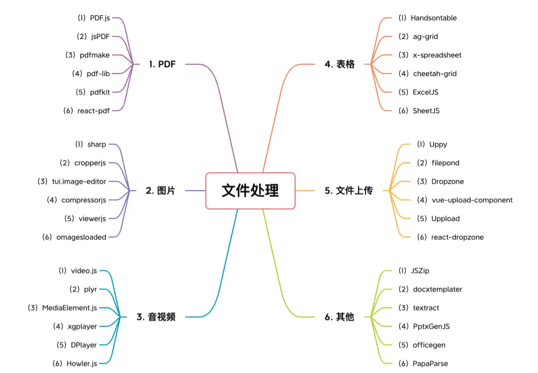 【6大类】实用的前端处理文件的工具库,快来收藏吧!Jul 15, 2022 pm 02:58 PM
本篇文章给大家整理和分享几个前端文件处理相关的实用工具库,共分成6大类一一介绍给大家,希望对大家有所帮助。


Hot AI Tools

Undresser.AI Undress
AI-powered app for creating realistic nude photos

AI Clothes Remover
Online AI tool for removing clothes from photos.

Undress AI Tool
Undress images for free

Clothoff.io
AI clothes remover

AI Hentai Generator
Generate AI Hentai for free.

Hot Article
Hot Tools

ZendStudio 13.5.1 Mac
Powerful PHP integrated development environment

SAP NetWeaver Server Adapter for Eclipse
Integrate Eclipse with SAP NetWeaver application server.

EditPlus Chinese cracked version
Small size, syntax highlighting, does not support code prompt function

DVWA
Damn Vulnerable Web App (DVWA) is a PHP/MySQL web application that is very vulnerable. Its main goals are to be an aid for security professionals to test their skills and tools in a legal environment, to help web developers better understand the process of securing web applications, and to help teachers/students teach/learn in a classroom environment Web application security. The goal of DVWA is to practice some of the most common web vulnerabilities through a simple and straightforward interface, with varying degrees of difficulty. Please note that this software

Atom editor mac version download
The most popular open source editor

