
Home >Web Front-end >CSS Tutorial >css3 box-shadow shadow graphic tutorial
css3 box-shadow shadow graphic tutorial
- 巴扎黑Original
- 2017-08-12 14:52:592187browse
This article mainly introduces the css3 box-shadow shadow (outer shadow and outer glow). Through five tests, the pictures show the different effects of the shadow in different positions. Friends in need can refer to it
Basic description:
Outer shadow: box-shadow: X axis Y axis Rpx color;
Attribute description (corresponding order): Shadow X axis (negative values can be used) Y axis of the shadow (negative values can be used) Shadow blur value (size) Color of the shadow
Inner shadow: box-shadow: X axis Y axis Rpx color inset;
Default is outer shadow Inner shadow: inset can be set to inner shadow
Note (PS): This attribute is used in box models such as (p,p,h1,h2,h3,h4,h5, h6, etc.) is not used to set text shadow. If you want to set text shadow, please refer to the knowledge point: text-shadow (same reason)
Because it is a new attribute, in order to be compatible with major browsers and support the latest version of these major browsers In the lower version, when using the box-shadow attribute on mainstream browsers, we need to write the attribute name in the form -webkit-box-shadow. Firefox browser needs to be written in the form of -moz-box-shadow, and Open browser -o-box-shadow IE>9 -ms-box-shadow
Basic exercises:
In order to better understand the characteristics of box-shadow, do a few small tests: (For convenience and directness Nesting styles within tags)
Test 1:
box-shadow: 0 0 10px #f00 (Because the X-axis and Y-axis movement setting values are not moved, the radius range and color will be affected)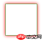
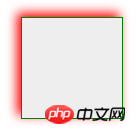
Test 2:
box-shadow:4px 4px 10px #f00; Different from test 1, the X-axis and Y-axis changed positive values (positive value to the right and down) So it becomes like this
Test 5: --Inner shadow box-shadow : 0px 0px 10px red inset; The only difference is the addition of an inset. The other attributes are the same as the outer shadow. , once you understand it, you will know the principle, and you can rewrite it at will. With the animation effect of CSS3, the flash layer (word) is very easy to implement. . Hope it helps you. .
The above is the detailed content of css3 box-shadow shadow graphic tutorial. For more information, please follow other related articles on the PHP Chinese website!