

This article mainly introduces several methods for drawing 0.5 pixels on the Web front-end, which are implemented by using meta viewport, border-image, background-image and transform: scale(). Friends who need it can refer to it
Recently completed the mobile web touch screen development arranged by the company, which involved displaying lines on mobile devices. At first, the css board attribute commonly used on PCs was used to display 1-pixel lines, but it was found that it did not work on mobile devices. It’s not beautiful. Referring to the touch screens of Taobao and JD.com, we found that they all use shallow and thin lines to display on mobile devices.
The following records four more convenient ways to draw 0.5 pixel lines
1. Use the meta viewport method, which is also the method used by Taobao touch screen
Commonly used mobile html viewport settings are as follows
<meta name="viewport" content="initial-scale=1.0, maximum-scale=1.0, user-scalable=no">
I won’t mention the specific meaning. It is to make the height and width of the page equal to the height and width of the device in pixels. In order to facilitate the drawing of a 0.5 pixel viewport, the settings are as follows
<meta name="viewport" content="initial-scale=0.5, maximum-scale=0.5, minimum-scale=0.5, user-scalable=no">
The width and height of html are 2 times the size of the device. If the css board is still used at this time to be 1 pixel, the page lines seen by the naked eye are equivalent to the effect of transform:scale(0.5), which is 0.5 pixels
But this method involves the page The overall layout planning and image size production, so if you use this method, it is better to determine it in advance
2. Use the border-image method
This is actually relatively simple Now, just create a picture of a 0.5 pixel line and its matching background color
<!DOCTYPE html>
<head>
    <meta charset="utf-8">
    <meta name="viewport" content="initial-scale=1.0, maximum-scale=1.0, user-scalable=no" />
    <title>boardTest</title>
    <style>
            p{
                margin: 50px auto;
                padding: 5px 10px 5px 10px;
                color: red;
                text-align: center;
                width: 60px;
            }
            p:first-child{
                border-bottom: 1px solid red;
            }
            p:last-child{
                border-width: 0 0 1px 0; border-image: url("img/line_h.gif") 2 0 round;
            }
    </style>
<body>
    <p>
        <p>点击1</p>
        <p>点击2</p>
    </p>
</html>
3. Use the background-image method
What I use here is the linear-gradient method of gradient color. The code is as follows
<!DOCTYPE html>
<html>
<head>
    <meta charset="utf-8">
    <meta name="viewport" content="initial-scale=1.0, maximum-scale=1.0, user-scalable=no" />
    <title>boardTest</title>
    <style>
            p{
                margin: 50px auto;
                padding: 5px 10px 5px 10px;
                color: red;
                text-align: center;
                width: 60px;
            }
            p:first-child{
                border-bottom: 1px solid red;
            }
            p:last-child{
                background-image: -webkit-linear-gradient(bottom,red 50%,transparent 50%);
                background-image: linear-gradient(bottom,red 50%,transparent 50%);
                background-size:  100% 1px;
                background-repeat: no-repeat;
                background-position: bottom right;
    </style>
</head>
<body>
    <p>
        <p>点击1</p>
        <p>点击2</p>
    </p>
</body>
</html>
linear-gradient(bottom,red 50%, transparent 50%); means to draw a gradient color from the bottom, the color is red, the proportion is 50%, and the total width has been set to 100% and the total height is one pixel background-size: 100% 1px;
This will display a line of 0.5 pixels
4. Use the transform: scale() method
It is the height of the drawn line To perform half-time scaling, the code is as follows
<!DOCTYPE html>
<html>
<head>
<meta charset="utf-8">
<meta name="viewport" content="initial-scale=1.0, maximum-scale=1.0, user-scalable=no" />
<title>boardTest</title>
<style>
p{
margin: 50px auto;
padding: 5px 10px 5px 10px;
color: red;
text-align: center;
width: 60px;
}
p:first-child{
border-bottom: 1px solid red;
}
p:last-child{
position: relative;
}
p:last-child:after {
position: absolute;
content: '';
width: 100%;
left: 0;
bottom: 0;
height: 1px;
background-color: red;
-webkit-transform: scale(1,0.5);
transform: scale(1,0.5);
-webkit-transform-origin: center bottom;
transform-origin: center bottom
}
</style>
</head>
<body>
<p>
<p>点击1</p>
<p>点击2</p>
</p>
</body>
</html>The above is the detailed content of Introduction to the method of drawing 0.5 pixels on the front-end page. For more information, please follow other related articles on the PHP Chinese website!

 演示win7调整屏幕亮度的方法Jul 08, 2023 pm 07:49 PM
不同的电脑系统在调整屏幕亮度的操作方法上会有些不同,最近就有使用win7系统的网友不知道win7怎么调整屏幕亮度,看久了电脑眼睛比较酸痛。下面小编就教下大家win7调整屏幕亮度的方法。具体的操作步骤如下:1、点击win7电脑左下角的“开始”,在弹出的开始菜单中选择“控制面板”打开。2、在打开的控制面板中找到“电源选项”打开。3、也可以用鼠标右键电脑右下角的电源图标,在弹出的菜单中,点击“调整屏幕亮度”,如下图所示。两种方法都可以用。4、在打开的电源选项窗口的最下面可以看到屏幕亮度调整的滚动条,直
 win10监控摄像头打开照片的方法Jul 10, 2023 pm 09:41 PM
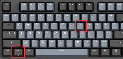
如果我们手头没有手机,只有电脑,但我们必须拍照,我们可以使用电脑内置的监控摄像头拍照,那么如何打开win10监控摄像头,事实上,我们只需要下载一个相机应用程序。打开win10监控摄像头的具体方法。win10监控摄像头打开照片的方法:1.首先,盘快捷键Win+i打开设置。2.打开后,进入个人隐私设置。3.然后在相机手机权限下打开访问限制。4.打开后,您只需打开相机应用软件。(如果没有,可以去微软店下载一个)5.打开后,如果计算机内置监控摄像头或组装了外部监控摄像头,则可以拍照。(因为人们没有安装摄
 基于Java的机器视觉实践和方法介绍Jun 18, 2023 am 11:21 AM
随着科技的不断发展,机器视觉技术在各个领域得到了广泛应用,如工业自动化、医疗诊断、安防监控等。Java作为一种流行的编程语言,其在机器视觉领域也有着重要的应用。本文将介绍基于Java的机器视觉实践和相关方法。一、Java在机器视觉中的应用Java作为一种跨平台的编程语言,具有跨操作系统、易于维护、高度可扩展等优点,对于机器视觉的应用具有一定的优越性。Java
 win7怎么调屏幕亮度的两种简单方法Jul 08, 2023 pm 06:33 PM
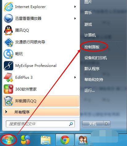
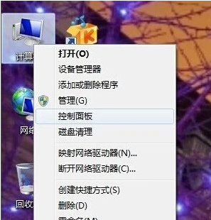
目前有很多屏幕亮度调整软件,我们可以通过使用软件进行快速调整或者通过显示器上自带的亮度功能进行调整。以下是详细的Win7屏幕亮度调整方式,您可以通过教程中的方法进行快速调整即可。Win7系统电脑怎么调节屏幕亮度教程:1、依次点击“计算机—右键—控制面板”,如果没有也可以在搜索框中进行搜索。2、点击控制面板下的“硬件和声音”,或者点击“外观和个性化”都可以。3、点击“NVIDIA控制面板”,有些显卡可能是AMD或者Intel的,请根据实际情况选择。4、调节图示中亮度滑块即可。5、还有一种方法,就是
 Go 语言中的方法是怎样定义和使用的?Jun 10, 2023 am 08:16 AM
Go语言是近年来备受青睐的编程语言,因其简洁、高效、并发等特点而备受开发者喜爱。其中,方法(Method)也是Go语言中非常重要的概念。接下来,本文就将详细介绍Go语言中方法的定义和使用。一、方法的定义Go语言中的方法是带有接收器(Receiver)的函数,它是一个与某个类型绑定的函数。接收器可以是值类型或者指针类型。用于接收者的参数可以在方法名
 PHP文件下载方法及常见问题解答Jun 09, 2023 pm 12:37 PM
PHP是一个广泛使用的服务器端编程语言,它的许多功能和特性可以将其用于各种任务,包括文件下载。在本文中,我们将了解如何使用PHP创建文件下载脚本,并解决文件下载过程中可能出现的常见问题。一、文件下载方法要在PHP中下载文件,我们需要创建一个PHP脚本。让我们看一下如何实现这一点。创建下载文件的链接通过HTML或PHP在页面上创建一个链接,让用户能够下载文件。
 图文详解如何下载win10系统方法Jul 16, 2023 pm 01:25 PM
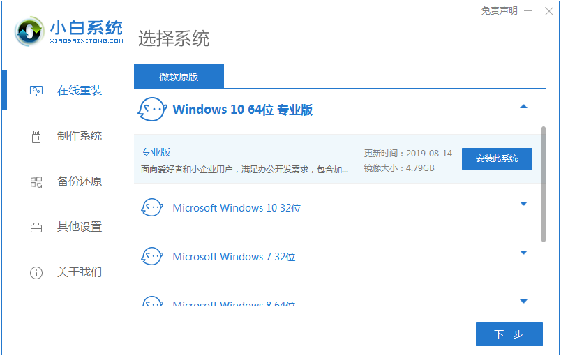
如今微软的Windows系统已经更新换代到了Windows10版本。很多以前还在使用Windows7系统的用户都想体验这个新版本Windows10系统。下面小编就来说说如何下载win10系统下载的方法,大家快来看看。1、首先下载一个小白重装系统软件,然后点击在线重装,下载win10系统。2、然后就开始系统镜像的下载了。3、系统镜像下载完成就是环境部署了。然后win10系统就下载完成啦。4、重启之后开始安装系统,安装完成就能进入桌面咯。以上就是如何下载win10系统的方法介绍啦,希望能帮助到大家。
 Vue 中的 createApp 方法是什么?Jun 11, 2023 am 11:25 AM
随着前端开发的快速发展,越来越多的框架被用来构建复杂的Web应用程序。Vue.js是流行的前端框架之一,它提供了许多功能和工具来简化开发人员构建高质量的Web应用程序。createApp()方法是Vue.js中的一个核心方法之一,它提供了一种简单的方式来创建Vue实例和应用程序。本文将深入探讨Vue中createApp方法的作用,其如何使用以及使用时需要了解


Hot AI Tools

Undresser.AI Undress
AI-powered app for creating realistic nude photos

AI Clothes Remover
Online AI tool for removing clothes from photos.

Undress AI Tool
Undress images for free

Clothoff.io
AI clothes remover

AI Hentai Generator
Generate AI Hentai for free.

Hot Article
Hot Tools

EditPlus Chinese cracked version
Small size, syntax highlighting, does not support code prompt function

Dreamweaver CS6
Visual web development tools

WebStorm Mac version
Useful JavaScript development tools

SublimeText3 Mac version
God-level code editing software (SublimeText3)

DVWA
Damn Vulnerable Web App (DVWA) is a PHP/MySQL web application that is very vulnerable. Its main goals are to be an aid for security professionals to test their skills and tools in a legal environment, to help web developers better understand the process of securing web applications, and to help teachers/students teach/learn in a classroom environment Web application security. The goal of DVWA is to practice some of the most common web vulnerabilities through a simple and straightforward interface, with varying degrees of difficulty. Please note that this software

