


Detailed explanation of css3 flex layout examples

flex Layout is the most frequently used and outstanding function in css3. It is a bit complicated. It is divided into attributes applied to the container and attributes on the project, that is, on the parent element. of and attributes on child elements.
Attributes on the parent element
-
display: flex
<style>p{display: flex; background-color: yellow;}b{background-color: red;}</style><body> <p> <b>a</b><b>b</b><b>c</b><b>d</b><b>e</b><b>f</b><b>g</b><b>h</b><b>i</b> </p></body>When the parent element is set to
flexAfter, its parent element itself will appear as a block-level element. If you want to appear as an inline element, you can useinline-flex. All child elements, whether block-level or inline, will immediately become inline layout. This is due to the default values of other attributes and can be modified later.
- ##flex-
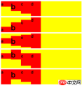
<style>p{display: flex; background-color: yellow; margin: 5px;}p.row{ flex-direction: row;}p.row-reverse{ flex-direction: row-reverse;}p.column{ flex-direction: column;}p.column-reverse{ flex-direction: column-reverse;}b{background-color: red;}</style><body> <p class="row"> <b>a</b><b>b</b><b>c</b><b>d</b> </p> <p class="row-reverse"> <b>a</b><b>b</b><b>c</b><b>d</b> </p> <p class="column"> <b>a</b><b>b</b><b>c</b><b>d</b> </p> <p class="column-reverse"> <b>a</b><b>b</b><b>c</b><b>d</b> </p></body>flex-direction
Decision Arrangement direction of child elements, default valuerow.##flex-wrap <style>p{display: flex; background-color: yellow; margin: 5px; }p.nowrap{ flex-wrap: nowrap;}p.wrap{ flex-wrap: wrap;}p.wrap-reverse{ flex-wrap: wrap-reverse;}b{background-color: red; width: 100px;}</style><body> <p class="nowrap"> <b>a</b><b>b</b><b>c</b><b>d</b> </p> <p class="wrap"> <b>a</b><b>b</b><b>c</b><b>d</b> </p> <p class="wrap-reverse"> <b>a</b><b>b</b><b>c</b><b>d</b> </p></body>flex-wrapDetermines how the child element should be handled when it exceeds one line. The default value
nowrapwill compress the width of child elements,wrapwill wrap a new line, andwrap-reversewill add a new line upwards. Note: This is discussed under the premise that the main axis is the X-axis.
##justify-content


<style>b{background-color: red; }p{display: flex; background-color: yellow; margin: 5px; }p.start{ justify-content: flex-start;}p.end{justify-content: flex-end;}p.center{ justify-content: center;}p.space-between{ justify-content: space-between;}p.space-around{ justify-content: space-around;}</style><body> <p class="start"> <b>a</b><b>b</b><b>c</b><b>d</b> </p> <p class="end"> <b>a</b><b>b</b><b>c</b><b>d</b> </p> <p class="center"> <b>a</b><b>b</b><b>c</b><b>d</b> </p> <p class="space-between"> <b>a</b><b>b</b><b>c</b><b>d</b> </p> <p class="space-around"> <b>a</b><b>b</b><b>c</b><b>d</b> </p></body>justify-content
Determines whether the child element is on the main axis (currently the X axis ), the default value isflex-start. The distance between space-between and space-around is divided equally by the excess space, but the latter will also count the space for the left and right ends.
 ##align-items
<style>b{background-color: red; width: 40px;}b:nth-child(1){}b:nth-child(2){font-size: 30px; height: 40px;}b:nth-child(3){height: 50px;}b:nth-child(4){height: 60px;}p{display: flex; flex-wrap: wrap; background-color: yellow; margin: 5px; }p.start{ align-items: flex-start;}p.end{ align-items: flex-end;}p.center{ align-items: center;}p.baseline{ align-items: baseline;}p.stretch{ align-items: stretch;}</style><body> <p class="start"> <b>a</b><b>b</b><b>c</b><b>d</b> </p> <p class="end"> <b>a</b><b>b</b><b>c</b><b>d</b> </p> <p class="center"> <b>a</b><b>b</b><b>c</b><b>d</b> </p> <p class="baseline"> <b>a</b><b>b</b><b>c</b><b>d</b> </p> <p class="stretch"> <b>a</b><b>b</b><b>c</b><b>d</b> </p></body>Determine the secondary axis (currently the Y axis) The alignment of elements. The default value
stretch means that when the child element does not set a height, it will fill the height of the parent class.
 align-content
<style>b{background-color: red; width: 100px;}p{display: flex; flex-wrap: wrap; background-color: yellow; margin: 5px; height: 70px;}p.start{ align-content: flex-start;}p.end{ align-content: flex-end;}p.center{ align-content: center;}p.space-between{ align-content: space-between;}p.space-around{ align-content: space-around;}p.stretch{ align-content: stretch;}</style><body> <p class="start"> <b>a</b><b>b</b><b>c</b><b>d</b> </p> <p class="end"> <b>a</b><b>b</b><b>c</b><b>d</b> </p> <p class="center"> <b>a</b><b>b</b><b>c</b><b>d</b> </p> <p class="space-between"> <b>a</b><b>b</b><b>c</b><b>d</b> </p> <p class="space-around"> <b>a</b><b>b</b><b>c</b><b>d</b> </p> <p class="stretch"> <b>a</b><b>b</b><b>c</b><b>d</b> </p></body>indicates that when the child element has multiple lines, each line Position on the secondary axis (currently the Y axis). The default value
stretch means changing the height of each row of child elements until the parent element is filled.
 Attributes on child elements
order
<style>p{display: flex; background-color: yellow; margin: 5px;}b{background-color: red; }b.test{order: -1;}</style><body> <p class="start"> <b>a</b><b>b</b><b class="test">c</b><b>d</b> </p></body>- order
means arranging elements of the same level from small to large, the default value is
0.
##flex-grow
<style>p{display: flex; background-color: yellow; margin: 5px;}b{background-color: red; }b.test{flex-grow: 1; background-color: green;}</style><body> <p class="start"> <b>a</b><b>b</b><b class="test">c</b><b>d</b> </p></body>flex-grow - means when the main axis (currently the X axis) is on When there is remaining space, the proportion occupied by dividing the space equally. The default value is
0
, which means it does not occupy space. The current space bisection ratio is0 : 0 : 1 : 0
##flex-shrink, so c occupies all remaining space.<style>p{display: flex; background-color: yellow; margin: 5px;}b{background-color: red; width: 100px; flex-shrink: 0;}b.test{flex-shrink: 1; background-color: green;}</style><body> <p class="start"> <b>a</b><b>b</b><b class="test">c</b><b>d</b> </p></body>flex-shrink means when the main axis (currently the X axis) space When it is not enough to fill all the sub-elements, how should the sub-elements be compressed? The default value is - 1
, which means
1 : 1 : 1 : 1, that is, equal-ratio compression. The current ratio is
0: 0: 1: 0, indicating that all space is compressed by c.##flex-basis<style>p{display: flex; background-color: yellow; margin: 5px;}b{background-color: red; flex-grow: 1;}b.test{flex-basis: 100px; background-color: green;}</style><body> <p class="start"> <b>a</b><b>b</b><b class="test">c</b><b>d</b> </p></body>
means when the main axis (currently the X axis) is on The position occupied before dividing the space equally. When the main axis is the X-axis, it is equivalent to settingflex-basis width - . When the main axis is the Y-axis, it is equivalent to setting
height
. The default valueauto
means equal towidthorheight.##align-self<style>p{display: flex; background-color: yellow; margin: 5px;}b{background-color: red; flex-grow: 1;}b:nth-child(1){height: 20px;}b:nth-child(2){height: 40px;}b:nth-child(3){height: 50px;}b:nth-child(4){height: 60px;}b.test{align-self: flex-end; background-color: green;}</style><body> <p class="start"> <b>a</b><b>b</b><b class="test">c</b><b>d</b> </p></body>align-self表示当前元素可以覆盖父元素align-items所决定的副轴(当前为Y轴)上的方向。默认auto,即不设置。可选择与align-items一致,auto | flex-start | flex-end | center | baseline | stretch。

 flex-shrink
 flex-basis
特别注意,为简化布局理解,上面事例都使用了默认的 flex-direction:row 作为子元素排序方向为基础。如果改为 flex-direction:column ,主轴将为变成 Y 轴,而副轴将变成 X 轴,所有属性的效果将会改变,这个留给读者自行实践。
学习过程中遇到什么问题或者想获取学习资源的话,欢迎加入学习交流群
343599877,我们一起学前端!
The above is the detailed content of Detailed explanation of css3 flex layout examples. For more information, please follow other related articles on the PHP Chinese website!

 A Little Reminder That Pseudo Elements are Children, Kinda.Apr 19, 2025 am 11:39 AM
Here's a container with some child elements:
 Menus with 'Dynamic Hit Areas'Apr 19, 2025 am 11:37 AM
Flyout menus! The second you need to implement a menu that uses a hover event to display more menu items, you're in tricky territory. For one, they should
 Improving Video Accessibility with WebVTTApr 19, 2025 am 11:27 AM
"The power of the Web is in its universality. Access by everyone regardless of disability is an essential aspect."- Tim Berners-Lee
 Weekly Platform News: CSS ::marker pseudo-element, pre-rendering web components, adding Webmention to your siteApr 19, 2025 am 11:25 AM
In this week's roundup: datepickers are giving keyboard users headaches, a new web component compiler that helps fight FOUC, we finally get our hands on styling list item markers, and four steps to getting webmentions on your site.
 Making width and flexible items play nice togetherApr 19, 2025 am 11:23 AM
The short answer: flex-shrink and flex-basis are probably what you’re lookin’ for.

 Weekly Platform News: HTML Inspection in Search Console, Global Scope of Scripts, Babel env Adds defaults QueryApr 19, 2025 am 11:18 AM
In this week's look around the world of web platform news, Google Search Console makes it easier to view crawled markup, we learn that custom properties
 IndieWeb and WebmentionsApr 19, 2025 am 11:16 AM
The IndieWeb is a thing! They've got a conference coming up and everything. The New Yorker is even writing about it:


Hot AI Tools

Undresser.AI Undress
AI-powered app for creating realistic nude photos

AI Clothes Remover
Online AI tool for removing clothes from photos.

Undress AI Tool
Undress images for free

Clothoff.io
AI clothes remover

Video Face Swap
Swap faces in any video effortlessly with our completely free AI face swap tool!

Hot Article
Hot Tools

ZendStudio 13.5.1 Mac
Powerful PHP integrated development environment

mPDF
mPDF is a PHP library that can generate PDF files from UTF-8 encoded HTML. The original author, Ian Back, wrote mPDF to output PDF files "on the fly" from his website and handle different languages. It is slower than original scripts like HTML2FPDF and produces larger files when using Unicode fonts, but supports CSS styles etc. and has a lot of enhancements. Supports almost all languages, including RTL (Arabic and Hebrew) and CJK (Chinese, Japanese and Korean). Supports nested block-level elements (such as P, DIV),

MinGW - Minimalist GNU for Windows
This project is in the process of being migrated to osdn.net/projects/mingw, you can continue to follow us there. MinGW: A native Windows port of the GNU Compiler Collection (GCC), freely distributable import libraries and header files for building native Windows applications; includes extensions to the MSVC runtime to support C99 functionality. All MinGW software can run on 64-bit Windows platforms.

SublimeText3 Mac version
God-level code editing software (SublimeText3)

Dreamweaver CS6
Visual web development tools

