
Heim >Web-Frontend >CSS-Tutorial >Mehrere Methoden zum Erzielen eines Textfarbverlaufs in CSS
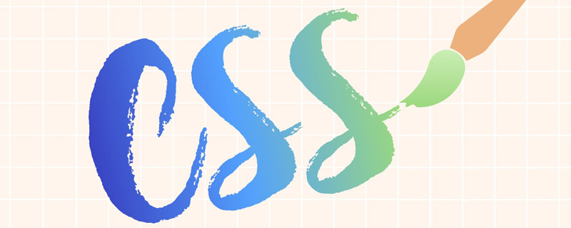
Mehrere Methoden zum Erzielen eines Textfarbverlaufs in CSS

- 青灯夜游nach vorne
- 2020-12-18 09:31:302036Durchsuche
(Empfohlenes Tutorial: CSS-Video-Tutorial)
Während des Web-Frontend-Entwicklungsprozesses entwerfen UI-Designer häufig einige Designzeichnungen mit Verlaufstext. In der Vergangenheit konnten wir Text nur durch PNG-Bilder ersetzen. Heutzutage ist es möglich, Verlaufstexte mit reinem CSS zu implementieren. Hier sind 3 Implementierungsmethoden als Referenz!
Grundstil:
.gradient-text {
	text-align: left;
	text-indent: 30px;
	line-height: 50px;
	font-size: 40px;
	font-weight: bolder;
	position: relative;
}
Die erste Methode, verwenden Sie background-cli, text-fill-color: background-cli、 text-fill-color:
.gradient-text-one{
    background-image:-webkit-linear-gradient(bottom,red,#fd8403,yellow);
    -webkit-background-clip:text;
    -webkit-text-fill-color:transparent;
}
说明 :
background: -webkit-linear-gradient(...)为文本元素提供渐变背景。webkit-text-fill-color: transparent使用透明颜色填充文本。webkit-background-clip: text用文本剪辑背景,用渐变背景作为颜色填充文本。
第二种方法,使用 mask-image:
.gradient-text-two {
	color: red;
}

.gradient-text-two[data-content]::after {
	content: attr(data-content);
	display: block;
	position: absolute;
	color: yellow;
	left: 0;
	top: 0;
	z-index: 2;
	-webkit-mask-image: -webkit-gradient(linear, 0 0, 0 bottom,
	                       from(yellow), to(rgba(0, 0, 255, 0)));
}
说明:
mask-image 和 background-image 一样,不仅可以取值是 图片路径,也可以是渐变色。
第三种方法,使用 linearGradient、fill
.gradient-text-three{
    fill:url(#SVGID_1_);
    font-size:40px;
    font-weight:bolder;
}
Anleitung:
background: -webkit-linear-gradient(...) Stellt einen Verlaufshintergrund für Textelemente bereit. -
webkit-text-fill-color: transparentText mit transparenter Farbe füllen. -
webkit-background-clip: textSchneiden Sie den Hintergrund mit Text aus und füllen Sie den Text mit dem Verlaufshintergrund als Farbe.
Die zweite Methode, verwenden Sie mask-image:
<svg viewBoxs="0 0 500 300" class="svgBox">
    <defs>
        <linearGradient id="SVGID_1_" gradientUnits="userSpaceOnUse" x1="0" y1="10" x2="0" y2="50">
            <stop  offset="0" style="stop-color:yellow"/>
            <stop  offset="0.5" style="stop-color:#fd8403"/>
            <stop  offset="1" style="stop-color:red"/>
        </linearGradient>
    </defs>
    <text text-anchor="middle" class="gradient-text-three" x="110px" y="30%">花信年华</text>
</svg>
Anweisungen: 
mask-image und background- Like image, der Wert kann nicht nur der Bildpfad, sondern auch die Verlaufsfarbe sein.
linearGradient, fill: 🎜🎜🎜<!DOCTYPE html>
<html>
<head>
<meta charset="utf-8">
<meta name="viewport" content="width=device-width, user-scalable=no,
initial-scale=1.0, maximum-scale=1.0, minimum-scale=1.0">
<title>CSS3渐变字体</title>
<link rel="stylesheet" href="https://cdn.bootcss.com/bootstrap/3.3.7/css/bootstrap.min.css">
<script src="https://cdn.bootcss.com/jquery/2.1.1/jquery.min.js"></script>
<script src="https://cdn.bootcss.com/bootstrap/3.3.7/js/bootstrap.min.js"></script>
<style type="text/css">
*{margin:0;padding:0;}
body,html{width:100%;height:100%;}
.wrapper{width:80%;margin:0 auto;margin-top:30px;}
.gradient-text{text-align: left;text-indent:30px;line-height: 50px;font-size:40px;
font-weight:bolder; position: relative; }
.gradient-text-one{
background-image:-webkit-linear-gradient(bottom,red,#fd8403,yellow);
-webkit-background-clip:text;
-webkit-text-fill-color:transparent;
}
.gradient-text-two{
color:red;
}
.gradient-text-two[data-content]::after{
content:attr(data-content);
display: block;
position:absolute;
color:yellow;
left:0;
top:0;
z-index:2;
-webkit-mask-image:-webkit-gradient(linear, 0 0, 0 bottom, from(yellow),
to(rgba(0, 0, 255, 0)));
}
.gradient-text-three{
fill:url(#SVGID_1_);
font-size:40px;
font-weight:bolder;
}
</style>
</head>
<body>
<section class="wrapper">
<div class="panel panel-info">
<div class="panel-heading">
<h3 class="panel-title">方法1. background-clip + text-fill-color</h3>
</div>
<div class="panel-body">
<h3 class="gradient-text gradient-text-one">花样年华</h3>
</div>
</div>
<div class="panel panel-warning">
<div class="panel-heading">
<h3 class="panel-title">方法2. mask-image</h3>
</div>
<div class="panel-body">
<h3 class="gradient-text gradient-text-two" data-content="豆蔻年华">豆蔻年华</h3>
</div>
</div>
<div class="panel panel-danger">
<div class="panel-heading">
<h3 class="panel-title">方法3. svg linearGradient</h3>
</div>
<div class="panel-body">
<svg viewBoxs="0 0 500 300" class="svgBox">
<defs>
<linearGradient id="SVGID_1_" gradientUnits="userSpaceOnUse"
x1="0" y1="10" x2="0" y2="50">
<stop offset="0" style="stop-color:yellow"/>
<stop offset="0.5" style="stop-color:#fd8403"/>
<stop offset="1" style="stop-color:red"/>
</linearGradient>
</defs>
<text text-anchor="middle" class="gradient-text-three" x="110px"
y="30%">花信年华</text>
</svg>
</div>
</div>
</section>
</body>
</html>rrreee🎜🎜Erklärung: 🎜🎜🎜In SVG gibt es zwei Haupttypen von Farbverläufen: 🎜 🎜🎜🎜Linearer Farbverlauf (linearGradient) 🎜🎜🎜🎜Radialer Farbverlauf (radialGradient) 🎜🎜🎜🎜Farbverlauf in SVG kann nicht nur zum Füllen von grafischen Elementen, sondern auch von Textelementen verwendet werden. 🎜🎜🎜Dom-Beispiel: 🎜🎜rrreee🎜 Wirkung: 🎜🎜🎜🎜🎜Weitere Kenntnisse zum Thema Programmierung finden Sie unter: 🎜Einführung in die Programmierung🎜! ! 🎜Das obige ist der detaillierte Inhalt vonMehrere Methoden zum Erzielen eines Textfarbverlaufs in CSS. Für weitere Informationen folgen Sie bitte anderen verwandten Artikeln auf der PHP chinesischen Website!
In Verbindung stehende Artikel
Mehr sehen- So referenzieren Sie Bilder in CSS-Dateien, ohne sie anzuzeigen
- So erreichen Sie eine Zentrierung in CSS, wenn Breite und Höhe nicht festgelegt sind
- So zeigen Sie einen Teil des Bildes in CSS an
- Was sind die Ähnlichkeiten zwischen CSS-Zeilenelementen und Blockelementen?
- So ändern Sie die Schriftfarbe von CSS-Hyperlinks