

一. rem+vw 布局手机端
实例演示:
<!DOCTYPE html><html lang="zh-CN"><head><meta charset="UTF-8" /><meta http-equiv="X-UA-Compatible" content="IE=edge" /><meta name="viewport" content="width=device-width, initial-scale=1.0" /><title>手机端布局常用技巧</title></head><body><div class="box">手机页面响应式布局</div></div></body><!-- 一般会给设计稿,750的分辨率,DPR = 2device-width = 750px / DPR = 750 / 2 = 375px则我们以后就直接以 375px 为宽度进行布局 --><!-- 除了屏幕适配需要固定,布局参数不要用到px --></html><style>*{padding: 0;margin: 0;box-sizing: border-box;}/* 样式重置三步 */html{font-size: calc(100vw / 3.75);/* 因为 font-size是一个可以被继承的属性 *//* 这边参考宽度是375px,即100vw = 375px ,所以100px = 100vw / 3.75 *//* 此处可得1rem = 100px */}body{font-size: 0.16rem;/* 把字号还原成浏览器默认的字号, 16px *//* 此处可得1em = 16px */}/* 设置最小宽度根字号大小 */@media screen and (max-width: 320px) {html {font-size: 85px;/* 最小的屏幕宽度时需要固定参数,不可用rem,否则就太小看不见了 *//* 至于为什么是320px,字号是85px,此处为项目经验设置值,跟着走就对了 */}}/* 设置最大宽度根字号大小 */@media screen and (min-width: 640px) {html {font-size: 170px;/* 最大的屏幕宽度时需要固定参数,目前还没超过640的手机端布局,除非ipad类型 *//* 至于为什么是640px,字号是170px,此处可为最小宽度的比例*2即可得 */}}/* 接下来实例样式设置查看 */.box{width: 3rem;height: 1rem;background-color: red;}</style>
效果图示例演示: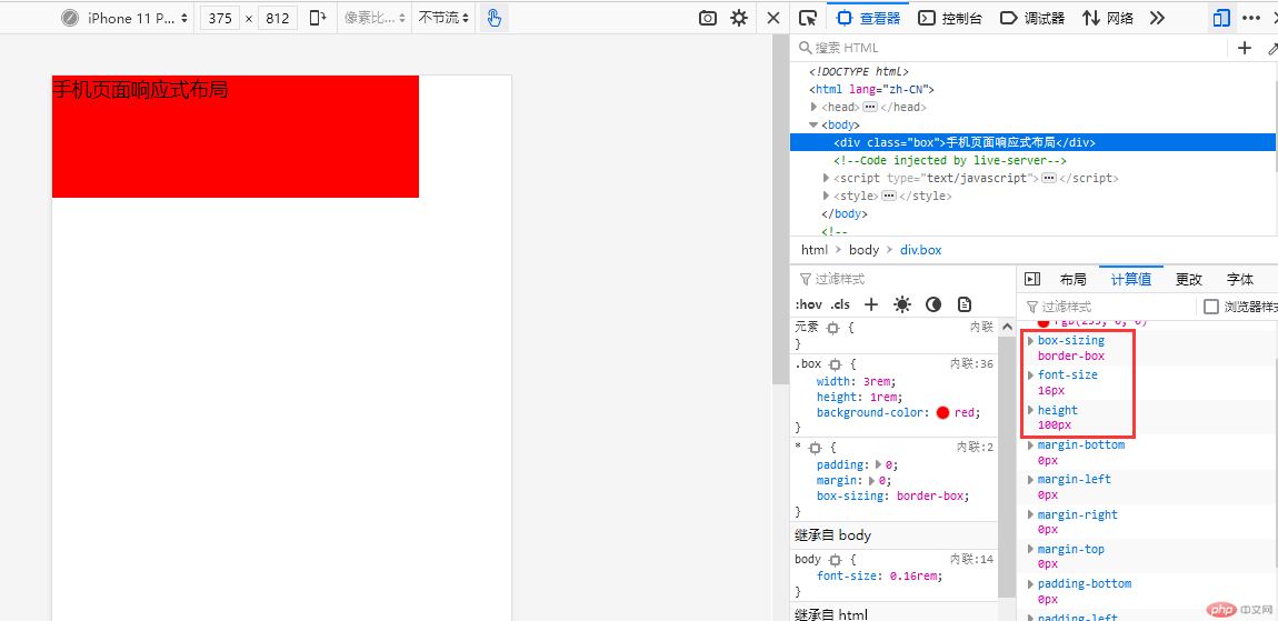
二. grid 布局中的常用属性
2.1 grid 布局显式网格单个与区域网格选定
代码实例:
<!DOCTYPE html><html lang="zh-CN"><head><meta charset="UTF-8" /><meta http-equiv="X-UA-Compatible" content="IE=edge" /><meta name="viewport" content="width=device-width, initial-scale=1.0" /><title>grid容器属性与项目属性</title></head><body><div class="container"><div class="item"></div></div></body></html><style>* {padding: 0;margin: 0;box-sizing: border-box;}.container {width: 30em;height: 30em;background-color: darkblue;/* 使用grid布局容器 */display: grid;/* 显示在外面的网格:显式网格,建立一个3行3列的网格的3种写法 *//* 第一种写法 */grid-template-columns: 10em 10em 10em;grid-template-rows: 10em 10em 10em;/* 第二种写法 */grid-template-columns: repeat(3, 10em);grid-template-rows: repeat(3, 10em);/* 第三种写法 ,这个用的比较多,响应式布局*/grid-template-columns: repeat(3, 1fr);grid-template-rows: repeat(3, 1fr);}/* 项目默认从左到右, 从上到下,按书写顺序进行排列 */.container > .item {background-color: #fff;/* grid项目单个默认起始和结束参数,grid-row: 起始行 / 结束行 */grid-row: 1 / 2;grid-column: 1 / 2;/* 如果我们要移到中间去,那么改变行号和列号即可 */grid-row: 2 / 3;grid-column: 2 / 3;/* 也可以使用跨越的方式进行移动,使用最多的方式 */grid-row: 2 / span 1;grid-column: 2 / span 1;/* grid项目网格区域,如中间一行三格如何布局*/grid-row: 2 / 3;grid-column: 1 / 4;/* 也可以使用跨越的方式进行移动,使用最多的方式 */grid-row: 2 / span 1;grid-column: 1 / span 3;/* 还可以使用简化代码,grid-area: 行开始/列开始/行结束/列结束; */grid-area: 2 / 1 / 3 / 4;/* 或者使用区域的跨越方式 */grid-area: 2 / 1 / span 1 / span 3;}</style>
效果图 1(单个项目默认样式)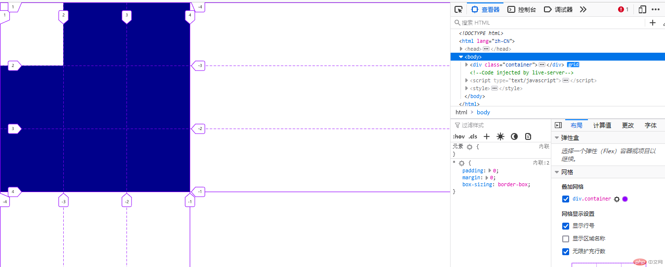
效果图 2(项目在容器中移动到中间居中)
效果图 3(网格区域移动到中间一行)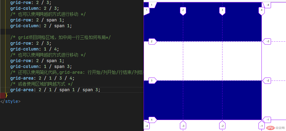
2.2 grid 容器整体对齐方式以及项目在单元格内的对齐方式
代码实例:
<!DOCTYPE html><html lang="zh-CN"><head><meta charset="UTF-8" /><meta http-equiv="X-UA-Compatible" content="IE=edge" /><meta name="viewport" content="width=device-width, initial-scale=1.0" /><title>grid容器属性与项目属性</title></head><body><div class="container"><!-- 显示网格,直接生成在网格内的9个单元格 --><div class="item">1</div><div class="item">2</div><div class="item">3</div><div class="item">4</div><div class="item">5</div><div class="item">6</div><div class="item">7</div><div class="item">8</div><div class="item">9</div><!-- 再增加二个隐式网格,显示在容器自动生成的单元格中 --><div class="item">10</div><div class="item">11</div></div></body></html><style>* {padding: 0;margin: 0;box-sizing: border-box;}.container {width: 40em;height: 45em;background-color: darkblue;display: grid;grid-template-columns: repeat(3, 10em);grid-template-rows: repeat(3, 10em);/* gap: 行间距 列间距 */gap: 10px 10px;/* 隐式网格: 容纳超出显式网格的项目即第10和11个项目显示在容器自动生成的单元格中 *//* 当前的排列规则/方向, 行优先, 先在一行排列,排列不上再换行显示,可以改为列优先 *//* 列优先可使用:grid-auto-flow: column;效果可看后面图例示意 *//* 默认行优先,那么我们只需要限定行高即可,设定为10em */grid-auto-rows: 10em;/* 对齐的第一个前提:要有剩余空间进行分配 *//* 对齐第二个前提:参照物;grid项目对齐有二个参照物: 容器, 单元格 *//* 1. 所有项目在"容器"中的对齐方式 *//* place-content: 垂直方向 水平方向; 参数:start,center,end;默认值:place-content: start start;*//* 所有项目的垂直水平都居中使用center,两个参数都一样可以只写一个 */place-content: center center;/* 剩余空间在所在项目之间进行分配,项目中最常用的是两端对齐 */place-content: space-between space-between;/* 2. 所有项目在所在的"单元格"中的对齐方式,项目需要限定大小,有剩余空间 *//* place-items: 垂直方向 水平方向; 参数:start,center,end;默认值:place-items: start start;*//* 垂直不动,水平居中示例 */place-items: start center;/* 垂直水平都居中示例 */place-items: center center;/* 所有项目在容器和单元格中全部水平垂直居中 */place-content: center;place-items: center;}.container > .item {background-color: lightgreen;/* 限定一个项目大小,使得有剩余空间进行布局 */width: 6em;height: 6em;}/* 单个项目在单元格中位置的调整,可以使用伪类来进行选择,然后使用place-self属性 */.container > .item:nth-of-type(3) {background-color: #fff;place-self: end end;}</style>
效果图 1(九个网格默认样式)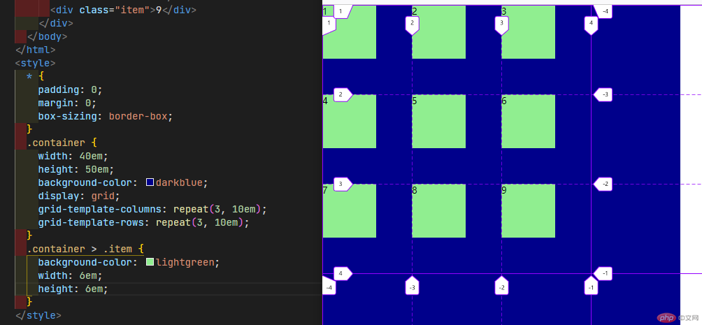
效果图 2(所有项目在容器中的垂直水平都居中)
效果图 3(所有项目在容器中两端对齐)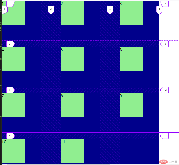
效果图 4(所有项目在所在的”单元格”中垂直不动,水平居中)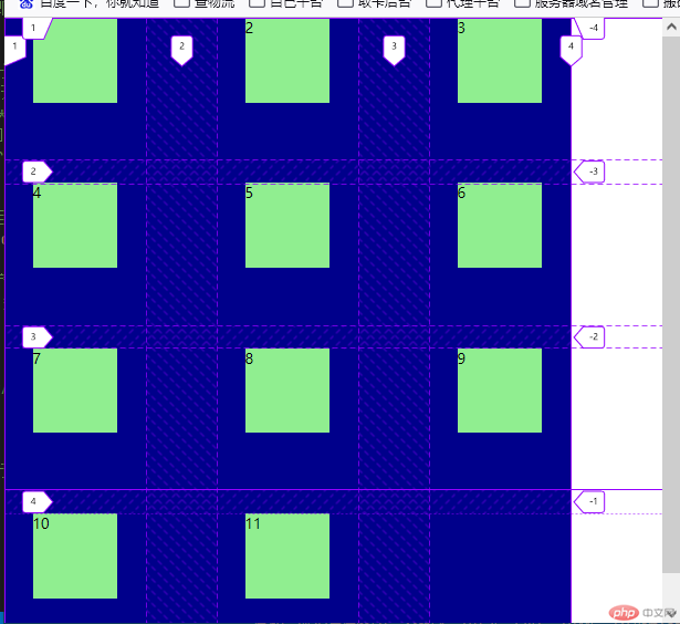
效果图 5(所有项目在所在的”单元格”中垂直,水平都居中)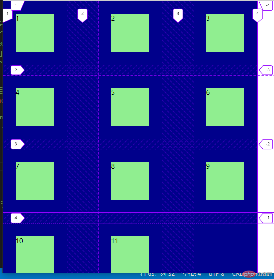
效果图 6(grid-auto-flow: column;列优先示例)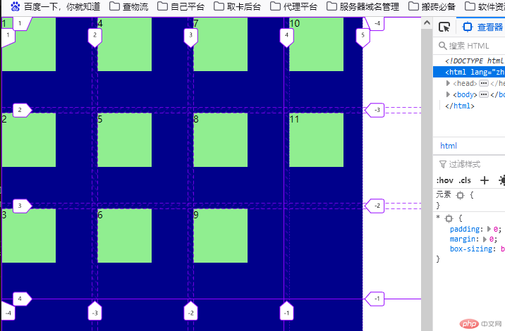
效果图 7(隐式网格2个的排列)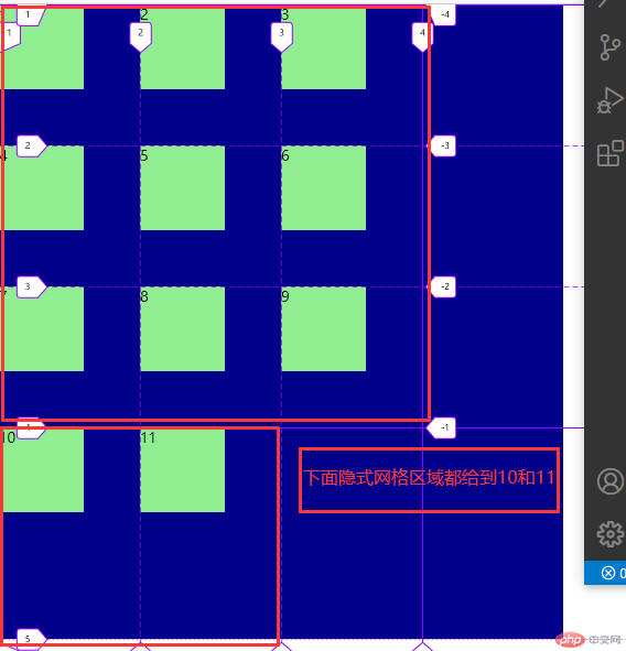
效果图 8(隐式网格行高限定10em)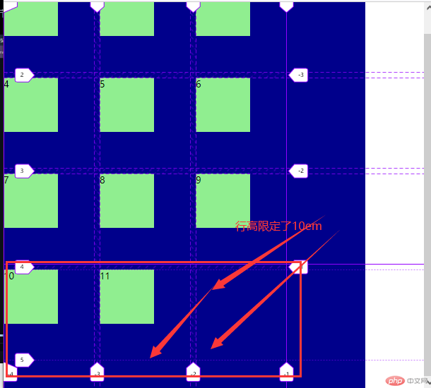
效果图 9(单个项目在单元格向下调整图)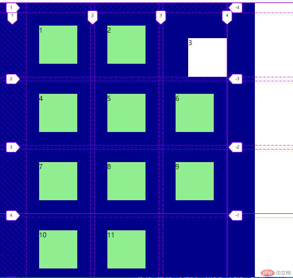
三. 圣杯布局(grid 版)赏析
代码实例:
<!DOCTYPE html><html lang="zh-CN"><head><meta charset="UTF-8" /><meta http-equiv="X-UA-Compatible" content="IE=edge" /><meta name="viewport" content="width=device-width, initial-scale=1.0" /><title>圣杯布局(grid版)</title></head><body><header>页眉</header><aside>左侧</aside><main>主体</main><aside>右侧</aside><footer>页脚</footer><style>* {padding: 0;margin: 0;box-sizing: border-box;}body * {background-color: lightgreen;}body {/* grid布局 */display: grid;/* 3行3列,中间最小固定,然后自适应放大 */grid-template-columns: 200px minmax(400px, 1fr) 200px;grid-template-rows: 3em minmax(calc(100vh - 6em - 0.6em), 1fr) 3em;gap: 0.3em;place-content: center;}header,footer {grid-column: span 3;}</style></body></html>
圣杯布局效果图: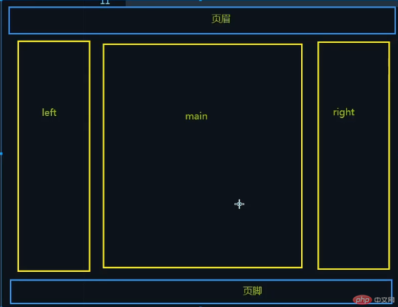