flex布局与glid布局
flex实现pc端三列布局
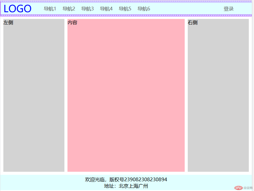
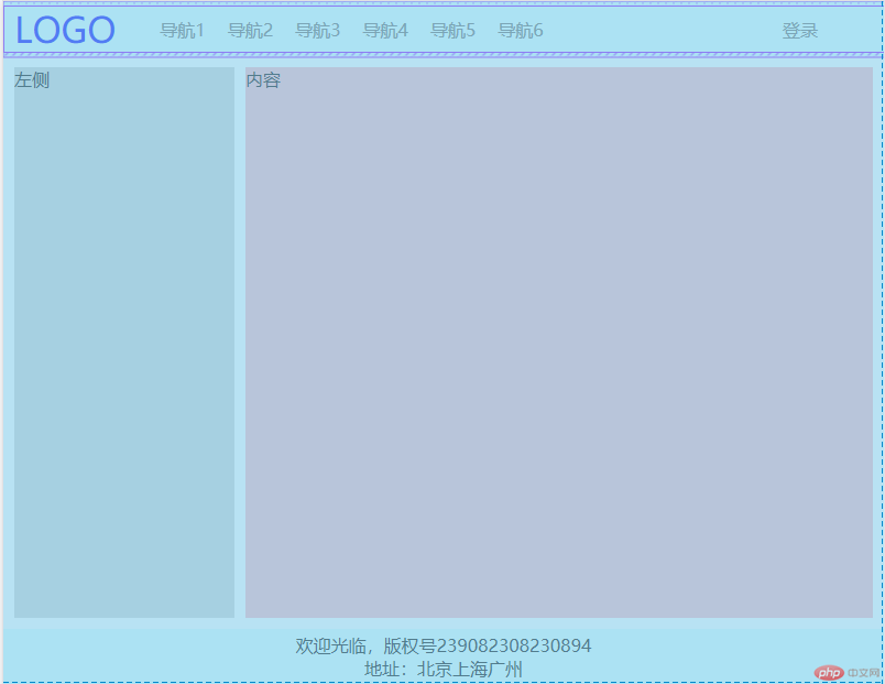
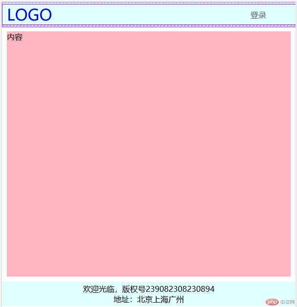
<header> <nav> <a href="">LOGO</a> <a href="">导航1</a> <a href="">导航2</a> <a href="">导航3</a> <a href="">导航4</a> <a href="">导航5</a> <a href="">导航6</a> <a href="">登录</a> </nav></header><div class="container"> <div class="left">左侧</div> <main>内容</main> <div class="right">右侧</div></div><footer> <p>欢迎光临,版权号239082308230894</p> <p>地址:北京上海广州</p></footer>
/* 重置样式 */ * { margin: 0; padding: 0; box-sizing: border-box; } a { text-decoration: none; color: #666; } /* 显示内容使用flex布局垂直排列 */ body { display: flex; flex-flow: column nowrap; } /* 设置页眉与页脚具有相同属性的样式 */ header, footer { height: 50px; background-color: lightcyan; display: flex; flex-flow: column nowrap; justify-content: center; align-items: stretch; } /* 设置导航栏 */ header>nav { display: flex; justify-content: center; align-items: center; } header>nav>a { padding: 0 10px; } /* logo标签与登录标签区别对待 */ header>nav>a:first-of-type { margin-right: 20px; font-size: 2.0rem; color: blue; } header>nav>a:last-of-type { margin-left: auto; margin-right: 50px; } header>nav>a:hover:not(:first-of-type) { color: red; } /* 设置主体区样式 */ .container { min-height: 500px; margin: 10px; display: flex; } .container>.left, .container>.right { background-color: lightgray; flex: 0 0 200px; } .container>main { margin-left: 10px; margin-right: 10px; background-color: lightpink; flex: 1 1 600px; } footer { align-items: center; } /* 使用媒体查询适配终端设备样式 */ @media screen and (max-width:800px) { .container>.right { display: none; } .container>main { margin-right: 0; } } @media screen and (max-width:600px) { .container>.left { display: none; } .container>main { margin-left: 0; } header a:not(:first-of-type):not(:last-of-type) { display: none; } }
说明:
- 界面分为页眉、主体、页脚,使用flex布局垂直排列
- 页眉与页脚使用flex垂直水平居中对齐,固定高度与背景颜色
- 导航区使用flex水平布局,对logo图标与登录分别处理
- 左栏、内容区、左栏通过flex的放大因子、缩小因子,基准尺寸设置大小
- 使用媒体查询适配终端设备样式
flex实现(m.php.cn)首页
参考:
解决img在a标签中存在下间距问题
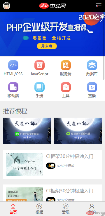
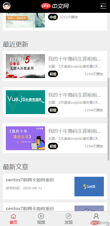
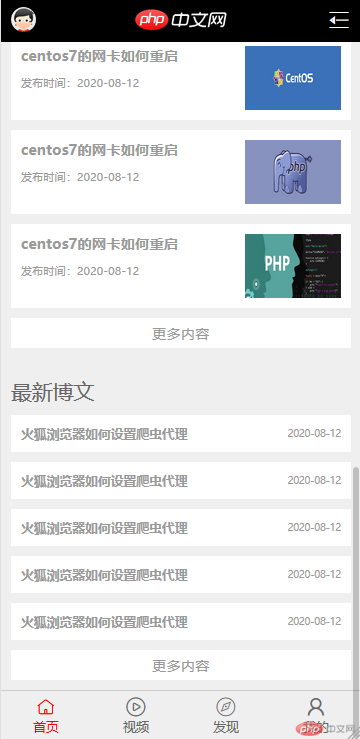
<header> <!-- 导航栏 --> <a href=""><span class="user"><img id="user_avater" src="image/user_avatar.jpg"></span></a> <a href=""><span class="logo"><img id="logo" src="image/logo.png"></span></a> <a href=""><span class="iconfont more"></span></a></header><!-- 轮播图 --><a href=""><img class="banner" src="image/lunbotu.png" alt=""></a><!-- 菜单栏 --><div class="menu"> <div class="item"><a href=""><img src="image/html.png" alt=""></a><a href="">HTML/CSS</a></div> <div class="item"><a href=""><img src="image/JavaScript.png" alt=""></a><a href="">JavaScript</a></div> <div class="item"><a href=""><img src="image/code.png" alt=""></a><a href="">服务端</a></div> <div class="item"><a href=""><img src="image/sql.png" alt=""></a><a href="">数据库</a></div> <div class="item"><a href=""><img src="image/app.png" alt=""></a><a href="">移动端</a></div> <div class="item"><a href=""><img src="image/manual.png" alt=""></a><a href="">手册</a></div> <div class="item"><a href=""><img src="image/tool2.png" alt=""></a><a href="">工具</a></div> <div class="item"><a href=""><img src="image/live.png" alt=""></a><a href="">直播</a></div></div><!-- 推荐课程 --><h2 class="title">推荐课程</h2><div class="recommend"> <div class="head"> <a href=""><img src="image/recommed1.jpg" alt=""></a> <a href=""><img src="image/recommed2.jpg" alt=""></a> </div> <div class="body"> <a href=""> <img src="image/recommed4.jpg" alt=""> <dl> <dt>CI框架30分钟极速入门</dt> <dd> <span class="tip">中级</span>3232次播放 </dd> </dl> </a> <a href=""> <img src="image/recommed3.jpg" alt=""> <dl> <dt>CI框架30分钟极速入门</dt> <dd> <span class="tip">中级</span>3232次播放 </dd> </dl> </a> </div></div><!-- 最近更新 --><h2 class="title">最近更新</h2><div class="new"> <a href=""> <img src="image/new1.png" alt=""> <dl> <dt>我的十年撸码生涯啦啦啦啦出港年费2天</dt> <dd>主题:2天速成vuejs出港年费2天速成vuejs出港年费</dd> <dd><span class="tip">初级</span><span>1234次播放</span></dd> </dl> </a> <a href=""> <img src="image/new2.png" alt=""> <dl> <dt>我的十年撸码生涯啦啦啦啦出港年费2天</dt> <dd>主题:2天速成vuejs出港年费2天速成vuejs出港年费</dd> <dd><span class="tip">初级</span><span>1234次播放</span></dd> </dl> </a> <a href=""> <img src="image/new3.png" alt=""> <dl> <dt>我的十年撸码生涯啦啦啦啦出港年费2天</dt> <dd>主题:2天速成vuejs出港年费2天速成vuejs出港年费</dd> <dd><span class="tip">初级</span><span>1234次播放</span></dd> </dl> </a></div><!-- 最新文章 --><h2 class="title">最新文章</h2><div class="article"> <a href=""> <dl> <dt>centos7的网卡如何重启</dt> <dd>发布时间:2020-08-12</dd> </dl> <img src="image/article1.jpg" alt=""> </a> <a href=""> <dl> <dt>centos7的网卡如何重启</dt> <dd>发布时间:2020-08-12</dd> </dl> <img src="image/article2.jpg" alt=""> </a> <a href=""> <dl> <dt>centos7的网卡如何重启</dt> <dd>发布时间:2020-08-12</dd> </dl> <img src="image/article3.jpg" alt=""> </a> <a href=""> <span>更多内容</span> </a></div><!-- 最新博文 --><h2 class="title">最新博文</h2><div class="blog"> <a href=""> <dl> <dt>火狐浏览器如何设置爬虫代理</dt> <dd>2020-08-12</dd> </dl> </a> <a href=""> <dl> <dt>火狐浏览器如何设置爬虫代理</dt> <dd>2020-08-12</dd> </dl> </a> <a href=""> <dl> <dt>火狐浏览器如何设置爬虫代理</dt> <dd>2020-08-12</dd> </dl> </a> <a href=""> <dl> <dt>火狐浏览器如何设置爬虫代理</dt> <dd>2020-08-12</dd> </dl> </a> <a href=""> <dl> <dt>火狐浏览器如何设置爬虫代理</dt> <dd>2020-08-12</dd> </dl> </a> <a href=""> <span>更多内容</span> </a></div><!-- 页脚 --><footer> <a href=""><span class="iconfont tab"></span><span>首页</span></a> <a href=""><span class="iconfont tab"></span><span>视频</span></a> <a href=""><span class="iconfont tab"></span><span>发现</span></a> <a href=""><span class="iconfont tab"></span><span>我的</span></a></footer>
* { margin: 0; padding: 0; box-sizing: border-box;}a { text-decoration: none; color: #666;}html { font-size: 16px;}body { min-width: 360px; display: flex; flex-flow: column nowrap; background-color: #efefef;}/* 头部导航栏 */header { width: 100vw; height: 42px; background-color: black; position: fixed; display: flex; justify-content: space-between; align-items: center;}header>a { padding: 0 10px;}#user_avater { width: 25px; height: 25px; border-radius: 25px;}#logo { height: 45px;}.iconfont.more { font-size: 1.5rem; color: white; font-weight: bold;}/* 轮播图 */.banner { width: 100%; height: 150px; margin-top: 42px;}/* 菜单栏 */.menu { display: flex; flex-flow: row wrap; background-color: white;}.menu>.item { width: 25vw; text-align: center; padding: 10px; display: flex; flex-flow: column; align-items: center;}.menu img { width: 50%;}.menu>.item>a { font-size: 0.8rem;}/* 推荐课程 */.title { padding: 20px 10px 0; color: #666; font-weight: 500; font-size: 1.3rem;}.recommend { padding: 10px; display: flex; flex-flow: column;}.recommend>.head { display: flex; justify-content: center; align-items: center;}.recommend>.head>a { font-size: 0;}.recommend>.head>a:last-of-type { margin-left: 10px;}.recommend>.head img { width: 100%;}.recommend>.body { display: flex; flex-flow: column;}.recommend>.body a { height: 98px; margin-top: 20px; padding: 10px; background-color: white; display: flex;}.recommend>.body img { width: 40%;}.recommend>.body dl { margin-left: 10px;}.recommend>.body dl>dt { color: #999;}.tip { padding: 3px 5px; color: white; margin-right: 5px; background-color: #000000; border-radius: 10px; font-size: 0.7rem; font-weight: 800;}.recommend>.body dl>dd { color: #999; font-size: 0.7rem; margin-top: 15px;}/* 最近更新 */.new { padding: 10px; display: flex; flex-flow: column;}.new a { height: 98px; margin-top: 20px; padding: 10px; background-color: white; display: flex;}.new a:first-of-type { margin-top: 0px;}.new img { width: 40%;}.new dl { width: 56%; margin-left: 10px; display: flex; flex-flow: column; justify-content: space-around;}.new dt,.new dd { color: #999; overflow: hidden; text-overflow: ellipsis; white-space: nowrap;}.new dd { font-size: 0.7rem;}.new dd:last-of-type { display: flex; justify-content: space-between; align-items: center;}/* 最新文章 */.article { padding: 10px; display: flex; flex-flow: column;}.article>a { height: 84px; margin-top: 10px; padding: 10px; background-color: white; display: flex; flex-flow: row nowrap; justify-content: space-between;}.article>a:first-of-type { margin-top: 0;}.article img { width: 30%;}.article dt { font-size: 0.9rem; font-weight: bold; color: #999;}.article dd { margin-top: 10px; font-size: 0.7rem; color: #999;}.article>a:last-of-type { height: 30px; width: 100%; padding: 0; font-size: 0.9rem; color: #999; text-align: center; line-height: 30px; display: initial;}/* 最新博文 */.blog { padding: 10px; margin-bottom: 50px; display: flex; flex-flow: column;}.blog>a { padding: 10px; margin-top: 10px; background-color: white;}.blog a:first-of-type { margin-top: 0;}.blog dl { display: flex; flex-flow: row nowrap; justify-content: space-between; align-items: center;}.blog dt { font-size: 0.8rem; color: #999; font-weight: bold;}.blog dd { font-size: 0.6rem; color: #999;}.blog>a:last-of-type { height: 30px; width: 100%; padding: 0; font-size: 0.9rem; color: #999; text-align: center; line-height: 30px; display: initial;}/* 页脚 */footer{ height:50px; background-color: #efefef; border-top:1px solid #ccc; position:fixed; bottom:0; left: 0; right:0; display: flex; flex-flow:row nowrap; justify-content: space-around; align-items: center;}footer>a{ display:flex; flex-flow:column nowrap; align-items:center;}footer>a:first-of-type{ color:red;}footer .tab{ font-size: 1.2rem;}footer span:last-of-type{ font-size: 0.8rem;}
说明
- 准备素材 网站右键另存内将素材保存到本地
- 准备字体图标 iconfont网站查找素材添加到项目,下载到本地
- 分块处理 头部导航栏/轮播图/菜单栏/推荐课程/最近更新/最新文章/最新博文/底部选项卡
- 头部导航栏 flex水平排列,两端对齐,整体加一个左右边距,使用固定定位,不随滚动条的上下滚动而滚动
- 轮播图 宽度占满,高度固定
- 菜单栏 flex水平排列允许换行显示,项目宽度为设备宽度4/1(25vw)项目内部再使用flex垂直排列交叉轴方向居中显示
- 推荐/最近/最新博文 标题栏可统一设置样式,整体模块采用flex垂直排列,项目内再使用flex水平与垂直排列相互嵌套完成大致布局
- 底部选项卡 flex水平排列两端对齐,项目内使用flex垂直排列居中对齐,使用固定定位将该模块定位在页面底部
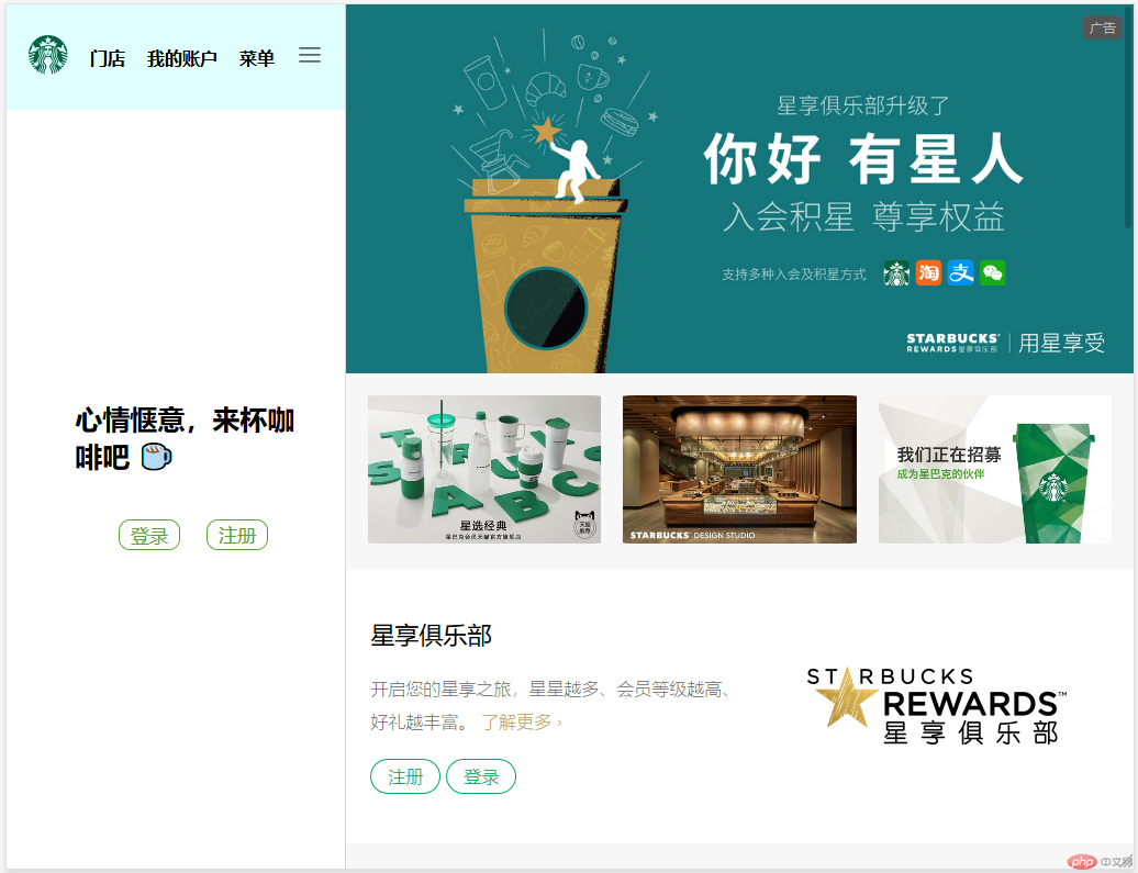
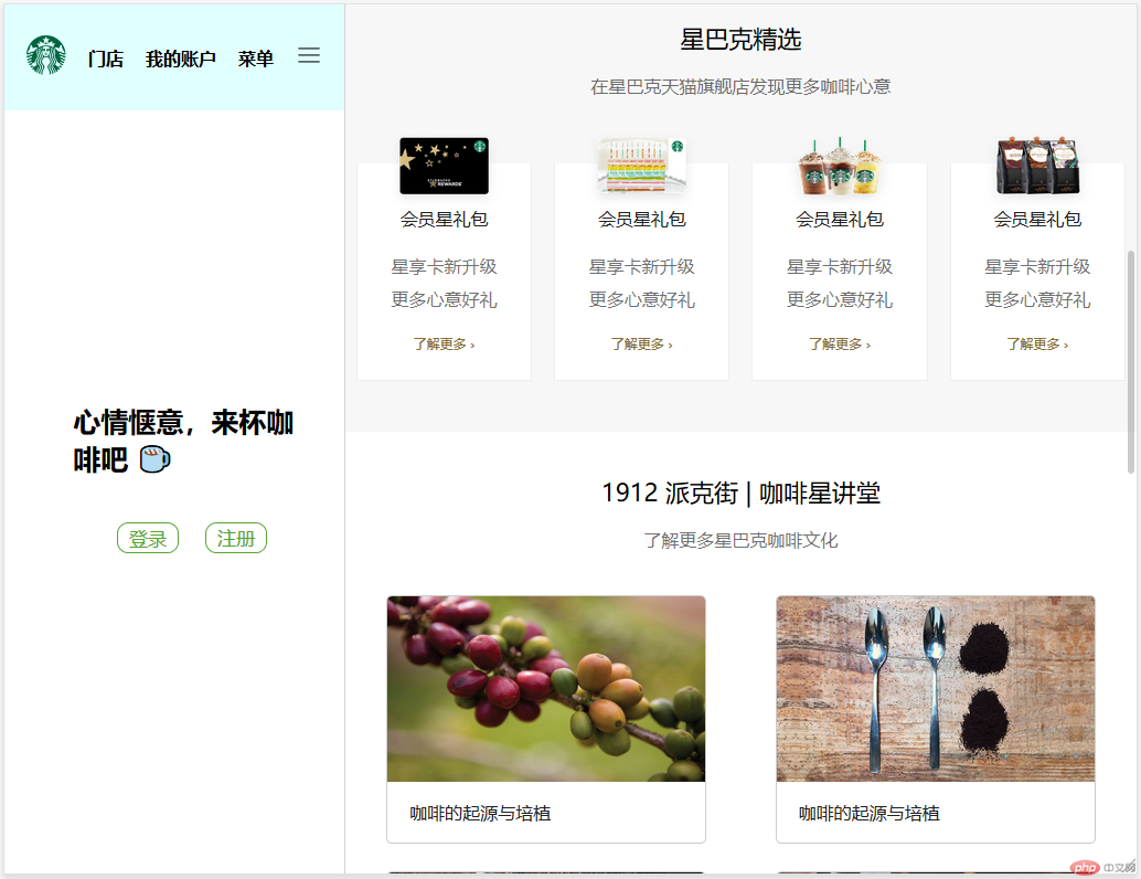
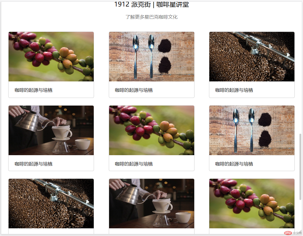
某企业站首页:星巴克
参考链接:星巴克官网: 用每一杯咖啡传递星巴克独特的咖啡体验
- 媒体查询规则:
- 设备屏幕最大为1024像素时:关闭侧边栏
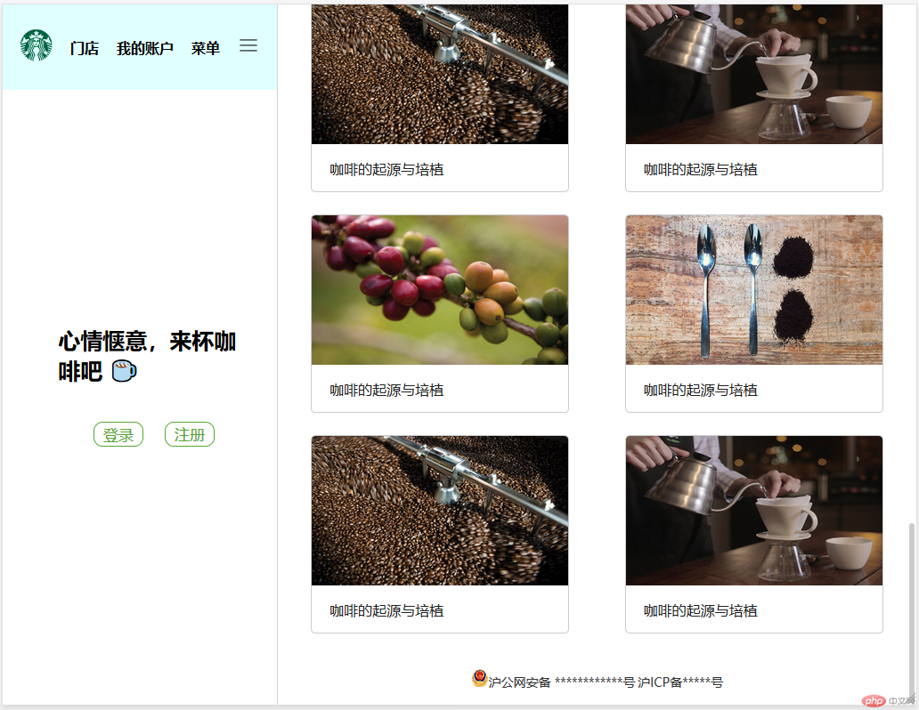
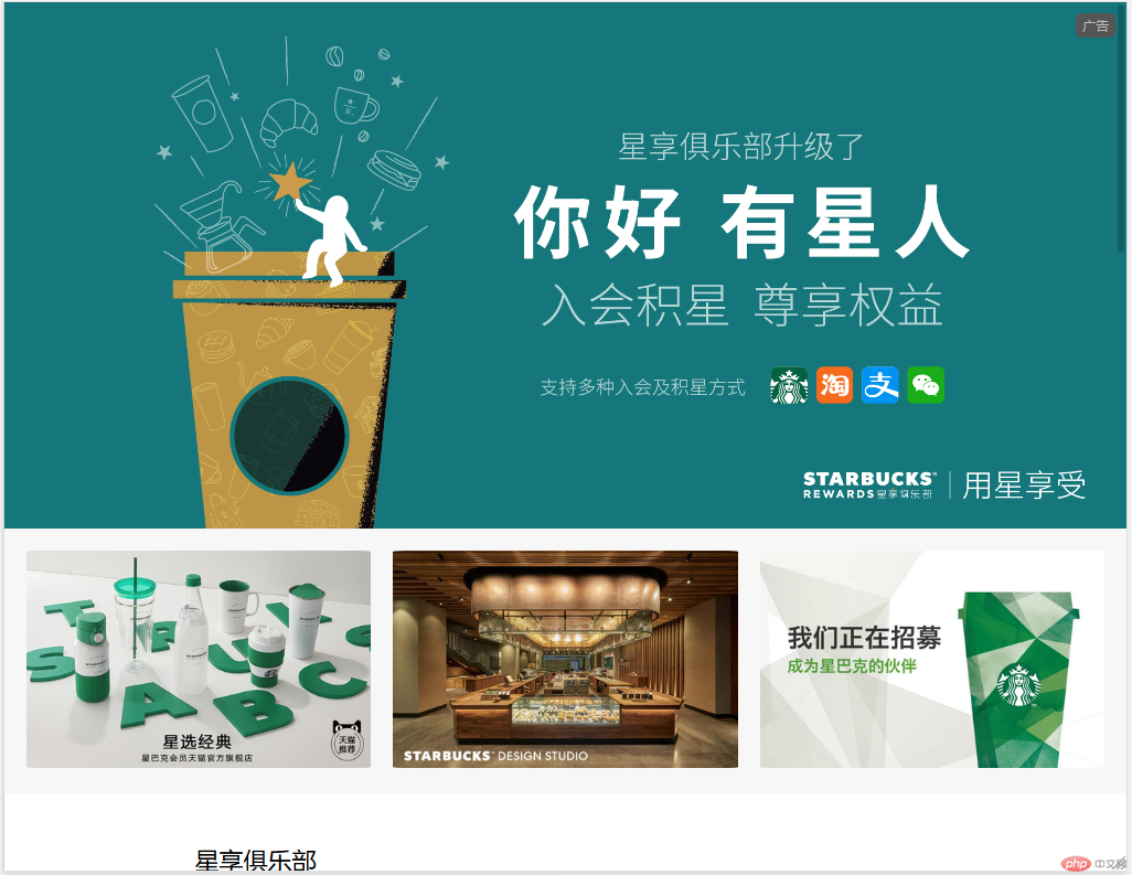
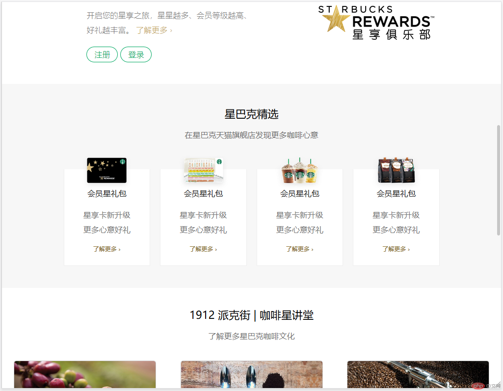
<!-- 左侧导航 --> <nav> <header> <a href="" class="logo"><img src="image2/logo.svg" alt=""></a> <a href="">门店</a> <a href="">我的账户</a> <a href="">菜单</a> <a href=""> <img src="image2/icon-hamburger.svg" alt=""> </a> </header> <div class="body"> <div class="con"> <div class="content"> <span>心情惬意,来杯咖啡吧 ☕</span> </div> <footer> <a href=""> <img src="" alt=""><span>登录</span> </a> <a href=""><span>注册</span></a> </footer> </div> </div> </nav> <!-- 内容区 --> <section class="container"> <section class="row"> <div class="col-12 bigimg "> <span class="tag_ad">广告</span> <div class="hero"><img src="image2/banner.jpg" alt=""></div> </div> </section> <section class="row small_img"> <div class="col-4"><img src="image2/tmall-2020-06-29-zh.jpg" alt=""></div> <div class="col-4"><img src="image2/starbucks-design-studio-web-china.jpg" alt=""></div> <div class="col-4"><img src="image2/homepage-career-cn.jpg" alt=""></div> </section> <!-- 第三部分 --> <section class="row msg"> <div class="col-6 small_msg"> <h2>星享俱乐部</h2> <p>开启您的星享之旅,星星越多、会员等级越高、<br>好礼越丰富。 <a href="">了解更多 ›</a> </p> <p class="account"><a href="">注册</a><a href="">登录</a></p> </div> <div class="col-6 small_logo"><img src="image2/logo-msr-new.svg" alt=""></div> </section> <section class="row goods"> <div class="col-12"> <h2>星巴克精选</h2> <p>在星巴克天猫旗舰店发现更多咖啡心意</p> <div class="card"> <a href=""> <img src="image2/tmall-card-01.png" alt=""> <span class="content"> <h2>会员星礼包</h2> <p>星享卡新升级<br>更多心意好礼</p> <p>了解更多 ›</p> </span> </a> <a href=""> <img src="image2/tmall-card-02.png" alt=""> <span class="content"> <h2>会员星礼包</h2> <p>星享卡新升级<br>更多心意好礼</p> <p>了解更多 ›</p> </span> </a> <a href=""> <img src="image2/tmall-eticket.png" alt=""> <span class="content"> <h2>会员星礼包</h2> <p>星享卡新升级<br>更多心意好礼</p> <p>了解更多 ›</p> </span> </a> <a href=""> <img src="image2/tmall-reserve.png" alt=""> <span class="content"> <h2>会员星礼包</h2> <p>星享卡新升级<br>更多心意好礼</p> <p>了解更多 ›</p> </span> </a> </div> </div> </section> <section class="row forum"> <div class="col-12"> <h2 class="title1">1912 派克街 | 咖啡星讲堂</h2> <p class="title2">了解更多星巴克咖啡文化</p> <div class="content"> <a href=""> <img src="image2/coffeehouse-coffee-cultivation-kv.jpg" alt=""> <span class="tag_type"></span> <strong>咖啡的起源与培植</strong> </a> <a href=""> <img src="image2/coffeehouse-4-fundamentals-kv.jpg" alt=""> <span class="tag_type"></span> <strong>咖啡的起源与培植</strong> </a> <a href=""> <img src="image2/coffeehouse-roast-story-kv.jpg" alt=""> <span class="tag_type"></span> <strong>咖啡的起源与培植</strong> </a> <a href=""> <img src="image2/coffeehouse-pour-over-kv.jpg" alt=""> <span class="tag_type"></span> <strong>咖啡的起源与培植</strong> </a> <a href=""> <img src="image2/coffeehouse-coffee-cultivation-kv.jpg" alt=""> <span class="tag_type"></span> <strong>咖啡的起源与培植</strong> </a> <a href=""> <img src="image2/coffeehouse-4-fundamentals-kv.jpg" alt=""> <span class="tag_type"></span> <strong>咖啡的起源与培植</strong> </a> <a href=""> <img src="image2/coffeehouse-roast-story-kv.jpg" alt=""> <span class="tag_type"></span> <strong>咖啡的起源与培植</strong> </a> <a href=""> <img src="image2/coffeehouse-pour-over-kv.jpg" alt=""> <span class="tag_type"></span> <strong>咖啡的起源与培植</strong> </a> <a href=""> <img src="image2/coffeehouse-coffee-cultivation-kv.jpg" alt=""> <span class="tag_type"></span> <strong>咖啡的起源与培植</strong> </a> <a href=""> <img src="image2/coffeehouse-4-fundamentals-kv.jpg" alt=""> <span class="tag_type"></span> <strong>咖啡的起源与培植</strong> </a> <a href=""> <img src="image2/coffeehouse-roast-story-kv.jpg" alt=""> <span class="tag_type"></span> <strong>咖啡的起源与培植</strong> </a> <a href=""> <img src="image2/coffeehouse-pour-over-kv.jpg" alt=""> <span class="tag_type"></span> <strong>咖啡的起源与培植</strong> </a> </div> </div> </section> <section class="row"> <footer class="col-12"> <a href=""><img src="image2/icpicon.png" alt="">沪公网安备 ************号</a> <a href="">沪ICP备*****号</a> </footer> </section> </section>
<style type="text/css"> * { margin: 0; padding: 0; box-sizing: border-box; } a { text-decoration: none; } html { font-size: 10px; } /* 左侧导航 */ nav { width: 30%; height: 100vh; background-color: white; display: flex; flex-flow: column nowrap; position: fixed; } nav>header { padding: 0 10px; height: 96px; background-color: lightcyan; display: flex; flex-flow: row nowrap; align-items: center; } nav>header>a { margin: 0 10px; color: inherit; font-weight: bold; font-size: 1.6rem; } nav>header>a:last-of-type { margin-left: auto; } nav>header>a:first-of-type>img { width: 36px; } nav>header>a:last-of-type>img { width: 24px; } nav>.body { width: 100%; height: 80vh; display: flex; flex-flow: column; justify-content: center; align-items: end; } nav>.body>.con { width: 70%; height: 100px; margin-right: 30px; } nav>.body .content>span { font-size: 2.5rem; font-weight: bold; } nav footer { margin-top: 30px; } nav>.body footer span { margin: 0 10px; padding: 2px 10px; color: #55A532; font-size: 1.7rem; border: 1px solid #55A532; border-radius: 10px; ; } /* 内容区 */ .title1 { font-size: 2.2rem; font-weight: 400; margin-bottom: 18px; text-align: center; } .title2 { font-size: 1.6rem; text-align: center; color: rgba(0, 0, 0, 0.56); } .container { width: 70%; margin-left: 30%; border-left: 1px solid #D3D3D3; float: left; } .bigimg { position: relative; } .bigimg .tag_ad { padding: 3px 6px; font-size: 1.2rem; border-radius: 5px; color: #bbb; background-color: #555555; position: absolute; right: 10px; top: 10px; } .bigimg img { width: 100%; display: block; } /* 第二部分 */ .small_img { padding: 0 10px; background-color: #F7F7F7; box-shadow: 0 0 2px #eee; } .small_img img { padding: 20px 10px; width: 100%; border-radius: 21px; } /* 第三部分 */ .msg { height: 250px; } .msg .small_msg { margin-left: auto; display: flex; flex-flow: column; justify-content: center; } .msg h2 { font-size: 2.2rem; font-weight: 400; } .msg p { margin-top: 20px; font-size: 1.6rem; font-weight: 200; color: rgba(0, 0, 0, 0.56); line-height: 30px; } .msg a { color: #C2A661; } .msg .account a { color: #00A862; padding: 5px 15px; margin-top: 30px; border: 1px solid #00A862; border-radius: 20px; } .msg .account a:last-of-type { margin-left: 5px; } .msg img { width: 236px; } .msg .small_logo { display: flex; justify-content: center; align-items: center; } /* 第四部分 */ .goods { height: 416px; background-color: #F7F7F7; display: flex; flex-flow: column; align-items: center; justify-content: center; } .goods h2 { font-size: 2.2rem; font-weight: 400; margin-bottom: 18px; text-align: center; } .goods p { font-size: 1.6rem; text-align: center; color: rgba(0, 0, 0, 0.56); } .goods .card { margin: 60px auto 0; max-width: 786px; display: flex; align-items: center; } .goods .card a { width: 25%; height: 197px; margin: 0 10px; background-color: white; display: flex; flex-flow: column; justify-content: center; border-right: 1px solid #EEEEEE; border-bottom: 1px solid #EEEEEE; border-left: 1px solid #EEEEEE; position: relative; } .goods .card a:hover { top: -8px; box-shadow: 0 1px 3px 2px rgba(0, 0, 0, 0.12); } .goods .card img { width: 101.4px; height: 72px; position: absolute; top: -30px; left: 0; right: 0; margin: 0 auto; } .goods .card h2 { margin-top: 20px; font-size: 1.6rem; color: rgba(0, 0, 0, 0.87); } .goods .card p { margin-top: 10px; color: rgba(0, 0, 0, 0.56); line-height: 30px; } .goods .card p:last-of-type { color: #887035; font-size: 1.2rem; } /* 第五部分 */ .forum { } .forum h2{ margin-top: 40px; } .forum a { width: 290px; background-color: white; border: 1px solid #CCCCCC; border-radius: 5px; overflow: hidden; display: inline-block; position: relative; } .forum a:hover{ top:-5px; box-shadow: 2px 2px 2px #D3D3D3; } .forum img { width: 100%; height:168px; } .forum .content{ margin-top: 40px; display: grid; grid-template-columns: repeat(auto-fill,290px); grid-template-rows: repeat(auto-fill,225px); place-content: space-evenly; gap:25px; } .forum strong{ font-size: 1.6rem; font-weight: 400; padding: 0 20px; color:rgba(0, 0, 0, 0.87); line-height: 50px; } /* 结尾部分 */ footer{ margin-top: 30px; height:50px; text-align: center; } footer a{ line-height: 50px; font-size: 1.4rem; color:rgb(51, 51, 51); } /* 设备屏幕最大为1024像素时使用该媒体查询 */ @media screen and (max-width:1024px){ nav{ display: none; } .container { width: 100%; margin-left: 0; } } </style>
说明
- 左侧菜单使用固定定位,不随屏幕的滚动而滚动,宽度为30%
- 右侧内容区使用据左边距为30%来防止覆盖左侧菜单
- a标签包含img元素,设置圆角时图片部分不响应,可对a标签设置overflow:hidden来解决
