
1、浮动
1.1、浮动高度坍塌的原因
- DOM结构如下:
<div class="container"><div class="item">1</div><div class="item">2</div><div class="item">3</div></div>
当给3个
item设置浮动后,container高度坍塌
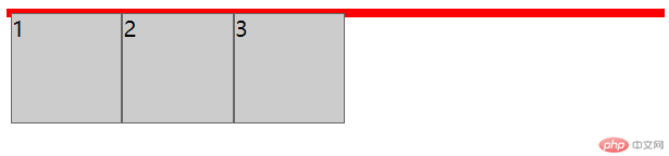
- 为什么呢?
- 因为父元素的高度默认是被子元素撑开的,一旦
item设置浮动后,就脱离了文档流,此时将会导致子元素无法撑起父元素的高度,导致父元素的高度塌陷。
1.2、解决方案
解决方案1: 给父元素
container也添加一个高度- 可行,但当子元素更改高度时父元素需同时改;不推荐;
解决方案2: 父元素
container也添加浮动- 可行,但父元素
container上面假设还有好多层级元素,需全部加上浮动(相对全浮动页面);不推荐;
- 可行,但父元素
解决方案3: 添加
container下添加<div style="clear:both;"></div>用于清除浮动- 可行,但页面多余代码给后端渲染带来不便;不推荐;
解决方案4: 给父元素
container添加一个伪元素.container::after {content: "";display: block;clear: both;}
- 可行;推荐;
解决方案5: 最简单的解决方案,用到BFC(块级格式化上下文)
overflow: hidden;
- 可行,简单明了;强烈推荐;
2、经典3列布局示例
2.1 浮动方式实现3列布局
<!DOCTYPE html><html lang="zh-cn"><head><meta charset="zh-cn" /><meta name="viewport" content="width=device-width, initial-scale=1.0" /><title>浮动实现三列布局</title><style>/* 清除所有元素的内外边距*/* {margin: 0;padding: 0;}/* 父盒子 */.box {background-color: #ccc;width: 100%;min-height: 600px;overflow: hidden; /* 清除浮动*/}/* 左盒子 */.box_left {width: 160px;height: 600px;background-color:lightseagreen;float: left;}/* 右盒子 */.box_right {width: 160px;height: 600px;background-color:lightsalmon;float: right;}/* 中盒子-自适应*/.box_main {height: 600px;margin-left: 160px;margin-right: 160px;background-color:lemonchiffon;}</style></head><body><div class="box"><div class="box_left"></div><div class="box_right"></div><div class="box_main"></div></div></body></html>
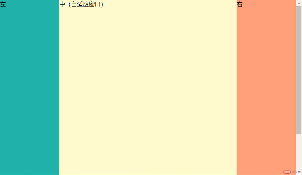
2.2 定位方式实现3列布局
<!DOCTYPE html><html lang="zh-cn"><head><meta charset="zh-cn" /><meta name="viewport" content="width=device-width, initial-scale=1.0" /><title>定位实现三列布局</title><style>/* 清除所有元素的内外边距*/* {margin: 0;padding: 0;}/* 父盒子 */.box {background-color: #ccc;width: 100%;min-height: 600px;position: relative;}/* 左盒子 */.box_left {width: 160px;height: 600px;background-color: lightseagreen;position: absolute;top:0;left: 0;}/* 右盒子 */.box_right {width: 160px;height: 600px;background-color: lightsalmon;position: absolute;top: 0;right: 0;}/* 中盒子-自适应*/.box_main {height: 600px;margin-left: 160px;margin-right: 160px;background-color: lemonchiffon;}</style></head><body><div class="box"><div class="box_left">左</div><div class="box_right">右</div><div class="box_main">中(自适应窗口)</div></div></body></html>
总结:
- 通过学习,对浮动产生的影响有了更深的理解,新的知识点
overflow: hidden;简单易懂;经典3列简单布局已经能独立写出来,有空需要实践更复杂的案例,遇到问题,才明白自己什么地方理解不足。