
1、盒模型
1.1、盒模型常用属性
盒模型常用属性主要有3个
- border (边框)
- padding (内边距)
- margin(外边距)
以上属性还支持单独设置上/下/左/右属性
border (边框)
border 比较特殊, 除了可以设置宽度, 还可以设置样式和颜色,所以有更多的属性
border:(4边框)
border: 1px solid #ccc- border-top:(上边框)
border-top: 1px solid #ccc - border-left(左边框):
border-left: 1px solid #ccc - border-bottom(下边框):
border-bottom: 1px solid #ccc - border-right(右边框):
border-right: 1px solid #ccc
- border-top:(上边框)
除上下左右外,还支持单独为每个边框线设定宽度/样式/颜色,非常灵活。比如:
- border-top-width
- border-top-style
- border-top-color
其它边框同样可以单独设置
1.2、盒模型属性示例
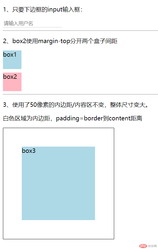
<!DOCTYPE html><html lang="en"><head><meta charset="UTF-8" /><meta name="viewport" content="width=device-width, initial-scale=1.0" /><title>盒模型属性示例</title><style>input {border: none;border-bottom: 1px solid #ccc;}.box1 {width: 50px;height: 50px;background: lightblue;}.box2 {width: 50px;height: 50px;background: lightpink;margin-top: 10px;}.box3 {width: 200px;height: 200px;background: lightblue;padding: 50px;border: 1px solid #000;background-clip: content-box;}</style></head><body><p>1、只要下边框的input输入框:</p><input type="text" name="user" placeholder="请输入用户名" /><hr /><p>2、box2使用margin-top分开两个盒子间距</p><div class="box1">box1</div><div class="box2">box2</div><hr /><p>3、使用了50像素的内边距/内容区不变,整体尺寸变大。</p><p>白色区域为内边距,padding=border到content距离</p><div class="box3">box3</div></body></html>
效果如下:
2、元素大小的计算
- 元素的计算方式
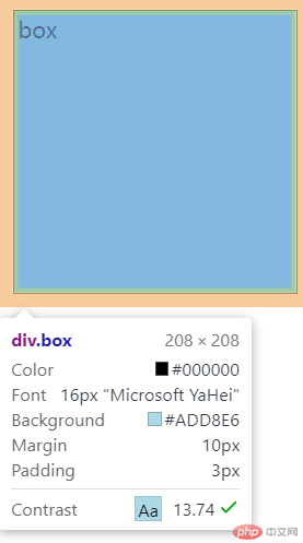
.box {width: 200px;height: 200px;padding: 3px;margin: 10px;border: 1px solid #000;background: lightblue;}
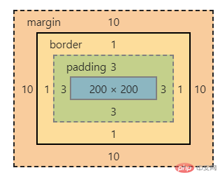
盒子宽/高都设置了200像素,实际为208像素,可以看出:
盒子的具体宽高=content+padding+border=200+6+2=208结论:盒子大小受边框及内边距影响,布局时应该考虑。
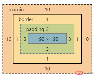
- 如果希望盒子大小不受边框及内边距影响,可以使用以下属性:
box-sizing: border-box;
使用后盒子大小不受边框及内边距影响,但内容区会缩小,如图所示:
3、定位
一旦一个元素被添加了
position:属性 ,且值非static,那么它就是定位元素。
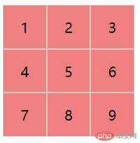
3.1 相对定位
position: relative;相对定位:是相对自己做了偏移,这个元素仍然在文档流中的位置不释放例:使用相对定位做出九宫格
<!DOCTYPE html><html lang="en"><head><meta charset="UTF-8" /><meta name="viewport" content="width=device-width, initial-scale=1.0" /><title>Document</title><style>* {box-sizing: border-box; /*盒子重新计算大小,不受边距而变化*/}div {width: 50px;height: 50px;text-align: center;line-height: 50px;border: 1px solid #ccc;background-color: lightcoral;}.box2{position: relative;top:-50px;left: 50px;}.box3{position: relative;top:-100px;left: 100px;}.box4{position: relative;top:-100px;}.box5{position: relative;top:-150px;left: 50px;}.box6{position: relative;top:-200px;left: 100px;}.box7{position: relative;top:-200px;}.box8{position: relative;top:-250px;left: 50px;}.box9{position: relative;top:-300px;left: 100px;}</style></head><body><div class="box1">1</div><div class="box2">2</div><div class="box3">3</div><div class="box4">4</div><div class="box5">5</div><div class="box6">6</div><div class="box7">7</div><div class="box8">8</div><div class="box9">9</div></body></html>
3.2 绝对定位
position: absolute;绝对定位:相对于它的定位父级进行定位的使用绝对定位将盒子水平排列
<!DOCTYPE html><html lang="en"><head><meta charset="UTF-8" /><meta name="viewport" content="width=device-width, initial-scale=1.0" /><title>Document</title><style>* {margin: 0;padding: 0;box-sizing: border-box; /*盒子重新计算大小,不受边距而变化*/}div {width: 50px;height: 50px;text-align: center;line-height: 50px;background-color: lightcoral;}.box2 {position: absolute;top: 0;left: 50px;}.box3 {position: absolute;top: 0;left: 50px;}</style></head><body><div class="box1">1</div><div class="box2">2<div class="box3">3</div></div></body></html>
box2的定位父级是body,是根据body进行偏移;box3的父级是box2,是根据box2进行偏移。
3.3 固定定位
position: fixed;忽略你的定位父级,总是相对于<body>定位
总结:
- 学习了盒模型与定位,对布局有了更进一步的理解,但发现一个问题,绝对定位偏移量好像是从
content+一边的border计算的?希望老师解答。