

1. 将课堂介绍了三个小案例, 自己动手写一遍, 再抄一遍
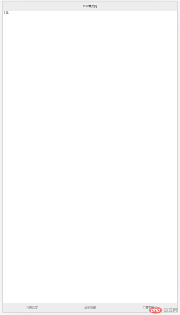
DEMO1:手机端通用布局
<!DOCTYPE html><html lang="en"><head><meta charset="UTF-8"><title>手机端通用布局</title><link rel="stylesheet" href="css/style1.css"></head><body><header>PHP中文网</header><main>主体</main><footer><a href="">官网首页</a><a href="">教学视频</a><a href="" class="last-link">工具手册</a></footer></body></html>
CSS部分:
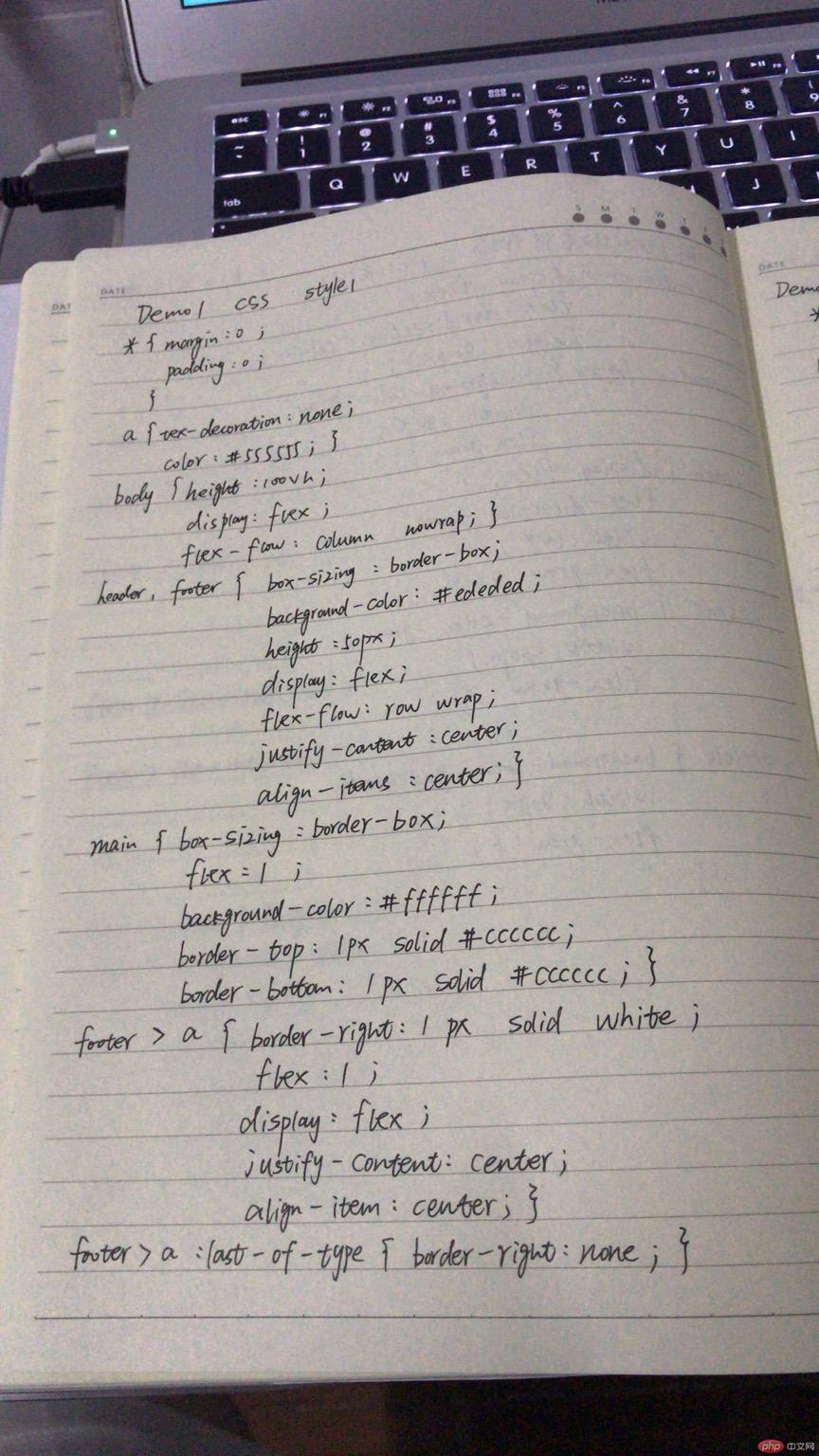
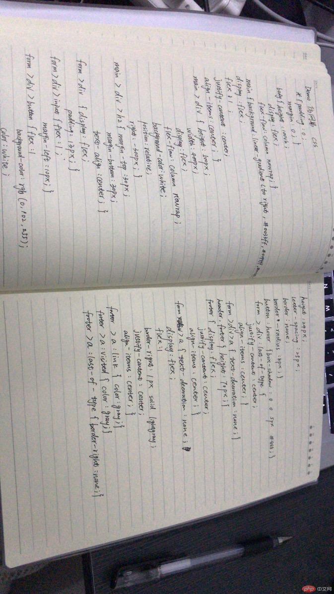
* {margin: 0;padding: 0;}a {text-decoration: none;color: #555555;}body {height: 100vh;display: flex;flex-flow: column nowrap;}header, footer {box-sizing: border-box;background-color: #ededed;height: 50px;display: flex;flex-flow: row nowrap;justify-content: center;align-items: center;}main {box-sizing: border-box;flex: 1;background-color: #ffffff;border-top: 1px solid #cccccc;border-bottom: 1px solid #cccccc;}footer > a {/*line-height: 50px;*//*text-align: center;*/border-right: 1px solid white;flex: 1;display: flex;justify-content: center;align-items: center;}footer > a:last-of-type {border-right: none;}
运行效果:
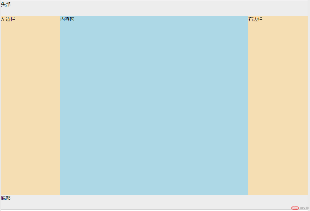
DEMO2:圣杯布局
<!DOCTYPE html><html lang="en"><head><meta charset="UTF-8"><title>flex实现圣杯布局</title><link rel="stylesheet" href="css/style2.css"></head><body><header>头部</header><main><article>内容区</article><aside>左边栏</aside><aside>右边栏</aside></main><footer>底部</footer></body></html>
CSS部分:
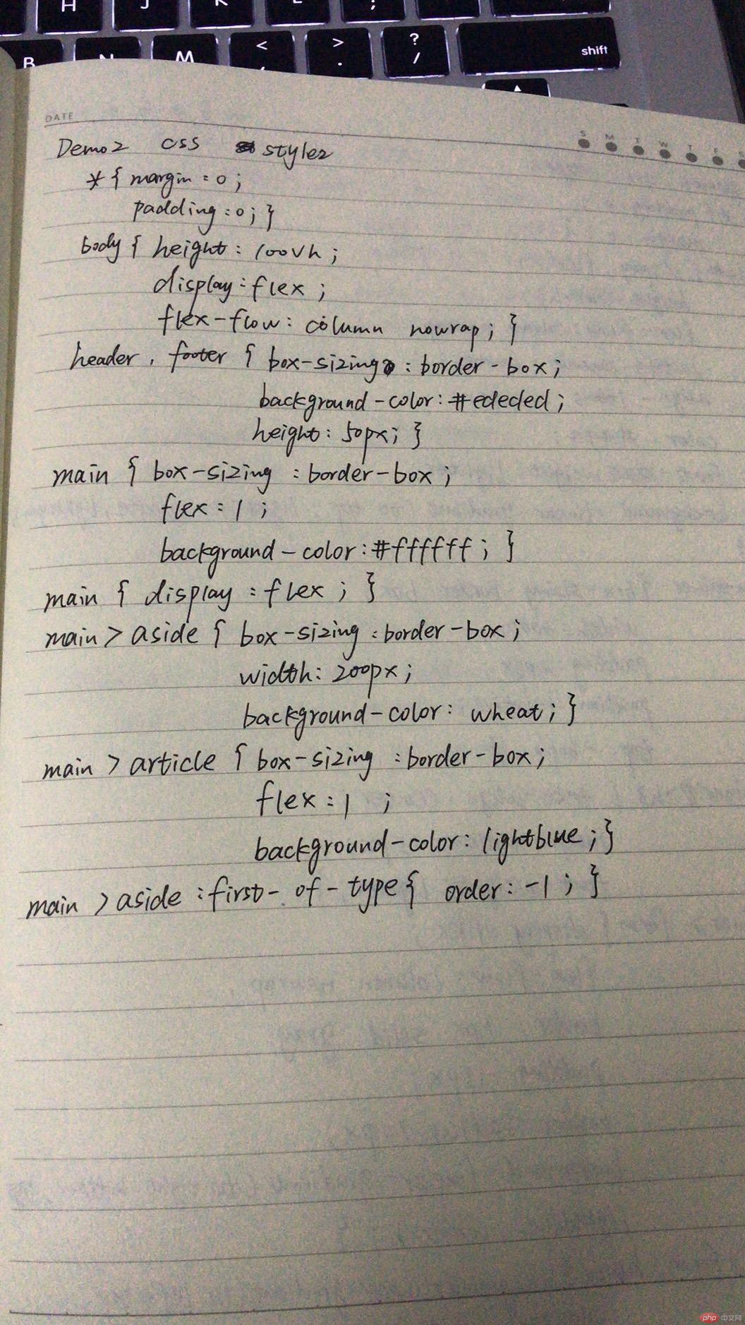
* {margin: 0;padding: 0;}body {height: 100vh;display: flex;flex-flow: column nowrap;}header, footer {box-sizing: border-box;background-color: #ededed;height: 50px;}main {box-sizing: border-box;flex: 1;background-color: #ffffff;}main {display: flex;}main > aside {box-sizing: border-box;width: 200px;background-color: wheat;}main > article {box-sizing: border-box;flex: 1;background-color: lightblue;}main > aside:first-of-type {order: -1;}
运行效果:
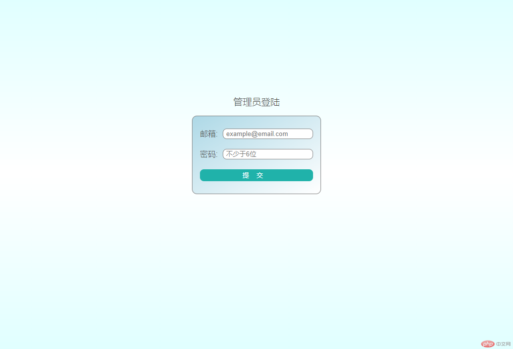
DEMO3:酷炫的登录界面
<!DOCTYPE html><html lang="en"><head><meta charset="UTF-8"><title>弹性布局实现登录表单</title><link rel="stylesheet" href="css/style3.css"></head><body><div class="container"><h3>管理员登陆</h3><form action=""><div><label for="email">邮箱:</label><input type="email" id="email" name="email" placeholder="example@email.com"></div><div><label for="password">密码:</label><input type="password" id="password" name="password" placeholder="不少于6位"></div><div><button>提交</button></div></form></div></body></html>
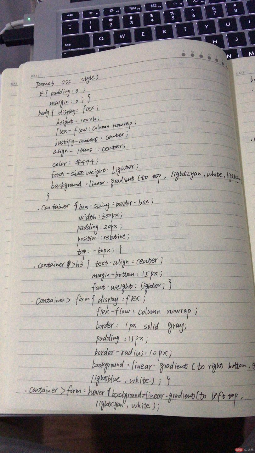
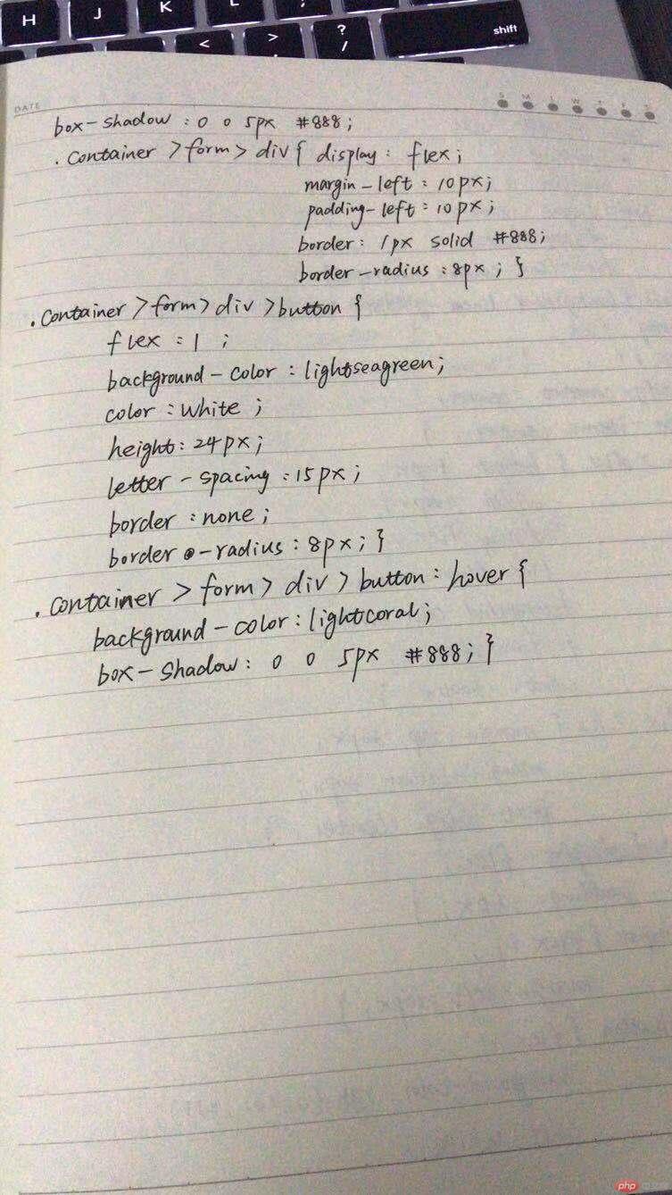
CSS部分
* {padding: 0;margin: 0;}body {display: flex;height: 100vh;flex-flow: column nowrap;justify-content: center;align-items: center;color: #444;font-weight: lighter;background: linear-gradient(to top, lightcyan, white, lightcyan);}.container {box-sizing: border-box;width: 300px;padding: 20px;position: relative;top: -60px;}.container > h3 {text-align: center;margin-bottom: 15px;font-weight: lighter;}.container > form {display: flex;flex-flow: column nowrap;border: 1px solid gray;padding: 15px;border-radius: 10px;background: linear-gradient(to right bottom, lightblue, white);}.container > form:hover {background: linear-gradient(to left top, lightcyan, white);box-shadow: 0 0 5px #888;}.container > form > div {display: flex;margin: 10px 0;}.container > form > div > input {flex: 1;margin-left: 10px;padding-left: 6px;border: 1px solid #888;border-radius: 8px;}.container > form > div > button {flex: 1;background-color: lightseagreen;color: white;height: 24px;letter-spacing: 15px;border: none;border-radius: 8px;}.container > form > div > button:hover {background-color: lightcoral;box-shadow: 0 0 5px #888;}
运行效果:
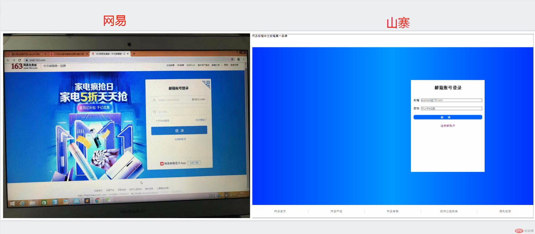
2. 自己根据自己情况, 自定义一个小案例, 使用flex实现, 例如网站后台首页
demo:仿网易邮箱登录界面
<!DOCTYPE html><html lang="en"><head><meta charset="UTF-8"><title>仿某易邮箱</title><link rel="stylesheet" href="css/style.css"></head><body><header>网易邮箱中文邮箱第一品牌</header><main><div class="log"><h2>邮箱账号登录</h2><form><div><label for="email">邮箱</label><input type="email" id="email" name="email" placeholder="example@163.com"></div><div><label for="password">密码</label><input type="password" id="password" name="password" placeholder="不少于6位数"></div><div><button>登录</button></div><div><a href="">注册新账户</a></div></form></div></main><footer><a href="">网易首页</a><a href="">网易严选</a><a href="">网易有钱</a><a href="">政府公益热线</a><a href="">隐私政策</a></footer></body></html>
CSS部分:
*{padding: 0;margin: 0;}body{height: 100vh;/*将整个页面转为弹性盒子FlexBox*/display: flex;/*主轴垂直且不换行*/flex-flow: column nowrap;}main{background: linear-gradient(to right , #0033ff,#0099ff,#0033ff);display: flex;flex: 1;justify-content: center;align-items: center;}main > div {height : 500px;width : 400px;display: flex;flex-flow: column nowrap;background-color: white;position: relative;right: -300px;}main > div > h2{margin-top:30px;margin-bottom:30px;text-align: center;}form > div {display: flex;padding: 13px;}form > div >input {flex:1;margin-left: 10px;}form > div > button {flex: 1;background-color:rgb(0, 102, 255);color: white;height: 24px;letter-spacing: 25px;border: none;border-radius: 8px;}button:hover{box-shadow: 0 0 5px #888;}form > div:last-of-type {justify-content: center;align-items: center;}form > div > a{text-decoration: none;}header,footer{height: 70px;}footer{display: flex;justify-content: center;align-items: center;}footer > a {text-decoration: none;display: flex;flex: 1;border-right: 1px solid lightgray;justify-content: center;align-items: center;}footer > a:link{color: gray;}footer > a:visited{color: gray;}footer > a:last-of-type{border-right: none;}
效果对比