
CSS 小結筆記之變形、轉場與動畫的範例

- 青灯夜游轉載
- 2018-10-09 17:00:402606瀏覽
這篇文章主要介紹了CSS 小結筆記之變形、過渡與動畫的範例的相關資料,有一定的參考價值,有需要的朋友可以參考一下,希望對你們有所幫助。
1、過渡transition
過渡屬性用法: transition :ransition-property transition-duration transition -timing-function transition-delay
可以一起指定也可以分別單獨指定
transition-property: 是要過渡的屬性(如width,height),all是所有都改變。
transition-duration:花費的時間,單位為s或ms
transition-timing-function:是指定動畫類型(運動區曲線),運動曲線有以下幾種
ease=>逐漸慢下來(預設值) linear=>勻速ease-in=>加速ease-out=>減速ease-in-out=>先加速在減速
transition-delay 延遲時間,單位為s或ms
<!DOCTYPE html>
<html lang="en">
<head>
<meta charset="UTF-8">
<meta name="viewport" content="width=device-width, initial-scale=1.0">
<meta http-equiv="X-UA-Compatible" content="ie=edge">
<title>Document</title>
<style>
p {
width: 100px;
height: 200px;
background-color: aqua;
transition: width 2s ease-in-out 0.5s;
}
p:hover {
width: 500px;
}
</style>
</head>
<body>
<p></p>
</body>
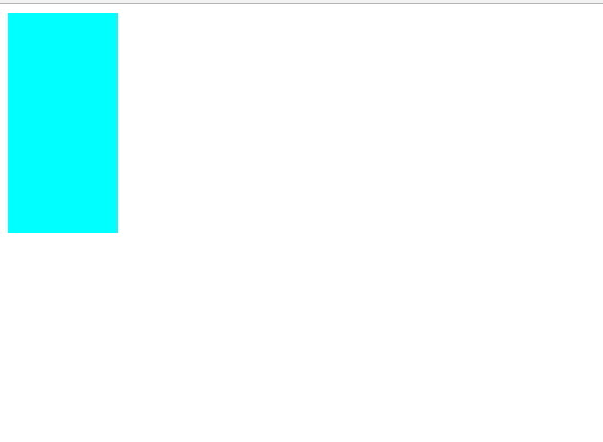
</html>結果如下,當滑鼠上去後變化不再是瞬間完成,而是過渡完成。
2、變形transform
#(1)、 2D變形
(a)移動 translate(x,y)
#移動可以指定像素值也可以指定百分比, 注意:指定百分比是自身大小的百分比,因此可以用於設定盒子定位時的居中對齊(在設定left:50%後再移動自身的-50%即可)。
<!DOCTYPE html>
<html lang="en">

<head>
    <meta charset="UTF-8">
    <meta name="viewport" content="width=, initial-scale=1.0">
    <meta http-equiv="X-UA-Compatible" content="ie=edge">
    <title>Document</title>
    <style>
        p {
            width: 100px;
            height: 100px;
            background-color: aqua;
            transition: all 2s;
        }

        p:active {
            transform: translate(200px, 200px);
        }
    </style>
</head>

<body>
    <p></p>
</body>

</html>
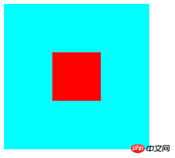
點擊之後盒子進行了移動。用於讓定位的盒子居中的程式碼入下
<!DOCTYPE html>
<html lang="en">

<head>
    <meta charset="UTF-8">
    <meta name="viewport" content="width=device-width, initial-scale=1.0">
    <meta http-equiv="X-UA-Compatible" content="ie=edge">
    <title>Document</title>
    <style>
        .fa {
            width: 300px;
            height: 300px;
            background-color: aqua;
            transition: all 0.5s;
            position: relative;
        }

        .son {
            background-color: red;
            position: absolute;
            left: 50%;
            top: 50%;
            width: 100px;
            height: 100px;
            transform: translate(-50%, -50%);
        }

    </style>
</head>

<body>
    <p class="fa">
        <p class="son"></p>
    </p>

</body>

</html>
結果為
#(b)縮放 scale(x,y)
#x,y設定大於1 是放大,小於1 是縮小。
<!DOCTYPE html>
<html lang="en">

<head>
    <meta charset="UTF-8">
    <meta name="viewport" content="width=device-width, initial-scale=1.0">
    <meta http-equiv="X-UA-Compatible" content="ie=edge">
    <title>Document</title>
    <style>
        p {
            width: 100px;
            height: 100px;
            background-color: aqua;
            margin: 200px auto;
            transition: all 2s;
        }

        p:hover {
            transform: scale(0.5, 2);
        }
    </style>
</head>

<body>
    <p>

    </p>
</body>

</html>
(c)旋轉 rotate(x deg)
x指定度數值,正數是順時針旋轉,負數是逆時針旋轉。
旋轉可以使用 transform-origin 指定旋轉中心點,transform-origin 給left top right bottom 也可以指定特定的像素值。
<!DOCTYPE html>
<html lang="en">

<head>
    <meta charset="UTF-8">
    <meta name="viewport" content="width=device-width, initial-scale=1.0">
    <meta http-equiv="X-UA-Compatible" content="ie=edge">
    <title>Document</title>
    <style>
        p {
            width: 200px;
            height: 100px;
            background-color: aqua;
            margin: 200px auto;
            transition: all 2s;
            transform-origin: bottom left;
        }

        p:hover {
            transform: rotate(120deg);
        }
    </style>
</head>

<body>
    <p></p>
</body>

</html>
(d)傾斜skew(x deg ,y deg)
x,y分別指定傾斜在x,y方向上的角度,可以為負數。 y值不寫預設為0。
<!DOCTYPE html>
<html lang="en">

<head>
    <meta charset="UTF-8">
    <meta name="viewport" content="width=device-width, initial-scale=1.0">
    <meta http-equiv="X-UA-Compatible" content="ie=edge">
    <title>Document</title>
    <style>
        p {
            width: 100px;
            height: 100px;
            background-color: aqua;
            border: 1px solid red;
            transition: all 1s;
            margin: 200px auto;
        }

        p:hover {
            transform: skew(30deg, 20deg);
        }
    </style>
</head>

<body>
    <p></p>
</body>

</html>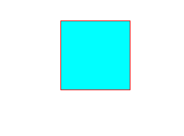
(2)3D變形
#(a)旋轉(rotateX,rotateY,rotateZ)
# 3D旋轉與2D類似,只不過一個是基於二位座標一個是基於三維座標。三個值可以同時指定也可以單獨指定。
<!DOCTYPE html>
<html lang="en">

<head>
    <meta charset="UTF-8">
    <meta name="viewport" content="width=device-width, initial-scale=1.0">
    <meta http-equiv="X-UA-Compatible" content="ie=edge">
    <title>Document</title>
    <style>
        p {
            width: 200px;
            height: 100px;
            background-color: aqua;
            margin: 200px auto;
            transition: all 2s;
            transform-origin: bottom left;
        }

        p:hover {
            transform: rotateX(120deg);
            /* transform: rotateY(120deg); */
            /* transform: rotateZ(120deg); */
        }
    </style>
</head>

<body>
    <p></p>
</body>

</html>
(b)移動(translateX,translateY,translateZ)
#3D移動對於xy方向上的移動與2d移動一致。只有z方向上的移動不一樣。 Z方向上的移動在現實生活中是距離變遠,距離變近。因此在網頁中顯示結果是變近則變大,變遠則變小。
要讓Z放線上移動生效首先要設定perspective(眼睛距離螢幕的距離);
<!DOCTYPE html>
<html lang="en">

<head>
    <meta charset="UTF-8">
    <meta name="viewport" content="width=device-width, initial-scale=1.0">
    <meta http-equiv="X-UA-Compatible" content="ie=edge">
    <title>Document</title>
    <style>
        body {
            perspective: 1000px;
            /* 数值越小说明眼睛离的越近 */
        }

        p {
            width: 200px;
            height: 200px;
            background-color: aqua;
            transition: all 0.5s;
            margin: 200px auto;
        }

        p:hover {
            transform: translate3d(0, 0, 200px);
        }
    </style>
</head>

<body>
    <p>

    </p>
</body>

</html>
3、動畫 animation
(1)、animation: animation- name || #animation- #duration|| animation- # #timing-function || animation- #delay || ##animation- iteration-count|| animation-
direction||
#animation-
fill-mode;
######animation-name:動畫名稱(自己使用@keyframes 定義的動畫)# #####animation-duration:持續時間######animation-timing-function:運動曲線,與過渡的運動曲線類似。 ######animation-delay:延遲時間######animation-iteration-count:循環次數(infinite 是無限循環)######animation-direction:是否反向(動畫是否由結尾倒開是倒著放的)###animation-fill-mode:设置在动画播放之外的状态(结束时的状态)none | forwards(设为结束时的状态)| backwards(设为开始时的状态)|both(设为开始或结束时的状态)
animation-play-state:设置动画状态 running 开始|paused 暂停
(2)、@keyframes 自定义动画
格式如下
@keyframes 动画名称 {
from{ 开始} 0%
to{ 结束 } 100%
}
可以用 from...to 来指定动画过程,也可以用0%~100%指定动画过程。
<!DOCTYPE html>
<html lang="en">

<head>
    <meta charset="UTF-8">
    <meta name="viewport" content="width=device-width, initial-scale=1.0">
    <meta http-equiv="X-UA-Compatible" content="ie=edge">
    <title>Document</title>
    <style>
        p {
            width: 100px;
            height: 100px;
            background-color: aqua;
            /* animation: 动画名称 动画时间 运动曲线 何时开始 播放次数 是否反方向 */
            animation: move 5s linear 3;
        }

        @keyframes move {
            0% {
                transform: translate3d(0, 0, 0);
            }
            25% {
                transform: translate3d(400px, 0, 0);
            }
            50% {
                transform: translate3d(400px, 300px, 0);
            }
            75% {
                transform: translate3d(0, 300px, 0);
            }
            100% {
                transform: translate3d(0, 0, 0);
            }
        }
    </style>
</head>

<body>
    <p></p>
</body>

</html>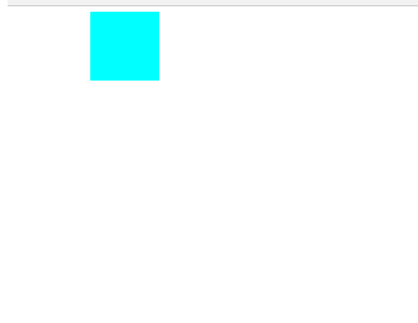
总结:以上就是本篇文的全部内容,希望能对大家的学习有所帮助。更多相关教程请访问 CSS视频教程,CSS3视频教程!
相关推荐:
以上是CSS 小結筆記之變形、轉場與動畫的範例的詳細內容。更多資訊請關注PHP中文網其他相關文章!