
CSS+HTML5的使用方法實例

- PHP中文网原創
- 2017-06-21 15:54:012523瀏覽
1.HTML5基礎
文件類型
<!DOCTYPE HTML PUBLIC ><!DOCTYPE html>
使用video和audio標籤播放影片和音訊

 <video controls>
         <source src="video/video.webm" type="video/webm"/>
         <source src="video/video.mp4" type="video/mp4"/>
     </video>
2.彈性盒子
#box-sizing :border-box/content-box(
預設值)#
##3.圓角邊框
Border-raduis: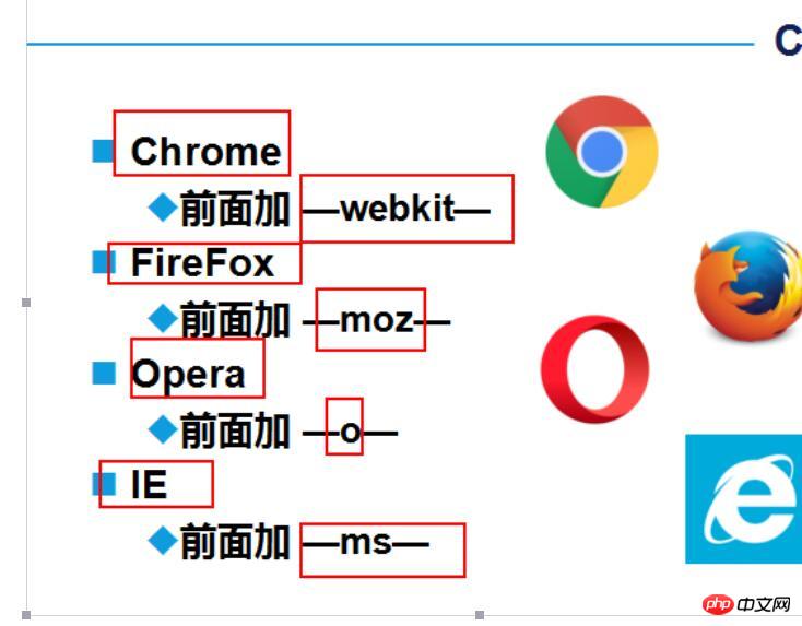 左上角,右上角,右下角,左下角。
- #
- CSS 其文法的日新月異,讓許多以前完成不了的事情,現在可以非常輕鬆的做到。說幾個比較新的強大的CSS 功能:
##shape 的意思是圖形,CSS shapes 也就是CSS 圖形的意思,也就是使用CSS 產生各種圖形(圓形、矩形、橢圓、多邊形等幾何圖形)。
- CSS3之前,我們能做的只有矩形,四四方方,條條框框。
CSS3
CSS3出來後,我們有了更廣闊的施展空間,透過##border-radius
#border
#transform
- 偽元素配合
border-radius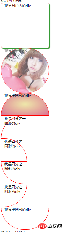 ),下面稍微列舉一些其他幾何圖形:
//01圆角边的css #circle{
width: 300px;
height: 300px;
border: 1px solid red;
border-radius: 10px;
box-shadow: 5px 5px 5px green;
}<div id="circle">我是圆角边的div</div>//02圆形的css加图片#circleshape{
width: 300px;
height: 300px;
border: 1px solid red;
border-radius: 150px;
background: url("img/001.jpg") 0px 0px no-repeat;
background-size: cover;
opacity: 0.7;
transition: all 5s;
}
#circleshape:hover{
transform: rotate(300deg) scale(1.5);
transition: all 5s linear;
}<div id="circleshape">我是圆形的div</div>//03半圆形的CSS #halfcircle{
width: 300px;
height: 150px;
border: 1px solid red;
border-radius: 150px 150px 0px 0px;
background:linear-gradient(to top,pink,palegreen);
background:radial-gradient(palegoldenrod,palevioletred);
}<div id="halfcircle">我是半圆形的div</div>//04四分之一圆形 #halfcircles{
width: 150px;
height: 150px;
border: 1px solid red;
border-radius: 150px 0px 0px 0px;
}<div id="halfcircles">我是四分之一圆形的div</div>
#halfcircless{
width: 150px;
height: 150px;
border: 1px solid red;
border-radius: 0px 150px 0px 0px;
}<div id="halfcircless">我是四分之一圆形的div</div>
#halfcirclesss{
width: 150px;
height: 150px;
border: 1px solid red;
border-radius: 0px 0px 0px 150px;
}<div id="halfcirclesss">我是四分之一圆形的div</div>#halfcirclessss{
width: 150px;
height: 150px;
border: 1px solid red;
border-radius: 0px 0px 150px 0px;
}<div id="halfcirclessss">我是四分之一圆形的div</div>
#halfcircl{
width: 300px;
height: 150px;
border: 1px solid red;
border-radius: 0px 0px 150px 150px;
}<div id="halfcircl">我是半圆形的div</div>//05:三角形 .traingle {
width: 0;
height: 0;
border-left: 50px solid transparent;
border-right: 50px solid transparent;
border-bottom: 100px solid yellowgreen;
}<div class="traingle ">我的三角形,我是div</div>//06:切角:多重线性渐变实现切角。 .notching {
width: 40px;
height: 40px;
padding: 40px;
background: linear-gradient(135deg, transparent 15px, yellowgreen 0) top left,
linear-gradient(-135deg, transparent 15px, yellowgreen 0) top right,
linear-gradient(-45deg, transparent 15px, yellowgreen 0) bottom right,
linear-gradient(45deg, transparent 15px, yellowgreen 0) bottom left;
background-size: 50% 50%;
background-repeat: no-repeat;
}<div class="notching">我是切角,我是div</div>//07:椭圆形 .ellipse {
width: 120px;
height: 160px;
background-color: yellowgreen;
border-radius: 50% 50% 50% 50% / 60% 60% 40% 40%;
}<div class="ellipse">我是椭圆形,我是div</div>08:梯形:伪元素加旋转透视实现梯形
.trapezoid{
position: relative;
width: 60px;
padding: 60px;
}
.trapezoid::before{
content:"";
position: absolute;
top: 0; right: 0; bottom: 0; left: 0;
transform: perspective(20px) scaleY(1.3) rotateX(5deg);
transform-origin: bottom;
background: yellowgreen;
}<div class="trapezoid">我是上面短的梯形,我是div</div>.trapezoids {
position: relative;
width: 60px;
border-top: 60px solid yellowgreen;
border-left: 40px solid transparent;
border-right: 40px solid transparent;
}<div class="trapezoids">我是下面短的梯形,我是div</div>//09.五边形:梯形加上三角形,很容易就组合成一个五边形,这里需要借助一个伪元素实现:.pentagon {
position: relative;
width: 60px;
border-bottom: 60px solid yellowgreen;
border-left: 40px solid transparent;
border-right: 40px solid transparent;
}
.pentagon::before {
content:"";
position: absolute;
top: 60px;
left: -40px;
border-top: 60px solid yellowgreen;
border-left: 70px solid transparent;
border-right: 70px solid transparent;
}//10六边形看看上面的梯形,如果两个反方向且底边同样大小的梯形,叠加在一起,是不是就能得到一个六边形呢
.pentagon {
position: relative;
width: 60px;
border-bottom: 60px solid yellowgreen;
border-left: 40px solid transparent;
border-right: 40px solid transparent;
}
.pentagon::before {
content: "";
position: absolute;
width: 60px;
height: 0px;
top: 60px;
left: -40px;
border-top: 60px solid yellowgreen;
border-left: 40px solid transparent;
border-right: 40px solid transparent;
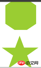
}//11:八边形六边形都解决了,八边形也不在话下,一个矩形加上两个梯形,可以合成一个八边形。
.octagon {
position: relative;
width: 40px;
height: 100px;
background: yellowgreen;
}
.octagon::before {
content: "";
height: 60px;
position: absolute;
top: 0;
left: 40px;
border-left: 30px solid yellowgreen;
border-top: 20px solid transparent;
border-bottom: 20px solid transparent;
}
.octagon::after {
content: "";
height: 60px;
position: absolute;
top: 0;
left: -30px;
border-right: 30px solid yellowgreen;
border-top: 20px solid transparent;
border-bottom: 20px solid transparent;
}//12:五角星好的,探索完多边形,我们继续探索X角星。
先来看看五角星,要怎么实现呢?当然是直接打出来啦 -- ★☆
.star {
margin: 50px 0;
position: relative;
width: 0;
border-right: 100px solid transparent;
border-bottom: 70px solid yellowgreen;
border-left: 100px solid transparent;
transform: rotate(35deg) scale(.6);
}
.star:before {
content: '';
position: absolute;
border-bottom: 80px solid yellowgreen;
border-left: 30px solid transparent;
border-right: 30px solid transparent;
top: -45px;
left: -65px;
transform: rotate(-35deg);
}
.star:after {
content: '';
position: absolute;
top: 3px;
left: -105px;
border-right: 100px solid transparent;
border-bottom: 70px solid yellowgreen;
border-left: 100px solid transparent;
transform: rotate(-70deg);
}//12:六角星六角星呢?想象一下,一个向上的三角形 ▲,叠加上一个向下的三角形 ▼,就可以得到一个六边形:
.sixstar {
position: relative;
width: 0;
border-left: 50px solid transparent;
border-right: 50px solid transparent;
border-bottom: 100px solid yellowgreen;
}
.sixstar:after {
content: "";
position: absolute;
border-left: 50px solid transparent;
border-right: 50px solid transparent;
border-top: 100px solid yellowgreen;
top: 30px;
left: -50px;
}//13:八角星八角星呢?八个角那么多呢。其实使用两个矩形进行旋转拼接就可以了。
.eightstar {
position: relative;
width: 100px;
height: 100px;
background-color: yellowgreen;
transform: rotate(30deg);
}
.eightstar::before {
content: "";
position: absolute;
top: 0;
left: 0;
width: 100px;
height: 100px;
transform: rotate(45deg);
background-color: yellowgreen;
}//14:十二角星好。最后多角星再来一个十二级角星。在八角星的基础上,再增加一个矩形,就能得到十二角啦。也就是要过第一个伪元素。
.twelvestar {
position: relative;
width: 100px;
height: 100px;
margin-bottom: 100px!important;
background-color: yellowgreen;
transform: rotate(30deg);
}
.twelvestar::before {
content: "";
position: absolute;
top: 0;
left: 0;
width: 100px;
height: 100px;
transform: rotate(30deg);
background-color: yellowgreen;
}
.twelvestar::after {
content: "";
position: absolute;
top: 0;
left: 0;
width: 100px;
height: 100px;
transform: rotate(60deg);
background-color: yellowgreen;
}


以上是CSS+HTML5的使用方法實例的詳細內容。更多資訊請關注PHP中文網其他相關文章!
陳述:
本文內容由網友自願投稿,版權歸原作者所有。本站不承擔相應的法律責任。如發現涉嫌抄襲或侵權的內容,請聯絡admin@php.cn
上一篇:HTML5的文字樣式實例介紹下一篇:HTML5的文字樣式實例介紹