
生日蛋糕的製作方法-不過用的是HTML5+CSS3代碼
- 巴扎黑原創
- 2017-05-21 18:35:153785瀏覽
“祝你生日快樂,祝你生日快樂…”,過生日有生日歌,生日蛋糕也是必不可少的,這篇文章主要為大家詳細介紹了程式設計師利用純HTML5+CSS3製作的生日蛋糕,具有一定的參考價值,感興趣的小伙伴們可以參考一下
以一個前端開發的身份繪製一個簡單的蛋糕慶祝一下今天這個好日子吧,程序員慶生的樂趣與哀愁啊。寫的比較簡陋,感興趣的看一下吧。
先發個效果圖吧
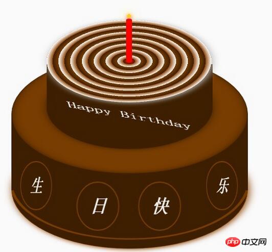
蛋糕分成三個部分,底部蛋糕,頂層蛋糕和蠟燭部分。 HTML的佈局結構也是依照這三部分佈局的。另外就是使用CSS定位和CSS3的rotate,內外陰影等效果調整部分DOM元素樣式。比較簡單,相信碼農都懂的。
不贅述其它有的沒的了。
下面給出完整的HTML程式碼和CSS程式碼
<!DOCTYPE html>
<html>
<head lang="en">
    <meta charset="UTF-8">
    <title></title>
    <style>
        .birthday .container{
            width:600px;
            height:600px;
            margin:0px auto;
            background: #fafafa;
            border-radius:5px;
            position: relative;
        }

        /**
       ** 顶层的
       **/

        .birthday .top-one{
            position: absolute;
            width:280px;
            height: 280px;
            bottom: 200px;
            left:160px;
        }

        .birthday .top-one .bottom{
            position: absolute;
            width:280px;
            height: 280px;
            bottom:-30px;
            border:1px solid #3e2001;
            border-radius: 140px;
            transform: rotateX(60deg);
            z-index: 4;
            background: #3e2001;
            box-shadow: 0px 0px 20px #3e2001;
        }
        .birthday .top-one .top{
            position: absolute;
            width:280px;
            height: 280px;
            top:-50px;
            border-radius: 140px;
            background: #FFFFFF;
            transform: rotateX(60deg);
            box-shadow: 2px 2px 20px #b7b7b7;
            z-index: 6;
            background: -webkit-repeating-radial-gradient(circle, #783d01, #3e2001 10px, #914909 10px,white 20px);
            background: -moz-repeating-radial-gradient(circle, #783d01, #3e2001 10px,#914909 10px,white 20px);
        }
        .birthday .top-one .side{
            position: absolute;
            top:95px;
            width:280px;
            height: 70px;
            border:1px solid #3e2001;
            border-top-width: 0px;
            border-bottom-width: 0px;
            background: #FFFFFF;
            z-index: 5;
            background: #3e2001;
        }


        /**
        ** 底层的
        **/
        .birthday .bottom-one{
            position: absolute;
            width:400px;
            height: 400px;
            bottom: 0px;
            left:100px;
        }
        .birthday .bottom-one .bottom{
            position: absolute;
            width:400px;
            height: 400px;
            bottom:-30px;
            border:1px solid #914909;
            border-radius: 200px;
            transform: rotateX(60deg);
            box-shadow: 2px 2px 20px #914909;
            z-index: 1;
            background: #3e2001;
            overflow: hidden;
        }
        .birthday .bottom-one .line{
            position: absolute;
            width:400px;
            height: 400px;
            border-radius: 200px;
            z-index: 1;
        }
        .birthday .bottom-one .line1{
            bottom: 30px;
            border:5px solid #783d01;
            left:-5px;
            z-index: 1;
        }

        .birthday .bottom-one .top{
            position: absolute;
            width:400px;
            height: 400px;
            top:-100px;
            border:1px solid #3e2001;
            border-radius: 200px;
            background: #FFFFFF;
            transform: rotateX(60deg);
            z-index: 3;
            background: #783d01;
            box-shadow: inset 0px 0px 20px #3e2001;

        }

        .birthday .bottom-one .side{
            position: absolute;
            top:100px;
            width:400px;
            height: 130px;
            border:1px solid #3e2001;
            border-top-width: 0px;
            border-bottom-width: 0px;
            background: #3e2001;
            z-index: 2;

        }


        /**
        ** 底层的文字
        **/
        .birthday .flower{
            position: relative;
            text-align: justify;
            z-index: 9;
            top:200px;
            font-size: 32px;
            font-family: "Helvetica Neue", "Noto Sans CJK SC", "Source Han Sans CN";
            color:#FFFFFF;
            font-weight: bold;
        }
        .birthday .flower:after{
            content:"";
            display:inline-block;
            position: relative;
            width:100%;
        }

        .birthday .flower i{
            position: relative;
            width:80px;
            line-height: 80px;
            display: inline-block;
            border-radius: 50%;
            border:2px solid #783d01;
            text-align: center;

        }

        /**
        ** 顶层的文字
        **/
        .birthday .top-one .text{
            width:100%;
            text-align: center;
            position: absolute;
            top:165px;
            z-index: 9;
            margin:0px auto;
            font-size: 30px;
            color:#FFFFFF;
            transform: rotateX(60deg) skew(10deg,20deg);
        }


        /**
         ** 蜡烛
        **/

        .birthday .candle{
            width:10px;
            height:80px;
            margin:0px auto;
            position: absolute;
            left:295px;
            top:130px;
            z-index: 9;
        }
        .birthday .candle .body{
            width:10px;
            height:70px;
            margin:0px auto;
            background: red;
            border-bottom-width: 0px;
        }

        .birthday .candle .top{
            width:10px;
            height: 10px;
            border-radius: 5px;
            transform: rotateX(60deg);
            position: relative;
            top:5px;
            background: red;
        }
        .birthday .candle .bottom{
            width:10px;
            height: 10px;
            border-radius: 5px;
            transform: rotateX(60deg);
            position: relative;
            bottom:5px;
            background: red;
            box-shadow: 1px 1px 10px red;
        }

        .birthday .candle .fire{
            position: absolute;
            width:6px;
            height: 6px;
            left:2px;
            transform: rotate(45deg);
            background: #ffd507;
            box-shadow: 0px 0px 20px #ffff00, 2px 2px 10px red;

        }


    </style>

</head>
<body>
    <p class="birthday">
        <p class="container">

            <p class="candle">
                <p class="fire"></p>
                <p class="top"></p>
                <p class="body"></p>
                <p class="bottom"></p>
            </p>

            <p class="top-one">
                <p class="top"></p>
                <p class="side"></p>
                <p class="bottom"></p>
                <p class="text">
                    Happy Birthday
                </p>
            </p>

            <p class="bottom-one">
                <p class="top"></p>
                <p class="side"></p>
                <p class="bottom">
                    <p class="line line1"></p>
                </p>
                <p class="flower">
                    <i style="top:-20px;transform: rotateY(50deg)">生</i>
                    <i style="top:15px;transform: rotateY(30deg)">日</i>
                    <i style="top:15px;transform: rotateY(30deg)">快</i>
                    <i style="top:-20px;transform: rotateY(50deg)">乐</i>
                </p>
            </p>
        </p>
    </p>
</body>
</html>
okay,慶生開發的小Demo,以後可以試試用Canvas畫布或SVG試著在做一下,感謝閱讀。
以上是生日蛋糕的製作方法-不過用的是HTML5+CSS3代碼的詳細內容。更多資訊請關注PHP中文網其他相關文章!
陳述:
本文內容由網友自願投稿,版權歸原作者所有。本站不承擔相應的法律責任。如發現涉嫌抄襲或侵權的內容,請聯絡admin@php.cn