RadioButton(radio button)&Checkbox(checkbox)
Introduction to this section:
This section brings you RadioButton and Checkbox in Andoird’s basic UI controls; Let me first talk about the content to be explained in this section: RadioButton and Checkbox
1. Basic usage
2. Event processing;
3. Customize click effects;
4. Change text Relative position to the selection box;
5. Modify the distance between the text and the selection box
In fact, these two controls are similar in many places, except for single selection and multi-selection. , event handling, everything else is similar! There is also a problem of misalignment of Checkbox on ListView. We will discuss this problem in the chapter of ListView. Solved, okay, let’s start this section~ Official document API of this section: RadioButton; CheckBox;
1. Basic usage and event handling:
1) RadioButton (radio button)
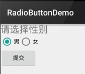
For example, the radio button in the title can only select one, so we need to put the RadioButton into the RadioGroup button group to achieve Radio function! First, familiarize yourself with how to use RadioButton, a simple example of gender selection: In addition, we can set the orientation attribute for the outer RadioGroup and then set the arrangement of RadioButtons, whether vertical or horizontal~
Rendering:

PS: The author’s mobile phone is Android 5.0.1. Compared with the old version of RadioButton, the RadioButton here looks slightly better~
Layout code as follows:
xmlns:tools="http://schemas.android.com/tools"
android:id="@+id/LinearLayout1"
android:layout_width="match_parent"
android:layout_height="match_parent"
android:orientation="vertical"
tools:context=".MainActivity" >
<TextView
android:layout_width="wrap_content"
android:layout_height="wrap_content"
android:text="请选择性别"
android:textSize="23dp"
/>
<RadioGroup
android:id="@+id/radioGroup"
android:layout_width="wrap_content"
android:layout_height="wrap_content"
android:orientation="horizontal">
<RadioButton
android:id="@+id/btnMan"
android:layout_width="wrap_content"
android:layout_height="wrap_content"
android:text="男"
android:checked="true"/>
<RadioButton
android:id="@+id/btnWoman"
android:layout_width="wrap_content"
android:layout_height="wrap_content"
android:text="女"/>
</RadioGroup>
<Button
android:id="@+id/btnpost"
android:layout_width="wrap_content"
; android:layout_height="wrap_content"
; android:text="Submit"/>
</LinearLayout>
Get the selected value:
There are two methods here,
The first one is to set an event listener setOnCheckChangeListener for RadioButton
The example code is as follows:
//Set a listener for radioGroup: setOnCheckedChanged()
radgroup.setOnCheckedChangeListener(new OnCheckedChangeListener() {
@Override
public void onCheckedChan ged(RadioGroup group, int checkedId) {
RadioButton radbtn = (RadioButton) findViewById(checkedId);
Toast.makeText(getApplicationContext(), "The button group value has changed, you selected" + radbtn.getText(), Toast.LENGTH_LONG). show();
Running rendering: 

PS: Another thing to remember is to add an id to each RadioButton, otherwise the radio selection function will take effect! ! !
The second method is to get the value of the selected radio button by clicking other buttons. Of course, we can also get it directly. This depends on the needs~
The example code is as follows:
// Set a listener for Radiography: SetoncheckedChanged ()
Btnchange.SetonClickListener (New Onclicklistener () {
@overRide
PUBLID (View v) {
for (int i = 0; I Toast.makeText(getApplicationContext (), "Click the submit button to get your choice:" + rd.getText(), Toast.LENGTH_LONG).show(); }
});
Running rendering:

##Code analysis: Here we set the submit button A setOnClickListener event listener, which traverses the RadioGroup once each time it is clicked to determine which button is selected. We can obtain the relevant information of the RadioButton through the following method!
getChildCont( ) Gets the number of radio buttons in the button group;
getChinldAt(i): Get our radio button based on the index value
isChecked( ): Determine whether the button is checked
2) CheckBox(check box)
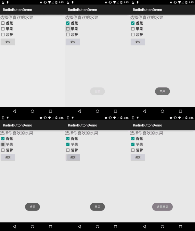
As mentioned in the check box, multiple options can be selected at the same time. As for obtaining the selected value, there are also two ways: 1. Add an event for each CheckBox: setOnCheckedChangeListener 2. Make a button, and after clicking it, judge each checkbox: isChecked();
Running rendering:

Implementation code:
private CheckBox cb_one;
private CheckBox cb_two;
private CheckBox cb_three;
private Button btn_send;
@Override
protected void onCreate(Bundle savedInstanceState) {
super.onCreate(savedInstanceState);
setContentView(R.layout.activity_main);
cb_one = (CheckBox) findViewById(R.id.cb_one);
cb_two = (CheckBox) findViewById(R.id.cb_two);
cb_three = (CheckBox) findViewById(R.id.cb_three);
btn_send = (Button) findViewById(R.id.btn_send);
cb_one.setOnCheckedChangeListener(this);
cb_two.setOnCheckedChangeListener(this);
cb_three.setOnCheckedChangeListener(this);
btn_send.setOnClickListener(this);
}
@Override
public void onCheckedChanged(CompoundButton compoundButton, boolean b) {
if(compoundButton.isChecked()) Toast.makeText(this,compoundButton.getText().toString(),Toast.LENGTH_SHORT).show();
}
@Override
public void onClick(View view) {
String choose = "";
if(cb_one.isChecked())choose += cb_one.getText().toString() + "";
if(cb_two.isChecked())choose += cb_two.getText().toString() + "";
if(cb_three.isChecked())choose += cb_three.getText().toString() + "";
Toast.makeText(this,choose,Toast.LENGTH_SHORT).show();
}
}
2. Custom click effect
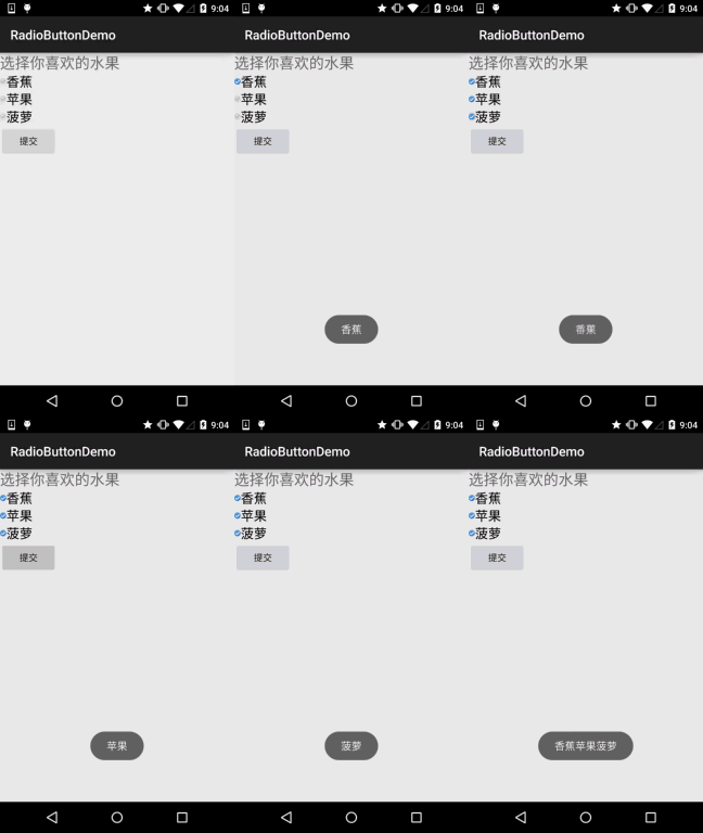
Although the RadioButton and Checkbox after 5.0 are slightly better looking than the old version, for us You may still not like it or need it, so you need to click on the effect yourself! It is very simple to implement. First write a custom The selctor resource, sets the switching image when selected and not selected~!
The rendering is as follows:

PS: The reason for the material here is a bit small...
<selector xmlns:android="http://schemas.android.com/apk/res/android">
android:state_enabled="true" :state_enabled="true"
android:state_checked="false"
android:drawable="@mipmap/ic_checkbox_normal" />
</selector>
Write After that, we have two ways to set it up, or we can say one! You will know after you look at it~
①The android:button attribute is set to the above selctor
android:button="@drawable/rad_btn_selctor"
② Define an attribute in style, and then set it through the android style attribute. First add the following code to style:" </style>
3. Change the relative position of the text and the selection box
This is also very simple to implement. Do you remember the drawableXxx we used when we learned TextView before? To control the position of the selection box, just two steps! Settings:
Step 1. android:button="@null"
Step 2. android:drawableTop="@android:drawable/btn_radio"
Of course we can replace drawableXxx with the effect we like!
4. Modify the distance between the text and the selection box
Sometimes, we may need to adjust the distance between the text and the selection box to make them look slightly Not so crowded, we can:
1. Control in XML code: Use android:paddingXxx = "xxx" to control the distance
2. In Java code, it is slightly better to dynamically calculate paddingLeft!
The sample code is as follows:
int rb_paddingLeft = getResources().getDrawable(R.mipmap.ic_checkbox_checked).getIntrinsicWidth()+5;
rb.setPadding( rb_paddingLeft, 0, 0, 0);
Summary of this section:
Okay, that’s it for RadioButton and Checkbox, if you have anything to write If you get something wrong or bad, or if you have any good suggestions, please point them out. Extremely grateful~Thank you...


