ToggleButton and Switch
Introduction to this section:
The basic Android UI controls introduced to you in this section are: switch button ToggleButton and switch Switch. You may face two components. I’m not familiar with it, but suddenly I remembered that the author’s first outsourcing company used TextView to switch on whether to connect to the Internet under wifi, and then called the artist And the two pictures before and after switching, and then set them in the code. Of course, when clicking the TextView, judge the status, and then set the corresponding background...
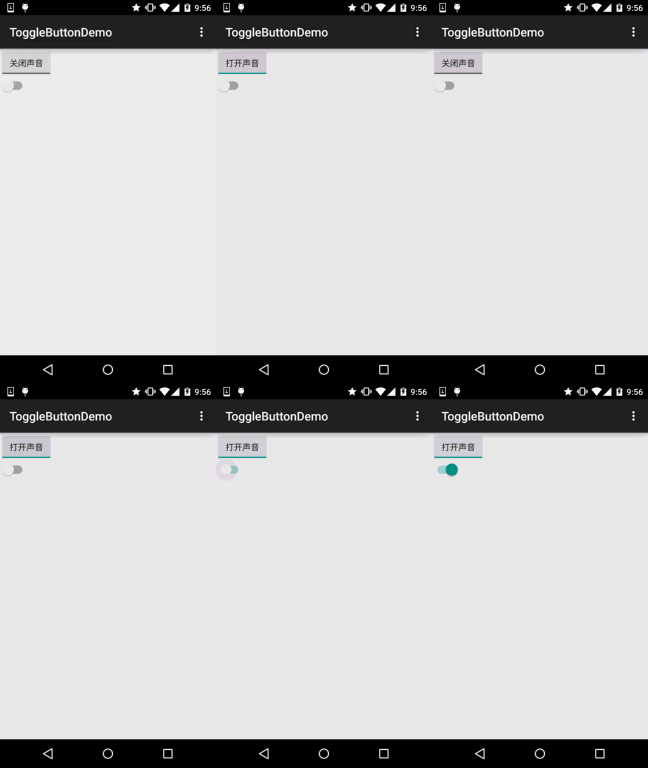
Okay, I am also drunk, okay...This section The two explained are actually switch components, but the latter can only be used after Android 4.0. Therefore, the minsdk in the AndroidManifest.xml file needs to be >= 14, otherwise an error will be reported. Let’s first take a look at what these two controls look like. After Android 5.0, these two controls look much better than before. Let’s take a look at what they looked like before 5.0:
ToggleButton and Switch before 5.0:
Version 5.0:
##Okay, a stark contrast ...Next let's learn how to use the two controls. In fact, the use of the two is almost the same. Before starting, post the official API: Switch; ToggleButton
1. Explanation of core attributes: 1) ToggleButton(switch button)Attributes available for us to set:
2) Switch is available to us Set attributes:
android:disabledAlpha: Set the transparency of the button when it is disabled
android:textOff:The text displayed when the button is not selected
android:textOn:Displayed when the button is selected Text In addition, in addition to this, we can also write a selector ourselves, and then set the Background property~
- ##android:showText:
Whether to display text when setting on/off, boolean
- android:splitTrack:
Whether to set a gap to separate the slider from the bottom image, boolean
- android:switchMinWidth:
Set the switch The minimum width
- android:switchPadding:
Set the spacing of text within the slider
- android:switchTextAppearance :
Set the text appearance of the switch, I haven’t found any use yet...
- android:textOff:
Text displayed when the button is not selected
- android:textOn:
The text displayed when the button is selected
- android:textStyle:
Text style, bold, italic, write the underlined ones
- android:track:
# #android:thumb:Pictures at the bottom
- Picture of slider
android:typeface:Set the font, which supports these three types by default: sans, serif, monospace; in addition, it can also be used For other font files (*.ttf), you must first save the font file in the assets/fonts/ directory, but you need to set it in the Java code: Typeface typeFace =Typeface.createFromAsset(getAssets() ,"fonts/HandmadeTypewriter.ttf"); textView.setTypeface(typeFace);
2. Usage example:
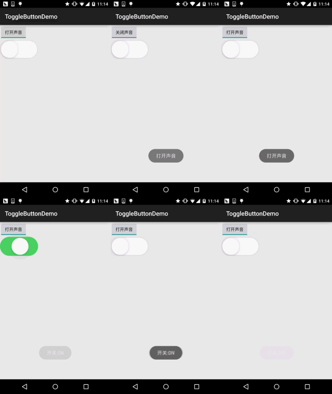
Because it is relatively simple, we write them together , In addition, we set the lower slider and bottom picture for Switch to achieve An effect similar to the slider in IOS 7, but one disadvantage is that the size of the slider and bottom cannot be set in XML. The size of the material depends on the size of the Switch. We can obtain the Drawable object in Java and then modify the size. Simple example:
Running rendering:

##Implementation code: First, there are two drawable files: thumb_selctor.xml:
<item android:state_pressed="true" android:drawable="@drawable/switch_btn_pressed"/>
<item android:state_pressed="false" android:drawable="@drawable/switch_btn_normal"/>
</selector>
<?xml version="1.0" encoding="utf-8"?>
<item android:state_checked="false" android :drawable="@drawable/switch_btn_bg_white"/>
</selector>
布局文件:activity_main.xml:
xmlns:tools="http://schemas.android.com/tools"
android:layout_width="match_parent"
android:layout_height="match_parent"
android:orientation="vertical"
tools:context=".MainActivity">
<ToggleButton
android:id="@+id/tbtn_open"
android:layout_width="wrap_content"
android:layout_height="wrap_content"
android:checked="true"
android:textOff="关闭声音"
android:textOn="打开声音" />
<Switch
android:id="@+id/swh_status"
android:layout_width="wrap_content"
android:layout_height="wrap_content"
android:textOff=""
android:textOn=""
android:thumb="@drawable/thumb_selctor"
android:track="@drawable/track_selctor" />
</LinearLayout>
MainActivity.java:
private ToggleButton tbtn_open;
private Switch swh_status;
@Override
protected void onCreate(Bundle savedInstanceState) {
super.onCreate(savedInstanceState);
setContentView(R.layout.activity_main);
tbtn_open = (ToggleButton) findViewById(R.id.tbtn_open);
swh_status = (Switch) findViewById(R.id.swh_status);
tbtn_open.setOnCheckedChangeListener(this);
swh_status.setOnCheckedChangeListener(this);
}
@Override
public void onCheckedChanged(CompoundButton compoundButton, boolean b) {
switch (compoundButton.getId()){
case R.id.tbtn_open:
if(compoundButton.isChecked()) Toast.makeText(this,"打开声音",Toast.LENGTH_SHORT).show();
else Toast.makeText(this,"打开声音",Toast.LENGTH_SHORT).show();
break;
case R.id.swh_status:
if(compoundButton.isChecked()) Toast.makeText(this,"开关:ON",Toast.LENGTH_SHORT).show();
else Toast.makeText(this,"开关:OFF",Toast.LENGTH_SHORT).show();
break;
}
}
}


