언론문의
반응형 웹 디자인 - 미디어 쿼리
미디어(미디어) 쿼리는 CSS3에 도입되었습니다: CSS3 @media query.
@media 쿼리를 사용하면 다양한 미디어 유형에 대해 다양한 스타일을 정의할 수 있습니다.
Instance
<!DOCTYPE html>
<html>
<head>
<meta name="viewport" content="width=device-width, initial-scale=1.0"/>
<meta charset="utf-8">
<title>php 中文网</title>
<style>
body {
    background-color:lightgreen;
}

@media only screen and (max-width: 500px) {
    body {
        background-color:lightblue;
    }
}
</style>
</head>
<body>
<p>重置浏览器大小,当文档的宽度小于 500 像素,背景会变为浅蓝色,否则为浅绿色。</p>
</body>
</html>
인스턴스 실행 »
온라인 인스턴스를 보려면 "인스턴스 실행" 버튼을 클릭하세요.
중단점 추가
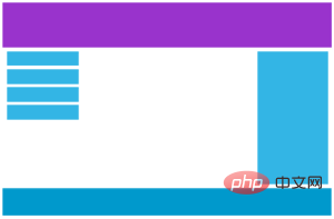
이전 튜토리얼에서는 행과 열을 사용하여 웹 페이지를 만들었으며 이는 반응형 스타일이었습니다. , 하지만 작은 화면에서는 친숙한 표시가 아닙니다.
미디어 쿼리는 이 문제를 해결하는 데 도움이 될 수 있습니다. 디자인 초안 중간에 중단점을 추가할 수 있습니다. 중단점마다 효과가 다릅니다. ㅋㅋㅋ 온라인으로 보기 버튼 예시
모바일 우선 디자인
모바일 우선은 데스크톱 및 기타 장치용으로 디자인할 때 모바일 디자인을 우선시한다는 의미입니다.
이는 CSS를 일부 변경해야 함을 의미합니다.
화면이 768px보다 작은 경우에도 스타일을 수정합니다. 화면 너비가 768px보다 큰 경우에도 스타일을 수정해야 합니다. 다음은 모바일 우선 예입니다.
[class*="col-"] {
width: 100%;
}
@ 미디어 전용 화면 및 (최소 너비: 16. 66%;}
.col-3 {
25%;} .col-4 {
너비: 33.33%;} .col-5 {
wi dth: 41.66% ;} .col-6 {
너비: 50%;} .col-7 {
너비: 58.33%;} .col- 8 {
너비: 66.66%;} .col-9 {
너비: 75%;} .col-10 {
너비: 83.33%; } .col-11 {
너비: 91.66%;} .col-12 {
너비: 100%;}}
기타 중단점
필요에 따라 중단점을 추가할 수 있습니다.
태블릿 장치와 휴대폰 장치에도 중단점을 설정할 수 있습니다.
데스크톱 기기
태블릿 기기

모바일 기기
화면이 600px일 때 미디어 쿼리를 추가하고 새로운 스타일을 설정합니다(화면은 600px보다 크고 768px보다 작습니다):
예시
<!DOCTYPE html>
<html>
<head>
<meta name="viewport" content="width=device-width, initial-scale=1.0">
<meta charset="utf-8">
<title>php 中文网</title>
<style>
* {
    box-sizing: border-box;
}
.row:after {
    content: "";
    clear: both;
    display: block;
}
[class*="col-"] {
    float: left;
    padding: 15px;
}
html {
    font-family: "Lucida Sans", sans-serif;
}
.header {
    background-color: #9933cc;
    color: #ffffff;
    padding: 15px;
}
.menu ul {
    list-style-type: none;
    margin: 0;
    padding: 0;
}
.menu li {
    padding: 8px;
    margin-bottom: 7px;
    background-color :#33b5e5;
    color: #ffffff;
    box-shadow: 0 1px 3px rgba(0,0,0,0.12), 0 1px 2px rgba(0,0,0,0.24);
}
.menu li:hover {
    background-color: #0099cc;
}
.aside {
    background-color: #33b5e5;
    padding: 15px;
    color: #ffffff;
    text-align: center;
    font-size: 14px;
    box-shadow: 0 1px 3px rgba(0,0,0,0.12), 0 1px 2px rgba(0,0,0,0.24);
}
.footer {
    background-color: #0099cc;
    color: #ffffff;
    text-align: center;
    font-size: 12px;
    padding: 15px;
}
/* For desktop: */
.col-1 {width: 8.33%;}
.col-2 {width: 16.66%;}
.col-3 {width: 25%;}
.col-4 {width: 33.33%;}
.col-5 {width: 41.66%;}
.col-6 {width: 50%;}
.col-7 {width: 58.33%;}
.col-8 {width: 66.66%;}
.col-9 {width: 75%;}
.col-10 {width: 83.33%;}
.col-11 {width: 91.66%;}
.col-12 {width: 100%;}

@media only screen and (max-width: 768px) {
    /* For mobile phones: */
    [class*="col-"] {
        width: 100%;
    }
}
</style>
</head>
<body>

<div class="header">
<h1>Chania</h1>
</div>

<div class="row">

<div class="col-3 menu">
<ul>
<li>The Flight</li>
<li>The City</li>
<li>The Island</li>
<li>The Food</li>
</ul>
</div>

<div class="col-6">
<h1>The City</h1>
<p>Chania is the capital of the Chania region on the island of Crete. The city can be divided in two parts, the old town and the modern city.</p>
</div>
<div class="col-3 right">
<div class="aside">
<h2>What?</h2>
<p>Chania is a city on the island of Crete.</p>
<h2>Where?</h2>
<p>Crete is a Greek island in the Mediterranean Sea.</p>
<h2>How?</h2>
<p>You can reach Chania airport from all over Europe.</p>
</div>
</div>

</div>

<div class="footer">
<p>Resize the browser window to see how the content respond to the resizing.</p>
</div>

</body>
</html>
인스턴스 실행»
온라인 인스턴스를 보려면 "인스턴스 실행" 버튼을 클릭하세요
위 코드가 중복되어 보일 수 있지만 화면 크기에 따라 자동으로 다른 스타일을 설정할 수 있으므로 여전히 매우 필요합니다.
HTML 예
데스크톱의 경우:
첫 번째와 세 번째 부분은 3개의 열에 걸쳐 있습니다. 중간 섹션은 6개의 열에 걸쳐 있습니다.
태블릿 장치의 경우:
첫 번째 부분은 3개 열, 두 번째 부분은 9개 열, 세 번째 부분은 12개 열에 걸쳐 있습니다.
<div class="col-3 col-m-3">...</div>
< div class="col-6 col-m-9">...</div>
<div class="col-3 col-m-12">...</div>
</div>
방향: 가로/세로
CSS 미디어 쿼리와 결합하면 다양한 장치의 방향(가로 가로, 세로 세로 등)에 맞게 조정되는 레이아웃을 만들 수 있습니다.
구문:
<!DOCTYPE html>
<html>
<head>
<meta name="viewport" content="width=device-width, initial-scale=1.0">
<meta charset="utf-8">
<title>php 中文网</title>
<style>
* {
    box-sizing: border-box;
}
.row:after {
    content: "";
    clear: both;
    display: block;
}
[class*="col-"] {
    float: left;
    padding: 15px;
}
html {
    font-family: "Lucida Sans", sans-serif;
}
.header {
    background-color: #9933cc;
    color: #ffffff;
    padding: 15px;
}
.menu ul {
    list-style-type: none;
    margin: 0;
    padding: 0;
}
.menu li {
    padding: 8px;
    margin-bottom: 7px;
    background-color :#33b5e5;
    color: #ffffff;
    box-shadow: 0 1px 3px rgba(0,0,0,0.12), 0 1px 2px rgba(0,0,0,0.24);
}
.menu li:hover {
    background-color: #0099cc;
}
.aside {
    background-color: #33b5e5;
    padding: 15px;
    color: #ffffff;
    text-align: center;
    font-size: 14px;
    box-shadow: 0 1px 3px rgba(0,0,0,0.12), 0 1px 2px rgba(0,0,0,0.24);
}
.footer {
    background-color: #0099cc;
    color: #ffffff;
    text-align: center;
    font-size: 12px;
    padding: 15px;
}
/* For mobile phones: */
[class*="col-"] {
    width: 100%;
}
@media only screen and (min-width: 600px) {
    /* For tablets: */
    .col-m-12 {width: 8.33%;}
    .col-m-2 {width: 16.66%;}
    .col-m-3 {width: 25%;}
    .col-m-4 {width: 33.33%;}
    .col-m-5 {width: 41.66%;}
    .col-m-6 {width: 50%;}
    .col-m-7 {width: 58.33%;}
    .col-m-8 {width: 66.66%;}
    .col-m-9 {width: 75%;}
    .col-m-10 {width: 83.33%;}
    .col-m-11 {width: 91.66%;}
    .col-m-12 {width: 100%;}
}
@media only screen and (min-width: 768px) {
    /* For desktop: */
    .col-1 {width: 8.33%;}
    .col-2 {width: 16.66%;}
    .col-3 {width: 25%;}
    .col-4 {width: 33.33%;}
    .col-5 {width: 41.66%;}
    .col-6 {width: 50%;}
    .col-7 {width: 58.33%;}
    .col-8 {width: 66.66%;}
    .col-9 {width: 75%;}
    .col-10 {width: 83.33%;}
    .col-11 {width: 91.66%;}
    .col-12 {width: 100%;}
}
</style>
</head>
<body>

<div class="header">
<h1>Chania</h1>
</div>

<div class="row">
<div class="col-3 col-m-3 menu">
<ul>
<li>The Flight</li>
<li>The City</li>
<li>The Island</li>
<li>The Food</li>
</ul>
</div>

<div class="col-6 col-m-9">
<h1>The City</h1>
<p>Chania is the capital of the Chania region on the island of Crete. The city can be divided in two parts, the old town and the modern city.</p>
</div>

<div class="col-3 col-m-12">
<div class="aside">
<h2>What?</h2>
<p>Chania is a city on the island of Crete.</p>
<h2>Where?</h2>
<p>Crete is a Greek island in the Mediterranean Sea.</p>
<h2>How?</h2>
<p>You can reach Chania airport from all over Europe.</p>
</div>
</div>

</div>

<div class="footer">
<p>Resize the browser window to see how the content respond to the resizing.</p>
</div>

</body>
</html>
portrait: 출력 장치에서 페이지의 가시 영역 높이가 너비
landscape: 초상화 제외 value, all are Landscape


