
Maison >interface Web >tutoriel CSS >Utilisez CSS pour implémenter un bouton de commutation imitant iOS7
Utilisez CSS pour implémenter un bouton de commutation imitant iOS7

- 不言original
- 2018-06-12 17:01:351720parcourir
Cet article présente principalement un bouton switch imitant iOS7 implémenté en pur CSS, sans avoir besoin d'inclure du code js. Dans la mise en œuvre, des démos de deux couleurs et trois tailles différentes sont proposées. Les amis dans le besoin peuvent se référer à
Aujourd'hui, je vais vous présenter un bouton de commutation qui imite iOS7. Ce bouton est également implémenté en CSS pur. Pas besoin d'inclure du code js. Dans la mise en œuvre, des démos de deux couleurs et trois tailles différentes sont proposées. Jetons un coup d'œil aux rendus :
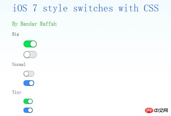
Code implémenté.
code html :
<p class="wrap" style="width: 600px; margin: auto;">
        <h1>
            iOS 7 style switches with CSS</h1>
        <h2>
            By Bandar Raffah</h2>
        <label>
            Big<input type="checkbox" class="ios-switch green  bigswitch" checked /><p>
                <p>
                </p>
            </p>
        </label>
        <label>
            <input type="checkbox" class="ios-switch bigswitch" checked /><p>
                <p>
                </p>
            </p>
        </label>
        <label>
            Normal<input type="checkbox" class="ios-switch green" /><p>
                <p>
                </p>
            </p>
        </label>
        <label>
            <input type="checkbox" class="ios-switch" /><p>
                <p>
                </p>
            </p>
        </label>
        <label>
            Tiny<input type="checkbox" class="ios-switch green tinyswitch" checked /><p>
                <p>
                </p>
            </p>
        </label>
        <label>
            <input type="checkbox" class="ios-switch tinyswitch" checked /><p>
                <p>
                </p>
            </p>
        </label>
  </p>
code css :
input[type="checkbox"]
        {
            position: absolute;
            opacity: 0;
        }
        /* Normal Track */
        input[type="checkbox"].ios-switch + p
        {
            vertical-align: middle;
            width: 40px;
            height: 20px;
            border: 1px solid rgba(0,0,0,.4);
            border-radius: 999px;
            background-color: rgba(0, 0, 0, 0.1);
            -webkit-transition-duration: .4s;
            -webkit-transition-property: background-color, box-shadow;
            box-shadow: inset 0 0 0 0px rgba(0,0,0,0.4);
            margin: 15px 1.2em 15px 2.5em;
        }
        /* Checked Track (Blue) */
        input[type="checkbox"].ios-switch:checked + p
        {
            width: 40px;
            background-position: 0 0;
            background-color: #3b89ec;
            border: 1px solid #0e62cd;
            box-shadow: inset 0 0 0 10px rgba(59,137,259,1);
        }
        /* Tiny Track */
        input[type="checkbox"].tinyswitch.ios-switch + p
        {
            width: 34px;
            height: 18px;
        }
        /* Big Track */
        input[type="checkbox"].bigswitch.ios-switch + p
        {
            width: 50px;
            height: 25px;
        }
        /* Green Track */
        input[type="checkbox"].green.ios-switch:checked + p
        {
            background-color: #00e359;
            border: 1px solid rgba(0, 162, 63,1);
            box-shadow: inset 0 0 0 10px rgba(0,227,89,1);
        }
        /* Normal Knob */
        input[type="checkbox"].ios-switch + p > p
        {
            float: left;
            width: 18px;
            height: 18px;
            border-radius: inherit;
            background: #ffffff;
            -webkit-transition-timing-function: cubic-bezier(.54,1.85,.5,1);
            -webkit-transition-duration: 0.4s;
            -webkit-transition-property: transform, background-color, box-shadow;
            -moz-transition-timing-function: cubic-bezier(.54,1.85,.5,1);
            -moz-transition-duration: 0.4s;
            -moz-transition-property: transform, background-color;
            box-shadow: 0px 2px 5px rgba(0, 0, 0, 0.3), 0px 0px 0 1px rgba(0, 0, 0, 0.4);
            pointer-events: none;
            margin-top: 1px;
            margin-left: 1px;
        }
        /* Checked Knob (Blue Style) */
        input[type="checkbox"].ios-switch:checked + p > p
        {
            -webkit-transform: translate3d(20px, 0, 0);
            -moz-transform: translate3d(20px, 0, 0);
            background-color: #ffffff;
            box-shadow: 0px 2px 5px rgba(0, 0, 0, 0.3), 0px 0px 0 1px rgba(8, 80, 172,1);
        }
        /* Tiny Knob */
        input[type="checkbox"].tinyswitch.ios-switch + p > p
        {
            width: 16px;
            height: 16px;
            margin-top: 1px;
        }
        /* Checked Tiny Knob (Blue Style) */
        input[type="checkbox"].tinyswitch.ios-switch:checked + p > p
        {
            -webkit-transform: translate3d(16px, 0, 0);
            -moz-transform: translate3d(16px, 0, 0);
            box-shadow: 0px 2px 5px rgba(0, 0, 0, 0.3), 0px 0px 0 1px rgba(8, 80, 172,1);
        }
        /* Big Knob */
        input[type="checkbox"].bigswitch.ios-switch + p > p
        {
            width: 23px;
            height: 23px;
            margin-top: 1px;
        }
        /* Checked Big Knob (Blue Style) */
        input[type="checkbox"].bigswitch.ios-switch:checked + p > p
        {
            -webkit-transform: translate3d(25px, 0, 0);
            -moz-transform: translate3d(16px, 0, 0);
            box-shadow: 0px 4px 8px rgba(0, 0, 0, 0.3), 0px 0px 0 1px rgba(8, 80, 172,1);
        }
        /* Green Knob */
        input[type="checkbox"].green.ios-switch:checked + p > p
        {
            box-shadow: 0px 2px 5px rgba(0, 0, 0, 0.3), 0 0 0 1px rgba(0, 162, 63,1);
        }
        /* Needless Page Decoration */
        body
        {
            -webkit-user-select: none;
            cursor: default;
            font: 18px "Helvetica Neue";
            color: rgba(0, 0, 0, 0.77);
            font-weight: 200;
            padding-left: 30px;
            padding-top: 0px;
            background: -webkit-linear-gradient(top, #f2fbff 0%, #ffffff 64%) no-repeat;
            background: -moz-linear-gradient(top, #f2fbff 0%, #ffffff 64%) no-repeat;
            background: -ms-linear-gradient(top, #f2fbff 0%, #ffffff 64%) no-repeat;
            background: linear-gradient(to bottom, #f2fbff 0%, #ffffff 64%) no-repeat;
        }
        h1
        {
            font-weight: 100;
            font-size: 40px;
            color: #135ae4;
        }
        h2
        {
            font-weight: 200;
            font-size: 22px;
            color: #03b000;
        }
        h3
        {
            font-weight: 200;
            font-size: 18px;
            color: rgba(0, 0, 0, 0.77);
            margin-top: 50px;
        }
        a:link
        {
            text-decoration: none;
            color: #f06;
        }
        a:visited
        {
            text-decoration: none;
            color: #f06;
        }
        a:hover
        {
            text-decoration: underline;
        }
        a:active
        {
            text-decoration: underline;
        }
Ce qui précède est l'intégralité du contenu de ce article, j'espère qu'il sera utile à l'apprentissage de tout le monde. Pour plus de contenu connexe, veuillez faire attention au site Web PHP chinois !
Recommandations associées :
À propos de la technologie d'assemblage d'images CSS
Utilisation de CSS pour obtenir des effets d'ombre
Ce qui précède est le contenu détaillé de. pour plus d'informations, suivez d'autres articles connexes sur le site Web de PHP en chinois!