
Maison >interface Web >tutoriel CSS >CSS3 pour obtenir un effet de vélo animé
CSS3 pour obtenir un effet de vélo animé
- php中世界最好的语言original
- 2018-03-22 11:09:532656parcourir
Cette fois je vais vous apporter CSS3 pour réaliser l'effet vélo animé. Quelles sont les précautions pour réaliser l'effet vélo animé avec CSS3 Voici un cas pratique, jetons un oeil.
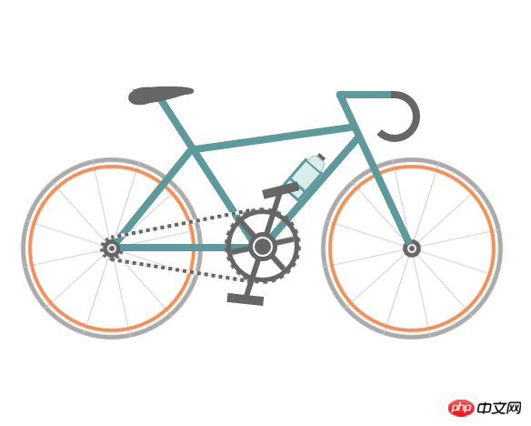
Tout d'abord, jetons un coup d'œil aux rendus implémentés (statiques) :
Code source de l'instance :
<!DOCTYPE html>
<html>
 <head>
  <meta charset="UTF-8">
  <title>自行车</title>
  <style type="text/css">
   * {
    margin: 0;
    padding: 0
   }

   ol,
   ul {
    list-style: none/*去掉圆点或数字*/
   }

   .cycle-outer {
    width: 534px;
    height: 260px;
    position: absolute;
    /*绝对定位*/
    top: 50%;
    /*距离顶部*/
    margin: -160px 0 0 -267px;
    /*距离外边距*/
    left: 50%;
   }

   .cycle-wrapper {
    width: 534px;
    height: 260px;
    margin: 0 auto;
    position: relative;
    /*相对定位*/
   }

   .cycle-wheel-front {
    /*前轮*/
    margin: 100px 0 0 330px;
   }

   .cycle-wheel-back {
    /*后轮*/
    margin: 100px 0 0 0px;
   }

   .cycle-wheel-outer {
    background: transparent;
    border: 5px solid #aaa;
    border-radius: 50%;
    /*画外轮圆圈*/
    width: 190px;
    height: 190px;
    position: absolute;
    margin-top: 5px;
    animation: wheel-rotate 2s linear infinite;
    /*定义动画*/
   }
   /*轮胎开始旋转*/
   @keyframes wheel-rotate {
    from {
     transform: rotate(0deg);
    }
    to {
     transform: rotate(360deg);
    }
   }

   .cycle-wheel-outer:after {
    /*插入内轮胎圆圈*/
    background: transparent;
    border: 4px solid #EF9058;
    border-radius: 50%;
    width: 176px;
    height: 176px;
    position: absolute;
    margin: 3px;
    content: "";
   }

   .spoke {
    /*开始画车轮线条*/
    position: absolute;
    width: 1px;
    height: 200px;
    background: #ccc;
    margin: -5px 0 0 95px;
    z-index: 0;
   }

   .spoke:after {
    /*在后面插入两条*/
    content: "";
    position: absolute;
    width: 1px;
    height: 200px;
    background: #ccc;
    transform: rotate(120deg);
   }

   .spoke:before {
    /*在前面插入两条*/
    content: "";
    position: absolute;
    width: 1px;
    height: 200px;
    background: #ccc;
    transform: rotate(240deg);
   }
   /*轮胎线条完成*/

   .spoke-container li:nth-child(2) {
    /*中心点旋转*/
    transform: rotate(30deg);
   }

   .inner-disc {
    /*画中心轴圆点*/
    background: #666;
    width: 20px;
    height: 20px;
    border-radius: 50%;
    position: absolute;
    left: 50%;
    margin: -10px 0 0 -10px;
    top: 50%;
   }
   /*.cycle-wheel-back .inner-disc:after {
    content: "";
    background: #666;
    width: 20px;
    height: 20px;
    border-radius: 50%;
    position: absolute;
    left: 50%;
    margin: -10px 0 0 -10px;
    top: 50%;
   }*/

   .inner-disc-2 {
    /*画轮胎中心轴的圆圈*/
    background: transparent;
    width: 6px;
    height: 6px;
    border: 2px solid #FFF;
    border-radius: 50%;
    position: absolute;
    left: 50%;
    margin: -5px 0 0 -5px;
    top: 50%;
   }

   .cycle-wheel-back .inner-disc-2:after {
    /*插入后轮轴心齿轮*/
    content: "";
    background: transparent;
    width: 18px;
    height: 18px;
    border-radius: 50%;
    position: absolute;
    left: 50%;
    margin: -13px 0 0 -13px;
    top: 50%;
    border: 4px dotted #666;
   }
   .cycle-body {
    margin-left: 125px;
   }
   .front-wheel-frame {/*前叉*/
    background: #5E999B;
    width: 8px;
    height: 180px;
    position: absolute;
    z-index: 2;
    transform: rotate(-25deg);
    margin: -72px 0 0 260px;
   }
   .top-frame {/*上管*/
    background: #5E999B;
    width: 180px;
    height: 8px;
    position: absolute;
    z-index: 2;
    margin: -20px 0 0 62px;
    transform: rotate(-8deg);
   }
   .front-frame {/*下管*/
    background: #5E999B;
    width: 8px;
    height: 160px;
    position: absolute;
    z-index: 2;
    transform: rotate(41deg);
    margin: -36px 0 0 189px;
   }
   .center-frame { /*坐杆*/
    background: #5E999B;
    width: 8px;
    height: 205px;
    position: absolute;
    z-index: 2;
    transform: rotate(-33deg);
    margin: -84px 0 0 75px;
   }
   .back-frame {/*后管*/
    background: #5E999B;
    width: 8px;
    height: 136px;
    position: absolute;
    z-index: 2;
    transform: rotate(39deg);
    margin: -23px 0 0 19px;
   }
   .bottom-frame {/*后叉or平管*/
    background: #5E999B;
    width: 159px;
    height: 8px;
    position: absolute;
    z-index: 2;
    margin: 100px 0 0 -16px;
   }
   .handlebar-front {/*车把*/
    width: 60px;
    height: 8px;
    background: #5E999B;
    z-index: 2;
    position: absolute;
    margin: -68px 0 0 222px;
    border-top-left-radius: 3px;
    border-bottom-left-radius: 3px;
   }
   .handlebar-curve {/*车把手*/
    width: 40px;
    height: 40px;
    border: 8px solid #666;
    border-top-right-radius: 100%;
    border-bottom-right-radius: 100%;
    border-bottom-left-radius: 100%;
    background: transparent;
    position: absolute;
    margin: -68px 0 0 258px;
    border-left: 8px solid transparent;
    border-top: 8px solid #666;
    border-bottom: 8px solid #666;
   }
   /*座垫*/
   .seat {
    width: 50px;
    height: 10px;
    background: #666;
    border-radius: 44%;
    position: absolute;
    margin: -73px 0 0 15px;
   }

   .seat:after {
    width: 0px;
    height: 0px;
    border-style: solid;
    border-width: 0 40px 16px 40px;
    border-color: transparent transparent #666 transparent;
    content: "";
    position: absolute;
    z-index: 3;
    transform: rotate(-12deg);
    position: absolute;
    border-radius: 100%;
    margin: 0 0 0 -26px;
   }
   .seat:before {
    width: 0px;
    height: 0px;
    border-style: solid;
    border-width: 0 40px 16px 40px;
    border-color: transparent transparent #666 transparent;
    content: "";
    position: absolute;
    z-index: 3;
    transform: rotate(179deg);
    position: absolute;
    border-radius: 100%;
    margin: 0 0 0 -26px;
   }
   .seat span {
    width: 32px;
    height: 19px;
    background: #666;
    border-radius: 100%;
    position: absolute;
    margin: 1px 0 0 -22px;
    transform: rotate(-11deg);
   }
   /*去掉中心轴的*/
   .chain-rotation {
    position: absolute;
    z-index: 16;
   }
   /*中心轴*/
   .chain-disc-inner {
    background: #666;
    width: 18px;
    height: 18px;
    border-radius: 50%;
    position: absolute;
    margin: 2px;
    z-index: 4;
   }
   .chain-disc-outer {
    background: #FFF;
    width: 22px;
    height: 22px;
    border: 5px solid #666;
    border-radius: 50%;
    position: absolute;
    margin: 87px 0 0 250px;
    z-index: 3;
    content: "";
   }
   /*牙盘*/
   .chain-rods {
    height: 70px;
    width: 6px;
    background: #666;
    position: absolute;
    margin: 67px 0 0 263px;
    z-index: 15;
    animation: wheel-rotate 2s linear infinite;
   }
   .chain-rods:before {
    content: "";
    height: 70px;
    width: 6px;
    background: #666;
    position: absolute;
    transform: rotate(120deg);
   }
   .chain-rods:after {
    content: "";
    height: 70px;
    width: 6px;
    background: #666;
    position: absolute;
    transform: rotate(240deg);
    -webkit-transform: rotate(240deg);
    -moz-transform: rotate(240deg);
   }
   .outer-axle {
    height: 70px;
    width: 70px;
    border-radius: 50%;
    background: transparent;
    border: 5px solid #666;
    position: absolute;
    margin: 62px 0 0 226px;
    z-index: 3;
   }

   .outer-axle:after {
    content: "";
    height: 74px;
    width: 74px;
    border-radius: 50%;
    background: transparent;
    border: 5px dotted #666;
    margin: -7px;
    position: absolute;
    z-index: 3;
    animation: wheel-rotate 2s linear infinite;
   }
   /*车链子*/
   .chain-up {
    background-color: transparent;
    background-size: 8px 2px;
    background-position: 0 0, 30px 30px;
    width: 155px;
    height: 4px;
    position: absolute;
    z-index: 9;
    background: #EEE;
    transform: rotate(-11deg);
    margin: 76px 0 0 98px;
   }
   .chain-up:before {
    content: "";
    background-color: transparent;
    background-image: linear-gradient(90deg, #666 25%, transparent 25%, transparent 75%, #666 75%, #666);
    background-size: 8px 2px;
    background-position: 0 0, 30px 30px;
    width: 155px;
    height: 4px;
    animation: chainUp 2s linear infinite;
    position: absolute;
    z-index: 10;
   }
   .chain-bottom {
    background-color: transparent;
    background-size: 8px 2px;
    background-position: 0 0, 30px 30px;
    width: 155px;
    height: 4px;
    position: absolute;
    z-index: 9;
    background: #EEE;
    -webkit-transform: rotate(9deg);
    -moz-transform: rotate(9deg);
    transform: rotate(9deg);
    margin: 127px 0 0 98px;
   }

   .chain-bottom:before {
    content: "";
    background-color: transparent;
    background-image: linear-gradient(90deg, #666 25%, transparent 25%, transparent 75%, #666 75%, #666);
    background-size: 8px 2px;
    background-position: 0 0, 30px 30px;
    width: 155px;
    height: 4px;
    animation: chainDown 2s linear infinite;
    position: absolute;
    z-index: 10;
   }
   /*脚踏*/
   .pedal-rod {
    height: 120px;
    width: 6px;
    background: #666;
    position: absolute;
    margin: -25px 0 0 0px;
   }

   .pedal-rod:before {
    width: 40px;
    height: 10px;
    background: #666;
    position: absolute;
    margin: 10px;
    content: "";
    margin: -7px -17px;
    animation: pedal1 2s linear infinite;
   }

   .pedal-rod:after {
    width: 40px;
    height: 10px;
    background: #666;
    position: absolute;
    margin: 10px;
    content: "";
    margin: 119px -17px;
    animation: pedal2 2s linear infinite;
   }
   /*水壶架*/
   .bottle-holder {
    width: 20px;
    height: 36px;
    background: #daeded;
    border: 3px solid #5E999B;
    position: absolute;
    margin: 54px 0 0 -25px;
   }

   .bottle-holder:after {
    width: 20px;
    height: 3px;
    content: "";
    background: #5E999B;
    position: absolute;
    margin: 24px 0 0 0px;
   }
   /*水壶*/
   .bottle-holder:before {
    background-color: #daeded;
    width: 18px;
    height: 10px;
    border-radius: 30% / 100%;
    border-bottom-left-radius: 0;
    border-bottom-right-radius: 0;
    content: "";
    position: absolute;
    margin-top: -13px;
    border: 1px solid #98baba;
    border-bottom: 0;
   }
   .bottle-holder span {
    position: absolute;
    width: 9px;
    height: 4px;
    background: #666;
    margin: -17px 0 0 5px;
   }
   /*车链子动画*/
   @keyframes chainUp {
    0% {
     background-position: 0 25%;
    }
    100% {
     background-position: 100% 0;
    }
   }
   @keyframes chainDown {
    0% {
     background-position: 100% 0;
    }
    100% {
     background-position: 0 25%;
    }
   }
   /*脚踏动画*/
   @keyframes pedal1 {
    0% {
     transform: rotate(00deg);
    }
    25% {
     transform: rotate(-140deg);
    }
    50% {
     transform: rotate(-180deg);
    }
    75% {
     transform: rotate(-240deg);
    }
    100% {
     transform: rotate(-360deg);
    }
   }
   @keyframes pedal2 {
    0% {
     transform: rotate(00deg);
    }
    25% {
     transform: rotate(-60deg);
    }
    50% {
     transform: rotate(-180deg);
    }
    75% {
     transform: rotate(-340deg);
    }
    100% {
     transform: rotate(-360deg);
    }
   }
  </style>
 </head>
 <body>
  <p class="cycle-outer">
   <p class="cycle-wrapper">
    <!--
                 描述:车架
                -->
    <p class="cycle-body">
     <p class="seat">
      <span></span>
     </p>
     <p class="front-wheel-frame"></p>

     <p class="top-frame"></p>
     <p class="front-frame">
      <p class="bottle-holder">
       <span></span>
      </p>
     </p>
     <p class="center-frame"></p>
     <p class="back-frame"></p>
     <p class="bottom-frame"></p>
     <p class="handlebar-front"></p>
     <p class="handlebar-curve"></p>
    </p>
    <!--
                 描述:后轮
                -->
    <p class="cycle-wheel cycle-wheel-back">
     <p class="cycle-wheel-outer">
      <p class="cycle-wheel-inner">
       <p class="cycle-wheel-inner-padding">
        <ul class="spoke-container">
         <li class="spoke"></li>
         <li class="spoke"></li>
        </ul>
        <p class="inner-disc"></p>
        <p class="inner-disc-2"></p>
       </p>
      </p>
     </p>
    </p>
    <!--
                 描述:前轮
                -->
    <p class="cycle-wheel cycle-wheel-front">
     <p class="cycle-wheel-outer">
      <p class="cycle-wheel-inner">
       <p class="cycle-wheel-inner-padding">
        <ul class="spoke-container">
         <li class="spoke"></li>
         <li class="spoke"></li>
        </ul>
        <p class="inner-disc"></p>
        <p class="inner-disc-2"></p>
       </p>
      </p>
     </p>
    </p>
    <!--
                 描述:中心轴  车链子 牙盘 水壶架  水壶   脚踏
                -->
    <p class="chain-up"></p>
    <p class="chain-bottom"></p>
    <p class="chain-rotation">
     <p class="outer-axle"></p>
     <p class="chain-disc-outer">
      <p class="chain-disc-inner"></p>
     </p>
    </p>
    <p class="chain-rods">
     <p class="pedal-rod"></p>
    </p>
   </p>
  </p>
  <p style="text-align:center;clear:both;">
 </body>
</html>
Je pense que vous maîtrisez la méthode après avoir lu le cas dans cet article. Pour des informations plus intéressantes, veuillez prêter attention aux autres articles connexes sur le site Web chinois de php !
Lecture recommandée :
Explication détaillée de l'utilisation du sélecteur multi-classe CSS3
Css pour créer une animation d'ondulation
Utilisation avancée de la pièce jointe en arrière-plan en CSS
Ce qui précède est le contenu détaillé de. pour plus d'informations, suivez d'autres articles connexes sur le site Web de PHP en chinois!