
 Software TutorialOffice SoftwareHow to create a mixed data comparison chart of radar chart and pie chart in Excel
How to create a mixed data comparison chart of radar chart and pie chart in Excel

Want to know how to merge radar charts with pie charts to show data comparison? PHP editor Youzi brings you detailed tutorials, allowing you to easily master the skills of making mixed data comparison charts in Excel and understand the steps to solve the problem.
First, add a column to the original data to calculate the proportion of each subsidiary in total sales, and the result is used as the data source of the pie chart. Select the sales data of each subsidiary and each product (i.e. A1:E6), select the [Insert] tab, click [Waterfall Chart → Radar Chart with Data Markers], select the inserted chart, and click [Chart Tools → Design] Style the chart as needed.

Select the pie chart data source (i.e. A2:A6, G2:G6), copy the data, select the chart, and paste; right-click the chart, select [Change Chart Type], and in the pop-up window Select [Combination], set the chart type of each product to [Radar Chart with Data Markers], and set the chart type of Series 5 to [Pie Chart].

Right-click the pie chart in the chart, select [Format Data Series], and in the [Series Options] tab, adjust the starting angle of the first sector so that each pie The company represented by the chart corresponds to the data of the corresponding company in the radar chart; adjust the pie chart separation percentage.

Select the pie chart, set its fill color to [Solid Color Fill], and delete the label representing the company in the radar chart. Select the pie chart and click [Chart Tools→Add Chart Elements→Data Labels→Data Annotation] to add numerical labels to the pie chart. Right-click the network line of the radar chart, select [Set Grid Line Format], and set it as needed in the right window.
Finally, delete [Series 5] in the legend and change the chart title. Of course, the chart can be further beautified as needed. In this way, the pie chart and the radar chart are combined, and the comparison between the data is obvious.
Tips:
Of course, you can also change the pie chart to a donut chart as needed. You also need to adjust the starting angle of the first sector and adjust the inner diameter of the donut chart to further beautify it. Combination chart.
The above is the detailed content of How to create a mixed data comparison chart of radar chart and pie chart in Excel. For more information, please follow other related articles on the PHP Chinese website!

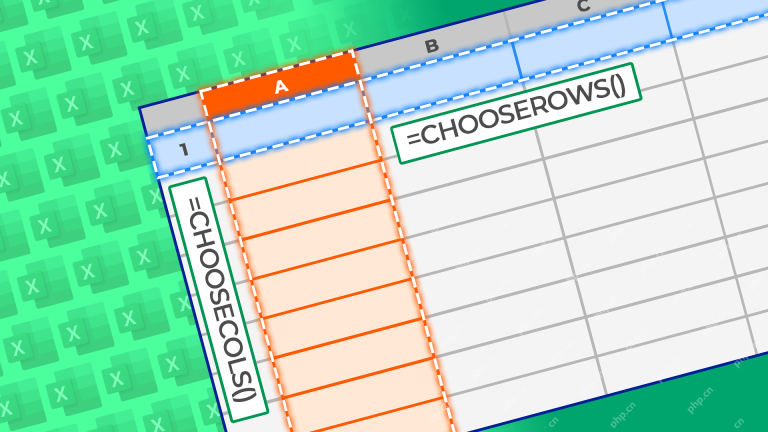 How to Use the CHOOSECOLS and CHOOSEROWS Functions in Excel to Extract DataMay 05, 2025 am 03:02 AM
Excel's CHOOSECOLS and CHOOSEROWS functions simplify extracting specific columns or rows from data, eliminating the need for nested formulas. Their dynamic nature ensures they adapt to dataset changes. CHOOSECOLS and CHOOSEROWS Syntax: These functio
 How to Use AI Function in Google SheetsMay 03, 2025 am 06:01 AM
Google Sheets' AI Function: A Powerful New Tool for Data Analysis Google Sheets now boasts a built-in AI function, powered by Gemini, eliminating the need for add-ons to leverage the power of language models directly within your spreadsheets. This f
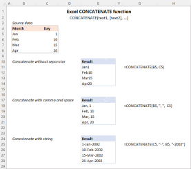 Excel CONCATENATE function to combine strings, cells, columnsApr 30, 2025 am 10:23 AM
This article explores various methods for combining text strings, numbers, and dates in Excel using the CONCATENATE function and the "&" operator. We'll cover formulas for joining individual cells, columns, and ranges, offering solutio
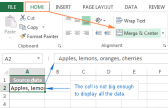 Merge and combine cells in Excel without losing dataApr 30, 2025 am 09:43 AM
This tutorial explores various methods for efficiently merging cells in Excel, focusing on techniques to retain data when combining cells in Excel 365, 2021, 2019, 2016, 2013, 2010, and earlier versions. Often, Excel users need to consolidate two or
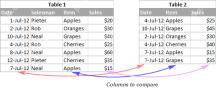 Excel: Compare two columns for matches and differencesApr 30, 2025 am 09:22 AM
This tutorial explores various methods for comparing two or more columns in Excel to identify matches and differences. We'll cover row-by-row comparisons, comparing multiple columns for row matches, finding matches and differences across lists, high
 Rounding in Excel: ROUND, ROUNDUP, ROUNDDOWN, FLOOR, CEILING functionsApr 30, 2025 am 09:18 AM
This tutorial explores Excel's rounding functions: ROUND, ROUNDUP, ROUNDDOWN, FLOOR, CEILING, MROUND, and others. It demonstrates how to round decimal numbers to integers or a specific number of decimal places, extract fractional parts, round to the
 Consolidate in Excel: Merge multiple sheets into oneApr 29, 2025 am 10:04 AM
This tutorial explores various methods for combining Excel sheets, catering to different needs: consolidating data, merging sheets via data copying, or merging spreadsheets based on key columns. Many Excel users face the challenge of merging multipl
 Calculate moving average in Excel: formulas and chartsApr 29, 2025 am 09:47 AM
This tutorial shows you how to quickly calculate simple moving averages in Excel, using functions to determine moving averages over the last N days, weeks, months, or years, and how to add a moving average trendline to your charts. Previous articles


Hot AI Tools

Undresser.AI Undress
AI-powered app for creating realistic nude photos

AI Clothes Remover
Online AI tool for removing clothes from photos.

Undress AI Tool
Undress images for free

Clothoff.io
AI clothes remover

Video Face Swap
Swap faces in any video effortlessly with our completely free AI face swap tool!

Hot Article
Hot Tools

Atom editor mac version download
The most popular open source editor

VSCode Windows 64-bit Download
A free and powerful IDE editor launched by Microsoft

PhpStorm Mac version
The latest (2018.2.1) professional PHP integrated development tool

MantisBT
Mantis is an easy-to-deploy web-based defect tracking tool designed to aid in product defect tracking. It requires PHP, MySQL and a web server. Check out our demo and hosting services.

WebStorm Mac version
Useful JavaScript development tools

