


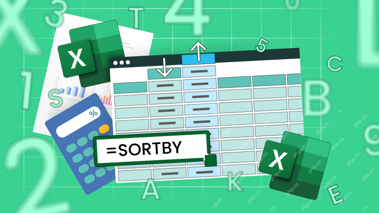
php editor Apple will help you master Excel drawing skills easily! As a commonly used office software, Excel can not only process data, but also create various exquisite charts. This article will introduce you in detail how to use various functions and techniques to create charts in Excel, allowing you to easily achieve professional-level data visualization effects. Follow our tutorials to make your data charts more vivid and let the data speak for itself!
1. Create a new EXCEL table on the computer desktop, open it, and enter the data required for charting in excel.

#2. Select data (to select discontinuous data, just hold down "ctrl" and select. When selecting, you must select the table header together), and then Click insert.

3. Select "Chart" under the "Insert" menu. For example, if you want to make a column chart, just select the column chart.

#4. At this time, click the icon, you can select the column chart style in the upper toolbar, and select the style to beautify it.

5. According to the above steps, you can complete the creation of the data table.

By processing the basic content of the data table, excel charts are successfully produced. The table only displays the data, and the chart is a more intuitive expression of data. In terms of form, different excel charts display different content. Some can visually see growth, and some can intuitively see proportion. After class, you can choose the appropriate chart form for practice based on the different data content.
The above is the detailed content of How to draw graphs with excel. For more information, please follow other related articles on the PHP Chinese website!

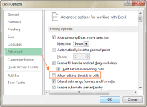
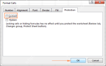 How to lock and hide formulas in ExcelApr 25, 2025 am 10:52 AM
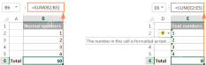
This tutorial explains how to conceal Excel formulas from the formula bar and protect them from unauthorized changes. Learn to lock individual or all formulas, ensuring data confidentiality and integrity. Microsoft Excel simplifies formula interpret
 How to copy formula in Excel with or without changing referencesApr 25, 2025 am 10:17 AM
This Excel tutorial explores various methods for copying formulas, addressing specific scenarios beyond simple mouse clicks. We'll cover copying formulas down columns, across entire columns, to non-adjacent cells, and techniques for preserving forma
 How to edit, evaluate and debug formulas in ExcelApr 25, 2025 am 09:52 AM
In this tutorial, you will learn a few quick and efficient ways to check and debug formulas in Excel. See how to use the F9 key to evaluate formula parts, how to highlight cells that reference or are referenced by a given formula, how to
 Excel formulas not working: how to fix formulas not updating or not calculatingApr 25, 2025 am 09:24 AM
This tutorial tackles common Excel formula errors, helping you troubleshoot formulas that won't calculate or update. Who can imagine Excel without formulas? Yet, malfunctioning formulas are incredibly frustrating. This guide provides solutions to
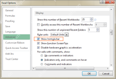 Formula bar in Excel: how to show, hide, expand or collapseApr 25, 2025 am 09:13 AM
This tutorial explains the Excel formula bar, how to restore it if missing, and how to adjust its size. We'll cover various Excel versions. Many of our tutorials delve into Excel functions and formulas, but beginners should start with the basics, an
 How to Use the SORTBY Function in ExcelApr 25, 2025 am 01:00 AM
Excel's SORTBY function: a tool for efficient sorting Microsoft Excel provides a variety of data sorting methods, and the SORTBY function is undoubtedly the simplest and most convenient one. It allows you to dynamically sort data based on multiple arrays while maintaining the integrity of the original data. SORTBY function syntax The syntax of the SORTBY function is concise and clear: =SORTBY(a,b¹,b²,c¹,c²...) in: a (required) is the region or array to be sorted; b¹ (Required) is the first region or array to sort by; b² (optional) is the sort order of b¹; c¹ and c² (optional)
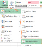 How to find and highlight duplicates in ExcelApr 24, 2025 am 10:42 AM
This tutorial shows you how to automatically highlight duplicate entries in Excel. We'll cover shading duplicate cells, entire rows, or consecutive duplicates using conditional formatting and a powerful add-in. Last week, we looked at using formulas
 How to identify duplicates in Excel: find, highlight, count, filterApr 24, 2025 am 10:06 AM
The tutorial explains how to search for duplicates in Excel. You will learn a few formulas to identify duplicate values or find duplicate rows with or without first occurrences. You will also learn how to count instances of each duplicate


Hot AI Tools

Undresser.AI Undress
AI-powered app for creating realistic nude photos

AI Clothes Remover
Online AI tool for removing clothes from photos.

Undress AI Tool
Undress images for free

Clothoff.io
AI clothes remover

Video Face Swap
Swap faces in any video effortlessly with our completely free AI face swap tool!

Hot Article
Hot Tools

SecLists
SecLists is the ultimate security tester's companion. It is a collection of various types of lists that are frequently used during security assessments, all in one place. SecLists helps make security testing more efficient and productive by conveniently providing all the lists a security tester might need. List types include usernames, passwords, URLs, fuzzing payloads, sensitive data patterns, web shells, and more. The tester can simply pull this repository onto a new test machine and he will have access to every type of list he needs.

Dreamweaver CS6
Visual web development tools

SAP NetWeaver Server Adapter for Eclipse
Integrate Eclipse with SAP NetWeaver application server.

SublimeText3 Linux new version
SublimeText3 Linux latest version

SublimeText3 Mac version
God-level code editing software (SublimeText3)

