
 Software TutorialOffice SoftwareInsurance ppt layout design principles: principles of intimacy and hierarchy
Insurance ppt layout design principles: principles of intimacy and hierarchy

php editor Yuzi introduces to you the layout design principles of insurance ppt: the principle of intimacy and hierarchy. When making insurance-related ppts, it is very important to properly apply the principles of intimacy and hierarchy, which can improve the overall visual effect and information transmission effect. Through the use of reasonable layout, color, font and other design elements, you can make the ppt more attractive and professional, helping you better display insurance-related content. This article will introduce in detail the application techniques of intimacy and hierarchy principles in ppt layout design, allowing you to easily create eye-catching insurance ppts!
The first part emphasizes the importance of intimacy to the understanding of copywriting, analyzes the ppt of the case, and points out the existing problems: improper placement and deviations caused by different intimacy relationships.

2. Part 2 [Two hierarchical relationships that affect intimacy in PPT] Through the analysis of this case, the size of the font, the white space and the color of the font are often used to highlight hierarchical relationships.

3. Two hierarchical relationships in the PPT page: [Father-son relationship, brother relationship] First analyze the father-son relationship: reflected in the title and body, subtitles, words, sentences As well as subtitles and main text, etc.

#4. Example: The father-son relationship is reflected in the enlargement of the font size, which weakens unimportant content and makes the page look beautiful.

5. Then analyze the sibling relationship: reflected in the juxtaposed content, pay attention to the distance relationship between the title and the content, as well as the spacing and page margins between the content the size of. We must also follow the principle of "center of the page" to make the page more beautiful overall.

#6. The third part [Two hierarchical relationships of the overall PPT] Expand the entire PPT for hierarchical analysis - hierarchical progression.

7. Review the content of this lesson [1. The position and relationship of elements affect the understanding of the page, 2. The two hierarchical relationships in the PPT page, 3. The overall PPT Two hierarchical relationships].

Here we mainly share it in the form of pictures. In fact, it may not be very effective. We can click on the course link: https://huke88.com/course/24712.html?pageType =1&key=ppt&identify=1626322030Watch the video tutorial, and you can find and learn more software tutorials on the website!
The above is the detailed content of Insurance ppt layout design principles: principles of intimacy and hierarchy. For more information, please follow other related articles on the PHP Chinese website!

 Excel CONCATENATE function to combine strings, cells, columnsApr 30, 2025 am 10:23 AM
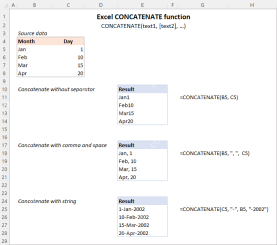
This article explores various methods for combining text strings, numbers, and dates in Excel using the CONCATENATE function and the "&" operator. We'll cover formulas for joining individual cells, columns, and ranges, offering solutio
 Merge and combine cells in Excel without losing dataApr 30, 2025 am 09:43 AM
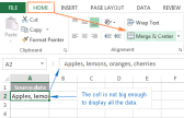
This tutorial explores various methods for efficiently merging cells in Excel, focusing on techniques to retain data when combining cells in Excel 365, 2021, 2019, 2016, 2013, 2010, and earlier versions. Often, Excel users need to consolidate two or
 Excel: Compare two columns for matches and differencesApr 30, 2025 am 09:22 AM
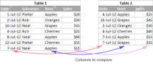
This tutorial explores various methods for comparing two or more columns in Excel to identify matches and differences. We'll cover row-by-row comparisons, comparing multiple columns for row matches, finding matches and differences across lists, high
 Rounding in Excel: ROUND, ROUNDUP, ROUNDDOWN, FLOOR, CEILING functionsApr 30, 2025 am 09:18 AM
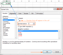
This tutorial explores Excel's rounding functions: ROUND, ROUNDUP, ROUNDDOWN, FLOOR, CEILING, MROUND, and others. It demonstrates how to round decimal numbers to integers or a specific number of decimal places, extract fractional parts, round to the
 Consolidate in Excel: Merge multiple sheets into oneApr 29, 2025 am 10:04 AM
This tutorial explores various methods for combining Excel sheets, catering to different needs: consolidating data, merging sheets via data copying, or merging spreadsheets based on key columns. Many Excel users face the challenge of merging multipl
 Calculate moving average in Excel: formulas and chartsApr 29, 2025 am 09:47 AM
This tutorial shows you how to quickly calculate simple moving averages in Excel, using functions to determine moving averages over the last N days, weeks, months, or years, and how to add a moving average trendline to your charts. Previous articles
 How to calculate average in Excel: formula examplesApr 29, 2025 am 09:38 AM
This tutorial demonstrates various methods for calculating averages in Excel, including formula-based and formula-free approaches, with options for rounding results. Microsoft Excel offers several functions for averaging numerical data, and this gui
 How to calculate weighted average in Excel (SUM and SUMPRODUCT formulas)Apr 29, 2025 am 09:32 AM
This tutorial shows you two simple ways to calculate weighted averages in Excel: using the SUM or SUMPRODUCT function. Previous articles covered basic Excel averaging functions. But what if some values are more important than others, impacting the f


Hot AI Tools

Undresser.AI Undress
AI-powered app for creating realistic nude photos

AI Clothes Remover
Online AI tool for removing clothes from photos.

Undress AI Tool
Undress images for free

Clothoff.io
AI clothes remover

Video Face Swap
Swap faces in any video effortlessly with our completely free AI face swap tool!

Hot Article
Hot Tools

MinGW - Minimalist GNU for Windows
This project is in the process of being migrated to osdn.net/projects/mingw, you can continue to follow us there. MinGW: A native Windows port of the GNU Compiler Collection (GCC), freely distributable import libraries and header files for building native Windows applications; includes extensions to the MSVC runtime to support C99 functionality. All MinGW software can run on 64-bit Windows platforms.

SAP NetWeaver Server Adapter for Eclipse
Integrate Eclipse with SAP NetWeaver application server.

SublimeText3 Chinese version
Chinese version, very easy to use

Notepad++7.3.1
Easy-to-use and free code editor

Dreamweaver Mac version
Visual web development tools

