Home >Web Front-end >H5 Tutorial >Introduction to the process of developing NetEase Weibo Web App using HTML5_html5 tutorial skills
Introduction to the process of developing NetEase Weibo Web App using HTML5_html5 tutorial skills
- WBOYWBOYWBOYWBOYWBOYWBOYWBOYWBOYWBOYWBOYWBOYWBOYWBOriginal
- 2016-05-16 15:51:161585browse
HTML5 is increasingly favored by Internet development teams at home and abroad. Abroad, Google is enthusiastically developing the Chrome Web Store, Microsoft has released the "Irish Spring" theme website that supports the development of HTML5 technology, and Nokia has spent huge sums of money to acquire and build the NOKIA MAP business. Domestic Internet giants are also interested in the new web development standards coming from the other side of the ocean, and have begun to test the waters of HTML5 products.
NetEase Weibo iPhone platform Web App product has been successfully launched in the first quarter of 2012. Now I would like to share the experience and lessons learned from the development of this project with everyone, and hope to grow together with you in the HTML5 development environment.
Staff configuration
1. Developer configuration
Product manager: 1;
Interaction designer: 1;
Visual designer: 1;
Front-end engineer: 1;
Backend engineer: 2;
Tester: 1.
2. Development time
Interaction designer: 22 working days;
Visual designer: 14 working days;
Front-end engineer: 50 working days;
Backend engineer: Because the original backend data is used, he only needs to cooperate with the front-end engineer to call the data
Among them, interaction and front-end take the longest time in the entire development cycle.
NetEase Weibo Web App Development Process
1. Functional Requirements Planning: Different from Web and Local Clients
Responsible Person: Product Manager; Participants: Interaction Designer
NetEase Weibo Web App (referring to the mobile version in this article) is different from the web product and also different from the local client.
1. Compared with the Web version, NetEase Weibo Web App has the advantages of strong mobility and rich media, but also has the disadvantages of small information presentation space and deep information architecture. The usage scenarios of the two are different. Weibo Web is mostly used for immersive use under ample time and superior network conditions; Weibo Web App is mostly used to kill time under trivial time and uneven network conditions.
Therefore, NetEase Weibo Web App should avoid having large and comprehensive functions. It needs to refine and select the functions most commonly used by users in the mobile environment from the Web side, and add functions unique to the mobile side (such as adding local functions during the iteration phase). service function).
2. Compared with the local client, NetEase Weibo Web App has the advantages of no installation, simple upgrade, low development cost, and adaptive layout. It also has a slightly slower response speed and low permissions to access the native controls of the mobile phone. , weak stability and other disadvantages.
Based on the analysis of the advantages and disadvantages of the two, NetEase Weibo Web App needs to catch up with the high-quality experience of the local client and try to ensure that it is lightweight and fast.
To sum up in one sentence, the functions of Web App can be more refined than those of the Web and local clients, meeting the core needs of users in the mobile environment.
NetEase Weibo Web App function planning, as shown below: 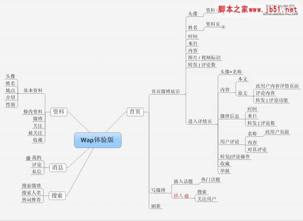
2. Information architecture design: as shallow and narrow as possible
Responsible person: interaction designer Participant: Product Manager
Anyone who has worked on mobile Internet products must know why the information architecture needs to be as shallow and narrow as possible. The biggest reason is the small and expensive display space of mobile phones. The information architecture of the mobile phone local client needs to be shallow and narrow, and Web App needs to be even more so, because the browser's bottom toolbar always exists in the browser page, which eats up a small piece of the already cramped display space. As shown below: 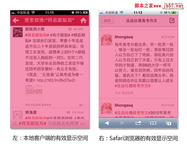
The browser toolbar at the bottom of the mobile phone screen is useless for Web App products: Web App itself is a closed-loop application and does not require the browser toolbar. Even if it does not affect the large information architecture, it eats up valuable display space and has an important impact on the design of the navigation system (this part was briefly analyzed in the previous article "Discussion on iPhone Web App Navigation Design").
Webpage production Webjx article introduction: HTML5 development practical NetEase Weibo.
3. Interaction design: simple and efficient
Responsible person: Interaction Designer; participants: product manager, visual designer, front-end engineer, back-end technician 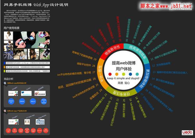
Interaction design concept:
The specific interaction design concept of this product comes from : Survey of user usage scenarios, competitive product analysis, Web App development status, and Weibo Web App’s own requirements. The main interaction design concepts finally summarized are:
1. Enhance ease of search:
Enhancement of global navigation, quick return to home page, permanent operation of common operations, timely animation demonstration, simple and clear web page layout, etc. .
2. Improve usage efficiency
Reduce the level of information architecture, provide appropriate access to shortcut keys, ensure safe touch areas, consider user browsing habits, prioritize core functions, eliminate unnecessary visual noise, etc.
3. More intelligent and considerate
It supports offline use, automatic filling in of information being edited after accidental interruption, careful use of warning boxes, help with the implementation of search suggestions, arranging toolbars according to current task needs, active and effective feedback, etc.
4. Improve task concentration
Single task operation path, timely hiding of tab navigation, elimination of distracting factors, grayscale display of unavailable buttons, maximization of task progress pages, and minimization of functions that are not in progress, etc.
5. Platform consistency:
Look and click, iOS platform list view, push screen animation during forward and return operations, iOS platform-specific modal view, alert box, calling native controls, simplicity Clear jump logic, etc.
The interaction design concept at this stage is not just a concept, but more of a specific design guidance for the Web App product. The design implementation method carrying beautiful design concepts is an important implementation in the design research stage.
There are many design contents and details, here is just one detail to share with you:
Enhance the ease of finding - the enhancement of global navigation 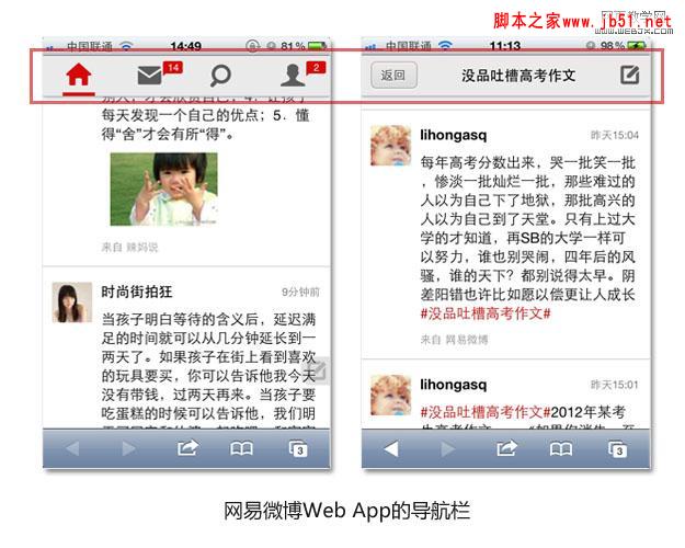
Compatible with the original wap Weibo Compared to this, the fixed presence of the global navigation bar is a big change. Let’s briefly analyze the reasons for this:
– What is the user’s usage environment? ——Outdoor mobile situations (such as on the subway, waiting in line), or indoor idle states (such as browsing Weibo before going to bed);
– What is the purpose of the user coming to this page? ——Browse Weibo;
– What are the common operations performed by users on this page? ——Pull down to read, pin to the top and load new information, click on other tabs to jump;
– What are the benefits if the global navigation bar is fixed at the top? ——It is convenient for users to return to the top, convenient for users to load new information, convenient for users to switch tabs, and has a strong sense of global control;
– What are the disadvantages if the global navigation bar is fixed at the top? ——Swallowing precious information display space
…………
During user use, the behaviors of pinning, refreshing, and switching tabs are also relatively frequent behaviors, and the convenience of operation needs to be ensured. The fixed global navigation bar can meet this demand: clicking the HOME button can pin it to the top and refresh it, making it easier for users to switch tabs. At the same time, the fixed global navigation bar allows users to always know clearly where they are, where they can go, and what they have given. Users have a strong sense of global control.
4. Visual design: experiment with fresh style
Responsible person: visual designer; participants: product manager, interaction designer, front-end engineer
The visual style of NetEase Weibo Web app was determined through many processes Angle of discussion:
1. Should it be consistent with the color tone of the local NetEase Weibo client?
Products need to maintain a certain consistency on different platforms, and color style is also an important component in forming the temperament of the product. So do we need to use a skin similar to the local NetEase Weibo client? The main color of NetEase Weibo local client is red.
The analysis is as follows:
–The benefits of using this red are: relatively strong product consistency; the product temperament formed by red is more "spiritual".
–The disadvantages of using this red color are: the red area is slightly eye-catching compared to Weibo content, and “immersive reading” is more difficult to achieve;
Using the NetEase Weibo Web App through the safari browser, the final visual effect is similar to Another difference with the local client is that the browser toolbar always occupies the bottom line of the screen. Red is a relatively "noisy" color, while the blue-gray color of the browser's toolbar is relatively "calm". The huge gap between the two colors makes the glasses extremely uncomfortable. 
Based on the above analysis, it is not suitable to use the red color of the local client.
Webjx article introduction to web page production: HTML5 development practice on NetEase Weibo.
2. What is the impact of running in Safari browser?
NetEase Weibo Web App is run and displayed from the safari browser, which is one of the environments of this product. The webpage gives people a "light and streamlined" feeling, while the local client gives people a "heavy and stable" feeling.
Therefore, the visual style "Lightweight" is a good choice.
3. Current visual style trends
The “little fresh” style led by Metro UI and Google has become a major visual style development trend. After a period of exquisite and complicated visual experience, he returned to his original simplicity and began to become popular with a simple and fresh visual style.
So, the visual designer went through several visual attempts, including red, cool black, and fresh light gray. After many comparisons, everyone unanimously agreed on the fresh and light gray color. Fresh light gray is the main color, and the status of the icon after clicking is the red commonly used by NetEase, which maintains the consistency of the visual style to a certain extent.
5. Front-end development: hire and use each other
Responsible person: front-end engineer; participants: product manager, interaction designer, visual designer, back-end technician
When reaching this part, you may be more concerned about what the specific code looks like and what the implementation framework looks like? I'm very sorry that the specific implementation code cannot be shown to you because it involves the company's product secrets. Forgive me!
Here are two questions from netizens selected for brief answers:
Question 1: Can you talk about the front-end architecture? Why is sencha not used?
Answer: Sencha touch 1.x/2.x, jQuery mobile, etc. are not yet ideal in terms of customizability, performance, and resource consumption, so NetEase has developed its own framework on the front end. As you said, seajs is used to handle script loading. iscroll simulates scrolling, and it seems to be very effective so far. NetEase’s front-end will continue to improve this framework.
Question 2: Can I take photos and upload pictures?
iPhone Safari does not give permission to access the camera and gallery, so this demand has not been met. In other words, if Android gives permissions, this "rigorous need" will definitely be met by then.
6. Follow-up work
The subsequent work will mainly include interactive walkthroughs, visual walkthroughs, QA testing, summarizing feedback and fixing problems after going online, and planning the next iteration. Everyone knows the project process, so I won’t go into details.
Experiences and lessons learned
1. Impressions on work process
1. Take excellent experience design as the guide.
This project is a typical example of design-led design. First, the designer is given sufficient time and space to develop, and the technology is used as needed. This working idea is the cornerstone of a good user experience for the entire product. HTML5 technology is very powerful and has too many possibilities; and design is the mold that shapes these technical possibilities.
2. Timely and frequent communication between the product manager, interaction, visual, and front-end engineers
Throughout the project, the product manager, interaction designer, visual designer, and front-end engineer will hold a weekly meeting. It was later proven that this kind of frequent communication greatly reduced the rework rate and improved development efficiency.
3. Run fast in small steps and focus on iteration.
NetEase Weibo products are relatively complex, coupled with the slow progress of HTML5 development and limited manpower, it is impossible to complete all functional details and go online at the same time. Otherwise, post-debugging will take a month, adding a heavy burden to the rapid development of the product. Therefore, it has become an inevitable choice to only do the core functions in the first phase.
2. User experience experience
1. The navigation system is more suitable at the top of the screen.
The browser toolbar has always existed, so the tab navigation bar is no longer suitable for being fixed at the bottom of the screen, and the top is more suitable.
2. Convenience is more important, and the most commonly used functions are cleverly set up.
Due to product performance and browser performance, the current fluency and jump speed of Web App are still not comparable to Native App, and the jump cost is slightly higher. Therefore, it is necessary to bring the most commonly used functions closer to users to reduce the waiting cost caused by jumps.
3. The visual draft is a trade-off between beauty and simplicity. Most visual drafts need to be implemented in code.
Almost all visuals are implemented through code, and it is best not to make the visual design too complicated. It also takes time for front-end engineers to digest the visual draft. 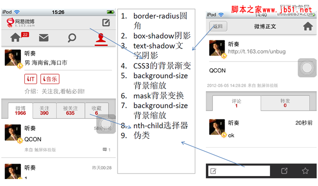
3. Understanding of technical implementation
1. Permission restrictions of Safari browser, Web App cannot yet call the camera tool, and does not support the image upload function.
This is a very troublesome and helpless matter. The permissions granted by the iOS system to Web App are too low. In contrast, the Android system's Web App can call up camera controls and also supports the Weibo image upload function (but there is no Android version yet).
2. The cutscenes are not as smooth as the local client.
The reasons are: good cutscenes will cannibalize the performance of the product; HTML5 technology is not yet so complete and mature; there is still a lack of a powerful browser.
Summary
Except for the permission issues of the iOS system, the excellent performance of Web App is already close to that of Native App. HTML5 technology has given new life to wap web pages and brought disruptive changes to wap. In the HTML5 project, functional planning is better to be refined; the information architecture needs to be as shallow and narrow as possible; the interaction design needs to be simple and efficient; the visual design also needs to consider the special operating environment of the browser; the front end not only needs to gradually digest the interaction design and visual design, but also boldly try to find solutions to new technologies and new problems. Frequent communication with the entire team is necessary, and development steps are best taken in small steps.
Manpower and energy are limited, so bias is inevitable. Everyone is welcome to contribute! Looking forward to discussing this interesting topic with you.
Related articles
See more- AlloyTouch full-screen scrolling plug-in creates a smooth H5 page in 30 seconds
- HTML5 actual combat and analysis of touch events (touchstart, touchmove and touchend)
- Detailed explanation of image drawing examples in HTML5 canvas 9
- Regular expressions and new HTML5 elements
- How to combine NodeJS and HTML5 to drag and drop multiple files to upload to the server

