Home >Web Front-end >H5 Tutorial >Use css to create triangles Use CSS3 to create 3d tetrahedron principle and code (html5 practice)_html5 tutorial skills
Use css to create triangles Use CSS3 to create 3d tetrahedron principle and code (html5 practice)_html5 tutorial skills
- WBOYWBOYWBOYWBOYWBOYWBOYWBOYWBOYWBOYWBOYWBOYWBOYWBOriginal
- 2016-05-16 15:50:281583browse
Today I read an article about how to use CSS3 to create a 3D tetrahedron. I thought it was quite good, so I shared it with you.
The first thing I want to share with you is how to use div css to create a triangle. Here I will paste the relevant code first, and then explain the principle to you.
html:
Copy the code
The code is as follows:css:
Copy code
The code is as follows:Operation effect :

Principle Analysis:
In the html code, we define two divs. The outer div is the container object, and the inner div is used to generate triangles. In the css code, we did not set the width and height of the internal div, but only set the width of the three sides of the border (top, bottom and left). By giving the three sides different colors, they will become three different triangles.
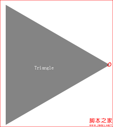
At this time, we only need to simply set the color of the upper and lower sides to transparent colors, and an equilateral triangle will appear.
Copy code
The code is as follows:#pyramid > div:first-child {
border-color: transparent transparent transparent rgba(50, 50, 50, 0.6);
}
Rendering:

Among them, red The place shown in the circle is the location of the inner div. He is an invisible object with 0 width and 0 height, but it actually exists.
What we are going to talk about next is how to implement a 3d tetrahedron and how to create animations.
First, paste the relevant code.
html:
Copy code
The code is as follows:< ;/div> 🎜>
The code is as follows:
The code is as follows:
现在开始相关代码的讲解。
html代码和之前的差不多,就是多了三个div,分别作为四面体的另外三个面。
css代码中,我们使用 #pyramid > div:nth-child(n) 寻找到三面体的四个面,设置border四个边的颜色,将他们分别定义成三角形。通过transform属性的rotateX,rotateY,translateX,translateY和translateZ方法,设置他们在3维空间中的角度、朝向和位置。这里涉及到很多数学知识,大家需要去补充相关知识。
通过上述设置,四面体就形成了。接下来就是为其添加动画效果。这里使用的东西也很简单,就是animation和keyframes。css3相关属性,大家可以到http://www.w3schools.com/css3/default.asp站点去学习,我这里就不做过多讲解了。
本文到此为止,大家可以把html和css代码粘贴在一起,查看最终效果。
代码里面有不懂的内容,大家可以给我留言。
Statement:
The content of this article is voluntarily contributed by netizens, and the copyright belongs to the original author. This site does not assume corresponding legal responsibility. If you find any content suspected of plagiarism or infringement, please contact admin@php.cn
Previous article:Discussion on website size when building a touch-screen website using html5_html5 tutorial skillsNext article:Discussion on website size when building a touch-screen website using html5_html5 tutorial skills
Related articles
See more- AlloyTouch full-screen scrolling plug-in creates a smooth H5 page in 30 seconds
- HTML5 actual combat and analysis of touch events (touchstart, touchmove and touchend)
- Detailed explanation of image drawing examples in HTML5 canvas 9
- Regular expressions and new HTML5 elements
- How to combine NodeJS and HTML5 to drag and drop multiple files to upload to the server

