Home >Web Front-end >H5 Tutorial >Discussion on website size when building a touch-screen website using html5_html5 tutorial skills
Discussion on website size when building a touch-screen website using html5_html5 tutorial skills
- WBOYWBOYWBOYWBOYWBOYWBOYWBOYWBOYWBOYWBOYWBOYWBOYWBOriginal
- 2016-05-16 15:50:271284browse
This article is divided into two parts. The first part discusses the feasibility of cross-platform websites, and the second part discusses how to set up the viewport
Developing a cross-platform website?
Rely on the adaptive width and height of the label to achieve multi-size versatility! ?
It’s true that the label width and height can be adaptive. We have been able to do this for a long time. But you will find that many traditional websites on the PC side still have a fixed width. (Taobao uses 1000px width, Sohu uses 950px...) Why don't we make the website adaptive to the width and height? That's because if we allow the label width to be arbitrarily stretched by the browser, it will lead to a very poor experience: you don't want your left column to turn into a noodle when the browser is zoomed to 100px; When the browser is overstretched, your website looks like an elementary school student's lined notebook. Therefore, it is unrealistic to rely on label adaptation to achieve cross-platform, and it comes at the expense of user experience. Many times we have to fix the width and height.
Build a responsive website relying on html5 device detection!
We rely on HTML5 device detection to check whether the current device is a mobile phone or tablet, and load the corresponding css accordingly. For example: If it is detected that your device is a tablet, I can display three columns horizontally. If it is a mobile phone, I will only display one column. This sounds easy, but it is very complicated to implement. Not only do we have to develop multiple sets of templates for different devices, but we also have to deal with the size of the images. In this regard, we can take a look at how the Boston Globe uses HTML5 to implement responsive design.
In general, implementing a cross-platform website is too costly and has too many restrictions for most websites. Whether it is feasible depends on the actual situation of the website.
viewport and website size
Mobile browsers place the page in a virtual "window" (viewport). Usually this virtual "window" (viewport) is wider than the screen, so that each web page does not need to be squeezed into a small window. (This will break the layout of web pages that are not optimized for mobile browsers.) Users can pan and zoom to see different parts of the web page. Mobile browsers introduced the viewport meta tag, allowing web developers to control the size and zoom of the viewport.
Basic concepts
(1) CSS pixels and device pixels
CSS pixels: Abstract units used by browsers, mainly used to draw content on web pages.
device pixels: The smallest physical unit of the display screen, each dp contains its own color and brightness.
How much position equivalent CSS pixels occupy on the mobile screen is not fixed, it depends on many properties. After analysis and summary, we can come up with such a formula: 1 CSS pixels = (devicePixelRatio)^2 device pixels (^2 means square. As for what devicePixelRatio is, we will explain it later).
(2) PPI/DPI
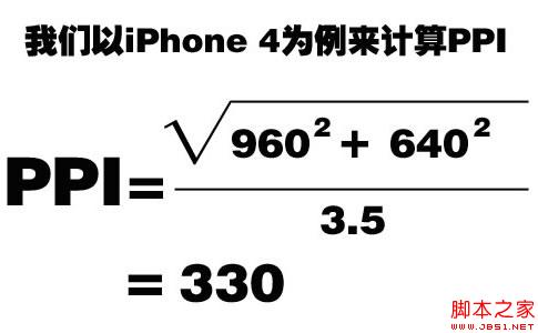
PPI, sometimes called DPI, represents the number of pixels per inch. The higher the value, the higher the density the display can display images. (Note: The pixels here refer to device pixels.) Once we understand what PPI means, we can easily understand the calculation method of PPI. We need to first calculate the diagonal equivalent pixels of the mobile phone screen, and then calculate Diagonal (what we usually call the mobile phone screen size is the length of the diagonal of the mobile phone screen), you can get the PPI. For accurate calculations, please refer to the figure below. What’s more interesting is that the PPI of iPhone 4 calculated based on the formula is 330, which is a little higher than the 326 officially announced by Apple.

Similarly, taking HTC G7 as an example, with a resolution of 480*800 and 3.7 inches, the calculated PPI is 252.
(3) Density determines the ratio
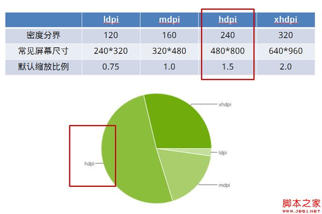
We calculate PPI to know which density range a mobile phone device belongs to, because different density ranges correspond to different default scaling ratios, which is a very important concept.

As can be seen from the above picture, mobile phones with a PPI between 120-160 are classified as low-density mobile phones, 160-240 are classified as medium-density mobile phones, 240-320 are classified as high-density mobile phones, and above 320 are classified as ultra-high-density mobile phones. (Apple gave it a fancy name - retina).
These densities correspond to a specific scaling value. Take the iPhone 4 or 4s that we are most familiar with. Their PPI is 326, which is an ultra-high-density mobile phone. When we write a page with a width of 320px and display it on the iPhone, you will find that it is actually full width. This is because the page is enlarged twice by default, which is 640px, and the width of iPhone 4 or 4s is exactly 640px.
The high-density category is circled in the picture because this is the statistical data of Android mobile phones. In the domestic Android mobile phone market, high-density devices account for the vast majority of the market share. This is a very important point. , which is also the key point we should pay attention to when making Android webapp.
Usage of viewport
viewport has a total of 5 attributes, as follows:
content="
height = [ pixel_value |device-height] ,
width = [ pixel_value |device-width ] ,
initial-scale = float_value , minimum-scale = float_value , maximum-scale = float_value ,
user-scalable =[yes | no] ,
target-densitydpi = [ dpi_value | device-dpi| high-dpi | medium-dpi | low-dpi] " />
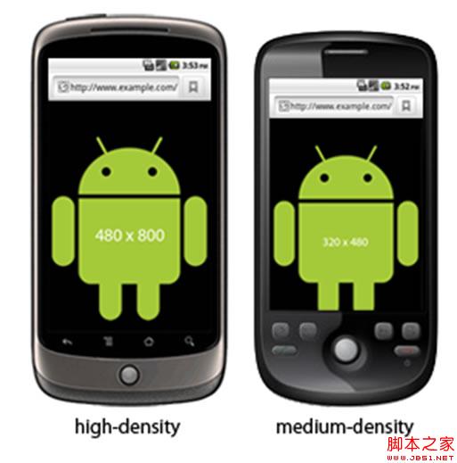
Among these properties, we focus on target-densitydpi. This property can change the default scaling of the device. medium-dpi is the default value of target-densitydpi. If we define target-densitydpi=device-dpi, then the device will render the page according to the real dpi. For example, if a 320*480 picture is placed in an iPhone 4, it will fill the screen by default. However, if target-densitydpi=device-dpi is defined, the picture will only occupy a quarter (half) of the screen. square of one), because the resolution of iPhone 4 is 640*960.
Solution
(1) Simple and crude
If we create the page according to the 320px wide design draft and do not make any settings, the page will automatically scale to the same width as the mobile phone screen by default (this is because medium-dpi is the default value of target-densitydpi, and Different densities correspond to different scaling ratios, all of which are automatically done by mobile devices). So this solution is simple, crude and effective. But there is a fatal drawback. For high-density and ultra-high-density mobile devices, pages (especially pictures) will be distorted, and the more density, the more severe the distortion.
(2) Extremely perfect
In this solution, we use target-densitydpi=device-dpi, so that the mobile device will render according to the real number of pixels. In professional terms, 1 CSS pixels = 1 device pixels. For example, for a 640*960 iPhone, we can create a 640*960 page, and there will be no scroll bars when displayed on the iPhone. Of course, for other devices, pages of different sizes also need to be produced, so this solution often uses media queries to create responsive pages. This solution can render perfectly at a specific resolution, but the more different resolutions you need to be compatible with, the higher the cost becomes because separate code needs to be written for each resolution. Here is a simple example:
< meta name="viewport"content="target- densitydpi =device-dpi, width=device-width " />
#header {
background:url (medium-density-image.png);
}
@media screen and (- webkit -device-pixel-ratio:1.5) {
/* CSS for high-density screens */
#header { background:url (high-density-image .png);}
}
@media screen and (- webkit -device-pixel-ratio:0.75) {
/* CSS for low-density screens */
#header { background: url (low-density-image.png);}

(3) Reasonable compromise
Considering that most Android devices are high-density and some are medium-density, we can adopt a compromise solution: we restore the 480px wide design draft, but the page is made 320px wide (using background -size to reduce the image), and then let the page automatically scale according to the proportion. In this way, low-density mobile phones have scroll bars (basically no one is using this kind of mobile phone anymore), medium-density mobile phones will waste a little bit of traffic, high-density mobile phones display perfectly, and ultra-high-density mobile phones have slight distortion ( There are very few ultra-high-density Android phones). The advantages of this solution are very obvious: only one set of design drafts and one set of code are needed (this is only discussing the situation of Android phones).
Related articles
See more- AlloyTouch full-screen scrolling plug-in creates a smooth H5 page in 30 seconds
- HTML5 actual combat and analysis of touch events (touchstart, touchmove and touchend)
- Detailed explanation of image drawing examples in HTML5 canvas 9
- Regular expressions and new HTML5 elements
- How to combine NodeJS and HTML5 to drag and drop multiple files to upload to the server

